Teaching Visual Communication in a Business Communication Course
13.9K views | +0 today
Follow
Teaching Visual Communication in a Business Communication Course
An online magazine by Bovee & Thill, authors of the leading textbooks in business communication and business writing, published by Pearson, featuring resources about visual communication, data visualization, including graphic design, photography, and presentations. For more information about Bovee & Thill's texts and their exclusive, superior coverage of visual communication, visit http://boveeandthillbusinesscommunicationblog.com. For instructor examination copies, go to http://blog.businesscommunicationnetwork.com/texts. To find your local sales representative, go to http://www.pearsonhighered.com/educator/replocator. To contact the authors, use this form: https://businesscommunicationnetwork.com/contact-us/. To get a free Comprehensive Guide to Business Communication Instructional Resources, visit http://blog.businesscommunicationnetwork.com/resources. Subscribe to a free weekly newsletter of new posts to all 11 of Bovee & Thill's Online Magazines: http://sco.lt/8kgeVV.
Your new post is loading...
Scoop.it!

Visual Communication: Why You Should Never Trust the Photos Hotels Post Online

Visual Communication: Why You Should Never Trust the Photos Hotels Post Online | Teaching Visual Communication in a Business Communication Course | Scoop.it

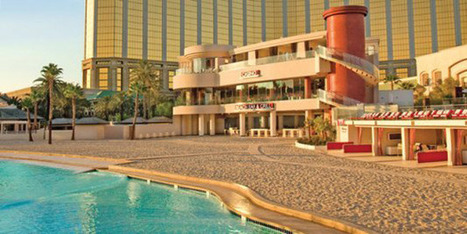
When it comes to picking a hotel, what you see online is not necessarily what you get when you check in. Travel deals website Oyster has caught hotels from Costa Rica to California doctoring their website photos to appeal to potential guests.


They've been kind enough to share their collection of "photo fakeouts," which serve as a kind of cautionary tale for anyone planning a vacation and relying solely on hotel websites.


Some of these photo "upgrades" are so egregious, you'll think you are looking at pictures of two completely different properties. . .

No comment yet.
Scoop.it!

How to Make a QR Code for Your Business Card

How to Make a QR Code for Your Business Card | Teaching Visual Communication in a Business Communication Course | Scoop.it
No comment yet.
Scoop.it!

The 22 Most Creative Business Cards We've Ever Seen

The 22 Most Creative Business Cards We've Ever Seen | Teaching Visual Communication in a Business Communication Course | Scoop.it

When you hand someone your businesscard, you're giving them a small, but important introduction to who you are.


Much like resumes and cover letters, a business card can easily get lost in the piles of other cards your prospective employers or clients are receiving on a daily basis. So you want to make yours stand-out.


We combed through some of the most creative business cards out there and spoke to several of the owners and designers. . .


No comment yet.
Scoop.it!

25 Examples of Creative Graphic Design Resumes

25 Examples of Creative Graphic Design Resumes | Teaching Visual Communication in a Business Communication Course | Scoop.it

Via andres taborga
Bovee & Thill's Online Business Communication Magazines's insight:

A unique resume is important for many reasons. Not only it does it resemble your personality, but it also speaks toyour capability and creativity.


Putting more effort and thoughts into creating an impressive resume is definitely worthwhile, as it is usually the first thing any employer sees before flipping through your entire portfolio. We are here to help you gain inspiration for this challenging task. So dust off your resume and give it a face-lift!


NOTE: For more creative resumes, as well as traditional resumes, take a look at Bovee & Thill's business communication textbooks.

No comment yet.
Scoop.it!

The Psychology of Color

The Psychology of Color | Teaching Visual Communication in a Business Communication Course | Scoop.it

This infographic from CertaPro Painters of Louisville shows how color evokes emotion and triggers your senses.

No comment yet.
Scoop.it!

The Most Powerful Colors on the Web

The Most Powerful Colors on the Web | Teaching Visual Communication in a Business Communication Course | Scoop.it
No comment yet.
Scoop.it!

Typographics

Typographics | Teaching Visual Communication in a Business Communication Course | Scoop.it

Typographics is a short lesson about typography illustrated in the visual language of infographics.


The objective was to use type as the main aesthetic and design element to create awareness about the evolution and main characteristics of typography.

No comment yet.
Scoop.it!

The World's Coolest Offices

The World's Coolest Offices | Teaching Visual Communication in a Business Communication Course | Scoop.it

Inc.com and Architizer present The World's Coolest Offices, a look at how companies are looking beyond cubicles and embracing modern architecture and office . . .

No comment yet.
Scoop.it!

When a Workspace Facilitates Communication

When a Workspace Facilitates Communication | Teaching Visual Communication in a Business Communication Course | Scoop.it

I visited the Palo Alto Skype office in June. I wasn’t aware of the uniqueness they created over there, but a friend of mine from Google, suggested . . .

No comment yet.
Scoop.it!

The Beauty of Data Visualization

The Beauty of Data Visualization | Teaching Visual Communication in a Business Communication Course | Scoop.it

Here are some of the points made this video:


- Visual representations of data make comparative perspectives easier


- Scraping (gathering) and graphically representing them can make patterns far easier to notice


- One data set may offer a certain picture, but when combined with another data set, a very different

picture (eg. refining perspectives on statistics about a nation’s totals by checking again per capita)


- Evolving data sets can produce evolving infographics


- Data can change thought and behavior. “Let my data set change your mindset.” – Hans Rosling


- Sometimes it’s emotionally easier to learn by visuals than by statement.

No comment yet.
Scoop.it!

50 Color-Creative Website Designs

50 Color-Creative Website Designs | Teaching Visual Communication in a Business Communication Course | Scoop.it

Eye catching web design starts with good use of color. Creative color combinations can instantly tell users what a website is about and why they should care.


Ideal placement of color on a web page can lead the eye to a desired action spot, or simply set the mood. It’s easy to spot a page with great use of color, but superior use of color is timeless. . .

No comment yet.
Scoop.it!

When a Workspace Facilitates Communication

When a Workspace Facilitates Communication | Teaching Visual Communication in a Business Communication Course | Scoop.it

I visited the Palo Alto Skype office in June. I wasn’t aware of the uniqueness they created over there, but a friend of mine from Google, suggested . . .

No comment yet.
Scoop.it!

The Power of Visual Communication

The Power of Visual Communication | Teaching Visual Communication in a Business Communication Course | Scoop.it

What we see has a profound effect on what we do, how we feel, and who we are. Through experience and experimentation, we continually increase our understanding of the visual world and how we are influenced by it.


Psychologist Albert Mehrabian demonstrated that 93% of communication is nonverbal. Research at 3M Corporation concluded that we process visuals 60,000 times faster than text. Further studies find that the human brain deciphers image elements simultaneously, while language is decoded in a linear, sequential manner taking more time to process. . .

No comment yet.
Scoop.it!

The Simple Guide to Creating Infographics in PowerPoint

The Simple Guide to Creating Infographics in PowerPoint | Teaching Visual Communication in a Business Communication Course | Scoop.it

Who doesn't love an infographic? They're pretty. They're educational. They're shareable. And they've played a powerful role in the visual content revolution we've seen take hold recently.


So what's the limiting factor stopping many people from jumping on board the infographic bandwagon? Design. More specifically, how on earth do you create a flipping infographic?


With PowerPoint! . .

Bovee & Thill's Online Business Communication Magazines's insight:

add your insight...

No comment yet.
Scoop.it!

See Bovee & Thill's Online Magazines for Business Communication

See Bovee & Thill's Online Magazines for Business Communication | Teaching Visual Communication in a Business Communication Course | Scoop.it


See all eight of Bovee & Thill's Online Magazines for Business Communication.


Business Communication 2.0: Social Media and Electronic Communication

http://www.scoop.it/t/business-communication-2-0-social-media-and-electronic-communication


Teaching a Modern Business Communication Course

http://www.scoop.it/t/teaching-a-modern-business-communication-course


Teaching Business Communication and Employment

http://www.scoop.it/t/teaching-business-communication-and-employment


Teaching Visual Communication

http://www.scoop.it/t/teaching-visual-communication


Teaching Business and Interpersonal Communication

http://www.scoop.it/t/teaching-business-and-interpersonal-communication\


Teaching Business Communication and Workplace Issues

http://www.scoop.it/t/teaching-business-communication-and-workplace-issues


Teaching Oral Communication in a Business Communicaction Course

http://www.scoop.it/t/teaching-oral-communication-in-a-business-communication-course


Exclusive Teaching Resources for Business Communication Instructors
http://www.scoop.it/t/teaching-oral-communication-in-a-business-communication-course


Visit Bovee & Thill's Business Communication Blog at http://boveeandthillbusinesscommunicationblog.com


Visit Bovee & Thill's YouTube Channel at http://www.youtube.com/BoveeandThill.


Visit Bovee & Thill on Pinterest at

http://pinterest.com/courtland_bovee/business-communication-pictorial-gallery-on-pinter


No comment yet.
Scoop.it!

Are Your Infographics a Rubber Band Ball of Confusion?

Are Your Infographics a Rubber Band Ball of Confusion? | Teaching Visual Communication in a Business Communication Course | Scoop.it

It seems infographics are everywhere.


Do you know what they are? Do you think they’re cool--or a rubber band ball of confusion?


Effective infographics keep it simple – and you know how we love simple. If you still don’t know what one looks like, here is a site devoted to it. . .

No comment yet.
Scoop.it!

10 Traits of Amazingly Awesome Infographics

10 Traits of Amazingly Awesome Infographics | Teaching Visual Communication in a Business Communication Course | Scoop.it

Honestly, who doesn't love infographics? They're informative, visually stimulating, and they allow you to easily digest a ton of information quickly.

No comment yet.
Scoop.it!

Paris Airport Testing Holographic Staffers

Paris Airport Testing Holographic Staffers | Teaching Visual Communication in a Business Communication Course | Scoop.it

Being told your plane is about to board could get a lot more pleasant, if other airports around the world follow France's lead. Paris's Orly airport is testing virtual boarding agents using what officials there are calling "2-D holograms." Paris-Orly has been testing the virtual displays out for about a month now, and, as you can see in a video, they definitely draw a lot of attention. . .


Via trendspotter, Ming-Li Chai, Antonios Bouris
No comment yet.
Scoop.it!

7 Creative Ways Your Brand Can Use Pinterest--A Virtual Pin Board

7 Creative Ways Your Brand Can Use Pinterest--A Virtual Pin Board | Teaching Visual Communication in a Business Communication Course | Scoop.it

Looking for a way to spark interest and engage with customers? Pinterest may be your solution. With a bit of creativity and research, you’re bound to find a way to use the new platform. Here are a few ways some business communicators, companies, and brands can use Pinterest.

No comment yet.
Scoop.it!

Avoiding "Death by PowerPoint" with Free-Form Slide Designs

Avoiding "Death by PowerPoint" with Free-Form Slide Designs | Teaching Visual Communication in a Business Communication Course | Scoop.it

Anyone who has suffered through a barrage of bullet points in a tedious presentation is likely to welcome the more creative style of slide design advocated by presentation specialists such as Nancy Duarte and Garr Reynolds.


Structured versus Free-Form

The PowerPoint slides you can download shows the difference between conventional, bullet point-intensive designs (which we refer to as structured slides) and the new, more visually oriented designs (which we refer to in our texts as free-form slides).

The two structured slides (Slides 1 and 2) follow the same format throughout the presentation. In fact, they’re based directly on the templates built into PowerPoint, which tend to feature lots and lots of bullet points.

In contrast, the two free-form slides (Slides 3 and 4) don’t follow a rigid structure. Of course, free-form designs should not change randomly from one slide to the next. They should still be unified by design elements such as . . .

No comment yet.
Scoop.it!

Data Visualization in Motion

Data Visualization in Motion | Teaching Visual Communication in a Business Communication Course | Scoop.it

This video demonstrates the power of data visualization.

No comment yet.
Scoop.it!

American Hand Gestures in Different Cultures

American Hand Gestures in Different Cultures | Teaching Visual Communication in a Business Communication Course | Scoop.it

Many American hand gestures are innocent in the US, but those same hand gestures in different cultures could land you in a whole handful of trouble. This


video shows 7 innocent American hand signs that can lead to serious difficulties in other parts of the world.

No comment yet.
Scoop.it!

A Crash Course in Typography: The Basics of Type

A Crash Course in Typography: The Basics of Type | Teaching Visual Communication in a Business Communication Course | Scoop.it
Typography could be considered the most important part of any design. It's definitely among the most important elements of any design project. And yet it's often the part of a design that's left for last, or barely considered at all.
No comment yet.
Scoop.it!

Definition, Usage and Popularity of Infographics

Definition, Usage and Popularity of Infographics | Teaching Visual Communication in a Business Communication Course | Scoop.it

Via thomesss
Dillon Thomas's curator insight, February 1, 2014 5:37 PM

INFOGRAPHICS   WHY ?  AND WHATS NEXT?