
Teaching Visual Communication in a Business Communication Course
14.4K views |
+0 today
An online magazine by Bovee & Thill, authors of the leading textbooks in business communication and business writing, published by Pearson, featuring resources about visual communication, data visualization, including graphic design, photography, and presentations. For more information about Bovee & Thill's texts and their exclusive, superior coverage of visual communication, visit http://boveeandthillbusinesscommunicationblog.com. For instructor examination copies, go to http://blog.businesscommunicationnetwork.com/texts. To find your local sales representative, go to http://www.pearsonhighered.com/educator/replocator. To contact the authors, use this form: https://businesscommunicationnetwork.com/contact-us/. To get a free Comprehensive Guide to Business Communication Instructional Resources, visit http://blog.businesscommunicationnetwork.com/resources. Subscribe to a free weekly newsletter of new posts to all 11 of Bovee & Thill's Online Magazines: http://sco.lt/8kgeVV.
 Your new post is loading...
 Your new post is loading...
Your new post is loading...

From
12most

In business, those who lead are frequently called upon to make presentations to clients, employees, investors and bankers, and often these presentations are an important element of conveying a message.
The primary tool used almost universally, and often badly, by most presenters is PowerPoint.
This excellent article suggests that when executed properly PowerPoint presentations can be tremendously persuasive, and it suggests 12 ways to improve your future presentations to help you strengthen your message. Via Daniel Watson 

An audience can't listen to your presentation and read detailed, text-heavy slides at the same time (not without missing key parts of your message, anyway). So make sure your slides pass what I call the glance test: People should be able to comprehend each one in about three seconds) Think of your slides as billboards. When people drive, they only briefly take their eyes off their main focus — the road — to process billboard information. Similarly, your audience should focus intently on what you're saying, looking only briefly at your slides when you display them. . Note: Bovee & Thill's textbooks are recognized in the field as having the best coverage of presentations and presentation tools, including PowerPoints.
Businesspeople are using sensual colors, shapes, movement, and magic to explore and communicate stories and themes to viewers in business documents, including business reports. The ever-increasing amount of data available today has created the need for tools, and analysis to make faster and superior insights. Information design reveals patterns, trends, relations, or dependencies that may have remained undiscovered. How are innovators using these new technologies, and how will they impact your job in the future? Is data visualization the future of communication and business? . . .
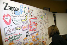
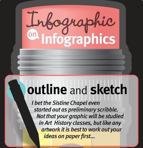
Employees in a range of businesses are being encouraged by their companies to sketch their ideas and draw diagrams to explain complicated concepts to colleagues. . .

Many misconceptions plague the field on information visualization. This post lists some of them and tells you how to remove those misconceptions. . .

Bovee and Thill launched a unique author blog that helps business communication instructors spend less time preparing and more time teaching. The original articles that help instructors focus their teaching to help their students’ learning be more efficient and effective. Articles discuss a wide variety of topics, including new topics instructors should be teaching their students, resources instructors can use in their classes (including immediately downloadable PowerPoints), solutions to common teaching challenges, and great examples and activities instructors can use in class. A subscription is complimentary and is available by email or RSS. Sign up today on the homepage!
Infographics had been famous around the web for its ability to relay information in a truly artistic manner. This makes it a universal language for it can tell a story even with one look at the visual representations. . .

Data Visualization is a relatively new field and as such, it has a lot of maturing to do. And part of that process is determining what is acceptable practice. . .

We’ve made the point time and time again that charts and graphs, though they feel official and true, can lie. Rarely do you get to see that at work, but the good folks at Hyperakt have sent us a prime case study in infographic deception.

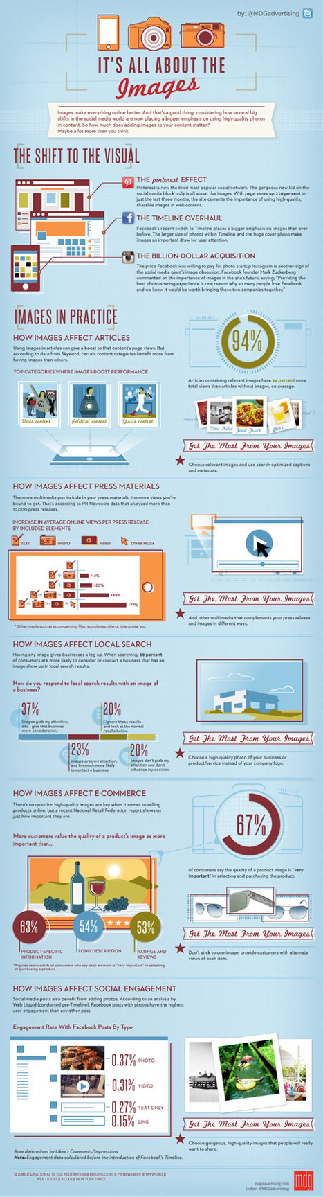
Visualized content is popping up all over the web lately, and it's no surprise. Visual content is pleasing to the eye, stimulating, entertaining, and much more interesting than plain old text. Haven't you noticed how much more frequently infographics seem to be making their way onto blogs and websites lately? There's a very reasonable explanation: people love visual content. . .
|

Colors often have different meanings in various cultures. And even in Western societies, the meanings of various colors have changed over the years. But today in the U.S., researchers have generally found the following to be accurate. . .

From
ht
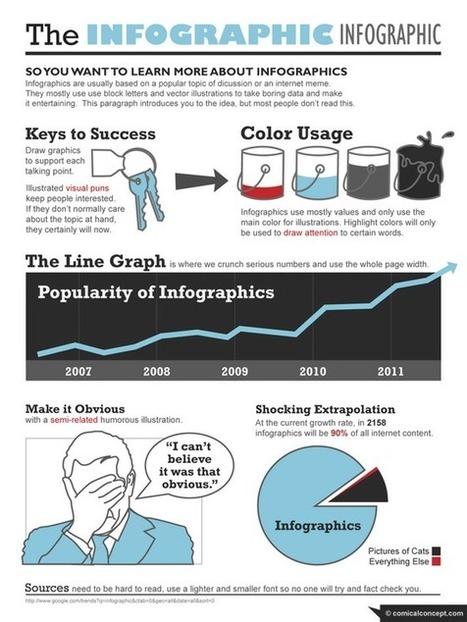
Let’s be honest, we don’t like to read big pieces of text. Text-heavy graphs are rather difficult for understanding, especially when we deal with numbers and statistics. That is why we use illustrations and flowcharts for such kind of information. It’s no wonder that today we know a method to make our life easier. It called an infographic – a visual representation of study or data. But like anything else, it can be done right or wrong ( I’m sure you've seen poor ones). How to create a cool infographic? The secret is in a long-time brainstorming. You need a really cool idea and good design. . . . Note: Bovee & Thill proivides thorough coverage of infographics in each of their business communication textbooks, a topic rarely covered in other texts.

Information can be useful--and even beautiful--but only when it’s presented well. In an age of information overload, any guidance through the clutter comes as a welcome relief. That’s one reason for the recent popularity of information graphics.

Ever wonder what makes an infographic successful? Why do some infographics accumulate more than 1 million views and others, barely 100? . . .
From
vimeo
An effort to eliminate "death by PowerPoint." Good advice here for that guy in your organisation (not you of course) who uses PowerPoint as a crutch ... and a sedative.
In my own work with coaching clients, we always look for creative ways to use PowerPoint (or Keynote for Mac users) and whiteboards and flip charts.

From
mashable
Do you want to take your online presence to the next level? Put your portfolio on one of these five great platforms. . .
Like many of his contemporaries, the design consultant Stephen Few bemoans the ubiquity of pie charts. Here, he explains his perspective: . . .
This video, the Value of Data Visualization, makes a compelling case for how infographics exploit visual clues like color, size, and graphic orientation to help us understand complex stories. Naturally, they use infographics to do it. . .

I love a good infographic! After all, knowledge is power and the visualization of data makes absorbing information all the easier. Well-designed infographics have a way of pulling me into a subject I’d normally never care to know about. . .
There may be times when you need to present ideas to clients or co-workers and could benefit from one of the many resources for creating online presentations. In this post we'll introduce 14 different presentation tools to get the job done. . . Via Let's Learn IT
|