The good news is you don’t need a big design team to overhaul your reports. There are tons of free online resources to help you create compelling presentations.

 Your new post is loading...
 Your new post is loading...
Your new post is loading...
The good news is you don’t need a big design team to overhaul your reports. There are tons of free online resources to help you create compelling presentations. 
No comment yet.
Sign up to comment

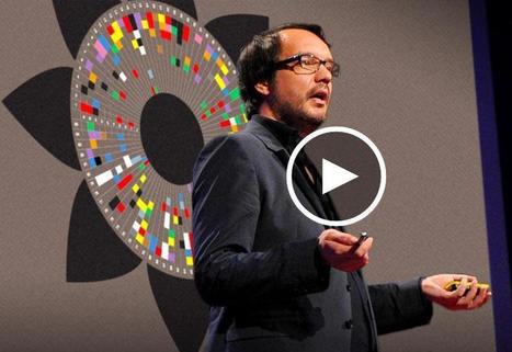
In a talk that's part history lesson, part love letter to graphics, information designer Tommy McCall traces the centuries-long evolution of charts and diagrams -- and shows how complex data can be sculpted into beautiful shapes. "Graphics that help us think faster, or see a book's worth of information on a single page, are the key to unlocking new discoveries," McCall says.
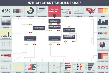
With so many ways to visualize data, do you ever wonder which chart you should use to showcase your information?"
From
www

David McCandless turns complex data sets (like worldwide military spending, media buzz, Facebook status updates) into beautiful, simple diagrams that tease out unseen patterns and connections. Good design, he suggests, is the best way to navigate information glut -- and it may just change the way we see the world.
Get inspired with the latest trends in visual communication. In this brief infographic, you’ll find a quick recap of the 9 trends that we’ve spotted through research, as well as with the help of content curators, international photographers, and designers."
The complaint of "death by PowerPoint" is often voiced by audiences forced to sit through screen after screen of overstuffed bullet-point slides.
From
hbr
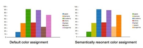
Using existing color-concept relationships leads to faster analysis.
Bovee & Thill's Online Business Communication Magazines's insight:
"What is the color of money? Of love? Of the ocean? In the United States, most people respond that money is green, love is red and the ocean is blue. "Many concepts evoke related colors — whether due to physical appearance, common metaphors, or cultural conventions. When colors are paired with the concepts that evoke them, we call these “semantically resonant color choices.” . . .
What are the rules of data visualization, a practice that draws on research into cognitive theory, graphical perception, statistics and journalism? The journalist and educator Alberto Cairo helps tie together many fields of study into easy-to-follow guides to data visualization and information graphics.

Does your data tell a story and can you visualize it? We look at the history and thought processes behind data visualization and successful infographics.
Bovee & Thill's Online Business Communication Magazines's insight:
"I had the pleasure of attending a Guardian Masterclass in London. Presented by both an editorial director and an art director, it covered both the story and the graphic design aspects, and the core theme of the course addressed a simple question – does your data tell a story and can you visualize it?" . . .
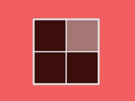
A free, insanely difficult color quiz is making the rounds on Facebook.
Bovee & Thill's Online Business Communication Magazines's insight:
To take the quiz, with each new screen of colors, click on the lightest hue. Don't take more than 60 seconds with each screen, or you will be penalized." . . .

Pinterest is a visual discovery tool that you can use to find ideas for all your projects and interests.
An essential part of every business communication and business writing textbook is a chapter on visual media or visual communication, but it's seriously out of date unless it places the content in a mobile context."
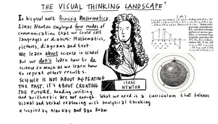
"Visual thinking is a way to organize your thoughts and improve your ability to think and communicate."
Bovee & Thill's Online Business Communication Magazines's insight:
"Visual thinking is a way to expand your range and capacity by going beyond the linear world of the written word, list and spreadsheet, and entering the non-linear world of complex spacial relationships, networks, maps and diagrams."
|

Using visual communication -- images and video -- is a great way to effectively get your point across. Make certain your intended message is being received!

Creating charts and infographics can be time-consuming. But these tools make it easier.
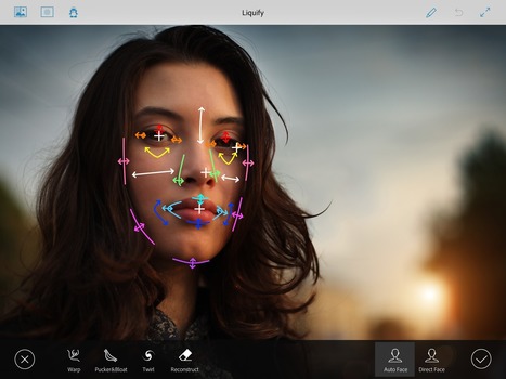
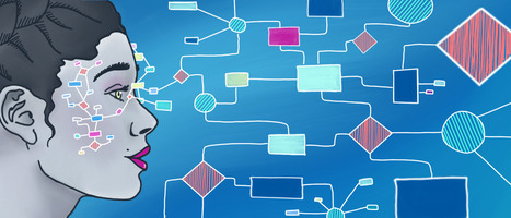
"Facial detection and recognition has evolved from a futuristic fairytale into a central piece of today’s digital, social, and technological landscape.
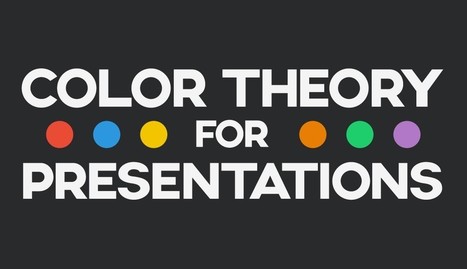
Some useful tips for choosing harmonious and impactful color schemes that have the power to move your audiences to a specific action. Via Rosário Durão
Bovee & Thill's Online Business Communication Magazines's insight:
"It is imperative for anyone who strives to become a better visual communicator to familiarize themselves with the basics of color theory and how to choose the most effective color schemes for presentations, infographics and other visual content."

Bovee & Thill's Online Business Communication Magazines's curator insight,
March 26, 2017 6:31 PM
"It is imperative for anyone who strives to become a better visual communicator to familiarize themselves with the basics of color theory and how to choose the most effective color schemes for presentations, infographics and other visual content." 
SlideDocs, the New Form of Business Communication
Bovee & Thill's Online Business Communication Magazines's insight:
"My new book Slidedocs , a free, downloadable e-book I've released on SlideShare, is about using presentation software to create compelling visual documents. And we’ve practiced what we preach by writing and designing the book in PowerPoint and distributing it on SlideShare — using the medium as the message."
"Big Data is amazing. It describes our everyday behavior, keeps track of the places we go, stores what we like to do and how much time we spend doing our favorite activities."
Bovee & Thill's Online Business Communication Magazines's insight:
"Big Data is made of numbers, and I think we all agree when we say:

Creating charts and infographics can be time-consuming. But these tools make it easier.
Bovee & Thill's Online Business Communication Magazines's insight:
"There are many different ways of telling a story, but everything starts with an idea. So to help you get started we've rounded up some of the most awesome data visualization tools available on the web."

Speed and agility are traits that define our society today. We avoid reading extensive articles, watching long how-to videos on YouTube or checking websites that are hard to navigate as we usually look for quick and easy solutions."
Bovee & Thill's Online Business Communication Magazines's insight:
"Presenting information in a crisp and concise way is something that we need daily needs such utilities as well. So we took our time to find tools that are time-efficient and offer some class in presenting yourself and/or your project." . . .

"How can content creators supplement their textual content with attractive images without any experience with design? The solution is curation."
Bovee & Thill's Online Business Communication Magazines's insight:
"One of the biggest challenges that content marketers face is creating visual content. Visual design is a specialized field requiring the tools and skills of an artist to communicate viscerally what cannot be expressed through words." . . .
Bovee & Thill's Online Business Communication Magazines's insight:
"Displaying data can be a tricky proposition, because different rules apply in different contexts. A sales director presenting financial projections to a group of field reps wouldn’t visualize her data the same way that a design consultant would in a written proposal to a potential client. "So how do you make the right choices for your situation? Before displaying your data, ask yourself these five questions:" . . .

How Much Data is Created Every Minute? "Every minute massive amounts of it are being generated by phones, websites, and applications across the Internet."
Bovee & Thill's Online Business Communication Magazines's insight:
"With all our data creation—clicks, likes, tweets, photos, blog posts, online transactions—our digital data tells a compelling story about who we are and what we do. For people and business alike, the key to making these digital actions worthwhile is to ensure they and the data they create continue to improve our lives." . . .
Bovee & Thill's Online Business Communication Magazines's insight:
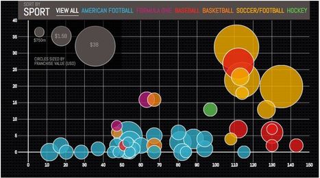
ike many designers, Eric Rodenbeck has had a long relationship with bar graphs and pie charts. He just thinks they are a little old school for today’s data-filled world. Mr. Rodenbeck has experimented with animation, three-dimensional maps that show the height of buildings by color changes and a representation of how photos spread on Facebook that looks like ice crystals forming on a car window. He’s even tried to characterize in a graphic how people were communicating in back channels at business conferences, with the biggest talkers at the center of a series of circles. . .
|