Your new post is loading...

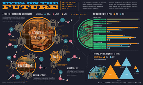
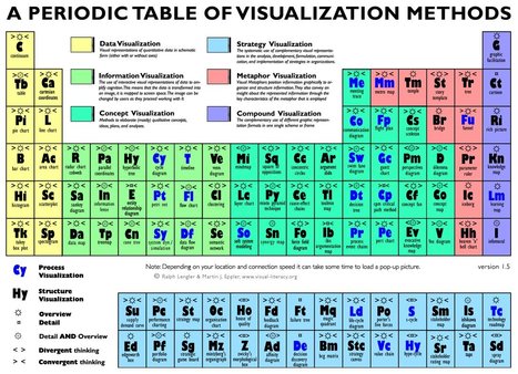
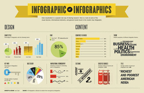
What we see has a profound effect on what we do, how we feel, and who we are. Through experience and experimentation, we continually increase our understanding of the visual world and how we are influenced by it.
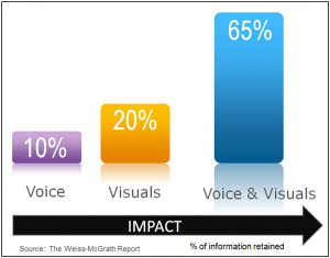
Psychologist Albert Mehrabian demonstrated that 93% of communication is nonverbal. Research at 3M Corporation concluded that we process visuals 60,000 times faster than text. Further studies find that the human brain deciphers image elements simultaneously, while language is decoded in a linear, sequential manner taking more time to process. . .