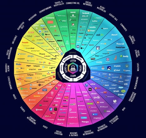
Karen Lopez at InfoAdvisors sent in what she calls "the stupidest bar chart of 2011" (link), showing us that one can mess up bar charts too. This chart originally came from an infographic (link) published by Klout, which is a . . .

 Scoop.it!
Karen Lopez at InfoAdvisors sent in what she calls "the stupidest bar chart of 2011" (link), showing us that one can mess up bar charts too. This chart originally came from an infographic (link) published by Klout, which is a . . .

 Your new post is loading...
Scoop.it! Your new post is loading...
Your new post is loading...
Scoop.it!
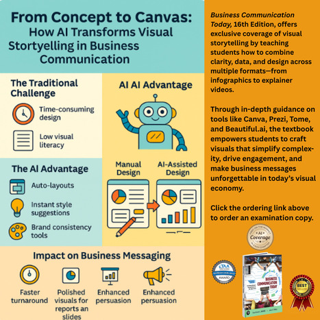
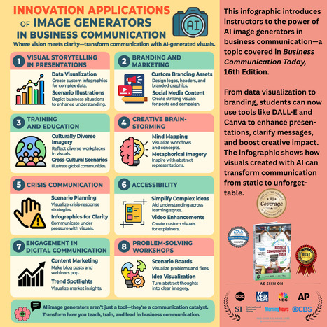
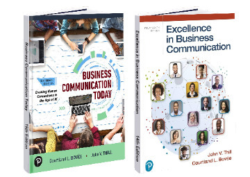
Imagine teaching a visual communication chapter that truly prepares students for today's AI-powered workplace. Chapter 9 of Business Communication Today, 16th Edition, by Bovee and Thill, delivers exactly that – and here's what makes it revolutionary.
Business Communication Today, 16th Edition, by Bovee and Thill, deliver exactly what students need to succeed in our AI-enhanced world. That's the promise of Chapter 9.
Scoop.it!
|
Scoop.it!

And Why Most Business Communication Textbooks Aren't Solving It
Bovee & Thill's Online Business Communication Magazines's insight:
Visual communication has become a core career skill, yet many business graduates struggle because instruction often treats visualization as secondary rather than foundational.
While Gen Z students bring strong platform-based visual fluency, they lack the professional judgment needed for ethical, strategic business visualization—gaps that AI tools now amplify rather than solve.
The article argues that effective business communication curricula must integrate visual literacy and AI instruction throughout, not as add-ons, and must help students bridge consumer design habits to workplace decision-making. It positions Business Communication Today as distinctive for combining deep visual communication coverage with AI integration and robust instructor support that makes real-world teaching and learning outcomes achievable.
Scoop.it!
|