In this article, we’re going to help you to create your very own time-lapse video.
Time-Lapse photography is a way of recording a scene or specific objects that slowly change and turning it into a high-speed video. You’ll see frequent examples of time-lapse in films and documentaries. For example, in David Attenborough’s Planet Earth series, you’ll notice that the passing of time, seasons changing, animals growing and plants taking form, all happening very quickly – this is time-lapse.
The easiest way to create a time-lapse video is to point your stationary camera at something that alters very slowly, things like plants growing, clouds moving, people walking etc. and start taking a series of photographs which can go on for hours, days or even months. Then, the magnitude of photographs captured is compressed into a video that is just a few minutes in length and thus creates the desired time-lapse effect.
In simple terms, the use of this effect allows an audience to watch things happening much faster than they do in reality. Watching the leaves on trees change color would take months in real time, you’d never be able to do it! But watching the leaves changes from green to red in mere seconds is captivating.
In standard video, each second contains 24-30 frames (photos). Converted into frames per second (fps) this means that a 2-minute video at 30 fps would be made from 3600 frames (photos) that are playing at high speed.
In order to create the desired time-lapse video effect, you need to reduce the gap for each shot and then merge the photos into a 24-30 fps video. E.g. if a flower takes two weeks to change from a bud to full bloom and you took a photo every hour you’d have 336 photos. This means that if you compress these frames into 24 fps, you’ll be able to watch a flower bloom in just 14 seconds, which is pretty incredible!
(Jason Weddington) Here are some techniques that you may not be aware of if you’re new to portrait photography. It takes practice, but being aware of these ideas can get you experimenting, and inspire you to try shots you might not have otherwise tried.
1. Frame Tight
Next time you’re watching a movie, pay attention to the close-up shots. See the top of anyone’s head? Probably not very often.
Leaving too much space above the head is a common mistake in portrait photography. For a close-up portrait, just cut off the top of the head. You don’t need it.
2. The eyes have it
The eyes often look best when the iris is centered in the eye. Direct the subject’s gaze to position her eyes such that the iris is about centered. By centered, I mean centered from the camera’s point of view, not the subject’s point of view.
I do this one of two ways, depending on the situation. If possible, I raise my left hand and have the subject follow my hand with her eyes until her eyes are positioned favorably. If this isn’t possible, I give directions like “keep your head still and just move your eyes a tiny bit to the left.”
3. Let the kids run wild!
You’ve heard this before but I’ll mention it again. When photographing children, one of the best ways to get natural smiles and fun photos is to shoot them in their natural habitat, which probably isn’t a photo studio.
4. Watch the hands
When it comes to portrait photography, hands are rarely neutral. Usually they are either adding to your photo, or taking from it. Make it a point to pay attention to your subject’s hands.
When photographing women, showing the hand in profile with the fingers curled works well. Often this looks more feminine and alluring than showing the back of the hand.
5. Shoot into the sun
Morning and evening are great times for backlit portraits. When the sun is low in the sky, you can use it as a rim light to highlight the subject’s hair. This works best if you can position your subject against a darker background, like a shaded area, without loosing the light on the subject’s head.
Canon, la marque célèbre des appareils photos a lancé un petit projet en ligne pour apprendre la photographie en utilisant une application interactive.
C'est une belle application qui a pour objectif d'aider les utilisateurs non pas à devenir des professionnels en photographie mais plutot à maîtriserl es notions de base en la matière. Son principe est pratique car elle met à notre disposition un certain nombre d'options pour apprendre à utiliser quelques réglages de lumière, de l'opacité etc.
Nous pouvons également utiliser des exercices pratiques contre la montre pour vérifier le niveau de maitrise de ces réglages. Une fois terminé, l'application génère un rapport sur notre expérience avec des conseils pour améliorer nos performances. L'application est gratuite et fonctionne en ligne sans inscription ni l'installation d'une application tierce.
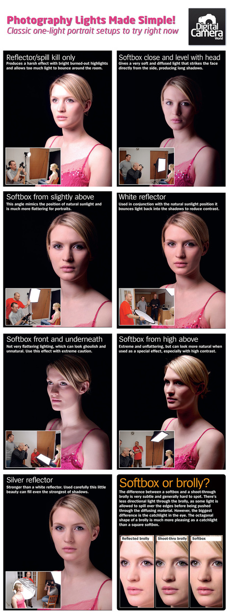
Photography lights come in all shapes and sizes, and can be set up in so many different ways. In our latest portrait photography cheat sheet we show you seven classic one light portrait setups, illustrating both the arrangement and the effects produced.
Noam Kroll : One of the most common goals for filmmakers and DP’s today is achieving a film look when shooting on video. I’m often asked “which digital camera will look the most like film?”, or “how do I color grade my footage to look filmic?”. The truth is that there is not one single thing that you can do that will magically make your footage look like it was shot on film. There are a number of key variables that you need to get right in order to get the most filmic looking footage when shooting digital, and below I’m going to break down the more important elements that you should take into account. And keep in mind, while any of these suggestions will help out on their own, it’s really only when they are all used together that you can achieve a film look.
Watching a movie shot on film feels like you’re looking into a parallel universe. It almost looks the same as real life, but there are these subtle differences that allow it to feel more surreal, dreamier and pull you as the audience member into it. Doing this digitally is achieved by a combination of many factors, starting with how you set up your camera and finishing in the edit suite.
In this tutorial we share our best in-camera composition tips and show you how to take 1 subject and shoot it 6 different ways.
Framing your shots isn’t just about using the rules of photo composition such as leading lines, the rule of thirds or including foreground interest. Simply changing position and experimenting with different focal length lenses are two of the best ways that you can get new and more interesting shots.
We all fall into the habit of using similar viewpoints when shooting, so here’s an exercise that will help you break this habit and take more successful photos.
Find a simple, static subject such as a building, photograph it from the first viewpoint that you find, then find six more viewpoints and compositions.
The key to this is exploring the area and keeping an open mind when it comes to framing and composition. If you are struggling to see new viewpoints, fit a different lens and try again.
For example, if you would normally shoot the subject with a wide-angle lens, fit a telephoto one (or use a zoom at its longest focal length), find a viewpoint that suits that focal length.
Remember that different lighting conditions can also transform your shots, so wait for sunset (or get up early and arrive at sunrise), and you will find that the direction and colour of the light can inspire you to try a completely different type of shot to one that you would take during the day.
PAGE 1 – Composition No. 01 The classic approach PAGE 2 – Composition No. 02 Get in close PAGE 3 – Composition No. 03 Use shallow depth-of-field PAGE 4 – Composition No. 04 Show the surroundings PAGE 5 – Composition No. 05 Compress perspective PAGE 6 – Composition No. 06 Go for the wide view
A very powerful method of improving the composition of photos is the use of lines. Properly used, lines can significantly increase the impact of images. Lines serve to affect photographic composition in two ways. First, they serve to create a mood. Second, they lead the eye through the photograph. By affecting mood, lines add emotional content to images. By leading the viewer’s eye, they keep the viewer’s attention focused on the image.
When dealing with lines, the subject can be broken into the following types:
+ Horizontal
+ Vertical
+ Diagonal
+ Jagged and irregular
Mood: Horizontal
Horizontal lines tend to indicate a sense of homeostasis (lack of change). This use in an image often projects a feeling that an image, or part of one, is somehow frozen at a point in time. Horizontal lines should be used when a photographer wants to impart a sentiment of timelessness or lack of change to an image. In addition, they can serve to provide a contrast with more dynamic parts of an image. Examples can be found in buildings, horizons, and fallen objects (e.g. trees).
Mood: Vertical
Vertical lines can project either a mood of stability or peace. When projecting a mood of stability, they often function similarly to horizontal lines. This can convey an implication of substance or permanence. Examples of vertical lines used to impart a mood of stability can be found in rock formations, power line poles, and vertical lines of buildings.
Proper use of vertical lines can also impart an impression of peace and tranquility. Examples of this use are trees in a fog shrouded forest, old fence posts on an isolated prairie, and a figure on a secluded beach in the early morning.
Mood: Diagonal
Diagonal lines can convey a sense of action or make an image more dynamic. For this reason, diagonals are a very powerful tool. Their power resides in their ability to grab the attention of the viewer. The viewer’s eyes tend to travel back and forth along diagonals. Diagonal lines can be formed, not only of objects such as streets or sidewalks, but also of color. For instance, a diagonal section of color can add drama to a flower image. Examples of diagonals are plentiful: roads, streams, waves, and branches are but a few examples of objects that can be utilized in a diagonal manner.
Mood: Jagged and Irregular
Jagged and irregular lines take us one step further on the continuum of emotion and feeling. While diagonals move us into the area of the dynamic, jagged and irregular lines often impart a sense of unease, tension, or fear to the viewer of the image. Heavy use of jagged and irregular lines can cause a negative feeling in the viewer (which may be exactly what the photographer intended). Therefore, they are the tools of choice for the photographer who wants to create a feeling of disquiet or agitation in the viewer. Examples can be found in roots, a crocodile’s teeth, stark mountain peaks, and the twisted metal of an automobile wreck.
LEADING THE EYE
As powerful as lines are in helping to create a mood in an image, they become even more powerful when they are also used to direct the viewer’s attention. When using lines to direct the viewer’s attention, two rules need to be followed. First, make sure that the lines always point toward the most important object in the image. This will direct the viewer’s attention directly to that object. Second, make sure that the lines never point outside of the image. Lines that point outside the image will make the viewer’s eye leave the image. This weakens the image and may result in the viewer losing interest in the image entirely.
Double tone mapped HDR images are often very easy to recognize. They push the image beyond a natural looking image, into a much more painterly world. They start to look like paintings rather than photos. Some like this, others don’t. I do like it. But exactly what effect you get when you double tone map an image, depend very much on how the light was when you shot your photo.
What a double tone mapped image does, is to exaggerate the texture and details enormously, which can look very cool if applied to all of an image, but you can also use it much more subtle, like in the two images below. In both I have applied a double tone mapped image to both on the rocks in the foreground and to the house in back ground, but the rest of the images are mostly other normal tone mapped or maybe just even one of the original shots.
The idea of the double tone mapping is that, you first do one HDR photo and tone map it in Photomatix using the option “Tone map” and “details enhancer” and the image that you get from that process, you tone map too. This is simply done by pressing the “Tone mapping” button once more.
A side effect of the double tone mapping is, that you get a lot more noise (grain) into the image and a wildly saturated image. The noise you have to clean up with a tool, but not necessarily all of it. The noise adds some of the grittyness to the image, which is part of the effect.
So, if you’ve read anything about photography you will no doubt have come across the rule of thirds as demonstrated by the picture Cheesy Mouse below and if not, here is a free lesson here on the subject (http://goo.gl/Iatg6).
For a series of complex reasons, areas of importance in a picture are best placed where the lines intersect and most cameras and apps can provide you with an on screen grid to help your composition. It’s a great starting place to help you take better pictures, but it’s really only a dumbed down version of composition for photographers.
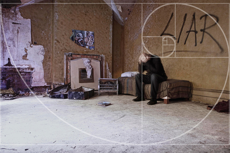
The golden ratio can be seen in artwork as early as 300 b.c, and in the 16th century it was dubbed the divine proportion. It is a mathematical formula called PHI and crops up in an extraordinarily diverse range of nature, artwork and design (from the Mona Lisa to the Great Pyramids) and has fascinated some of the greatest thinkers of our time.
Essentially, scientists have proven that when you read a picture (yes read…more on that in my forthcoming book and advanced lessons) your brain is looking for the presence of the Golden ration as it defines beauty.
For our purposes and to keep it simple, we are going to look at the Golden Spiral, as it is about placement and flow; helping guide the viewer’s eye and deliver satisfaction.
The Spiral is the natural path your follows as your brain tries to make sense of what it is viewing (like listening to a joke) and by placing the focal point at the end of the spiral you are delivering the punch line.
So, by understanding this, your compositions can deliver more impact and you’ll produce more successful pictures.
Time-lapse photography is an interesting technique that records a scene or objects that has a slow state-of-change and turns it into a video that plays back in high speed. The easiest way to do it is to have your camera stationary on something that changes slowly (e.g. clouds, plants growing, etc) and start taking series of photo for hours or even days. Hours and hour’s worth of photos are compressed into a video with merely few minutes playtime, thus creating a time lapsing effect.
In another word, it allows us to see the progress faster without having to wait along the actual time. Spotting sun’s movement from sunrise to sunset takes about 12 hours; it’s boring and you probably won’t notice the changes. But seeing it rise and set in 10 seconds, that’s pretty interesting!
In this article, we’ll show you how to create your own Time-lapse video.
To make things easier to digest, we’ve split the content up to several sections:
Mark Vargo is a big time cinematographer who has worked on too many well-known movies to list. He’s credited as a second unit director of photography on everything from Deep Impact and The Green Mile to Rise of the Planet of the Apes and Ted. In other words, knows what he’s doing, and now he’s chosen to share some of that knowledge with his fellow photographers and videographers.
The video above is the first in an informative series Vargo is putting together that will help you better understand certain photographic concepts and, in his words, “unleash your creative potential.”
This particular episode focuses on the two common types of light meters, how to use them, when to use which, and some tricks that have helped Vargo get the best results when shooting certain tricky situations. Of course, being a cinematographer by trade, his advice is aimed primarily at shooting video, but the same rules and tips apply to photography.
The tutorial is aimed at intermediate photographers, so beginners beware: it does get a bit technical. But the ability to understand and properly use a light meter — and not just the one built into your camera — can make a huge impact on your ability to properly expose certain scenes.
Beaucoup m’écrivent pour me parler de leurs problèmes de mise au point, d’images souvent pas nettes, des difficultés qu’ils ont pour maîtriser cet aspect de la photographie. Quand vous faites vos photographies, il est parfois difficile de penser à tout dans le feu de l’action mais pas de panique, ça va venir avec la pratique et quelques conseils comme ceux qui suivent…
Beaucoup m’écrivent pour me parler de leurs problèmes de mise au point, d’images souvent pas nettes, des difficultés qu’ils ont pour maîtriser cet aspect de la photographie. Quand vous faites vos photographies, il est parfois difficile de penser à tout dans le feu de l’action mais pas de panique, ça va venir avec la pratique et quelques conseils comme ceux qui suivent…
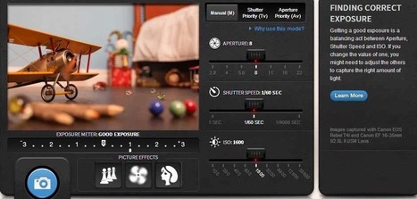
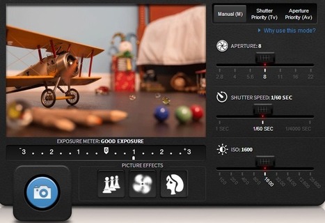
Smartphones and Social Networks increased the passion towards photography among people. Today many Smartphones offer a very good quality of photographs equal to digital cameras. Millions of new images were uploaded in Social networks each and every day. Since everyone loves photography, it is important to know some of the basics to take a good picture. Moving from auto mode to manual mode will let you take stunning pictures from your camera. Especially for people who use DSLRs, Manual mode gives all the control towards the photograph.
Even though Photography is a vast area, understanding few important things like Aperture, Shutter Speed, ISO, etc., are enough to take a decent picture. YouTube is a great tool for learning photography. Millions of tutorials were available to learn the photographic techniques. There are also some other web applications available to teach you the basics of photography. Today I came with a virtual DSLR web application from “Canon”, one of the biggest camera manufacturers in the world.
Canon has created a basic photography tutorial along with a virtual emulator of a DSLR. Compared to other emulators in online, this is pretty neat and easy to understand. You don’t need to register or sign up with any social accounts to use the emulator. Just go to Canonoutsideofauto website and start using the application. There will three different steps “Learn, Play and Challenge” to understand the basics of DSLR Photography.
Pour les débutants, il s'agit d' une excellente application Web pour apprendre et comprendre les bases de la photographie. Les tutoriels sont très claires et faciles à comprendre.
When you are snapping a portrait picture, hold your camera above the eye-line of your subject, advises professional photographer Joe Sinnott. About 20 or 30 degrees higher than the eyes is a good spot.
Sinnott shares some other great portrait photo tips in his short tutorial above, such as asking the subject to lean in towards you so they look more engaged. Finally, shoot over the shoulder than straight on—it makes them look a little leaner.
Stop shooting randomly and start photographing with intent. Before you click that shutter, ask yourself: “What do I want to convey? What story do I want to tell?” There are many ways to achieve this, here are few easy steps to help you step up your game, no matter what camera or lens you use.
1 – See the light
The more aware you become of the quality and quantity of light, the better you will be at harnessing it and making it work for you, no matter the time of day.
2 – Express your vision with basic composition rules
+ Use focus point and depth of field
The obvious way to lead the eye of the viewer is by focussing on the subject and using the right depth of fieldso that there is no mistake as to where the eye should go
+ Leading lines
Too often ignored, the use of lines is a powerful tool to lead the eye.
+ The rule of thirds
Positioning your subject in your frame is one of the most important decisions you will make in regards to your composition.
+ Using color
Just like using focus point to draw the eye, using color is another powerful compositional tool.
+ Negative space
The clever use of negative space makes stronger images as it puts more emphasis on the subject (positive space).
+ Patterns
See and use repeated patterns or, even better, look for breaks in the pattern!
3 – Less is more
Learn to make stronger images by leaving unnecessary elements out of the frame. One thing I notice all the time when I look at my students’ work is that they tend to include too much in their frame. What you decide to leave out of the frame during your composition will make or break the image. Keep it simple. Learn to see and crop in camera.
4 – Get close and fill your frame
Objects, even the most ordinary ones, look more interesting if you frame them tight. Get close. You think you’re close enough? Now get closer!
5 – Work your frame
Try shooting from different perspectives, shoot high, shoot low. Tilt your camera for more dynamic images.
6- Watch your background!
It only takes a second to scan the edges of your frame and check your background
In the final part of our series looking at common problems that plague new photographers we turn our attention to composition and framing.
Unlike the more technical aspects of photography such as exposure or focusing, choosing how to compose and frame your shots is as much about personal choice as being right or wrong. Despite this, there are ways to improve the composition of your images. The classic habits to break are putting the main subject in the centre of the frame, and not getting close enough to the subject.
+ Including subjects at the edge of the image
You need to watch out for areas of the subject, especially at the edge of the frame, which draw attention away from the main subject. Before you press the shutter, try looking all around the frame for anything that doesn’t help the composition.
+ Uninteresting foreground
Shooting with a wide-angle lens means that you will often include a large area of the foreground. So you should look out for interesting subjects or textures to make the most of this area of the image.
+ Horizon in the middle of the frame
Placing the horizon in the middle of the image is generally not recommended. It produces two equal-sized areas and makes the whole image appear static. Positioning the horizon around a third from the top or bottom of the frame produces a better composition.
+ Horizon isn’t straight If the horizon is clearly visible in the scene it should generally be horizontal. Getting the horizon precisely level using the viewfinder can be tricky. Many cameras offer a grid display in Live View mode or an electronic spirit level option to help you. Using some simple composition rules such as placing the main elements off-centre produces a much stronger image
+ Subject too small in the frame Unless the area around the subject adds something to the image – such as showing the environment or landscape around it – you’ll get a stronger image by filling the frame with the main subject.
+ Image too cluttered While a strong subject can help to produce striking images, if there are too many subjects or points of interest in your image, they can actually detract from the impact of the shot. So try including less of the background, or blurring it by using shallow depth-of-field.
+ Subject in the middle of the frame Similar to placing the horizon in the centre, positioning the main subject in the middle of the image creates a very static, uninteresting composition. It’s usually better to shift the position to one side if shooting horizontally, or up or down on vertical images. Getting closer to the subject, or using a longer lens, produces a much simpler, more striking image.
Our annual tradition on Creative Nerds is to showcase the best Photoshop tutorials from the current year. We have scoured the web , in order to roundup the top
I know the feeling. You unboxed your camera and thought that taking pictures would be just about pointing it and clicking the button. Technically – yes, you are right. Creatively – wrong.
Panoramic imagery is a staple of the nature/landscape photographer. They allow you to capture a wide angle of view that a camera can not normally see at once. Another neat thing about Panorama’s are that they tend to sell well.
But what if you are new to landscapes, or photography in general? How can you take these awesome landscapes? I’ve got five tips for you that will greatly improve your panoramic images and get you well on your way to some epic shots.
1. Use your Camera’s Built-in Level
Having a level shot is imperative to a successful panoramic landscape. Believe me, nothing is worse than getting home and realizing in post production that the shot was not level on an otherwise perfect scene.
2. Shoot at F8 or Higher
Bokeh is generally not your friend for panoramic landscapes. You want as much in focus as possible, and that means a smaller aperture. As a general rule you should shoot at F8 or higher, I commonly shoot panoramas at F10.
3. Overlap Overlap Overlap
This is key when you are in the post-production stage of a panoramic image. The more overlap the easier it will be to combine the shots seamlessly. A good rule of thumb here is 1/3 to ½ of each shot should be overlap.
4. Slow your Shutter
This one is not so obvious, but shooting with a slow shutter speed is a great way to prevent birds or other flying objects from showing up in the final images. If you try this during the day though make sure to have a neutral density filter or you will have problems getting a good exposure.
5. Don’t Be Afraid to Think Outside the box
We tend to think of panoramas as horizontal images, but in truth they can be very effective vertically as well. Also, when you are framing and deciding on composition remember to think outside of a 4:3 ratio – I would caution against going too wide, because then it becomes hard to get the shot printed, but 16×9 is a good place to start.
Timelapse is a fun way to spend your time and to create something that people love to see. Shooting at day or at night separately is not a problem, but what does become a problem is when you try to shoot from day to night or from night to day. If you have not done it before it can seem complicated and chances are you will screw up the first couple times trying to figure it out.
Photographer Preston Kanak recently released an amazing full length and very detailed tutorial on shooting timelapse for day to night or night to day. The video itself is over an hour long so you will want to wait to watch it until you have some free time. But the video is very well done, and covers the three most popular methods that you can use then you are wanting to shoot timlapse from day to night.
You can also read his full written tutorial which goes along with the video on his website (http://goo.gl/l9qlF).
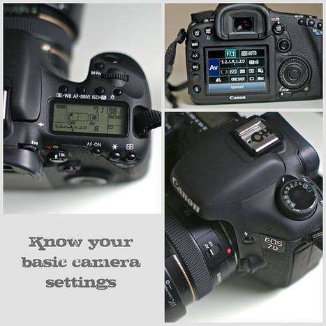
Are you currently shooting on Automatic - not taking advantage of the manual settings available in your camera? No worries – we’ve all been there!
I shot on automatic for over a year into my business – can you believe it! It´s true and I can tell you exactly WHY this was the case…..
Learning to shoot manual was overwhelming, it seemed difficult – I had no one to help me and it reminded me of a time in my childhood I really did not want to think about: doing math in school!
I did create pretty decent pictures in auto and no one was complaining about me not shooting manual. And to be honest I was thinking; “why on earth should I go through the hassle of learning that” I just did not get it – I did not understand WHY this could be a benefit for me.
So let me share with you what I know today, that I did not know back then:
+ When you control the manual settings – you get FULL control over your style and images. This is when you can get really creative and this can not be done in auto.
+ When you have the control, you save time in photoshop, because your photo will be close to perfect right out of the camera – you just need to fine-adjust a few things – that´s all.
+ By knowing the camera settings you can “dance a beautiful tango” with the available light, instead of being frustrated with it. You can create magic!
It was not until I started to comprehend these benefits, that I became eager to learn to shoot in manual. Once you understand just HOW important light is to making or breaking a photo, you will want to start shooting in manual mode.
It might seem difficult and very technical, but it´s actually easier than you think – you just need to put some time aside to practice, take a lot of shots, learn from them and delete them – then do it all over again.
Use the guidelines in this lesson and before you know it you´ll shoot in full manual mode!
Un histogramme est un graphique qui vous donne l’allure de la lumière sur votre photographie, il vous donne rapidement la répartition, l’intensité et la quantité de lumière dans les hautes et basses lumières sur votre photographie.
Cet histogramme sera présent dans votre appareil photo, vous l’afficherez sur l’écran au dos de votre appareil photo numérique, il accompagnera une image si vous le faites apparaître en appuyant sur le touche « infos » ou « display » ou autre en fonction de la marque de votre appareil photo, à voir sur votre notice pour « comment faire apparaître un histogramme ».
Vous aurez aussi un histogramme sur vos logiciels de traitement et de développement d’images favoris comme photoshop éléments, Lightroom, Camera Raw, Aperture, Digital Photo Professional, The Gimp et bien d’autres…
L’histogramme est une échelle horizontale qui va du noir (basses lumières, sous-exposition) à gauche, au blanc (hautes lumières, surexposition) à droite. Le centre correspond au valeurs neutres de la lumière, ni claire, ni sombre.
Attention quand on a une courbe qui grimpe fort dans les parties sombres (à gauche) ou claires (à droite) car c’est ce qui caractérise une sous-exposition quand tout est à gauche, votre image est « bouchée », noire ou une surexposition quand tout est à droite, votre image est « cramée ».
Attention, si vous faites du JPG, il vaut mieux avoir une image légèrement sous-exposée, ce qui sera rattrapable en post traitement qu’une image surexposée qui ne sera pas récupérable car quand vous êtes blanc sur votre image cela veut dire qu’il n’y a plus d’infos sur votre image alors que quand c’est noir, il y a trop d’infos donc c’est récupérable, dans certaines limites évidement…
L’histogramme sera là pour vous permettre de savoir si votre image est bien exposée, si elle n’est pas surexposée ou sous-exposée sur tout ou partie de l’image. L’histogramme vous informera de l’allure générale de votre image, si elle n’est pas trop « molle » avec une courbe au centre de ‘l’histogramme par exemple.
Un bon histogramme pour votre image c’est une courbe qui a des hautes et des basses lumière ainsi que des parties neutres et on aura une image avec un bon contraste. L’histogramme vous informe mais ne vous dis pas ce que vous devez faire, vous restez maître de vos créations.
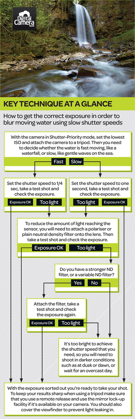
Your digital camera’s histogram serves as a guide to help you better underststand your exposure. To this end, it aims to illustrate the range of tones in a scene. On the left of your histogram you’ll find the extreme of dark shadows, while on the far right you will find your bright highlights. But it’s not always that simple to read a histogram (find out What your histogram says about your landscapes). Digital Camera World compiled this handy guide for explaining how this exposure chart represents the range of tones withing your scene.
Download this photography cheat sheet (http://sco.lt/7JaJP7) on to your desktop and keep it for a handy reference the next time you find yourself confused as to how to read a histogram.
Ever wonder how to create one of the many stunning time-lapse videos we've featured on Imaging Resource? Well, if you have about six minutes to spare, this video tutorial shot on location in Bryce Canyon, Utah by Canon Explorer of Light Vincent Laforet should help get you started.
Called "The Basics of Time Lapse Photography," the video is an excellent overview on how to create a time-lapse clip, which, as Laforet points out, is "a great way for photographers to capture motion with their still camera equipment."
If you're unfamiliar with the term "time lapse photography," it's a technique, as its name suggests, for capturing the passage of time of a particular scene or event. A photographer can accomplish this by shooting images in short intervals -- such as every one to two seconds -- of an event and then playing them back at normal speed to produce an effect where time appears to be moving faster, aka "lapsing."
In Laforet's introductory video, which is actually the first part of a series on time lapse photography, he breaks down some of the camera gear you'll need along with "some of the key philosophies when shooting," including the following five tips:
1) Look for change and movement in an event you want to capture
2) Anchor your shots with a strong foreground element
3) Determine the duration of your event
4) You will need 24 frames per second for smooth movement during playback
5) You can never shoot too many frames (the only downside being the large amounts of data you will collect and need to store)
To read more about this and to find out about the gear used to make this video please check out my blog at : http://goo.gl/s421Q
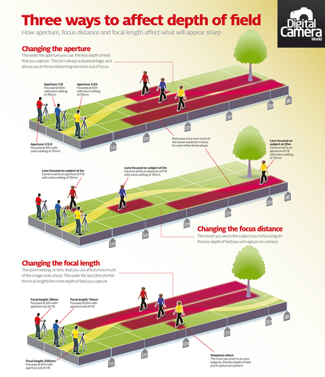
Find out how aperture, focus distance and focal length affect what will appear sharp with our free depth of field photography cheat sheet.
Depth of field, or ability to control which parts of your pictures are sharp, is one of the main advantages of owning an SLR camera. Look at a scene with your own eyes, and everything from your feet to the horizon is usually in focus. But your pictures do not need to look like this.
You can set up your digital camera so that only certain parts of the shot are in sharp focus, and others are artistically blurred. This allows you to create emphasis where you want it – and to hide elements that would otherwise prove distracting.
Your lens can only focus sharply at one distance. However, due to the optical property known as ‘depth of field’ a range of distances will actually appear sharp. This zone of sharpness will vary enormously.
Our latest photography cheat sheet examines three common ways you can affect depth of field. Our infographic looks at how aperture, focus distance and focal length will affect what appears sharp in your images (for more on this you might also find useful our guide to Depth of field: what you need to know for successful images (http://goo.gl/WcrBk).
To get content containing either thought or leadership enter:
To get content containing both thought and leadership enter:
To get content containing the expression thought leadership enter:
You can enter several keywords and you can refine them whenever you want. Our suggestion engine uses more signals but entering a few keywords here will rapidly give you great content to curate.


 Your new post is loading...