Your new post is loading...

|
Scooped by
Martin (Marty) Smith
September 1, 2012 8:57 PM
|
|
|
Scooped by
Martin (Marty) Smith
August 31, 2012 10:16 PM
|
Pyconic is a set of Royalty-Free Vector Icons, Raster and Font Formats for User Interface Designers.
Marty Note
It is easy to do pricing wrong on a webpage. Wrong is any design that reduces conversion and right or correct design does the opposite. With that much floating-point latitude it is hard to understand how to do pricing right. There doesn't seem to be best practices you can count on.
See sometimes that feeling you have that there aren't reliable best practices is because there are way too many variables to form a universal truth. Pricing is one of those "too any variables" Internet marketing situations. In other words, in this case your feeling there are no best practices to count on in all situations is correct.
The link above does pricing right though I'm not sure about making the pricing page their home page (another discussion for another time). From this Dan Ariely perfect 3-point list (read Predictably Irrational to know the importance of the 3 selection list) I can tell the middle selection, Vector Pack, is where they want customers to go. That is the sweet spot.
See the pattern of the jumps? $39 becomes $59 becomes $90. Wait, how did we get to $90 so fast? We got there because no one buys the $90 option in such a list and Pyconic knows this and is using the set point of $90 to make the $59 look like a "value". Well done.
Pyconic's design is GENIUS on the subconscious level where much of buying decisions are made. Here is an example that gets pricing dead wrong:
http://www.shopify.com/pricing
Too many options and pattern is strange. Better off to drop the upper most "too many choices" option and reduce down to the three that look prepared to do Dan Ariely Predictably Irrational pricing.
Sometimes web design isn't JUST the surface. Sometimes design is what is happening in MY MIND (where "My" is your customer). You "design in" the path you want your customers to take as Pyconic did and Shopify did not.
Want to read mor on pricing? One of my most popular ScentTrails is on pricing:
How To Price Your Product Or Service
http://scenttrail.blogspot.com/2011/07/how-to-price-your-product-or-service.html
|
|
Scooped by
Martin (Marty) Smith
August 28, 2012 10:32 PM
|
Kaggle is a platform for data prediction competitions. Companies, organizations and researchers post their data and have it scrutinized by the world's best statisticians.
Marty Note
Icons especially related icons are form a quick brand-like visual language. "Related" means the icon is already implied by your copy you are just unlocking the visual identity inside the words. Words + related graphic is more powerfully engaging than words or icon alone.
I still believe in the strategic use of people to warm up even icon pages (read my people not things sell post: http://scenttrail.blogspot.com/2012/06/startup-websites-people-not-things-sell.html ), but this page from the Kaggle site is a solid example of the power of matched icons.
It would be easy to think about NOT including people on a hosting page since we are talking about hardware and its related concepts. Yeah one problem with that is we buy from PEOPLE in the end not cartoons. That said, we have to capture attention first and this example of using icons and a smattering of copy does capture and guide attention beautifully.
Found this example with another new favorite tool PatternTap.com where examples of best in breed are organized against common Internet marketing ideas such as best use of icons.
|
|
Rescooped by
Martin (Marty) Smith
from AtDotCom Social media
August 23, 2012 7:33 AM
|
Smartpress.com conducted a survey to aggregate the opinion of dozens of the best and most-talented graphic designers in the industry.
Via John van den Brink
|
|
Scooped by
Martin (Marty) Smith
August 22, 2012 12:31 AM
|
The social network for education. Simple, elegant course management meets social networking. All for free.
Marty Note
I've always had a thing for icons. They are so clean, simple and engaging. Hard to beat an icon to communicate a complex message in shorthand much like a brand. Found This excellent education site with its great use of icons from PatternTap.com (my new secret weapon to find best of across a variety of ideas).
As much as I love the icons here, some PEOPLE looking at me (views out to visitors are engaging) would warm up what can come off as an icon-only site. Icons as ends unto themselves don't work as well as a means to an end.
|
|
Scooped by
Martin (Marty) Smith
August 17, 2012 9:38 PM
|
Premier source of web design inspiration and trends.
One of my favorites is http://simonfosterdesign.com/home/. Very nice responsive designs from England. Well done Simon! Lines are clean, easy to draw eyes and attention where you want it when the ecosystem is so clean and clear.
|
|
Scooped by
Martin (Marty) Smith
August 16, 2012 7:07 AM
|
RT @Followideas: Top 10 Ideas for Small Scale Business Web Design http://t.co/rHB3dz6z...
Marty Note
Ignore the strikingly BAD use of stock photography here and the overly lecturing tone and there are some solid tips here including:
* Simplify Navigation. * Fast Is Life, Slow Is Death In Website Load Time.
* Simplicity Is Key!
These 3 tips, out of the 10, are clear and true. There is a tip on SEO I don't agree with at all. It is impossible to explain SEO in this short paragraph 10 tip format. SEO is about site heuristics now (time on site, pages viewed, return visitors) so storytelling and linked pages are key. Play the SEO game the old way and you will be punished (read http://www.atlanticbt.com/blog/stop-these-10-old-seo-methods-now/ for more on this).
Ignore the stock and read at least those 3 tips and this article will help.
|
|
Scooped by
Martin (Marty) Smith
August 12, 2012 11:23 PM
|
Infographic about latest web design trends in 2012 - 2013.
Marty
Great infographic summarizing current web design trends incluing:
* Circles are now easier with css3. * Responsive (creating sites that look great on any receiving device). * Infogrpahics (are exploding because they work and are part of my Visuals vs. Textuals war).
And other tips I won't spoil with summary here.
|
|
Scooped by
Martin (Marty) Smith
August 9, 2012 7:59 AM
|
Where do you go normally when you are planning to start your new web design project and you are curiously finding for a mind blowing web design inspiration or just want yourself to bring up with some amazing creative ideas which can help...
Marty Note
I always start a project wandering around for inspiration, looking at how others are solving the problem gets the creative gears turning. There is nothing more intimidating than a blank canvas, so here are 27 ways to oil the gears and find inspiration from others - where inspiration always starts.
|
|
Scooped by
Martin (Marty) Smith
August 6, 2012 8:01 PM
|
The Product Canvas is a powerful agile tool that facilitates the development of new products by describing the users with their needs and the product’s features.
Marty Note
This looks like a cool tool to help Agile Product Development. Products I've created include:
* Poetryslam magnetic word game. * Dada Box magnetic word game. * Story Glasses. * Alien Questionnaire. * Magnetic Line Art.
All those products + $4 gets me coffee at Starbucks, but wouldn't change anything except how hard it is to create products. Creating products can really be tough. You get in, move around, do stuff and spend money and feel like there is nothing happening and you will never get there from here. The application of Agile Development methodology could really help make the process easier and less full of friction. Cool applicaiton of Agile Development to product creation life cycle.
|
|
Scooped by
Martin (Marty) Smith
August 3, 2012 2:58 PM
|
A guide to understanding digital & physical product design for startups... ...
Marty Design Is Note
WOW, Great guide for startups and anyone who wants to understand WHAT design is and btw that may be the most important concept to grasp in a post-apple design "infected" world. Everyone has everything they need now (moroe or less) so we BUY and JOIN things we love. We LOVE THINGS that match beauty and functionality to tell a new story. Better yet, a balanced beautiful object that helps US tell OUR Stories better.
The secret of Apple is not just their insistence on perfectly balanced functionality and beauty but that those things speak to our Stengel Values Matrix:
* Elicit Joy. * Enable Connection. * Inspire Exploration. * Impact Society (Save The World).
From Grow by fellow ex-P&Ger Jim Stengel. Add
|
|
Scooped by
Martin (Marty) Smith
August 2, 2012 12:26 AM
|
The results of the poster design contest "Redesign The Web" with freely available PDFs of the winners and best submissions.
Marty Note - Very cool. My fav Jacob Greif as he suggests the need for greater diversity in approach, code and creative with a gentle, funny graphic.
|
|
Scooped by
Martin (Marty) Smith
August 1, 2012 8:02 AM
|
We create printed books, ebooks and videos to help you get the most out of creative software like Indesign, Illustrator and Photoshop. (RT @designtuitive: Surely anyone can find all they need to learn and sharpen their key design skills online?
Marty's Conversion Challenge
After posting this piece to G+ I thought of a way to TEST tips like these. I think, after 12 years of Internet marketing and thousands of tests, there are ways to increase ANY SITE'S conversions by at least 2x. I'm willing to bet lunch that any ecommerce site's conversions can be at least doubled by simple tips. If you wan't to take me up on my version of the Pepsi Challenge email your site to Martin.Smith(at)Atlanticbt(dot)com and please put Martin's Conversion Challenge in the subject so I don't delete it as spam.
Marty Note
Nice clean, clear site design here, but it needs to be "warmed up" to increase conversion. Websites start COLD and HARD and need design, copy and images to make them feel approachable, authentic and fun. Here are 6 "Warming Up" Tips:
1. Roll is a tad fast. Rolls make our lizard brains active as we reassess threat damage so I'm not a big fan despite their prevalence in today's web design. If you do roll, roll SLOW.
2. No clear Call To Action - solid branding left a little abandoned by no clear directive about what you want me (visitors) to do now.
3. Navigation - never grey out your navigation as it causes more "What do I do now" panic. The non-grey HOME is supposed to say, "Hey here is the navigation," but it creates confusion since it is an active link even though it doesn't go anywhere since we are ON the home page (this is a pet peeve of mine and a common mistake) and Home is treated differently than the rest of the navigation. I don't like doing things one-way in a particular situation as it creates cross talk and confusion.
4. No testimonials or other trust marks - Don't ever pitch yourself, but always share feedback and comments from people who love you. The absence of any other voices here make this design more start than if it had people sharing the love.
5. The Blank Space - Hey I get it, I've used negative space too as it turns up the tension and makes visitors LOOK but not in such a flat, clean design. Here the missing tooth on the second line just makes it look like you forgot something. I WOULD NOT but a book in there, but a teaser to a sale page or a testimonial pull quote would achieve the same MADE YOU LOOK tension without looking like someone pulled a tooth and left a hole.
6. Bold at the bottom - Bold is an accent best used, like all accents, sparingly. Here again the site walks by a chance to create clear hierarchy. By bolding all the bottom copy it all becomes equal and so goes away. Attention is best gained and kept with meaningful differences. Creating meaningful differences is the job of the designer, differences that translate the merchandiser's and ecommerce manager's secret desires into conversions and engagement. This design is solid, but also a good example of how CLEAN isn't the only issue. Websites are like opinions everyone has one. I approach an ecommerce website from years of experiences and over $30 in sales. That can make me too commercial for some. I've been called a bit of a used car salesman and that hurts :).
I see it as our job, I always work with teams of designers, merchants and SEOs, to create an inviting, engaging, clear and concise environment that helps visitors become customers. Yes I like making money, but only as the ultimate score card for if we are achieving our goal of mutual benefit.
No matter how many times we employed Occam's Razor when I was a Director Ecommerce, we were never half as clear as we needed to be (lol). If Designtuitive were my site I would warm it up with the voice of others, help visitors by being clear about what I want them to do next via hierarchy and data (sharing most popular or best sellers is always a good idea on an ecommerce site) and look to be a little less Bauhaus and a little more our house :). M
|
|
|
Scooped by
Martin (Marty) Smith
September 1, 2012 9:00 AM
|
Sushi & Robots is the personal website of Jina Bolton, a designer, developer, and artist living in San Francisco.
Marty Note
Jina Bolton achieves the rarest of things simple simplicity. Saying "simple simplicity" sounds redundant, but it conveys just how hard it is to be quiet online. In a crowded noisy room the person standing alone in a corner catches the eye. Simple create distinction and gathers attention.
Simple works for other reasons than it is so hard to do. Simple works because confidence is clear. I've been selling, a now detested word btw, one thing or another for 30 years. One theme has remained constant. Quiet calm confidence works.
We buy people first. This is whey People Not Things Sell (http://scenttrail.blogspot.com/2012/06/startup-websites-people-not-things-sell.html). Jina's beautiful photograph with the engagement stare shows the power of people on a web page and that look straight out to the visitor is my 2nd favorite (first being staring at a Call To Action).
I've seen many sales approaches from screaming Crazy Eddie style to the make you (the buyer) feel stupid. Altruistic quiet confidence works best. Altruism because selling is sharing, teaching and being taught. Selling is and has always been about the relationship you are building, the connection you make.
This is why quiet and simple work so well in a website design. Quiet and simple like Jina's Sushi and Robots says you know yourself, you want to know me and there is room for our relationship to flourish. Well done Jina. Steal everythig you can from Sushi and Robots.
|
|
Scooped by
Martin (Marty) Smith
August 30, 2012 9:14 PM
|
Marty Note
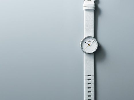
I've decided to pattern my curation today, to connect everything with an umbrella theme. My first attempt at this umbrella idea is to tie the Revolutions' Scoops to my love of art. This amazing Braun Japan site evokes the clean lines, simple colors and spiritual quiet of German Bauhaus designers such as: Walter Gropius, Marcel Breuer and Mies van der Rohe.
How can we bring those painfully won design lessons to our too chaotic time? Check out Braun's Japanese site for the art of selling in simple black and white time.
|
|
Scooped by
Martin (Marty) Smith
August 27, 2012 9:34 PM
|
Discover the source for enduring, purposeful and innovative furniture and accessories. Many items are in stock and ready to ship at new lower shipping rates.
Marty Note
DWR has it going on. Their social is in constant motion and fun. Website design has always been one of the cleanest onlline and they are expanding in creative ways. DWR.com rocks and erns a Steal This from the Revolutions on Scoop.it.
http://www.dailymarkets.com/stock/2012/08/27/design-within-reach-announces-studio-expansions-and-new-openings/
Great article on all the DWR.com changes, expansions and cool moves.
|
|
Scooped by
Martin (Marty) Smith
August 22, 2012 9:26 PM
|
Marty Note
Dan Mall is a talented designer. His designs for clients such as Crayola are colorful, clear and engaging. The reason he may have solved the portfolio problem is his main page is a series of simple green circles organized, floating really, in a clean timeline. You don't see his website designs until clicking. He sells the click.
The portfolio problem happens when placing 3 or 30 website examples on a page. There is an overwhelming sensation. You can't see anything. There is an explosion of color, style and CSS. Every website suffers by association. Dan Mall's solution is brilliant, elegant and simple much like his designs.
Well done!
|
|
Scooped by
Martin (Marty) Smith
August 20, 2012 6:08 PM
|
Marty Note
PatternTap.com is a great site. Instead of looking at websites as a whole PatternTap.com breaks them down into their parts, then tags the parts and organizes great examples of repeitition or shadow or creative examples other web design problems. This site helps designers dig whatever ditch is causing them problems at the moment. Need hints or ideas about how to fix a problem with that form, image or navigation? PatternTap.com is the solution.
|
|
Scooped by
Martin (Marty) Smith
August 17, 2012 8:16 AM
|
Bernhard’s typography rules were written for a pre-crash 1920s designer, but the lessons could just as easily apply to today’s reader.
Marty Note
Wow, if you ever need MORE evidence the bauhaus is still our house read this graphic and realize some design pressures are universal and always true.
|
|
Scooped by
Martin (Marty) Smith
August 14, 2012 10:48 PM
|
MetaLab Relaunches A Sexy New Ballpark, Officially Becomes A “Design ...TechCrunchThe company initially started out doing web development and design consultancy, but, over time, has diversified into digital goods and software.
Marty Note
Since our "Go Time" is looking long in the tooth at http://www.atlanticbt.com I'm gong to share Metalabs relaunched Ball Park with my boss. Cool tracking, invoicing and timing tool.
|
|
Scooped by
Martin (Marty) Smith
August 11, 2012 3:33 PM
|
CoolHomepages web page design and inspiration gallery of homepages, design, website designs and templates features thousands of cool web site design examples for inspiration - browse, search, learn, get inspired. ...
Marty - Great plae to find cool home page designs to inspire your design.
|
|
Scooped by
Martin (Marty) Smith
August 7, 2012 6:34 AM
|
Today we will showcase some excellent website layouts from Dribbble to help you get inspired and see what's new in the web design world.
Marty Note
One way we all learn is to look at how each other solves the problem of presentation. This post has some good design ideas, at least one great idea and one huge problem. I am going to put some space before I share my take on each of those in case you want to click the link, form your own ideas and then compare notes.
Marty Picks
I thought that UberSnap site was genius in its very Pinterest approach to an ever changing visual design not unlike the new Scoop.it account master page (http://www.scoop.it/u/martin-marty-smith ).
The huge mistake is the trend to chop off men's heads. What is with that? There are two examples of this huge mistake in these designs. What can be more unsettling to the lizard brain than seeing a headless body pitching a suit or a travel bag. Can designers really be so lost in translation they don't see how spooky, scary and strange it is to loop off the heads of the men? Would they EVER do such a thing to a woman? Let's hope not :).M

|
Suggested by
Susan Coils
August 4, 2012 3:13 PM
|
Marty
Great suggestion from Susan Coils. Negative space is the key to great design online as these examples prove. TY to Susan for keeping a Deisgn Revolution eye open for us.
Follow Susan http://www.scoop.it/u/sanssecret
|
|
Rescooped by
Martin (Marty) Smith
from MarketingHits
August 3, 2012 12:25 AM
|
Infographics on Designing Logo which sell Business Product/Services by Startup Business Checklist on Designing Wonderful and Unique Logo for Company Business...
Marty Logo Design Note
Ah the logo design, if I had half the sweat, pain and misery spent thinking about, pulling apart and redoing logos I would have a free year or so added back on to my life. One of the things I've noticed being on the agency side of Internet marketing now is how much new to Internet marketing teams focus, obsess and get pulled apart by the wrong things. It is as if, prior to real feedback, any dip or process hiccup can derail, stop and obstruct.
I suspect much of my logo obsessions of the past are the same, "Don't know any better," disease. I'm not saying your logo isn't important. It is. A popular Scoop from earlier was how to create a brand style guide:
http://www.scoop.it/t/brandjournalism/p/2300617884/how-to-create-your-brand-s-style-guide-tell-your-brand-s-story
If I had my marketing life to live over I think I would obsesses MORE about brand stories and less about look and feel. I'm a visual thinker so I start wrong. I start drawing the picture when I should tell the story. Once we have the story the picture is implied, suggested and probably half done. Always tell the story and let the picture form.
My story and sticking to it :).M
Via Christino Martin, Brian Yanish - MarketingHits.com
|
|
Scooped by
Martin (Marty) Smith
August 1, 2012 8:36 AM
|
A flyer is very practical and feasible for small businesses in marketing their new products and services in the local marketplace. Check out these 30 inspirational and creative flyer designs and start those creative juices flowing with ideas.
Marty
My fav is the global warming design.
|