Your new post is loading...
Just in Time Teaching (JiTT) is a series of evidence-based Infographics that address foundational clinical teaching principles (e.g. setting expectations, questioning techniques, 5 micro-skills, bedside teaching, feedback, and coaching). We have included review questions for each section to highlight key learning points to the reader. Ideal answers are included. Feedback is welcomed. In addition, clinically specific teaching techniques include content specific to internal/family medicine, pediatrics, obstetrics and gynecology, surgery, psychiatry, neurology, and ethics.
Via Peter Mellow
"Infographic tools are a great resource for teachers and students. Both can use them to capture complex concepts in pictorial form. In this blog entry, let’s explore a new infographic tool.
Via Tom D'Amico (@TDOttawa) , John Evans
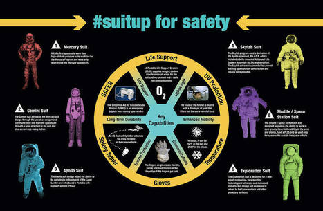
Do your students love a good infographic? Kids in the middle grades are frequently drawn to infographics because of their visual appeal and because information is presented in small bites. An infographic may be just one graphic, like a diagram, chart, or map, or it may be a compilation of graphics like the NASA infographic below.
Via Elizabeth E Charles
According to an article by Forbes, content with images tends to get 94% more views compared to content without images. This is one reason infographics steal the show in any platform. Be it in newspapers or social media, infographics can be found everywhere, even in online learning.
Via Elizabeth E Charles
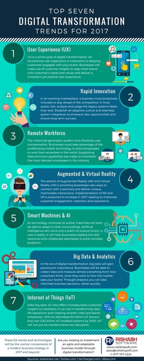
For a couple of years now, enterprises have undertaken the digital transformation efforts by way of using cloud services, data analytics, mobile, IoT and other technologies. While many have successfully embraced digital transformation, others have lagged at using data and right set of technologies to transform their organization. A Forbes research reveals that while 44 percent of organizations foresee themselves to be advanced in data and analytics, more than 90 percent of them have already seen increased revenue due to its implementation.
In 2017, enterprise digital transformation will continue to gain traction helping businesses to improve and accelerate processes and build upon what has already been achieved. However, they must understand that DX is not only about technology. It is more about reshaping of how the individuals operate, breaking down the silos and broadening the scopes of various roles and processes within the organization. It requires careful planning, seamless collaboration and inclusion of all the departments. If you’re planning to enable successful digital transformation, check out the infographic below highlighting top seven digital transformation trends. Learn more / En savoir plus / Mehr erfahren: https://www.scoop.it/t/21st-century-learning-and-teaching/?&tag=Digital+transformation
Via Gust MEES

|
Rescooped by
Yashy Tohsaku
from Scriveners' Trappings
May 20, 2017 11:12 AM
|
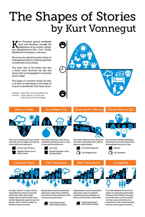
Maya Eilam is a freelance New York City graphic designer making digital and printed works that bring creativity to communication. Including websites, logos, social media graphics, custom lettering, illustration, photography, infographics, and more.
Via Penelope, Jim Lerman
|
|
Rescooped by
Yashy Tohsaku
from Education and Tech Tools
April 8, 2017 11:26 PM
|
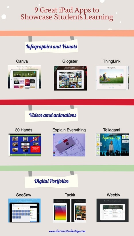
For those of you who haven't seen it yet, below is one of our popular visuals we published a few months ago featuring some of the best iPad apps students can use to showcase their learning.
Via Becky Roehrs
|
|
Rescooped by
Yashy Tohsaku
from Teach and tech
February 15, 2017 4:08 PM
|
About a week I was asked if I could write a post about tools for making infographics with students. A well constructed infographic ca
Via Luísa Lima
|
|
Scooped by
Yashy Tohsaku
January 9, 2017 6:27 PM
|
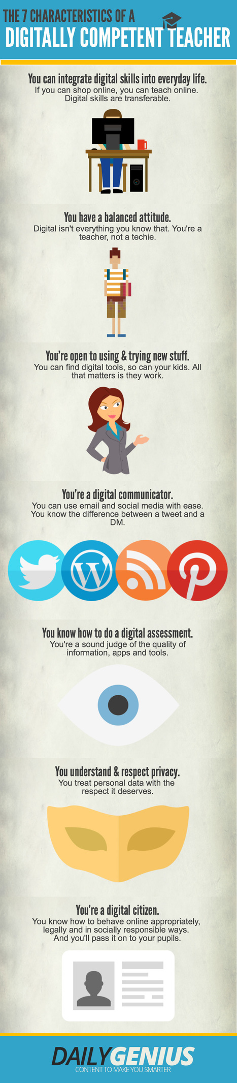
The Characteristics of a Digitally Competent Teacher Infographic clarifies and explains the most important characteristics of a digitally competent teacher.
|
|
|
Rescooped by
Yashy Tohsaku
from Creative teaching and learning
November 7, 2021 10:01 AM
|
"As regular readers know, for the past fourteen years I’ve been publishing about twenty-five different annual lists highlighting the best educational resources around (along with tons of…"
Via Leona Ungerer
Educators know we encounter many different types of learners in our classroom. Science class affords us the opportunity to meet the needs of hands-on, auditory, and visual learners. As we are faced with the task of teaching remotely, connecting with these types of learners is vital to our success.
One significant challenge familiar to all science teachers is getting students to understand data that is placed in front of them. Students often struggle with looking at different data sets and trying to make comparisons and interpretations.
My solution? Infographics. Infographics has been a great way for me to engage my students with data and encourage them to apply creative as well as critical thinking. And with the shift to online learning, I’m finding infographics more useful than ever.
What Are Infographics?
Via John Evans
Unseen trends, uplifting stats — a new chart every day. From Information is Beautiful.
Via Ana Cristina Pratas
Infographics are a great source of information and make reading information from the computer screen much easier, but just showing students an infographic and telling them to study it isn’t the most effective way to exploit the medium.
Via John Evans
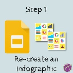
Before students create an infographic from scratch have them copy an infographic. This helps them to learn HOW to create the design elements.
Via Tom D'Amico (@TDOttawa)
The holiday season is a time of giving, spending time with family, and following holiday traditions!
Via Tom D'Amico (@TDOttawa)
Infographics, an effective form of content marketing, are everywhere on the Web, but it isn't always easy to come up with good designs when you want to create one yourself, especially if you're not skilled in design and visual content. Fortunately, you have plenty of options. Many blogs and other publications offer tips and tricks to help improve your visual content, and sites like online infographic maker Visme (which I founded) and applications such as PowerPoint offer templates to help you get started. Templates help you get a general feel about what works for an infographic and what doesn't, which can then allow you to branch out with your own designs. Often, though, in the business world, a lot of templates are simply tweaked to create an infographic; the basic template remains intact. After all, if it isn't broke, why fix it? So here are five of the most popular templates, the reasons they work so well, and a few tips and tricks to help you make them your own....
Via Jeff Domansky
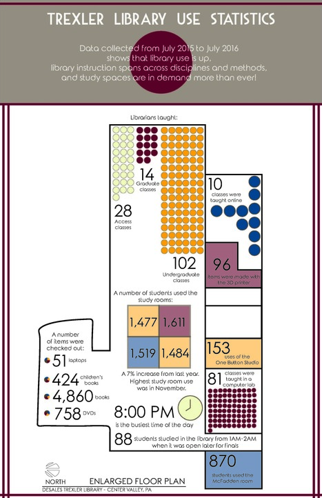
"If you haven't had time to look up from the frenzy, the end of the year is HERE! And with the end of another academic year, often comes the annual gathering of stats. Jess Denke, Public Services Librarian at the Trexler Library at DeSales University, has created an infographic that really illustrates how her library was used."
Via Mary Reilley Clark, Elizabeth E Charles
PinterestHelp Students Get Organized, Track Progress, Take Notes, and more with Google Keep! Google Keep is a robust G Suite tool that can help teachers and students create and share notes, lists, and reminders. There are so many possibilities that I decided to put together this post and infographic with ideas for how Google Keep can …
Via RitaZ
Tracy Tonnu from Visual News graces us with a list of 100 of the Web's very best in education infographics in the following article.
Via Tom D'Amico (@TDOttawa)
|


![Christmas Traditions Around the World [Infographic] | Daily Infographic | Education 2.0 & 3.0 | Scoop.it](https://img.scoop.it/U-jcskgif_G0A52DMRK1ADl72eJkfbmt4t8yenImKBVvK0kTmF0xjctABnaLJIm9)


![15 Ways for Students to Use Google Keep [infographic] | Shake Up Learning | Education 2.0 & 3.0 | Scoop.it](https://img.scoop.it/tuji0t5rLUeu0nti2Mf8fjl72eJkfbmt4t8yenImKBVvK0kTmF0xjctABnaLJIm9)