Designing G+ In Crazy to suggest using G+ as a tool to power your online marketing right? Maybe not. Greatest return always comes from the least understood ideas. GooglePlus is a "least understood" idea these days.
Their leader left and TechCrunch said G+ the social net is dead. They may be right, but that is beside the point. G+ has always been more than a social net. G+ is a suite of tools marketers can use to find blue oceans.
Blue oceans are the as yet unspoiled places where marketers can still swim without fear of a herd of sharks. Oceans where sharks eat themselves are "red oceans" such as Facebook.
We suggest designing G+ into your marketing and site. Hold weekly hangouts, you don't need a G+ profile to use hangouts now, and created a branded community if only so you rule your name in #seo. Finally we suggest curating the great comments you will receive on G+ as a source of future content.
We've never been able to figure out how to use circles in a unique way, but they too beckon with possibility. By creating weekly content based on Hangouts and Community you get lots of GoogleJuice, the least expensive #videomarketing we know about and great community development tools that cost you NOTHING.
The linked post discusses Mark Traphagen's call to use G+ as a hub of your marketing. That's a great call since the price is RIGHT (free though you may spend some making G+ play the way you want it in your design). Designing G+ tools INTO your community creates the cheapest, biggest and best online win we can think of.
So the death of G+ is greatly exaggerated and, if you are smart, you will find a way to design the tool's many possibilities into your marketing.
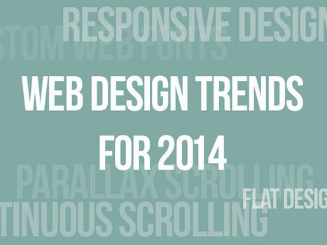
Like the World Wide Web itself, the world of website design is constantly in flux as technologies change and design standards evolve. What worked in 2013 may
Worth revisiting some of these web design trends. What is the engine behind these trends? Social / Mobile web. Like the "winners" and "losers" organization here.
If you spend enough time online, it's surprising how much most websites start to look alike. Sure, there are variations, but to a large extent, web design is
Wow, some cool web design ideas here and some HORRIBLE ones. I like Wolf & Badger: https://www.wolfandbadger.com/ Current site doesn't look like the FLASH example.
Never use Flash at this point as it kills SEO and its not "trending" in the right direction). Some of these ideas are a mess, but see which ones are your favorites. Always good to see where the line is. Some of these sites are well over the line.
New design isn't as funky, but it is solid. The idea of walking a customer into the middle of a strange fantasy seen and letting them find their links would not normally be something I would like since it obscures instead of makes clear.
The Online Shop (lower right) is what sold me on this fantasy. I also think we are in a time when sites are sites and so BORING. The Flash needed to be killed but check out the link to there new site and see if you don't still rock a good design.
The 10 most egregious UX offenses against users. Web design disasters and HTML horrors are legion, though many usability atrocities are less common than they used to be.
Marty Note If you took a day and fixed any of these Top 10 Web Design Mistakes That Apply you would make 50% more this holiday season. These are "cost of poker" fixes that can easily remain for years and years. Every year one of these mistakes exists your website is 10% less effective.
When you make 2 or more of these mistakes you pay with an order of magnitude more pain for each added mistake so 2 mistakes doesn't cost you 20%. No 2 mistakes cost you 200% of what your website could be doing for you.
Fix all 10 of these basic problems and your site is on its way to its "mission critical" place in your company.
Greatest Film Never Made "What is he purpose of life," the director Jodorowsky asks in this must view documentary film for any creative, "to create a soul". The amazing creativity and vision of El Topo's director is shared in a series of linked stories.
Much like any creative's mind, this film flies between the surreal, heroic, mystical and crazy. Stories about Orson Wells and Pink Floyd are rich in "sounds true" detail, but pales in comparison to the "I can't type that fast" advice shared.
Advice such as:
* Be all in. * Be a prophet.
* When it comes to missions THINK BIG (something important for humanity). * Start with clear ideas, but find and respect "light of genius". * Challenge people to find their best. * Give Morning Motivation speeches. * Your VISION should become OUR IDEA. * OUR Ideas become art. * When you think you are looking at a rock its an object & vice versa. * Lucky enough to meet a prophet FOLLOW HIM. * Be supportive of others.
* Transport people. MOVE THEM. * Look for and work with WARRIORS (life is too short for anything else). * Imagine and then imagine again. * No such thing as "too far". * Let the work rule. * One man's obsession is another man's art. * MOTIVATE others.
* If you can Seduce Salvador Dali DO SO. * Create enigmas. * If chance puts Dali at your hotel, send him a strange note. * When you find a clock in the sand discover who lost it. * Create MOVEMENTS and ART with your life. * If Dali asks you for a helicopter, GIVE IT TO HIM. * Dali gets you Giger, Giger gets you Magma (and so on). * If you can get a meeting with Mich Jagger, TAKE IT. * If Andy Warhol invites to the FACTORY, go there. * Plan everything, Plan Nothing (chance). * When you see Orson Wells in a Paris restaurant, send wine. * Live a EULOGY Life not a Resume Life.
Hope you are living a Eulogy Life. Jodorowsky sure did. I had to be shoved kicking and screaming on the Eulogy train by the Big C. Glad I got on this train even if it turns out to be the last train from Clarksville :). M
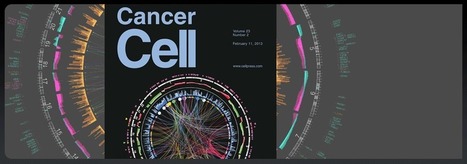
How To Succeed Visually Sorry all the low hanging fruit is long gone. If you want your website and marketing to stand out you are going to have to go high up on the tree or find another tree. Circular Data Visualization with Circos helps you create a new tree.
Yes there is some UI pain and some RETHINK pain, but that's good for several reasons:
* No Free Lunches Anymore - Everything Going To Be Painful Now.
* Learning Curve Protects The Niche WHEN You Get In. * Like Going Down The Rabbit Hole & Pulling Cover Over As You Fall.
If you are a web designer looking for a way to REALLY rock your bosses world here's one way - tap your inner geek to create killer visual marketing.
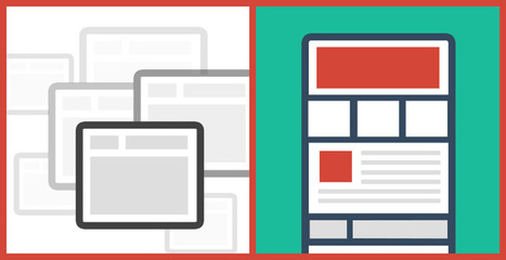
Pageless design frees websites from the outdated conventions of print design and fully utilizes the digital platform they’re built on.
8 Compelling Reasons Why "Pageless' Web Design Wins (in the end):
* Tells a better story.
* Easier to "digest" or understand what to do.
* Emotionally more powerful.
* Higher Conversion Rates!!! * Makes updating faster & easier.
* Lowers BOUNCE & encourages sharing.
* Looks great on all devices (mobile included).
* Lower cost to develop.
Marty Note I confess to not being in love with the "infinite scroll" just yet. One modification we worked out for @Curagami, our Startup Factory funded startup, is to include a Call-To-Action at the top & Bottom.
CTAs help prepare the scroll. Remember "open book" tests? Putting a CTA on top of a waterfall of content helps prep a visitors mind. It "opens the book" for them. With this many impressive benefits I'm going to have to figure out how to start loving "pageless" design (lol).
I bet there are 5 (or so) similar modifications we can make to help us know how to create the paths and conversion we want by going "pageless".
An engaging site that fights homelessness, a resource for seeing fonts in use, and a stylized design app are some of the best website designs chosen for this month.
This Curagami post shares our favorite Top 10 Summer Web Designs in the hope people will VOTE for theirs and share ones we missed. The post also shares a link from @Mike_Alton about the magic of List.ly (the Digg-like tool that runs the social voting engine that's free and easy to embed).
MacGuffins are plot devices in films & conventional web design "best practices" that hurt more in absence than presence helps. How to design for MacGuffins.
Website MacGuffins include Free Shipping, Satisfaction Guarantees and email subscription boxes. Important to know what has reached "MacGuffin" status in your business. This post explains what a MacGuffin is and how to design for yours.
Color & Texture This share bucks the flat monochrome color trend being driven by mobile, but its hard to deny the sensual impact of just the right color and texture as in Paid to Exist and other examples here. Brilliant.
Red is one of the most used colors out there. Among other things it symbolizes passion and courage and it has a strong visual impact. Numerous designers implement it in their work either in logos, backgrounds or other website elements. In today’s article we have selected 45 web designs using the color red in various …
This holiday selling season (2014) will happen as close to real time as any thanks to the social / mobile web. Listening and curating are going to be important, but so is tapping the nostalgia and spirit of the season in creative and collaborative ways.
Attending Search Exchange in Charlotte and MOBILE seems to be the dominant theme so here are 70 examples of responsive web design. On a laptop or desktop and want to see "responsive" design? Shrink your window and watch as the content adjusts to tablet and then phone size.
Hard Won Lessons I spent almost a million dollars of OPM (Other People's Money) learning these five lessons about images and web design, so lessons learned the hard way:
1. Portraits Are Powerful Portrait images where the model looks directly at the camera, are powerful "welcoming" images great for home, about and category "splash" pages.
2. Babies are DYNAMITE - Use Carefully Thanks to our ancient caveman brain we can't NOT look at babies. Problem is that is not a secret so babies are now overused to hock insurance, tires and shampoo. If you use a baby my preference is to have the baby looking AT something.
Visitors eyes go where the eyes of people (or babies) are looking, so point your baby image directly at an important Call-to-Action and bet your conversions go up.
3. People Talking To Each Other = DANGEROUS There may be context where it makes sense for you to have an image where people in the image are huddled together, but I doubt it. If you have two people huddled and a third looking directly out at the camera the image works better.
We respect a huddle. We don't want to intrude, so your web image is working against your online marketing purpose. Your image says we are here having a conversation and YOU (visitor) aren't invited. Not a good idea.
4. People Sell Better Than Widgets, but... I prefer to tell human stories even about the most widgety widget, but people bring "like me" problems too. Every visitor is looking for "like me" signals. If you know your archetype and tribe well enough to risk it use images of people consistent with your understanding.
If you have a wide variety of customers and members best to avoid single archetype "like me" images. This is yet another reason I like portraits. Portraits are "universal" meaning the welcoming look directly at the camera removes some of the "must be like me to engage" requirements.
5. In Action Shots Use The MOVEMENT If your image is riding a bicycle POINT the movement at something important. I don't like movement images as heroes (largest images on a page is called a hero), but I love them in "sub-hero" images because movement creates excitement and allows me to direct the visitor's eyes where we want them to go.
Use these 5 hard won tips and your images won't fight your site's desire to connect, create community and convert visitors into buyers and members.
Having spent over a decade as a professional photographer, this is spot on! Of utmost interest to Experience Designers interested in persuasive design methodologies!
Depending on your brand and message some can be very professional and straight to the point, and others a bit more relaxed and playful. Here is a collection of taglines and intro messages from freelance designers and design agencies around the world for your inspiration.
Marty's Take On Web Design & Data Visualization Had an interesting conversation with Curagami ( http://www.Curagami.com ) co-founder Phil Buckley at lunch yesterday. We were discussing my attempt to change the CSS on the Hack Headphones Shopify store I'm creating.
I shared how I found a post on how to change the buy button. I wanted a bigger button. The problem was the post with the answer must have been 2 or more iterations behind the theme I'm using.
The change moved slightly unintelligible java to completely unintelligible code (at least for me). Where once there was a "height" variable now there were nested variables.
Welcome to the future of web design.
If a company with more Ph.Ds than almost anyone, Google, decides to float their index creating a responsive float that seems to wrap search results around searchers like a blanket WHY don't we lucky few Internet marketers realize that's the planet we are all in transit to?
The New Web Designer Once a "website" becomes a series of interlocking "IF" "THEN" statements "designing" a website becomes an exercise in data visualization.
Design in a variable world is different as this great data visualization TED video shares (stay with it as the visual candy gets better in the middle). The skills need to be this "new designer" include but are not limited to:
* Spatial reasoning and intelligence.
* Ability to read and translate metrics into meaningful images (i.e. data visualization). * Enough Javascript to choke a horse.
* Even more CSS as everything is floating in a variable galaxy. * Understanding how variables and results should influence design, color, layout in order to increase engagement and conversion.
If this sounds like the silos between design, code, marketing, research, sales and customer service are coming down fast we agree.
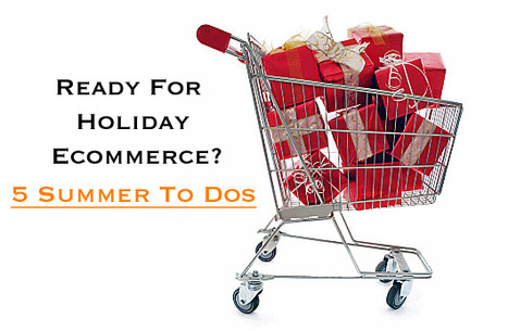
Summer = Make or Break What are you testing this week? Are you testing design, offers, shopping cart or merchandising now? Here are 5 Summer To Dos to help your sales in the 166 days left to Christmas:
Testing Plan Your testing plan should be FLAT OUT now. Testing after Halloween should be done with great CARE. This means you eat off the "testing meals" you cook now for 3 of the most important months of the year. Here are things we liked to test in the summer:
1 FREE SHIPPING This year we STRONGLY recommend offering Free Shipping both ways (out and back) and without any hoops to jump through starting about Halloween (i.e. remove your triggers as they start costing you money right around Halloween or at least they did when we tested). We could never get our DM bosses to thing of free shipping as advertising. Shame since we keep placing print ads long after that tactic was dead man walking (now print by itself is crazy).
When you model Free Shipping both ways now remember you need 3x the same customer visits now you will need in November.. In the summer we ran about 3.2 visits before a purchase. After 11.1 that number dropped to 1.5 and by Black Friday it was damn close to a single visit.
2 Offers & Causes Use that last paragraph to model great offers at this time of year. If an offer lowers the number of return visits needed BOOK IT for November and December since any summer offer should ROCK 4Q (unless the goods are summer related).
We liked to test cause marketing at this time of year. Our demographics were almost even (men to women). Find brand aligned causes and figure out how to help. If you sell auto stuff for trucks you might contribute to Ducks Unlimited for every sale of Chevy parts.
If you sell books contribute to literacy for every bestselling bought in any form (e-book or hardcover). Your cause doesn't have to be so close to your brand especially if you tie-in to the big 5:
American Red Cross Goodwill American Cancer Society Feed Children Care fore Pets
3 Create & Test Unique Merchandising Combinations Great time of year to create unique merchandising. Amazon is going to beat any price you have on products with velocity in segments like books, gifts and media. Your only HOPE is to create unique and branding merchandising.
Be sure to create a NEW page and SKU (Stock Keeping Unit) for your new combinations. Link your new combinations from established pages for best sales results. If you've always sold A, B & C offer a new combination of all 3 and give C away free.
Use your metrics to find natural combinations.
4 Free Gifts If you have Free Shipping both ways and no competitor is following you don't need a free gift. If you can't get free 2 way shipping approved toss in a free gift. Free gifts can't SUCK.
If can't give a gift aligned with your brand and that will delight and surprise DON'T GIVE A FREE GIFT.
5 Social Mentions & Kudos By far the LEAST expensive idea on this page is LISTEN, THANK and SHARE content your customers share with you. Follow back well more than 50% of your followers cutting out the spammers. You will be amazed how much traction ACKNOWLEDGEMENT creates.
Every follow back and Retweet wins hearts, minds and loyalty best mined NOW for THEN.
Our @Curagami Evolution of Web Design Infographic (http://sco.lt/74Nvsn_ broke daily view records for our startup. Here are 5 Web Design Implications implied by that infographic:
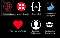
Leave Room For THEM (visitors & customers) - As User Generated Content (UGC) becomes increasingly important its important to build in ROOM for comments, reviews and other UGC. UGC needs an ASK and the room to curate and share results of the ask.
One For You, 2 For Them - Every System & Process you build for YOU, build 2 for them. Can users follow each other? Can users share a profile? Can users share content ideas and content easily? What is your social reward system for content shares.
Social Graphics - there is a reason people in the army wear rank. Wearing "social rank" immediately says who someone IS with a single graphic. Easier to trust social avatars when they are similarly grounded with graphics earned and proudly socially displayed. Social graphics reward those who've earned them AND set the stage for the next generation of people aspiring to "be like them" so a double win. Find ways to share feedback in social spaces like charities do with thermometers.
Build an Ambassadors Area - ambassadors are so important to creating and sustaining online community. Ambassadors are volunteers wiling to sacrifice to JOIN and ADVOCATE you and your ideas. One CSF our startup Curgami is working on is how to quickly identify a website's 1% Contributors and 9% Supporters. Once identified GIVE THEM JOBS and a special place to "hang out".
Curate & Collaborate More, Create Less = more "blank pages" - design is an important wrapper, but web design can become an obstruction too. If you curate a "Member of the Month" feature leave room to fill up as you go. Maybe this month's feature sits on top of 3 previous months. The more face-time you can build for THEM the more social shares and support your online community earns.
What about you? What design changes do you see ahead? As we move to "community" how can our design support and create trust?
Beautiful Unusual Navigation Designs for Inspiration. Selection of Awwwards websites with a strong presence of unusual navigation. An effective navigation design is crucial for a website
Navigation feels old and moldy. There are few things MORE critical than navigation. We've moved from left nav sitting firmly in the "golden triangle" to horizontal top navigation.
Neither of these options inspire and both are feeling long in the tooth and stupid. The social / mobile web requires a RETHINK about navigation. Can we find ways to make very page a homepage?
Can navigation be more relevant and less middle of the road boring? Here are some navigation examples from AWWWARDS.com that don't solve the problem...yet. But the dialogue helps begin the process of reducing our dependency on static, boring, "has-been" ideas like left or horizontal nav.
Are you as surprised that navigation hasn't been on the "top changes" list for web design in 2014? Has to be on our 2015 list because every current option is BAD and getting worse.
The first major struggle for business owners who want to use a blog for content marketing is creating content. With the dearth of content being created daily, it's certainly a challenge to come up with anything helpful and interesting to say. The second major struggle for business owners is getting people to actually visit their site and read their blog posts. The most brilliant writing in the world won't do you much good if no one reads it.
Great post by my friend Mike Allton on a tool I'm convinced is a secret web in the right designer's hands - List.ly. I'm working on embedded a Top 10 Summer Website Designs list now in Curagami (http://www.Curagami.com) so stay tuned.
Here’s a fun fact: Over the last 10 years, our attention spans have decreased from 12 minutes to 5 minutes. Our ability (and our desire) to read lots of c
My favorite is the NYT's Home and Garden in depth look at 4 square blocks in Philly. Great content daisy chained well so it never overwhelms and keeps readers moving. Great use of anchor links (from the sidebar) makes the piece feel more interactive than it really is.
Long form content has many #newseo benefits. The more engagement your content creates the greater chances for conversion. Web heuristic measures such as time on site, pages viewed and returning visitors help with the "new seo" too.
Steal some of these easy tricks from NYT and make your content feel more interactive than it is and read faster and more fun so your metrics go up and readers love you enough to become buyers or subscribers.
What are two of the coolest colors in web site design? And do you think we've assembled a collection for you that will knock your socks off? Take a peek >>
To get content containing either thought or leadership enter:
To get content containing both thought and leadership enter:
To get content containing the expression thought leadership enter:
You can enter several keywords and you can refine them whenever you want. Our suggestion engine uses more signals but entering a few keywords here will rapidly give you great content to curate.


 Your new post is loading...