


The color white is simple, elegant and peaceful and the use of this color is seen in lots of websites. Whether they're portfolios or online shops, people agree on...

 Your new post is loading...
 Scoop.it! The color white is simple, elegant and peaceful and the use of this color is seen in lots of websites. Whether they're portfolios or online shops, people agree on... 
No comment yet.
Sign up to comment
Scoop.it!
Master Blasters
Scoop.it!
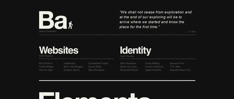
A common misconception is that black is thought of as a color in the same way that red, blue, purple or even green are. In actual fact, black is the complete absence of all color...
Martin (Marty) Smith's insight:
This post reminds me of something I read about Andy Warhol.. "With Warhol there is always BLACK," the author said and went on to explain that it was Warhol's awesome use of black that made him a great artist.
Scoop.it!

Explore Kevin Regenrek's hand-picked collection of Pins about Webdesign Inspiration 2014 on Pinterest. | See more about website designs, web design and landing pages.
Scoop.it!
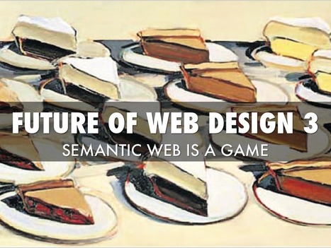
Created with Haiku Deck, free presentation software that’s simple, beautiful, and fun.
Martin (Marty) Smith's insight:
What is a website? Pages of content daisy chained together to tell a story. In the not very distant future we will need to be more agnostic about WHERE and more particular about WHAT.
Scoop.it!
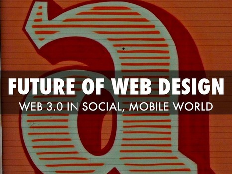
Created with Haiku Deck, free presentation software that’s simple, beautiful, and fun.
Martin (Marty) Smith's insight:
Social + Mobile changes everything.
Scoop.it!

After almost 14 years an Internet marketer and the last two as Marketing Director for Raleigh's largest web and software design agency I know people need HELP buying web design.
Scoop.it!

Great post from The Guardian on creating clean well lighted websites. My favorite? Discussion on how important surprise is to What's Next.
Scoop.it!

My favs: Clean Sale (pictured here), Retail Therapy and Kiosk. What are your favorites?
Scoop.it!
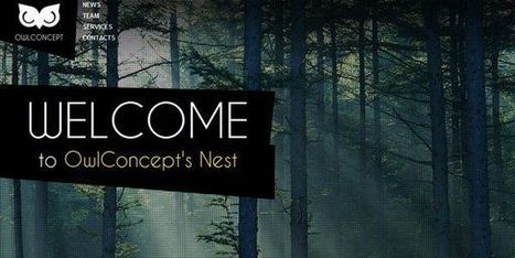
2014 Web Design Trends - Marty Note
Scoop.it!

Reading an article entitled 10 Rock Solid Website Layout Examples on Design Shack.
Martin (Marty) Smith's insight:
Love how Design Shack shares just about every web layout in silhouette then provides examples. Good idea to train your eye to see the frames (they are always there). Soon we will be training ourselves to think in ZONES and this wireframe approach is critical to that next step.
Scoop.it!
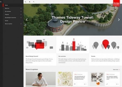
Fantastic CSS3 Website Designs for Inspiration. Selection of Awwwards winning CSS3 websites. CSS3 is a powerful tool for web designers to enhance the appearance of a website.
Martin (Marty) Smith's insight:
Strong first few pages of examples here. My favs include True - don't like blocking the face, but works here. * Limit color palette.
Scoop.it!

Every web designer has a secret or two. Hard-won workflows, hidden hacks, and insider knowledge that are the mark of true experience and the stuff that separates great web design training from good. Here, we've managed to persuade some of the web's busiest devs and designers to part with their most closely guarded tricks and tips.
|
Scoop.it!

From
visual

Apple In Numbers
Martin (Marty) Smith's insight:
Amazing.
Scoop.it!

"I spent a lifetime learning to draw like a child." Picasso
Scoop.it!

From
dezayo
Web design blog with actual news and web examples of inspirations by dezayo new york agency
Martin (Marty) Smith's insight:
Simple is always the hardest thing to achieve in web design. One interesting trend in 2014 web design is to flatten and simplify. Here are 25 great examples of why less can be more.
Scoop.it!
Martin (Marty) Smith's insight:
ReadWrite and 99 other "non-design" blogs every web designer should read is great and I love the way the list is organized.

Michael Allenberg's curator insight,
May 13, 2014 7:37 AM
Pay special attention to numbers 20-38, the UX section! Great stuff!
Scoop.it!

Created with Haiku Deck, free presentation software that’s simple, beautiful, and fun.
Martin (Marty) Smith's insight:
Web design is about to blow up.
Scoop.it!

Created with Haiku Deck, free presentation software that’s simple, beautiful, and fun.
Martin (Marty) Smith's insight:
How we create products is changing.
Scoop.it!

Product Development
Scoop.it!
|

|
Scooped by
Martin (Marty) Smith
April 29, 2014 8:18 PM
|
Scoop.it!
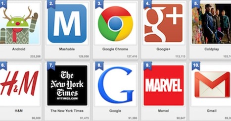
We've had a HUGE Day over on GPlus today. I wrote a post about why G+ is magical thinking (https://plus.google.com/102639884404823294558/posts/F5fXyrkTPCr ) and my post got picked up by my friend Mark Traphagen (@MarkTraphagen) and it BLEW up into an amazing conversation.
Given the MONSTER day we've had I thought it would be a great idea to share some of the most successful G+ Brand pages. GPlus is a massive Blue Ocean for most. Blue Oceans are where your content gets MORE traction with less work. Red Oceans are where your content requires more investment to generate LESS return.
GPlus is really a set of TOOLS. Incorporating Hangouts, maps, communities and other widget-like tools. The first website or agency to figure out how to combine those powerful tools in unique combinations is going to WIN big. Some of these examples approach the top of the mountain, but G+ has more power than even anyone here captures.
|
|
Scooped by
Martin (Marty) Smith
April 26, 2014 7:56 AM
|
Scoop.it!

Vogue's Marketing Lessons
* Be Specific (use BIG numbers).
* Be Branded (use existing brands).
* Be Topical (happening NOW iis easier).
* Be Welcoming (Models on hompage stare directly at camera).
* Use alliteration and rhythm in headlines (make em sing).
* Use juxtapositions.
* Use action verbs.
* Use SIMPLE colors.
Follow those 8 lessons and your web design improves.
|
|
Scooped by
Martin (Marty) Smith
April 24, 2014 5:39 PM
|
Scoop.it!
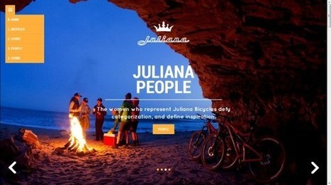
Design Beauty As Online Strategy
Beauty has a problem online. Imagine a line with pretty pictures on one end and makes money / converts on the other. As website design travels away from the balanced center out to either pole something is given up.
Beautiful sites often feel solipsistic and self referential. Commerce sites feel transactional and much like an not very special commodity. As visual marketing commands more and more of our attention, efforts and communication arresting imagery is important.
You can't sell someone who doesn't stop long enough to know who you are. Is beauty an effective strategy in and of itself? No. Is commerce an effective strategy in and of itself? No. Truth lies in the magic promise of a balanced approach as these 10 examples of somewhat practical beauty share.
My favorite and the one most centered between those two poles?
Juliana Bicycles - I don't typically like group scenes that aren't open to the viewer as they can send an exclusionary message. This bicycle site doesn't because of the magic of place pictured and the ancient desire to warm next to a fire with friends.
Would NEVER have thought Juliana Bicycles hero could feel so beautiful, friendly and inviting breaking several key rules - but it does.

One Unusual trend we ignore
In Digital strategy pay maximum attention to social media tools, digital tricks and marketing tips. But, we don’t always keep tabs on website design trends and evolution.
|
|
Scooped by
Martin (Marty) Smith
April 20, 2014 7:07 PM
|
Scoop.it!
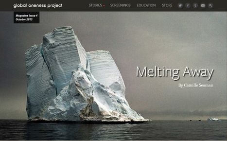
Nonprofit Websites
Nonprofit websites are designed to tell stories something we all need to do these days. My favs include Housing Works, Too Young To Wed and Melting Away.



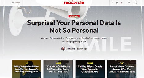


The space between the notes may be the most defining thing about music. I think of web design as a form of music. Web designs, like music, need space between their notes.
This is what made Google so astonishing and easy to use. White page, search box and as few menu options as possible. There is even a person who stands sentry on Google's design saying NO much more than they say yes.
I love to study great WHITE websites to learn how to put space in to quiet and strengthen web design.