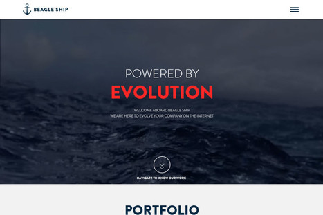
Great examples of flat webdesigns. Flat looks better as responsive design another way of saying it looks better on phones and pads. My faves here are the doesn't seem flat Beagle Ship and the Boldial WP theme.
Check out the hottest web UI patterns used by Pinterest, Facebook, Twitter, Kickstarter, AirBnB, Tinder, and more.
Marty Note This is a great web design scope full of examples and lots of good suggestions. At Curagami we are devoted to the conversations as The Next Ecom idea. Love the suggestion about conversational tone in forms.
Forms SUCK, but that doesn't mean you can ask for things in a MORE INTIMATE way than standard boring routine. The visual organization riff is evidence of a much larger tectonic shift - visual marketing is ruling the world.
Visual Marketing in a nutshell is...
1. GRAB attention with an arresting visual. 2. Tease a read with a great headline. 3. Snipit-ize your content so it daisy chains a series of "play list" like cliff hangers. 4. Move visitors to subscribers and buyers.
5. Create an ASK (such as Join our Ambassador Group).
“With the amount of people using mobile devices to access content online, many websites have started using responsive web design in order to appeal to the greater needs of their online audience. However, a website that’s responsive to changes in the platform it’s being accessed on simply isn’t enough and web users are looking for… Read More »”
SO TRUE, responsive design is MEANS not ENDS. Mobile first requires a healthy rethink of... We'll everything. As we interact in a more social and iterative way our S / R curves. The nature of what we lucky few #Internetmarketers do these days is shifting once again. The #socialmobile web changes the nature! tone and tenor of our interactions. Our customers expect involvement and the ability to interact with US (website creators) and each other (customers).
This article looks at some examples of interaction design in which smart interaction, defined by subtle animation, gently improves the user experience. We’ll share some lessons drawn from various models and analyze why these simple patterns work so well.
This article got me thinking. It's about transitions in user interface design with some very nice animated examples.
Are the transitions shown here useful in a learning context, or are they merely window dressing that detracts from learnability? Personally, I think that while they look nice the first time, most of these transitions become annoying with time, simply delaying users. Mayer and others have shown how eye-candy can often be detrimental to learning.
Is it time for some generous academic to re-evaluate the situation in light of recent UX designs, preferably in a corporate setting? Or, maybe somebody already has and some kind soul could post here and point me in the right direction?
Mondrian Grids First website I created in 1999 used a Mondrian grid. FoundObjects.com had SO MUCH information we needed a grid. Since we sold artist inspired gifts and cool stuff such as Magnetic Poetry Kit I worked hard to write the HTML to create a Mondrian grid manually.
There are "new designer" mistakes such as too many fonts and over selling the click I wouldn't make today, but maybe it was worth figuring out how to write the html to do those lines (took weeks and was named in my divorce lol).
I'm not alone in love for Mondrian as this link shows.
A poorly designed website has real impacts, whether page views or sales. We won't hesitate to bounce away to another with a better user experience.
1. Requiring users to signup before browsing your site 2. Forgetting about multiple screens 3. Having ridiculous forms to fill out 4. Using hard to read or cutesy fonts 5. Implementing a Search bar that sucks 6. Bombarding the reader with a wall of text 7. Displaying your products with low-res images
MS - 8 Non stop animated gifs (you will discover what I'm talking about)
Marty Note Agree with all 7 of these annoying disasters and would add an 8th - too many animated gifs all running at the same time with NO STOP.
Designing Tomorrow's Ecommerce I'm writing a blog post for Curatti that will go live at midnight tonight that discusses the "best practices" of "Tomorrow's Ecommerce". I'm also writing a Curagami blog post (also published at midnight) about how social shopping will change Tomorrow's Ecommerce.
* How did the painter meet his model? * What would explain that look in her eye? * Why is that man … blushing?
She shares three stories inspired by portraits, including the one that led to her best-selling novel "Girl With a Pearl Earring."
3 Find Your Story Tips One of the most common "we can't do it" complaints we hear is, "Our content is boring and no one on out team knows how to tell a story". There are no "boring" products or services and we are surrounded by stories. Here are 5 tips to help you find the magical content needed to wins hearts and minds online.
Story Finder Tip #1: Your Employees You never need to look far for great stories. Stories of heroic efforts against great odds are sitting in your office now. There are cancer survivors, triathletes and parents with special children in your company as I write this.
You might think, "I don't want to invade their privacy," and we aren't suggesting it. We suggest explaining that any company really only exists in the minds of its employees. Since publishing costs are now zero you can afford to explain who you are by proxy - via your employees stories, passions and loves.
This is "Employee Story of the Month" instead of a banal award your customers learn about the journey your team members have experienced and so feel close to them, you and your brands and products. "I feel like I know you," a woman said hugging my ex at the Gift Show in San Francisco.
Our potential customer learned about Found Objects and Janet McKean from our monthly newsletters. Those newsletters led to the hug and made doing business together easy.
Oh, btw each month I included a short story about Janet's life, experiences and family. May be why I'm divorced (lol), because Janet hated sharing so much. "You married a storyteller, " I would say smiling and writing and well you can figure out how well that worked in our relationship. Worked GREAT with our customers though (lol).
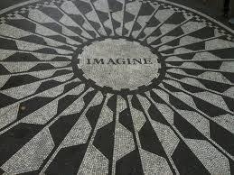
Story Finder Tip 2: Be Like Tracy Imagine An Image's Story Tracy wrote a best seller by imagining questions implied but not stated. Your online marketing uses images all the time, but what are the questions BEHIND the image.
If you have a picture from a company event who is there? What was being celebrated? What in the image doesn't make sense? Is there something that hints at a mystery o some enigma? Work backwards from an image. Begin like Tracy. Ask questions. The answers are your story.
Story Finder Tip 3: Ask For Customer Stories Take the image in example #2 and ask your customers to share their questions, stories or answers to hidden riddles. Asking for a story may be too hard and intimidating, but asking what these people in the corner are doing could be fun and spark imaginations and lead to stories.
Once you have an "Ambassador" group of customers / advocates established ask them to help shape your ASK. Ask your advocates to help you know the best way to engage and hear stories your customers are itching to share.
Writing this tip reminds me of a story (of course lol). I left home for the first time. I was in the 10th grade and enrolled at The Choate School. My mom cried when she and my father dropped me off. Now I was sitting in my first English class.
Mr. Noland, a bearded thirty something teacher dressed not unlike every preppie in the room (straight leg corduroys, button down oxford shirt) asked, "Tell me the story of this pencil". He said this hold a pencil inches from his nose and staring at it as he rotated it and waved it up and down.
Dutifully I set out to describe the pencil. "Pencils down," Mr. Noland said asking a student he clearly knew to read his story first. "She couldn't tell why. All she could smell was stale cigar...." the novella this student wrote about a possible murder, broken hearts and a love affair gone wrong made me realize I wasn't in Kansas anymore.
If Mr. Noland's shill can write 500 words on a pencil, YOU can tell a captivating story online about you, your company, brands and products.
Web Design & Stories Now that you know WHERE to find stories don't forget to DESIGN them in. Sharing stories online is tricky. You want to make readers do a little work to get to a place they can read and read.
Don't do like some and break your stories into tiny 200 word bites. Too much clicking ruins the "all in" feel of a good story. Make your readers click a couple of times to pan out readers from scanners and then let them read.
Will cover more "story design" tips in another post. First FIND your stories since that is often the hardest task. Next create a design that does the impossible - makes it fun to read online.
Paola Antonelli, design curator at New York’s Museum of Modern Art, wants to spread her appreciation of design -- in all shapes and forms -- around the world.
Marty Note I like SOME of this TED Talk, but LOVE The conversation below it. The next web, and btw MoMA is NOT on my "must steal from" website list, will be about promoting, curating and sharing conversations just like this one.
The real question is when the CONVERSATION is the website what exactly does that look like? How do we design an online "conversation". Digital "listening" is WORK and an evolving science.
SO, interesting talk from a MoMA curator made SPECIAL by the conversation :). M
Websites Are Dead Men Walking At our Startup Factory Funded startup Curagami (http://www.Curagami.com) we've been thinking about the end of tactical marketing. When we were helping The Man make millions online we could do so with TACTICS.
When our team was 2% better at SEO, PPC or email marketing we made millions. "Catch up" time, the time it took competitors to zero out the tactical advantage, took a long time. Sometimes we had YEARS on tactics such as content marketing.
We started content marketing in 2003 and NO ONE CARED until about 2010 / 2011. Oh, our traffic, the traffic that comes from Google, is related to our content. Whoops, okay NOW we care.
As websites become more mission critical in all companies the time an elite priesthood can have a tactic to themselves is shrinking fast. Now extend our thinking about tactics and you begin to understand why the web of boxes, borders and "sites" is so OVER.
As social media scales our loyalty is increasingly to EACH OTHER. Think of how your life changes as your personal network scales:
* Search less, ask more (ask friends, followers and friends of friends). * Consume less, collaborate more. * Understand MORE & FASTER. * Curate More Than Create. * Engineer, Quant and Artist.
NOW, imagine how you DESIGN a non-website website. Here are some things you will need:
* ASKS are legitimate ONLY in a sea of legitimacy (create that). * Collaboration depends on EASE and TRUST (get those).
* Images, Copy, Navigation & Social ARE THE SAME THING. * Leave ROOM for their notes (user generated content). * Curate more than you create. * Create Siftable-like "blocks" & relate them to each other & US.
That last bullet is where artist (web designers), engineers (programmers) and quants (data analysts) collide to create an artistic experience capable of correcting itself via flexible business rules and "on call" creative.
Now imagine how to TEST in such a dynamic POOL of content, curation and near real time reactions (thanks to the social / mobile web). Today we test and validate conclusions. The orange add to cart button beats the green button.
Tomorrow we test POSSIBILITIES. Once we test "possible" Multivariate testing wins. Once MVT testing wins you MUST mashup a cross functional team (designers, quants, marketing) because A/B testing will be to static and yesterday's news.
What about you? What do you think is next in web design?
Making Demands Again & Designing Design In At our Startup Factory funded startup Curagami we've been asking questions about how online communities are built and sustained. We are beginning to connect some important ideas from great thinkers:
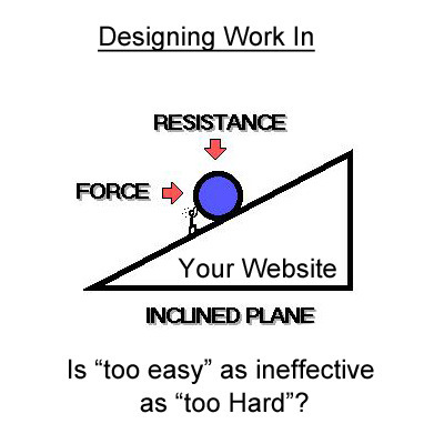
Web Design & "Work" Yes, we now realize, you can make your website too easy. You can also make it too hard. Perceptions of "hard" and "easy" are highly relative judgements. An experts will find things easy the novice find very difficult.
SO one of the most important ideas for designing "work" into a website is finding a way to put people of similar levels of understanding in the same bus. We thinking of all visitors in 3 cohorts or tribes:
* Novice or new to whatever the site is sharing. * Learning and so exposed to and thinking about the subject.
* Expert able to teach the Novice and Learning group.
At first we thought we should cluster members of each of these tribes into their own paths. All novices together, all learners together. After listening to Malcolm Gladwell and refining some of our testing conditions we realize such artificial selection harms rather than helps.
Community Is The Key The key is creation of online community where peer to peer interaction is possible, supported, encouraged and rewarded. We, as website designers, can't combine our Lego blocks in as many variations as possible given the real creativity and engagement of our customers.
The ONLY thing we can do as web designers is clearly communicate OUR creation story, provide access to our Lego-blocks and CURATE the cool creations of our tribe.
The rub comes in at the "provide access to our Lego-blocks" web design stage. If your blocks encourage creativity and just the right amount of work your customers will want to SHOW YOU their creations as we learned from our friends at Haiku Deck.
Our interaction with Haiku Deck helped us create the Content Marketing Triptych:
* Tool that engages the BUILDER in us. * Gallery where tool users share their creations (their work). * Personal Profile (their content on your site).
The missing "magic box" for web designers is knowing WHO to ASK what. These ideas are "live ammunition" for ecommerce merchants. Too much work and you lose money. Too little and you lose the opportunity to win hearts and minds through just the right amount of work on top of the perfect contextually relevant ask.
What IS clear is finding ways to make demands and reward what our customers and advocates do with those demands is a CSF (Critical Success Factor) to winning web design. What are your experiences with building work back into your marketing?
10 Great 2014 web design examples here. My favorite is the Urban Ministries of Durham "Names for Change" site created by McKinney (I think) right in my backyard (live in Durham, NC). Great idea and execution.
* DO LESS and let them DO MORE (them = customers, visitors, advocates_. * GALLERIES ROCK - especially when your gallery is chock a block full of User Generated Content (UGC). * Engagement Rocks - do you have a tool that is fun to use AND promotes positive site heuristics such as time on site, pages viewed, lower bounce? * Every product, idea or website starts about the creators and must become about those who visit and love it. * People love what THEY create and contribute more than what you do. * This means all web design is or will be about collaboration.
We love the simplicity of this little app, but the even COOLER riff came from our confirming email. This is the email that shares the link where my Picasso At The Beach drawing lives (linked from this post http://www.picassohead.com/?id=5290a28#.VBCSuy4Lksk.twitter ) and where this little pitch lived:
"This summer check out Picasso Looks at Degas at the Clark in Williamstown, MA. You won’t want to miss this groundbreaking, Clark-exclusive exhibition that is the first to look at Pablo Picasso’s deep fascination with Edgar Degas.
Wow, cool idea. Create a little art based app and sell related links in the confirmation email. That's brilliant marketing, subtle marketing and the art of web design. Kudos to Picassohead creators RFI Studios, http://www.rfistudios.com.
Facebook’s “like” and “share” buttons are seen 22 billion times a day, making them some of the most-viewed design elements ever created. Margaret Gould Stewa...
How strong is your content marketing strategy? What is SEO, anyway? Read 6 SEO tips and tricks to help you boost the visibility of your web content.
1. Strong Copy Trumps SEO. 2. Do Keyword Research. 3. Share Link Love (i.e. create great content).
Marty Note Interesting to see how How Design explains SEO to graphic designers. I would take a slightly different tack. Let's reframe SEO in ways graphic designers can understand and adapt.
I create content daily and am learning SLOWLY how to make headlines sing and links flow in. As competition for links goes UP with the rising tide of content publishers are the right side of the bell curve where more than average links reside will learn a few tricks from graphic designers such as:
* ARRESTING Images. * Demand hierarchy. * Clear Calls To Action (CTAs). * Headlines that GRAB and HOLD.
Content that doesn't get read doesn't help. The first rule of getting your content read is find an ARRESTING related image you won't get sued to use. Haiku Deck (http://www.haikudeck.com) is one of my favorite visual marketing tools. Need lawsuit free arresting images? Use Haiku Deck.
Demand Hierarchy is keeping demands on your visitors LOW. When I was a Director of Ecommerce we did extensive analysis of our 40+ homepage links and 5 mattered. Vicious 90%/10% rule in links. Key is to lower choice and eliminate the superfluous.
CTAs don't have to be "buy now" anymore. We love asking a question with the link between the present page and the answer. Want To Be A Great Internet Marketer? Highlight and underline that sentence and it will get clicked because it is an IMPLIED CTA.
This doesn't mean we are above a good "Learn More", but too many "old style" CTAs can get boring and lose their punch.
Finally your HEADLINE or subheads matter. Headlines should set a hook. Subheads should organize the answer so readers can scan and skip sections. I try to live by the 7 word rule.
I read this rule about roadside billboards. Billboard creators limit their copy to 7 words because who can read more zipping buy at 60 mph. We all zip by at 100 mph on the web these days so short, punchy headlines that align with your arresting image and plant a hook work best.
We like KEYWORDS, Brands and questions in headlines too. Questions create curiosity. Keywords create scenttrail and brands create comfort and "like me" feelings of trust and security.
What do waiting tables and UX design have in common? One UX director weighs in on how we can learn how to handle design problems from the physical world.
Waiting tables is great training for many professions. Waiting, or serving people, teaches many important skills such as listening, being nice and being careful. In this excellent How Design post a UX (User Experience) designer talks about lessons learned waiting tables that help him design better websites.
Marty Note Food Websites are great places to learn key elements of web design such as:
* Sensual and romantic images. * Great mouth watering headlines. * Visual marketing storytelling.
I like http://www.whitmansnyc.com/ and Soup Peddler. Whitmans BRANDS a hamburger beautifully. Food is HARD to shoot. Food can easily look TERRIBLE in a picture especially a picture with limited web resolution. Whitmans solves that problem creatively with a thin transparent layer between us and the burger. Well done!
Soup Peddler, in the example shown, is the ONLY site that includes PEOPLE. Foodies have "widget-itis" worse than techies. Widget don't sell as well as PEOPLE.
The SINGLE possible exception to that rule might be a foodie site, the one in 10M foodie sites that creates INCLUSION with their food. Whitman's is close since a hamburger is a universal thing, but the site remains a tad sterile due to lack of community.
If you scroll down below Whatman's hero you will see another pet peeve. WHY do web designers EVER let someone show an interior image WITHOUT PEOPLE.
Yes the lines are clean and the emptiness is sort of beautiful, but think about the NONVERBAL communication sent by an empty room. How long do you stay in an empty room when there is a party going on next door?
Food Heroes So, foodie sites need people. There are several ways I would work people into the equation so the story being told feels more inclusive and fun:
* Chef as Hero. * People with SMILES looking UP at chef or waitstaff. * Fan as hero (with story).
Food heroes (largest image on the page = hero) need to be QUIET and CONFIDENT. Too much NOISE or any WEAKNESS and we don't trust a website (or eat their food).
The CHEF is a hero that WORKS for any restaurant. Seeing Wolfgang Puck creates a brand. Seeing a chef wearing whites with a slightly stained towel over his (or her) shoulder says, "My food is so amazing you haven't LIVED until you've eaten here".
Instead of EMPTY rooms the picture is smiling, well dressed people looking up at the Chef or waitstaff listening in rapt attention. Better if dishes are gone b/c signals meal is over and everyone is still smiling (a tacit endorsement).
DON'T STAGE THIS PHOTO. Shoot it when a group is in for dinner (with permission and releases). Share the event and caption the photo. NEVER stage actors in food websites. Canned art + food says NO TRUST and DANGEROUS.
If your fans are MODEL good looking TELL THE STORY of the event that prompted the picture. What was being celebrated, shared or discussed. If the group is a nonprofit your restaurant supports MORE THE BETTER as you can tell 2 stories in one (risky but worth it).
Finally, you can feature a fan in your hero, BUT same "no canned or artificial" photos here either. ALSO, click me through to a page of pictures of other fans and stories (why they wanted to share their picture and story about FOOD i.e. make sure people know they aren't related :).
Food is SO individual, what I like and what you like can be very different, so think about the 5 stories you need to tell that "star" your content (i.e. tells the stories that cover the rainbow of your food's tribes).
One story shares love of sauces and sweet. Another story tells the visual romance story. Another might discuss meeting the chef and getting to know the "people behind the scenes".
Sharing different and strategically savvy stories creates the "like me" connection with the different tribes your food, restaurant and content should attract. Every restaurant has a passion. Share that passion.
Also share the reception the food creates, the passion others have for the food. Tell those stories in those ways and your foodie (or other) website wins hearts, minds and loyalty.
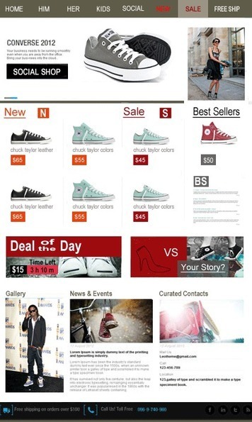
Toward A New Ecommerce The new #ecommerce is beginning to emerge. Curagami, our Durham, NC based startup, is working hard to create new community, merchandising and social media tools to bridge the gap between content and commerce.
This post outlines things every commerce site needs to show quickly such as:
* Is this site SHOPPING or INFORMATION (getting harder and harder to know this right off so want to make SHOPPING obvious). * Where's my easy to get free shipping? * Quickly find expected merchandising such as NEW, SALE and BEST SELLERS. * Are they (the website) open to MY (customer) input (one reason why the sneakers vs. high heels image asks for a story share).
Explain how I used the 8 tips I learned from Vogue (http://shar.es/1nlE2l on http://www.haikudeck.com). Things like the surprise juxtaposition of a women in chuck taylors and picking a fight to support #movementmarkeing are right out of the Vogue playbook.
Yes a little knowledge is a dangerous thing and most of our web designers at http://www.Curagami.com wouldn't know CMYK if it jumped up and smacked 'em, but knowing these other 14 "web design buzz words" is a good idea. Since we hang out at a least one hipster web design party a week we can fit right in (lol). M
This is the most shared, visited and viewed post on Design Revolution. December is always HOT for trend predictions. Interesting to look over December's predictions to see if they are coming true:
1 & 2 Diverse Women & Hands Dirty Dads Gladly we are seeing both of these trends. Loved Dove's What Dad's Really Do campaign http://adweek.it/1kYVCwI
3. Beards Yes beards on on the rise thanks to sports stars and Hollywood.
4. Lens Flare We are seeing LESS stock art (thankfully) and more "real" photos and videos. Marketers are starting to realize sharing warts and all helps create authenticity and a sense of immediacy.
5. Human as Robot Not sure this trend is happening any more or less than it already was.
6. Cameras we wear I think Google Glass is sucking up much of this "wearable" trend at the moment, but GoPro hasn't done badly (lol).
7. Multi-racial Models (was STRONG going into the year, stronger now).
8. World Cup Was huge and America STILL doesn't get soccer :).
9. Witches and bye bye vampires (end of True Blood signals this trend is right on and about time).
10. Handcrafted Vectors This is another "break down the perfection" trend and seeing it too (like the lens flare or nonperfect but more real photo).
11. Instagrammy FOODies - this is BLOWING UP almost as fast as "selfies".
12. Experiences over Things = Team Curagami (http://www.curagami.com ) is placing a HUGE bet on this one as we see the future of ecommerce being about the quality of interactions instead of their quantity.
13. Creative Collaboration - another one team Curagmai is betting on HUGE and we are seeing demand grow. Think about your life. I like to say I don't "passively consume anything" anymore. If I can't bend, shape and spin the content I go somewhere else. If the content isn't fascinating, cool and fun I go somewhere else. Curagami makes this "ambassador" interaction easy so your customers can advocate and share your brand.
TRIBES are the key going forward.
I would say IStock got way more RIGHT than wrong with their December design predictions. What do you think?
Marketing in this decade not only needs but REQUIRES the ability to think outside of the box! Look at some of the trends appearing in a marketing campaign near you in the next year!
Designing For Contests I love home Homes.com doesn't kid around. They create CONTESTS not CONTENT. Why? Because contests have the added value of helping to create community too.
Erica Campbell Byrum How To Create Contests Video (start at 1:41) http://sco.lt/6myquH VIDEO
Contest and games are FAVORITE engagement tactics because:
* They work (more new people come to play and share their playing). * They are inexpensive WINNING is the main thing not the prizes. * Contests have a LONG shelf life. * Contests help unearth power Contributors and Social Supporters.
That last bullet speaks to the Gladwellian "Mavens, Salespeople and Connectors" tribes within your visitors. When you create a contest you will be visited by "contest trolls" and Ms. Byrum discusses how to deal with them in her video (link above).
This link is to Homes.com's Contest Page. This is a "Contest Splash" Page that shares the many simultaneous contests they run. I would add an ask for their "Blogger Ambassadors Program" too. They use contests to unearth their bloggers, but why not cut out the middle man and ask for those Ambassadors straight out?
Doesn't hurt to do both and I like have a page that explains the elite nature of our "buzz team". Don't think I'm saying Homes.com is missing it. They clearly GET the value of contests and you should STEAL the "ditch digging" design they do to "Splash Page" their contests.
Highly recommend watching Ms. Byrum too as her video is nothing if not comprehensive http://sco.lt/6myquH
To get content containing either thought or leadership enter:
To get content containing both thought and leadership enter:
To get content containing the expression thought leadership enter:
You can enter several keywords and you can refine them whenever you want. Our suggestion engine uses more signals but entering a few keywords here will rapidly give you great content to curate.



 Your new post is loading...
 Scoop.it!
























Dla inspiracji - 10 ciekawych projektow stron tzw. "flat". Najnowszy trend wsrod stron www zbierajacy coraz wieksza rzesze fanow.