


Must Design
79.5K views |
+3 today
 Your new post is loading...
 Scoop.it!
Martin (Marty) Smith's insight:
One of the first books I read about website design, this would have been in 1998 or so, said use red, black and white because nothing looks better. These templates demonstrate how powerful these three colors can be all by themselves. 
Scoop.it!

Creative ecommerce merchants such as L.L.Bean use the weather and traditions to increase website conversions. The 2012 Top 10 Holiday Website Designs.
Scoop.it!

This is one of the largest collections of fresh WordPress magazine themes
Martin (Marty) Smith's insight:
My friend Phil Buckley @1918 shared these cool magazine WP themes. Going to move ScentTrail Marketing to a look like the one above.

Jeff Domansky's curator insight,
December 20, 2012 2:27 PM
Some good WordPress themes here. The most important thing is many are mobile and tablet optimized. 
Martin (Marty) Smith's comment,
December 20, 2012 8:11 PM
Jeff makes a great point I walked right by. Thanks Jeff. Marty
Scoop.it!

Ever thought of trying 25 Simple yet Graceful Website Designs. Experience the wonders of simplicity and uniqueness allowing for easy navigation and faster loading time.
Martin (Marty) Smith's insight:
Graceful and simple are hard to do online. Any team's mission creep is naturally toward clutter and busy. Simple and graceful takes work and a, "Just say NO," leader (lol).
Scoop.it!

There have been hundreds of incredible web design agencies founded over the past few decades. Much of our modern world is powered by the Int
Martin (Marty) Smith's insight:
Stunning is a tough keyword. What is stunning may vary. I agree with abotu a third of these designs falling safely into the "stunning" territory.
Scoop.it!

Although we sang the praises of colourful web design a week or two ago, we are equally fans of sparse colour schemes that use lashings of black and white throughout their design.
Martin (Marty) Smith's insight:
Sometimes, if you have an amazing design team, you can strip a website bare to make it standout. In a world awash in color sometimes black and white can be a way to differentiate, to stand out.
Scoop.it!

Modern web technologies are pushing the boundaries of creativity and today we want to share a little collection of modern websites with some great effects with you. From hover to scroll, there are many ways to surprise and engage the visitor. Via THE OFFICIAL ANDREASCY
Martin (Marty) Smith's insight:
Such cool stuff here from Andreas. Love the sense of anything is poosible and we don't have to make rectangles inside of other rectangles. Well done.
Scoop.it!

Ever thought of trying 25 Simple yet Graceful Website Designs. Experience the wonders of simplicity and uniqueness allowing for easy navigation and faster loading time.
Martin (Marty) Smith's insight:
Love these simple, graceful yet muscular website designs.
Scoop.it!
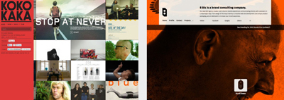
You probably won't have a better chance to show off all your potential if it's not by designing a website for your own agency or web studio. It's time to push all those ideas and concepts forward. 95 inspiring Websites of Web Design Agencies.
Martin (Marty) Smith's insight:
When WE are the client what do we create? Here are 95 great website designs created by web design agencies as self promotion.
Scoop.it!
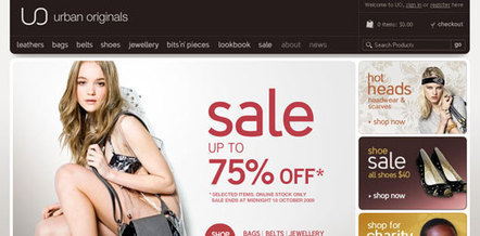
The e-commerce sector has long been known to develop websites that did not put much focus on design. They tend to get very cluttered and bogged down, consistently suffering from not being user friendly.
Martin (Marty) Smith's insight:
Agree with most of these.
Scoop.it!

Creativity comes in many shapes, sizes and colors - and it just so happens that today we're looking at some of the amazing work people do with paper textures in...
Martin (Marty) Smith's insight:
It is trick to communicate texture online, so doing so can create differentiation. Here are 35 website designs who use texture to create differentiation and inspiration.
Scoop.it!
Martin (Marty) Smith's insight:
I like this post for its examples of great B2B website designs and for the excellent tips on how to create a great B2B website design. Here is my favorite point: Social networking ... [is now] a work tool,” Pernice said. “Even the average person is using "share' and "forward to a friend' links on websites. Whether b2b or b-to-c, it's pretty much expected and should be a design staple.”
|
Scoop.it!

The Parallax effect or parallax scrolling in web design is the technique that features layered images that move around the website in different speeds/perspectives creating a nice and interesting 3D illusion. We gathered some examples of websites using the parallax effect to inspire you. This effect certainly makes scrolling around websites an interesting experience.
Martin (Marty) Smith's insight:
Some of the amazingly talented designers at Atlantic BT (http://www.Atlanticbt.com ) can create amazing parallax scrolling effects. Would love to A/B test to confirm the higher levels of engagment translate into greater conversion.
Scoop.it!

Web Design Gallery / Best Design Awards - updated regularly with new designs, Wordpress Themes and a design blog.
Martin (Marty) Smith's insight:
Cool website design examples here to steal from :).
Scoop.it!

No one tells a better story than nonprofits and these 19 nonprofit websites combine story, website design and great causes to inspire.
Martin (Marty) Smith's insight:
They forgot a few of my favorites such as RobinHood.org and City of Hope cancer center, but these 19 nonprofit website designs are great and there is something to be learned from each.
Scoop.it!
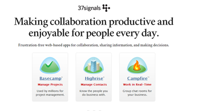
The web design world seems to be changing rapidly as designers push the boundaries on what can be done on the web. There are a lot of inspirational website lists out there so I wanted this one to be different.
Martin (Marty) Smith's insight:
37 Signals does rock and there are a handful of rockers in this group of "fantastic" website design.
Scoop.it!
Creative ecommerce merchants such as L.L. Bean use the weather and traditions to increase website conversions. The 2012 Top 10 Holiday Website Designs.
Martin (Marty) Smith's insight:
Some Big name Ecommerce websites decided NOT to decorate for Christmas this years. For those major players we award our first ever Scrooge Awards.
Scoop.it!

A marketer walks into a meeting, ready to see the newest designs for their client’s site. The new design is beautiful. It makes everyone weep with joy. It’s also totally devoid of text.
Martin (Marty) Smith's insight:
Love some of these web designs create to support content ideas.
Scoop.it!
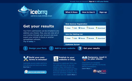
Another monday has come and here we are, ready to inspire you with our web design related lists! Today is all about blue... a color that personally, I love. A color that represents the oceans and the sky.
Martin (Marty) Smith's insight:
Blues is seductive, smooth and calming especially the way these great web designers use it.
Scoop.it!

Red is such a powerful colour, it provides emotion and a great emphasis on detail. With a dark, grey colour scheme - red can be used to emphasis text, navigation menu and more.
Martin (Marty) Smith's insight:
Red is a favorite color, but online a little red goes a long way. Red is aggressive, attention getting and stress producing. On the other hand several of these websites show how to use red to conquer, to distinguish and to ROCK.
Scoop.it!

It's quite easy to get stuck in creativity blocks, but it's damn hard to get out of them. Particularly if you are out of time and don't want to compromise your professional principles selecting the first "quick-n-dirty" solution you can think of.
Martin (Marty) Smith's insight:
Refined, elegant and classy website designs from Smashing Magazine.
Scoop.it!

Robin Good: If you are looking for the best creative design inspiration around and a great example of content curation at work you may want to check out Web Design Served and the other sites which are part of the Behance Served Sites network. The site showcases "curated work from leading creatives" from Behance and it is the fruit of a small team of human curators which you can get to know here: http://curation.masternewmedia.org/p/3524381153/why-curation-is-so-important-for-popular-content-sharing-sites-the-behance-story The more than a dozen sites in the "curated" Behance network cover topics ranging from Motion Graphics, to Web Design, Illustration, App Design, Industrial Design and Digital Art. Great inspiration. Great curation work. 8/10 Check them out: http://www.webdesignserved.com/ http://www.industrialdesignserved.com/ http://www.brandingserved.com/ http://www.illustrationserved.com/ http://www.appdesignserved.co/ Via Robin Good
Martin (Marty) Smith's insight:
Great time saver vis @RobinGood since I look for inspiration all the time and usually end up picking through Google.
Scoop.it!

Creative website can say a lot about the company or person it represents. Especially if it's for anyone involved with design.
Martin (Marty) Smith's insight:
Dreamy, floating and surreal these website designs inspire.
Scoop.it!

If you spend much time browsing through web design galleries you'll notice certain trends in design that vary from time-to-time. Right now, there are a number of sites that effectively utilize illustration and other types of very artistic design.
Martin (Marty) Smith's insight:
It is hard for most artists I know to restrain their artistic talent online. You see examples of this issue in some of these 25 highly artistic website designs.
|







As much as I love the smooth scroll in concept its SEO implications feel immense. Google, as a friend so accurately told me recently, indexes web PAGES. One thing that makes your website more valuable to Google is page spread.
Amazon has 1.4B pages (give or take) indexed. How can a 1 page smooth scroll site compete with that? Not sure it can, but interesting to try. What is clear is competing in the same way as Amazon built their now enviable content archive and partner network is impossible. That ship has sailed.
The only option is disruption.