


Click here to edit the content...

 Your new post is loading...
 Scoop.it! 
No comment yet.
Sign up to comment
Scoop.it!

Responsive website design as an approach is still quite new and it can be difficult to imagine the many new possibilities it offers. Here is some great inspiration!

Martin (Marty) Smith's comment,
November 28, 2012 10:13 AM
Wow Sam like the way you modified the Scoop.it template. Very nice. Marty
Scoop.it!

In this article we'll describe the most common trends in website designs for mobile applications store. Do not take this advice as a basis and unthinkingly use them at your website.
Scoop.it!
|

|
Scooped by
Martin (Marty) Smith
November 20, 2012 10:06 PM
|
Scoop.it!

Minimalism has been a popular website design style for years. It has so many benefits; minimalist sites load faster, take fewer server resources, and are often faster to develop than more graphically complicated designs.
Marty Note
Love these clean, clear lines and a handful of these sites such as Feze would even convert well. Clean and simple is the hardest design to create, so steal from these.
|
|
Scooped by
Martin (Marty) Smith
November 16, 2012 10:43 PM
|
Scoop.it!

In this collection, you’ll find some of the best dark-themed web designs. This is the second part of the Beautiful Web Designs series that starts off at 30 Beautifully Blue Web Designs.
Marty Note
I like white websites with color as accent, but these 50 beautiful examples of dark websites might get me to see the light or dark or something (lol).
|
|
Scooped by
Martin (Marty) Smith
November 6, 2012 9:41 PM
|
Scoop.it!

You can’t imagine your life nowadays without the internet. We all spend hours and hours doing various things, like work, research, entertainment.
Marty Note
Sometimes it is good to look at a group of websites. This link includes 35 examples of rock band websites. The convention is clear. Rock band staged photo looking out directly at the camera, lots of texture and dark colors in the designs. Here is how any one of these sites could increase conversion 3x or 4x:
* Lighten Up - all that dark texture and color lowers conversion.
* Calls To Actions - few CTA's (BUTTONS) hurt conversion.
* Scream Less - visitors are fans, so scream less convert more.
* FANS - where are the fans (testimonials, games, contests).
* Games & Mobile - scream to download the app.
Of these 35 designs Metallica and Incubus would convert the best. I understand branding must be done, but this much screaming branding is obsessive and damaging to conversion. Sometimes the best brand strategy is to make it easy for fans or supporters to JOIN and CONTRIBUTE.
Everyone of these band sites feels like a lecture NOT a conversation. Funny concerts aren't like this. Concerts are a give and take between the crowd's energy and the band's performance one contributing to the other. Web, at its best, works that way too but not here so much.
|
|
Scooped by
Martin (Marty) Smith
November 4, 2012 10:01 AM
|
Scoop.it!

Today I have compiled a list of amazing web design interfaces from the extremely popular design website, DeviantArt. These designs are seriously inspirational. They all have a special something added to them that makes them clean and stand out.
|
|
Scooped by
Martin (Marty) Smith
November 2, 2012 9:41 AM
|
Scoop.it!

Marty Note
Great article on 3 easy to implement ideas to increase your website's conversion. Examples of websites I love that use these conversion ideas include:
* REI.com
* Schwans.com
* LandsEnd.com
* BassPro.com
* BlueNile.com
|
|
Scooped by
Martin (Marty) Smith
November 1, 2012 9:55 AM
|
Scoop.it!

Marty Note
Great article sharing similarities and differences in the approach to ecommerce used by the Top 10 converting websites. When you look at these websites with your, "I want beautiful," glasses on you may be depressed. Don't be, learn from the tactics these high converting sites use such as remarketing. In fact, steal them blind since better conversion is the next web revolution.
|
|
Scooped by
Martin (Marty) Smith
October 30, 2012 3:27 AM
|
Scoop.it!

Marty Note
Creating a sense of texture is not easy online. We want to engage the world with all five senses. The problem with the web is it is mostly visual. The web can become a museum. We can look but we can't touch. Using textures can promote a tactile sense, a sense of touch.
Language is the other way to promote a sense of touch. Language alone can seem out of place or like you are trying to hard. Language needs to be backed up with visual support and these 30 examples of creating texture provide new visual dimensions to support copy and branding online.
|
|
Rescooped by
Martin (Marty) Smith
from Must Design
October 27, 2012 9:53 AM
|
Scoop.it!
Marty Note
Reviewing Analytics this post earns a Revolutionary Most Popular award.
This is a pair of Levi's®, buttons and rivets and pockets and cuffs, and the thread that holds it together. When the road gets rough and the sky gets jumpy a...
Marty Note
Woe is me to the great American brand that was Levis. Levis was more than jeans. Levis was America, apple pie, hamburgers and home. Levis became exportable culture. You could go to Russia with a suitcase of jeans and come home with a pile of cash. Then Brooke Shields didn't let anything come between her and her Calvin Klein jeans. Jeans moved from working class hero to downtown vogue Sheik.
Q: How does a brand recover cool? A: You can't. Once cool leaves the building it runs and you never catch it in the same way again. Power to the marketing team at Levis. Instead of a miserable grubbing beg they broke their own mold and spoke UP to us. First they used Walt Whitman and now they channel Patti Smith.
I am a Smith fan. There is a controversy about how dare Levis channel the singer/songwriter and poet without paying her. People who say that don't really know Patti Smith. Patti wasn't going to sell her work to Levis in this lifetime. Patti was married to Robert Mapplethorpe and she huddled on cold bare floors with little to eat, drink or wear in sacrifice to her art.
That Patti is experiencing a final act uplift in interest, praise and homage is a tiny spark of HOPE in the universe of Justin Bieber (no offense meant). Her estate might sell Patti's work to Levis, but Patti's appeal could be moot by then (though I believe Smith's tone poems will have staying power).
What about the reaction that these ads are trite or hamfisted? I say that too is nonsense. These ads are expressions of the hero with a thousand faces, Joseph Campbell's famous work. Campbell believed all cultures are guided by a handful of similar myths. A hero goes on a journey, discovers enlightenment and returns to change us. These ads are expressions of an ancient well, one that never goes dry.
Here is the thing that those outraged for Patti can take to heart. Patti is being talked about more now than before the ad. Patti will be paid in renewed interest and people wanting to know what all the controversy is about. Since this is the only way to channel Levis money to Patti I am all for it. We support ART in strange ways in this country. Best to chalk this latest example up to our American inability to be seen as listening to or supporting poetry. Music is all good, but poetry is unacceptable.
What about Levis stealing Patti's style? Nonsense, the ad is as much homage as outright theft and, as Picasso said, "Great artists steal, bad artists imitate." There is no stealing from Patti. She was and is much to distinct to ever be stolen from. If these "tributes" introduce an important voice to a new generation because of wearing some denim then I raise my gloved fist into the air in support of an American brand in the hopes they recover their cool.
|
|
Scooped by
Martin (Marty) Smith
October 6, 2012 10:32 AM
|
Scoop.it!

Marty Note
Here is another cool Wordpress Theme I Iike for ScentTrail Marketing's facelift and content tuck. I could see categories in that area directly below the hero and breaking content below that.
Working on design all weekend, so if you have a favorite content website or blog look and feel please share so I can include in my search. Have any good resources for WordPress themes? Please shre those too.
|
|
Scooped by
Martin (Marty) Smith
November 28, 2012 10:11 AM
|
Scoop.it!

This article gives an overview of the Best Wordpress Ecommerce themes.
Marty Note
There is a perception that WordPress is a CMS, a Content Management System. It is, but ecommerce is just a particular kind of content and WordPress can rock ecommerce. Data integration into your order processing and accounting systems may take some plumbing, but nothing a slightly above average coder/plumber hasn't done a thousand times.
The nice thing about wrapping a store into WP is you get what is arguably the best CMS too. If you use SalesForce or other CRM that is another data integraiton issue you will need to budget for, but on a scale of 1 to 10 in difficulty adding a Wordpress Store isn't higher than a 5 especially if you like one of these themes.
Themes are easier than coding from scratch. These themes have almost every variation I would want as a former Ecommerce Director so find one you like and plug and play a store with a little plumbing.
|
|
Scooped by
Martin (Marty) Smith
November 25, 2012 5:43 PM
|
Scoop.it!

There's a saying that nobody's going to do the work better than yourself. So who else might have the best looking, supernaturally coded and most outstanding websites than the designers themselves?
Marty Note
Some great designers here and I love the variations on the portfolio theme + tips for how to create a great portfolio presentation.
|
|
Scooped by
Martin (Marty) Smith
November 22, 2012 10:05 PM
|
Scoop.it!

Toxel.com - Design, Inspiration and Technology Blog...
Marty Note
Like the way some of these designs are playing with pespective such as:
http://www.vyniknite.sk
|
|
Scooped by
Martin (Marty) Smith
November 22, 2012 1:06 AM
|
Scoop.it!
Marty Note
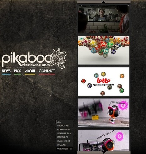
Have you seen those commercials promising to build a website, host it and get it "listed" with search engines for $19.95 a month? Love those ads.
I have 30,000,000 reasons why I know they are BS. That is the amount of money my excellent fighter pilot Internet marketers raked from the Internet over seven years I was Director of Ecommerce. It was NEVER easy, uncompetitive or a tall cold drink in the shade.
This time of year we didn't sleep much and the rest of the year we were setting up for this time of year. No rest for the weary and no website that matters for $19.95 UNLESS you are Oprah or Penn or Teller or a football player or Justin Bieber.
You see it right? If you have a SUBSTANTIAL engine developed offline in some other way or media you can live with a one page website built to convert the heck out of your efforts elsewhere. Some mobile plays MAY be able to get by with so little too.
The problem with the mobile boys is they ONLY think mobile and they have the same problem as outlined above. The market has to START somewhere. The market you start has to be NURTURED somewhere. Without content, community and campaigns you can't capture, arm and convert the brand advocates needed to scale.
Throw one of these one page sites in front of the bulls my old marketing team could get to run and it would be swept from the field into permanent irrelevance, so use this idea ONLY when you are just converting traffic already primed by some other effort.
|
|
Scooped by
Martin (Marty) Smith
November 19, 2012 2:40 PM
|
Scoop.it!

Here is a showcase of 30 dark designs that feature as diverse of a selection as possible for your benefit.
Marty Note
Here are 30 more exmaples of the dark arts, how to use dark backgrounds and foregrounds in web design to make foreground elements really fly off the page.
See also 50 Dark Webiste Designs Inspire: http://www.scoop.it/t/design-revolution/p/3367426513/50-beautifully-dark-web-designs-inspire
|
|
Scooped by
Martin (Marty) Smith
November 9, 2012 8:17 PM
|
Scoop.it!

This is a really subjective topic, however, we have chosen some of our favorite layouts, color combinations and aesthetically pleasing designs. Pin your favorite!
|
|
Scooped by
Martin (Marty) Smith
November 5, 2012 8:44 PM
|
Scoop.it!

When it comes to the web industry (or computer industry for that matter) men generally rule the roost.
Marty Note
I have 3 favorites here, but want this Scoop to cook for a bit before I weigh in and ruin everything (lol). What are your 3 favorite designers from these leading designers?
|
|
Scooped by
Martin (Marty) Smith
November 2, 2012 11:56 PM
|
Scoop.it!

A collection of beautiful web design illustrations. Examples range from character illustrations to fully illustrated backgrounds, and more.
Marty Note
There are 3 of these examples that work for me from a beauty and will convert standpoint. The problem with illustration is a little goes a long way, so an entire website of illustration can wear out illustration's welcome.
|
|
Scooped by
Martin (Marty) Smith
November 2, 2012 7:32 AM
|
Scoop.it!
Marty Note
Websites start cold and off putting. We buy from people we trust and who entertain and share. Entertainment has and will always be a form of seduction. How do you move a cold medium such as a website to the warmth necessary to entertain and seduce? Great tips in this slideshare.
|
|
Scooped by
Martin (Marty) Smith
October 30, 2012 11:31 PM
|
Scoop.it!
Marty Note
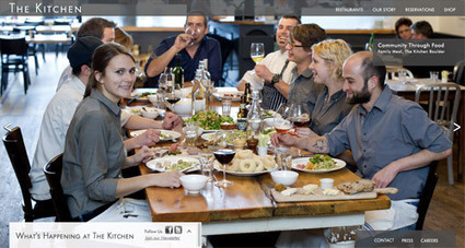
I love beautiful websites. They seduce, charm, hypnotize and rarely convert worth a hoot. Conversion is about clear signals and obvious paths (read Krug Don't Make Me Think). I agree mystery plays a role, but every website element must pass the five second rule.
If you can't understand what to do in five seconds neither can your customers and you have infinitely more patience than any customer. Conventions such as large heroes and four columns of products stacked up one on another exist because they work. A "hero" is the largest image on a webpage.
These examples make for beautiful films, but they sacrifice conversion for beauty. Some websites can afford to sacrifice cash for beauty most want both. Beauty is important. My first website, was created in 1999 (you can see it here: http://scenttrail.blogspot.com/2010/02/martins-first-web-site.html ).
That site created all those years ago could look rougher and more "garage band" than any website I would create today or than the large ecommerce site my team and I managed for seven years when I was a Director of Ecommerce. We had numbers we had to beat every day or seek employment elsewhere :).
Design and beauty influence trust and trust influences conversion. These 20 examples create a boatload of trust, but frustrate a visitor's desire to invest that trust in action. Don't do that is the best advice I can give you (lol). Don't do that UNLESS your site is art and not commerce.
|
|
Scooped by
Martin (Marty) Smith
October 28, 2012 9:08 AM
|
Scoop.it!

Marty Note
I am looking at a lot of sites right now to help refine my ScentTrail Marketing blog. Color is tough online. A little color can go a LONG way. Websites start cold. Our job as Internet marketers is to warm them up. Here is how I like to warm up a website's design:
* Color.
* Images (with people).
* Copy (especially teaser headlines).
* Clear navigation.
* Tagging the brand (helps create a sense of being in right place).
* Clear and omnipresent contact information.
* Testimonials (quotes from others that aren't ME or US lol).
* Heroes that match the seasons (can be tough if you are a global brand).
The last one is worth discussing. Time doesn't really exist online. Lack of a sense of time is what makes websites feel like Vegas where there are no clocks; weather and you rarely go out (lol). One way you connect to emotions and feeling is to feel like Christmas when it is Christmas.
If you are a global brand a picture of snow and trees turning may not work. Instead use images that address the IDEA of fall such as people in sweaters or displace your heroes (largest images on the page) to a location that suggest fall (mountains). You can also create interesting juxtapositions - winter in the desert.
The last example uses language to connect to time. Words with time IN THEM such as Fall, Winter, Spring and Summer are POWERFUL warming words when used in connection with the calendar.

|
Suggested by
Pasha Shmit
October 7, 2012 7:54 AM
|
Scoop.it!

Left menu Wordpress theme will fit to any portfolio or blog. As a rule, such themes have a left menu and a picture (or a collection of photos) on the right side.
Marty Note
Great share from Pasha Shmit. I prefer left menu stacks for SEO and ease of use reasons. Thanks.






Here are 50 website designs that run the gamut from grunge to corporate and back again.