Must Design
79.5K views | +3 today
Must Design
Design Is Revolutionary
Your new post is loading...
Rescooped by Martin (Marty) Smith from Design, Science and Technology
March 5, 2013 11:55 PM
Scoop.it!

Design Thinking ROCKS

Design Thinking ROCKS | Must Design | Scoop.it
When we are given a problem to solve, we spend time thinking about the problem and reframe the issue and try many things in our head to move towards a solution. Design thinking actually takes the problem to the customer ...

Via A. Kosuke, Antonios Bouris
Martin (Marty) Smith's insight:

Design thinking and IDEO rocks. 

No comment yet.
Scooped by Martin (Marty) Smith
February 28, 2013 11:55 PM
Scoop.it!

The SEO of Responsive Web Design

The SEO of Responsive Web Design | Must Design | Scoop.it
Will Critchlow announced back in November that Distilled's blog was updated with a new responsive design, but it occurred to me recently that we never went into the specifics of why responsive web design is so great.
Martin (Marty) Smith's insight:

Listening to the experts my friend Phil Buckley (@1918) lined up via Skype for his SEORaleigh session on "Technical SEO" I wrote this note:

RESPONSIVE Design Done Wrong KILLS SEO.

Didn't know how many new SEO pitfalls responsive brings. It figures, as much as Google says they want responsive the nature of a spider crawl is it must have SOMETHING to crawl.

The many hidden SEO traps of responsive design got me to write another large note:

RESPONSIVE projects MUST have a SEO Champion.

The "SEO Champion" is there for one reason, to protect the content's ability to get into a search engine. Without such a watchdog Responsive could crater a website existing rankings and make it hard to get new ones.

Content must work for VISITORS and SPIDERS was the last note I made.

Find the handout from this session here:

No comment yet.
Scooped by Martin (Marty) Smith
February 25, 2013 12:12 PM
Scoop.it!

Brainstorm Alone Here's How From How

Brainstorm Alone Here's How From How | Must Design | Scoop.it
Brainstorming alone can be a lonely and listless experience. But not to worry. Here are nine steps to keep solo brainstorming for your design projects fresh and productive—even if you're all alone.
Martin (Marty) Smith's insight:

Great post from the design magazine HOW on ways to do something that seems impossible - brainstorm alone. Much of what How describes in this excellent post is something I think of as "thought experiments", but keeping our minds flexible and open may be the most important "exercise" we do these days. 

No comment yet.
Scooped by Martin (Marty) Smith
February 16, 2013 9:25 AM
Scoop.it!

60 Less Is More Minimal Website Designs Inspire

60 Less Is More Minimal Website Designs Inspire | Must Design | Scoop.it
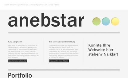
Minimalist design means using simple and basic elements only in the design. This article shares 60+ beautiful web designs that showcase minimalism in web design.
Martin (Marty) Smith's insight:

Minimal is so hard in website design. Mission creep is inevitable. We layer on more and more. Stopping that train is impossible or maybe not as these 60 website designs demonstrate. 

No comment yet.
Scooped by Martin (Marty) Smith
February 8, 2013 7:51 PM
Scoop.it!

Why GRUNGE and BEAUTIFUL Is NOT An Oxymoron: 10 Beautiful Grunge WordPress Themes

Why GRUNGE and BEAUTIFUL Is NOT An Oxymoron: 10 Beautiful Grunge WordPress Themes | Must Design | Scoop.it
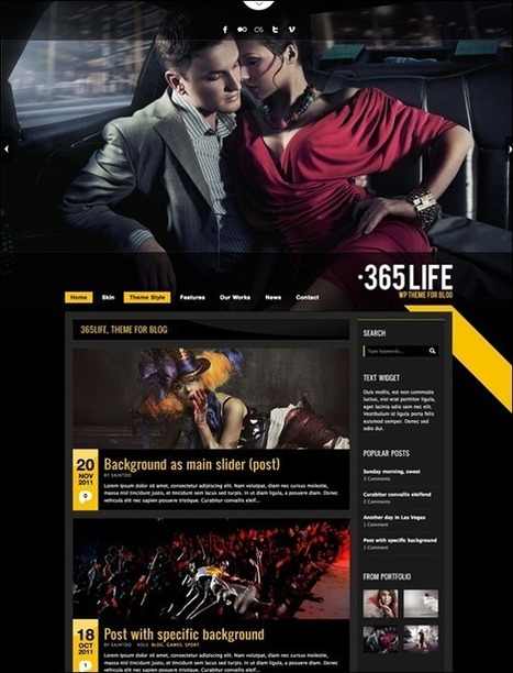
WordPress themes are very popular. While minimalist & clean themes are high in demand, there are also other types of themes which are less popular but still beautiful, creative and original. Here
Martin (Marty) Smith's insight:

I am NOT a big fan of black on a website, but the color black does make images pop off the screen.

No comment yet.
Scooped by Martin (Marty) Smith
January 21, 2013 8:51 AM
Scoop.it!

The Difference Between Good and Bad Website Design Isn't Complicated [NYT + Marty Note]

The Difference Between Good and Bad Website Design Isn't Complicated  [NYT + Marty Note] | Must Design | Scoop.it
Well-crafted sites need to fulfill their functions efficiently and engagingly.
Martin (Marty) Smith's insight:

I like this article's approach. Alice Rawsthorn makes understanding what good website design is easy. Good web design makes finding information easy. Love this idea, 

"...the most important purpose of most Web sites is to enable us to access information, helping us to find it effortlessly is essential."

As website designers if we were to put that sentence on a wall and check every new design element against it we would be better off. We don't check ideas against the real reason we created the website in the first place, Rawsthorn speculates, because:

* Technologyitis - love new tech without understanding it.

* Lack of imagination or too much imagination.

* Designers easily get lost in a "Curse of Knowledge".

This last bullet is true to my 7 years as a Director of Ecommerce. We looked at our website for hours every day. Our ability to "see" it was zero. What we thought was "easy" could be hard. What we thought was "hard" could be easy. We had, as the Heath brothers describe in their excellent book Made To Stick, the curse of knowledge.  

My team created an important rule. We called it the "Because Rule". Our because rule stated that BECAUSE you CAN do something doesn't mean it is the RIGHT thing to do. RIGHT = helping people find our content and intent (what we wanted them to do) faster, with less effort and with more fun. 

Here's the rub of our Because rule. Every website communicates in overt (click this next) and covert (we are easy to work because you can find what you want) ways. Our "Because Rule" like this article from Alice helped check the inevitable mission creep every Internet marketing team experiences. 

What is your "Because Rule"? How do you craft great website design? 

Miriam Murphy's comment, February 18, 2013 1:36 PM
I think you've got some good points (as does Rawsthorn), but something about her approach rankled me a bit. Web design isn't like architecture; it's much younger and has had to grow much faster. While we may not like to admit it, I think that web design is still riding that very chaotic wave of the early years of the Internet; we may have streamline what we do and how it should look, but we're only just pinpointing that and examining further strategies for a long-run approach. Frog on Top has a good criticism of the article, http://www.frogontop.com/detail.php?id=52 . I agree that bloated animations and navigation issues are really problematic and that sites are prone to dumb mistakes, but there's a larger historical context to consider sometimes!'
Scooped by Martin (Marty) Smith
January 17, 2013 2:43 PM
Scoop.it!

Awesome Content Without Social Shares Is Tree Falling and No Sound: 10 Tips For Designing Effective Social Media Shares

Awesome Content Without Social Shares Is Tree Falling and No Sound: 10 Tips For Designing Effective Social Media Shares | Must Design | Scoop.it
Just create great content. That’s the clearest most useful advice anyone can give you about content marketing. The better your content the more effective it
Martin (Marty) Smith's insight:

Great tips here on how to insure your Awesome content gets social shares. Oh, and here is a post I wrote a few days ago:

6 Secrets To Create Awesome Content 

http://scenttrail.blogspot.com/2013/01/6-secrets-to-create-awesome-content.html 


No comment yet.
Scooped by Martin (Marty) Smith
January 12, 2013 2:06 PM
Scoop.it!

20 Web Development And Design Trends 2013 From Creative Maniacs

20 Web Development And Design Trends 2013 From Creative Maniacs | Must Design | Scoop.it
Designer Tom Muller thinks big brands getting on board will lead to agencies “increasingly using responsive design as a major selling point, persuading clients to future-proof digital marketing communications”.
Martin (Marty) Smith's insight:

Here are my top 5 from th:

1. Baked In Responsive Design.

2. Leaner more systems architected websites (less static design).

3. Growth of open source design.

4. New tools for web design and management.

5. More Video, storytelling & personality.


Great list and I agree with most of it especially those five. 2013 feels like a watershed year anyway you cut it. Some stuff is baked enough to be useful other stuff is new and cool. Growth in Ecom will continue and we are all going to be doing more with less thanks to cool tools.


Read my 5 Magical Do More With Less Curation Tools
http://www.atlanticbt.com/blog/internet-marketing-5-magical-do-more-with-less-curation-tools/ 


No comment yet.
Scooped by Martin (Marty) Smith
January 10, 2013 7:42 AM
Scoop.it!

What's HOT In 2013 Web Design? Expert Panel

What's HOT In 2013 Web Design? Expert Panel | Must Design | Scoop.it
Another year has passed, which means it’s time for our annual instalment of design predictions for the coming year. In technology, one year can make a
Martin (Marty) Smith's insight:

Great panel here on what is hot in web design for 2013. Here is my favorite list from David Sachs:


  • Responsive and adaptive design: amid the constant search for future-friendly products, responsive design is the most reliable tool used nowadays.
  • User-centric design concepts: web designers have realized they need to pay more attention to the user, to context, objectives, metrics, etc., and not just the technical or visual aspects of the project.
  • Mobile first: I don’t need to say how important it is for a website to be accessible on mobile devices. The most respected approach so far is the mobile-first approach.
  • HTML5 and CSS3: no return point here. This is the future, and it still needs to be mastered by a majority of web designers.
  • Parallax scrolling: I have seen a lot of great websites use this technique. I believe in 2013 we will see more and more websites, even mobile sites, using it.


Well said, well argued and concensus around the first 4 items from other panel members. Parallax scolling, the infinite waterfall thing, is something I believe we will see more of too. What I really want to see is the A/B test showing it works, that parallax scrolling converts better. 

No comment yet.
Scooped by Martin (Marty) Smith
January 6, 2013 6:35 PM
Scoop.it!

Cure Cancer Starter First Look

Cure Cancer Starter First Look | Must Design | Scoop.it

Cure Cancer Starter Campaign Page
This is my very ROUGH sketch of the Cure Cancer Starter campaign page. Never before seen because it was only in my head before today.

Martin (Marty) Smith's insight:

Cue Cancer Starter - Tech Cures Cancer
It appears we are going to have some of the leading cancer centers in America in our Cure Cancer Starter pilot program. Cure Cancer Starter is a crowdfunding platform to connect cancer researchers to cancer patients their friends and families.

I am NOT a graphic designer, but I like to put roughs of my flow and functionality ideas into detailed functional specifications documents so a coding and design team isn't working with a blank sheet of paper.

This design is the very FIRST time any of these ideas have been anywhere other than my head (lol). This is the campaign page where the rubber meets the road in Cure Cancer Starter.

There are five sections to the page once you are past the header. They are:

* Video about the research from the doctors doing it.
* Thank You Awards gamification "stickers" (working out what that means now lol).

* Back This Project area with how much as been raised and time to go.

* Social Shares - if a person's profile settings allow sharing here their picture will appear with a snippet about why they donated. Can also click to see the donor's profile again depending on security.
* Researcher Bio and Link - This area is about who is doing the research and links back to a page similar to this where all current research is summarized.


Instead of highlighting someone else designs, I thought I would share a very early and very rough draft of where we are going on Cure Cancer Starter.


No comment yet.
Scooped by Martin (Marty) Smith
January 1, 2013 8:16 PM
Scoop.it!

I Shop Therefore I am: Artist Barbara Kruger Talks Art In The Digital Age

I Shop Therefore I am: Artist Barbara Kruger Talks Art In The Digital Age | Must Design | Scoop.it

The legendary artist discusses "Belief+Doubt" at the Hirshhorn Museum. with Complex.com.

Martin (Marty) Smith's insight:

Kruger's legendary use of Madison Avenue tactics as subversive art help create a movement. By coopting the mechanics of Mad Men era advertising Kruger created arresting designs usually with three basic colors: red, black and white.

Kruger's contemporaries have projected words on buildings (Jenny Holzer), helped elect a president (Obama Hope from Obey Giant artist Shepard Fairey) and helped create west coast cool (Ed Ruscha). In this interview with Complex.com Kruger reviews an influential career.

No comment yet.
Scooped by Martin (Marty) Smith
December 29, 2012 2:33 PM
Scoop.it!

13 Websites Worth Staring At Inspire

13 Websites Worth Staring At Inspire | Must Design | Scoop.it
The design and personal development blog of Ash Menon, graphic and web designer.
Martin (Marty) Smith's insight:

Love this format. Don't agree with every "noteworhy" point, but, on balance there is a lot to learn here about what makes a website design special, engaging and worth staring at. 

No comment yet.
Scooped by Martin (Marty) Smith
December 28, 2012 1:28 PM
Scoop.it!

Big Busy Bold Website Designs Inspire

Big Busy Bold Website Designs Inspire | Must Design | Scoop.it
A powerful color scheme can make or break your entire website. It's important that when designer's plan on a layout they take all aspects into consideration. If properly planned you can turn some o...
Martin (Marty) Smith's insight:

I tend to live more on the organic, small and elegant side of the design divide, but there is something to be said for grabbing visitors by the lapel and using big bold colors to focus attention and generate conversions. 

No comment yet.
Scooped by Martin (Marty) Smith
March 3, 2013 1:27 PM
Scoop.it!

Graphic Design from Around the World 3: Developing Countries

Graphic Design from Around the World 3: Developing Countries | Must Design | Scoop.it
The third part of the series 'Graphic Design from Around the World' will feature graphic design from 'developing countries'.
Martin (Marty) Smith's insight:

I like to look at exampls of graphic design from different perspective of my own to tear down preconceptions and see new ways in. There are several examples of great graphic design in this batch.

No comment yet.
Scooped by Martin (Marty) Smith
February 27, 2013 2:07 AM
Scoop.it!

Branding: How It Works in a Social Media Age [INFOGRAPHIC]

Branding: How It Works in a Social Media Age [INFOGRAPHIC] | Must Design | Scoop.it
Branding and social media — they seem to go together so well, yet they're both widely misunderstood. While social media can serve as a gigantic megaphone for your brand, social ...
Martin (Marty) Smith's insight:

Worth taking another look at this excellent branding infographic.

Jack Tang's comment, March 15, 2013 1:14 AM
Media and branding is always been mention together. The fastest to get your brand well known by everyone is though media channels like TV ads and internet. According to research, that TV ads advertisement has the biggest revenue in the industry
An, SungBin's comment, March 15, 2013 1:33 AM
because of these days internet immprovement, most of companies advertise there brand and products through internet like facebook and twitter. in article there are more facebook users than a twitter user in US. however, more people in twitter are saying only positive reactions to certain brand.
Kevin Chai's comment, March 15, 2013 3:17 AM
The article seems to be focused on a comparison between the effectiveness of marketing on Facebook or Twitter, with very little information regarding other sources of social media. Facebook is a decidedly more effective marketing tool than Twitter is, with their brand much more likely to spread there than on Twitter. However, Facebook is also a little bit more objective, due to how lenient females are on Twitter. While it does give a little bit of detail regarding how effective the two social media platforms are, much of these statements are something that we already knew and so this article does not contribute much to the understanding of branding.
Scooped by Martin (Marty) Smith
February 20, 2013 12:14 AM
Scoop.it!

How Facebook Graph Search Is Example Of Web 3.0's Smarter Infrastructure

How Facebook Graph Search Is Example Of Web 3.0's  Smarter Infrastructure | Must Design | Scoop.it
Web 3.0 will enable an unprecedented level of intelligence in almost all systems and applications.
Martin (Marty) Smith's insight:

Interesting take on Facebook's graphic search an example of the new, more flexible and intuitive Web 3.0 design. 

No comment yet.
Scooped by Martin (Marty) Smith
February 11, 2013 4:55 PM
Scoop.it!

45 Insanely Great Gaming Website Designs Inspire

45 Insanely Great Gaming Website Designs Inspire | Must Design | Scoop.it
Game websites are gaining a lot of popularity as of late and better the website, better is the fan following. Moreover, game websites are also one of the most profitable ones around.
Martin (Marty) Smith's insight:

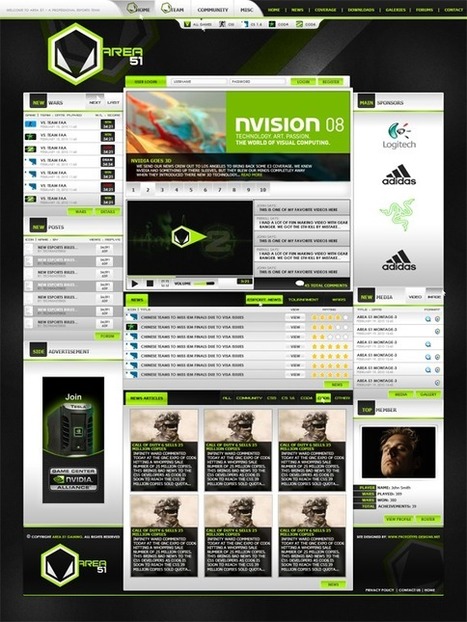
Need to design a great User Interface for LOTS of data? Take a look at gaming website design. These 45 Insanely Great Gaming Websites pack a lot of infomration into every page.


Hard for me to judge the efficiency or acceptance of these messages since I am not a gamer, but I suspect people who play these games feel right at home on these websites and we can "StealThis on how to organize and flow data, instruction and call to actions from any number of these designs. 

No comment yet.
Scooped by Martin (Marty) Smith
January 22, 2013 7:58 PM
Scoop.it!

A Brief History of Time and Web 3.0

A Brief History of Time and Web 3.0 | Must Design | Scoop.it
If you ask some, they'll tell you Web 2.0 as we know it is probably on its way out the door.
Martin (Marty) Smith's insight:

Web 3.0 Sure TO ROCK
Great primer on the difference between the structured Web 2.0 and the vastly less structured Web 3.0. Mobile, the cloud and WE are shaping web 3.0. 

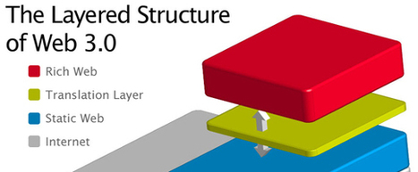
We are different. We've been using the web for years now. Some of our children ONLY know a web enabled world. Web 3.0 will detach the presentation layer from its current pre-conceived and static code. 

In less than two years such static presentation will seem old hat and ancient. Web 3.0's on demand structure will create frameworks and what if statements where static HTML structures a presentation layer now. 

In Web 3.0 a website's presentation will be controlled by branching AI-like algorithms and trimmed paths developed from analytics that fit to the behaviors and personas moving through the ecosystem. In fact path creation will be so fast and seamless novel combinations of elements is possible on the fly. 

The future converts better because we will "surf" environments that anticipate our needs and use wisdom of crowds and analytics to fit any website to our experience like hand to glove.  


Web 3.0's implications for designers and web developers include:

* Need to understand conditional logic (If/Then).

* Understanding of predictive analytics will help.

* Creative right brain skills + left-brain analytics.

* Presentation and program layer are connected twins.


It may be hard to have visual creators become more analytical and vice versa, but that is the journey Web 3.0 is on. Until the next generation, the generation who will only know this kind of hybrid web mashup, arrives teams will need to round out the skills needed to win with Web 3.0 designs.  


see Also
Website Design In 3 Dimensions
http://www.scoop.it/t/curation-revolution/p/3995705467/website-design-in-3-dimensions-why-google-s-float-is-a-blueprint-for-web-3-0  


No comment yet.
Scooped by Martin (Marty) Smith
January 18, 2013 1:46 PM
Scoop.it!

Top 10 Websites For Designers - January 2013 | HOW Magazine Blog

Top 10 Websites For Designers - January 2013 | HOW Magazine Blog | Must Design | Scoop.it
Every month HOW scours the web to find the best design websites. Then we compile the top promo sites, design tools, resources and sites for creative time-outs.
Martin (Marty) Smith's insight:

Designers look at website design differently. Love this list of power website designs from How Magazine (one of my favorite design resources because even non-designers can understand it :). How's list focuses on designer "self promotion" websites, but plenty of :#StealThis in these designs too. 

No comment yet.
Scooped by Martin (Marty) Smith
January 16, 2013 10:45 PM
Scoop.it!

Seing It Means We Can Cure, Fix, and Love It: Big Data Visualizations Fight Cancer (And Rethink Basketball)

Seing It Means We Can Cure, Fix, and Love It: Big Data Visualizations Fight Cancer (And Rethink Basketball) | Must Design | Scoop.it
Creating visualizations of huge data sets is big business. Companies like Palantir have been turning big-data visualization into huge profits for quite some time.
Martin (Marty) Smith's insight:

A Different Design Conversation
Designers I have a request. Read this post about the difference SEEING can make to projects that might just save the world and realize your job is bigger than you think.

In A Whole New Mind Daniel Pink says we've engineered as far as we are going to get. Engineering isn't enough anymore. Any innovation feeds on diversity. My request, no matter what you design, is that you view your calling as helping us SEE.

Here are the most important "RULES" we need you to remember as you help us SEE:

* The less we know you (the designer) are there the more magical the design.

* As the data gets bigger the visualizations must get better.

* There is NO data that can't be improved by visual presentation.

* Visualizations require NO PRIOR KNOWLEDGE to understand.

* We will mashup, change and alter your visualizations.

* You WANT us to mashup, change and alter your creations.

* There is nothing already so simple it can't be made more so.

I scooped this amazing post about how visualization can help cure cancer to make a point. If curing cancer requires diversity in THINKING and magic in presentation then so too does whatever you are going to do next.

 
Help us SEE and we cure cancer. Help us KNOW and we love you forever :). See your job as "designer" in the broadest terms possible and you get both.

No comment yet.
Scooped by Martin (Marty) Smith
January 10, 2013 11:39 PM
Scoop.it!

40+ Clean, Minimal, Quiet Website Designs Inspire

40+ Clean, Minimal, Quiet Website Designs Inspire | Must Design | Scoop.it
The web industry nowadays is very productive. During these years there have been many trends followed and every day the designers experiment new techniques creating new tendencies in the art of making website.
Martin (Marty) Smith's insight:

I've created more than 100 website designs (easily). I'm creating one now for Cure Cancer Starter and the hardest thing (by far) is to create simple clean lines where visitors know where to go without stress. 

No comment yet.
Scooped by Martin (Marty) Smith
January 7, 2013 3:39 PM
Scoop.it!

Cure Cancer Starter Homepage First Look and Marty's Steals

Cure Cancer Starter Homepage First Look and Marty's Steals | Must Design | Scoop.it
Martin (Marty) Smith's insight:

Cure Cancer Starter Homepage
Here is the rough of the homepage for Cure Cancer Starter (remember I am NOT a graphic designer :). This is right from the functional specifications I'm on my 3rd day straight writing. 

Sole cool ideas here from:

Ideo.com - love their top navigation and am using the idea to create curation into the site in order to make the site hyper-real time. 

Mashable.com - love Mashable's total share's count (the 950 at the very top). 

PatternTap.com - I grabbed the cool button graphics from Patterntap.com (great site for lifting cool ideas). 

UNC Lineberger Cancer Center (http://unclineberger.org/ ) is going to be well prepared for Cure Cancer Starter since they have AMAZING pictures of their doctors and researchers. NOTE the way they have the view directly at the camera. 

Using people can be tricky in a web design. You have one of two choices. Point the eyes at the Call To Action or straight out at the camera. CTA view increases conversion, straight out increases engagement. 

Cancer researchers are heroes and won't be hard putting them in heroes (largest graphic on the page is often called a "hero") with UNC's great photography. 

No comment yet.
Scooped by Martin (Marty) Smith
January 5, 2013 12:00 AM
Scoop.it!

TIME's 25 Best Blogs Of 2012 Inspire

TIME's 25 Best Blogs Of 2012 Inspire | Must Design | Scoop.it
TIME's annual tribute to the best in blogging covers everything from the economics of gadgets to the Civil War to Kate Middleton's fashions
Martin (Marty) Smith's insight:

What makes a blog great? At least PART of what makes a blog great is dows it create the community the author wants. This is why I like this list of 25 Great Blogs from TIME. Time asked the right question - what blogs did their job the best. Well done.

No comment yet.
Scooped by Martin (Marty) Smith
December 31, 2012 12:13 PM
Scoop.it!

32 Cool Homepage Designs Inspire

32 Cool Homepage Designs Inspire | Must Design | Scoop.it
CoolHomepages best websites design gallery of homepages, website designs and templates features thousands of the best website design examples and cool pages for inspiration - browse, search, learn, get inspired.
Martin (Marty) Smith's insight:

Some real gems in here. This is a multi-author submission site so you see designs different people think are cool. This page is their "vote it up" page and has several homepage designs you can steal idea from. 

No comment yet.
Scooped by Martin (Marty) Smith
December 28, 2012 9:10 PM
Scoop.it!

50 Beautiful Green Website Designs Inspire

50 Beautiful Green Website Designs Inspire | Must Design | Scoop.it
After showing you a list of Yellow Web Designs and one of Blue Web Designs, today is time to show you a list of green websites!
Martin (Marty) Smith's insight:

Green is soothing and reassuring online especially the way these talented web designers use it to create 50 amazing green websites.

No comment yet.