 Your new post is loading...

|
Scooped by
Martin (Marty) Smith
October 24, 2013 12:03 PM
|
Create Conversations Not Websites: The Lean Design Movement Why Web Designers Will Design Less and Partner More
I'm involved in a very cool project right now called CureCancerStarter.org (http://www.curecancerstarter.org). This project is forcing the team at Atlantic BT to THINK about the future of web design.
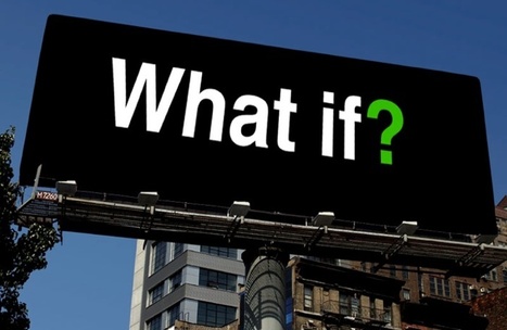
We hinted at the "lean design" movement a few days ago in a Scoop (Designing for What If http://sco.lt/8nYdG5 ). Today we see how we aren't really designing websites anymore.
We are designing conversations.
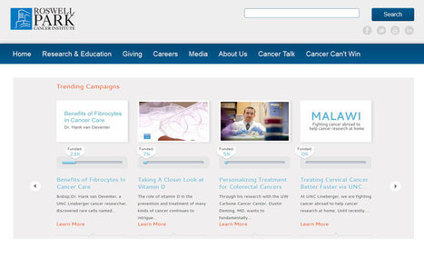
The design example above embeds CureCancerStarter.org's trending campaigns inside of one of our cancer research partner's websites. Once the number of cancer research campaigns is more than 100 the best way to control and navigate to our content isn't on CureCancerStarter.org and that realization hit like a TRUCK.
We would be better served to NOT SCALE a new website but embed the campaigns back in the already scaled websites of our partners. We design the "crowdfunding cancer reserach" conversation and create the easy to plug in widget our partners can use to speak to their existing customers.
We started thinking the best approach was to create a new scaled commons (the Kickstarter or cancer research), and there can still be a "net the new fish" role for such a website, but the web is more and more about TRUST and trust doesn't come FAST or EASY.
Now we can see, given the current state of Internet marketing, why our jobs as web designers are changing. Instead of designing sites to scale we need to feed off of existing scale. When I started creating websites in 1999 no one had scale so everyone was equal.
1999 was before Google's decision to eliminate spam by elevating trusted sources. The problem is YOU CAN'T GET THERE FROM HERE. You don't have the TIME to work your way slowly up your business vertical's ladder. Instead you should be thinking about creating partnerships and widgets.
Design LESS and collaborate more will be our web design future.
Read more about my big V8 web design SLAP on G+: https://plus.google.com/102639884404823294558/posts/XHXxCn5qgEb
|
|
Scooped by
Martin (Marty) Smith
October 22, 2013 12:40 PM
|
5 Ecommerce Checkout Tips - How To DESIGN For More Conversions Next Year
|
|
Scooped by
Martin (Marty) Smith
October 17, 2013 1:47 PM
|
|
|
Scooped by
Martin (Marty) Smith
October 14, 2013 9:18 PM
|
Designing For WHAT IF: Why Website Designers Are About TO DESIGN LESS
|
|
Scooped by
Martin (Marty) Smith
October 10, 2013 12:12 PM
|
Had fun creating CureCancerStore.org with my friends Eric and Cynthia Garrison's Agile7 template. As I worked I was reminded of a few tips that may help any web designer, and aren't we all web designers now, work with templates including:
* SEO Don't Forget it.
* Adjust YOUR Perspective Not Other Way Around. * Get Creative and Modify What is THERE. * Improve Shopping Cart LATER. * Tables and old HTML are TOUGH.
This last bullet is important. The world is HTML5 and CSS3 and if you don't have CSS skills templates are both a Gift from God and a Curse from the Devil. If, like me, you still can write <tables> don't expect them to look like what you expect because their display is controlled by CSS (style sheets).
I tend to bull forward and do the best I can until a firm understanding of where and how we are making money. Once I understand how the site makes money I can invest intelligently in designers with more talent than me (not hard to find those btw lol).
This post should help anyone know how to work with templates better to design a website or blog and templates are in all of our futures because they are great, getting better and cheap.
|
|
Scooped by
Martin (Marty) Smith
October 6, 2013 2:58 PM
|
15% of internet usage is done on a mobile device, and that's expected to climb to 20% by the end of 2013. Review the facts to build the best mobile site you can, whether it's a separate mobile site, a responsive site, or a combination of the two.
|
|
Scooped by
Martin (Marty) Smith
October 1, 2013 7:41 AM
|
This holiday season will be the Christmas of MOBILE devices. Here are some amazing examples of the art and science of responsive design.
|
|
Scooped by
Martin (Marty) Smith
September 22, 2013 6:51 PM
|
Predicting the future is tough, but with the fast-moving nature of the web, it’s good to know what lies ahead. Craig Grannell talks to top industry figures about the web design trends you should be mindful of over the coming 12 months.
|
|
Scooped by
Martin (Marty) Smith
September 15, 2013 8:31 PM
|
Everything about Helvetica is repellant: from its uptight aura to its smug, splendid isolation. How it persists in the face of such brilliant alternatives as Frutiger and Syntax defies logic.
|
|
Scooped by
Martin (Marty) Smith
September 8, 2013 12:54 AM
|
Enter Your Art, Product Design or Idea Into Story of Cancer Foundation's Art Cures Cancer Contest. Entry Deadline October 5th.
|
|
Scooped by
Martin (Marty) Smith
September 3, 2013 10:56 AM
|
Amazon is becoming a bit of a hot mess as they add streaming and move from things to digital bits, but the big A still has lessons every Ecommerce vet can learn for this holiday including:
* BIG Buy Now Button On Plane with Product Picture. * Institutionalize Free Shipping (i.e. Prime makes free shipping a loyalty program).
* Customers Who Bought, Also Bought (great up-sale) on product page. * Reviews & Review the Reviewer.
* Social prominent but not overbearing.
Big Buy Buttons
I like BIG buy buttons (see REI.com) with high contrast. I also like how Amazon puts their Buy button in what is normally a dead-end gutter (far right side of the page) on the same plane as their product headline.
Free Shipping As Loyalty
Prime is more than Free Shipping. Prime members get free streaming movies and other benefits. Amazon prime may have started as "free shipping" but it is rapidly becoming Amazon's loyalty program as they institutionalize it more and more (brilliant and a #STEALTHIS).
Up-Sale and Cross-Sale
I like that Amazon tried to sell you the product on the page AND something else. Many ecom sites pitch cross sale and that can get confusing. Customers have worked hard to get to THIS product page so why hit them with a lot of option that create dissonance. Better to say People who've purchased the product you are looking at also bought these other things. This is UP-SALE instead of CROSS-SALE (where you offer other similar items in the hope of making a sale on one of them).
Cross-Sale is most effective on products where you can move customers from THEIR products to YOUR products or from low margin to higher margin. I'm not in love with this kind of cross-sale because it can be confusing and distracting. Amazon includes cross sale WAY down the page in their "continue shopping" suggestions.
Review & Review the Reviewer
Most ecom websites have reviews, but few go the next easy step and ask for feedback on reviewers. A simple thumbs up or down on the reviews themselves can identify star reviewers. Writers fight to get on Amazon's review team more for the social kudos than the free books. Your "review team" should be a hotly competed for club too.
Social (Facebook, Twitter, Pinterest)
I would suggest those three social icons at the very least for any e-commerce website. You may also want to add LinkedIn (if you re B2B) or a tool/net like Scoop.it or Paper.li.
|
|
Scooped by
Martin (Marty) Smith
August 28, 2013 6:56 AM
|
Check out an all-star list of some of the best website designs for graphic and web designers. This list is curated by HOW magazine's art director.
|
|
Scooped by
Martin (Marty) Smith
August 22, 2013 11:05 AM
|
5 Quick and Easy Holiday Website Design Tips
How To Have A Happy Holidays
Easy to get caught up in holiday planning and forget some simple tips to maximize customer engagement and sales. Here are 5 Holiday Website Design Tips NOT to let fall through the cracks:
Holiday Website Design Tip #1: Relevant Images
Make sure your heroes (largest image on any webpage is a "hero") project holiday spirit. Snow if you sell snowboards is a good thing less so if you sell surfboards. Remember PEOPLE sell more effectively than things, so be sure your images communicate holiday spirit and include engaged people (try to avoid canned photographs if possible).
Holiday Website Design Tip 2: People In Images
Using people in your hero images can be tricky. If people are talking amongst themselves in your images the feeling can be off-putting. Here are my favorite ways to use people in images during the holidays:
* Looking out at viewers (promotes engagement, welcoming).
* Looking directly at a Call-To-Action (CTA - increases conversion). * One looking out on left of two or more talking together. * Baby looking at a CTA.
Babies can be TOUGH. We all MUST look at babies but they can be distracting too, so I like to have them looking at something that matters. Why all of this attention to where model's eyes are looking? Viewers’ eyes follow the path of where your models look, so make sure they are looking where you want your customers' eyes to go.
Holiday Website Design Tip #3: Less Copy
During the holidays we made a sale with only 1.1 visits (on average). During the summer it took just over 3 visits to make a sale. The holidays are about getting 'er done so cut your copy, lower the number of clicks (to links that have tested well) and rock images.
Holiday Website Design Tip #4: Vox Populi, Vox Dei
The voice of the people is the voice of God during the holidays. Curate great ideas and comments from your social channels to make sure all customers have a chance to hear them and LISTEN more than you talk this holidays. If your social plan doesn't leave about a third of the time for RESPONSE it is wrong and you should change it. Social is about PRESENCE and you win by showing up, listening and responding.
Build LISTENING into your website design with customer quotes, a "social corner" where you curate great riffs from your social channels, polls, surveys, contests and games.
Holiday Website Design Tip #5: Integration
Create an "umbrella theme" this holiday and support your theme with consistent visuals across all channels. The more consistent, cool and fun your Internet marketing is this holidays the more shoppers you convert to buyers.
Make sure your umbrella is good for 8 to 12 weeks, used in your mobile, email and social sites and when in doubt open YOUR marketing up to THEM (create ways for customers to use those ever present cameras and smart phones).
|
|
|
Scooped by
Martin (Marty) Smith
October 24, 2013 12:49 AM
|
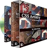
CSS Artistry: A Web Design Master Class (includes full-color Transcending CSS book and 2 1/2-hour Inspired CSS DVD video training) [Andy Clarke] on Amazon.com. *FREE* super saver shipping on qualifying offers.
|
|
Scooped by
Martin (Marty) Smith
October 21, 2013 3:34 PM
|
Didn't ASK for a Web 3.0 site (necessarily) from the design and UX team at Atlantic BT, but they built me one anyway. Here are 5 Web 3.0 features they built into http://www.curecancerstarter.org :
* Cloud Content Management via CDN. * Control to "Users" and math.
* Control to "Visitors" & MVP.
* Highly Responsive.
* Framework to Unique Backends.
Cloud Based Content Delivery Network
I used to have to worry about image "weight". Now talented programmers can use the cloud and caching to keep page load snappy even as the traditional "weight" of the page is high. Large images with large file sizes can be stored and cached in ways so they look great and don't slow the page presentation.
Control To Cancer Centers & Algorithms
The IDEA of CureCancerStarter.org is to create a framework with more and more control available for "users", a term I hate but in this case users=cancer research centers. Even things like Hero image management will be managed by the framework code and an algorithm (when we have hundreds of cancer research campaigns on the website). The key is to design with as small a "designer" footprint as possible passing more and more "control" over via the Content Management System (CMS).
Control to Visitors and MVPs
Visitors will be cancer patients, their friends and families so we created personas for our main groups of donors. Personas help understand the behaviors of any websites archetypes, something very important with donations. We are lacking a few features such as the ability to donate in someone's name and the ability to create tribes (groups and sub-groups), but the framework ASSUMES these features are coming (i.e. Atlantic BT's team coded a flexible framework capable of moving in any number of directions). We got something UP and LIVE (Ries stresses MVPs in The Lean Startup).
Highly Responsive
We are working to make the framework SWIPE so IOS devices aren't compatible yet, but the site plays like an accordion (moves to meet the device looking at it be it phone, pad or computer).
4 Unique Backends We Can't See
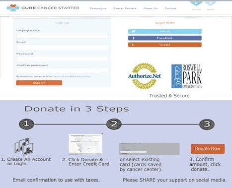
Perhaps CureCancerStarter.org's most revolutionary idea is to take the Facebook Framework idea and extend it via Authorize.net to an individual backened for each platform user (cancer center). CureCancerStarter.org pipes donations directly into the Authorize.net account of a cancer center.
We pass the ball over to the cancer centers and so 100% of donations go to them. This pass does mean we are helpless when UNC has trouble setting up their Authorize.net environment (as they are now), but they will work it out with the bank and then the GENIUS of Mark Foulkrod's idea comes to the front - it is possible to divorce merchandising from payment systems with this methodology.
I want to add commerce features to Scoop.it, Facebook and GPlus, but haven't been able to figure out a seamless way to do so. Once the Authorize.net environment is established it is AGNOSITIC to where transactions come from. This means ecommerce is simply a matter of a link, some graphics and an individual can accomplish the same thing as PayPal (easily transportable shopping cart).
Explaining that StoryofCancer.org is the Charge To if you are on my Scoop.it may be needed, but the ability to easily add commerce into any corner means the distance between content and conversion just got shorter.
KUDOS to the programmers and designres at Atlanticbt.com. They rocked this one!
http://www.atlanticbt.com
|
|
Scooped by
Martin (Marty) Smith
October 16, 2013 10:40 AM
|
CureCancerStarter.org Is Launching Today - Marty's Thank You Note
Here is what I just wrote on our CureCancreStarter.org blog. Blog is acting a little…
|
|
Scooped by
Martin (Marty) Smith
October 12, 2013 7:05 PM
|
|
|
Scooped by
Martin (Marty) Smith
October 7, 2013 6:18 PM
|
First of our 2 New Idea Websites launched today
CureCancerStore.org (http://www.curecancerstore.org ) where you can "shop to cure cancer" went LIVE today with several innovative ideas including:
* Cure Cancer Varsity Jacket - a way for cancer patients, their friends and family to recreate the feeling of solidarity cancer patients feel when sitting in a chemotherapy ward. Cool and customizable this jacket is based on a Varsity Letterman's jacket Marty's wore at Central Junior High in Greenwich, CT a lifetime ago.
* Become a Cancer-preneur - if you are willing to give profits to help cure cancer WE will build an online store for you. Great way to create awareness and LOVE for your Etsy.com store.
* Cure Shirts, Caps and Socks - we love the word CURE and are ALL IN to help cure cancer in our lifetime (all profits go to Story of Cancer Foundation our 501c3 funding the NEW CANCER RESEARCH REVOLUTION).
The linked post is my exhausted #startup #journal for LAUNCH DAY (today) when we launched one of the two websites we are working so hard on. CureCancerStarter, crowdfunding cancer research, is set to launch Wednesday and Raleigh's WRAL (CBS) will run a piece about Marty and Cure Cancer Starter tomorrow night.
We still need great BUZZ TEAM members. Pleas join perhaps the coolest group of Internet marketers and tools ever assembled :).
http://storyofcancer.org/cure-cancer-buzz-team/
|
|
Scooped by
Martin (Marty) Smith
October 4, 2013 1:50 AM
|
Cure Cancer Buzz Team Brief 10.4
Well when I started this brief it was the 10.3 brief (lol). This is the first time our exclusive Cure Cancer Varsity…
|
|
Rescooped by
Martin (Marty) Smith
from WebsiteDesign
September 26, 2013 6:33 PM
|
Getting started in the world of design can be both thrilling and intimidating. Sometimes, you feel like you just don’t have the tools or skills you need to
Via Brian Yanish - MarketingHits.com
|
|
Scooped by
Martin (Marty) Smith
September 19, 2013 11:44 PM
|
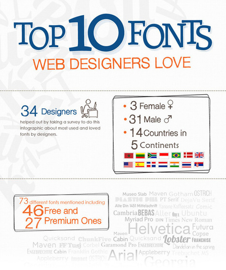
When I was starting out with Web and graphic design, I was always wondering about the fonts that real designers use.
|
|
Scooped by
Martin (Marty) Smith
September 15, 2013 1:24 AM
|
This is a great video by Objectified's (another great video) Director Gary Hustwit. The fact we CAN do something doesn't mean doing it is the right thing to do. This is so true with type.
Because we have more crazy "grungy" fonts doesn't mean we serve our designs well by using them. Sometimes the simple and true work best. Also, as many designers demonstrate in this great design film, the tried and true can be bent into a pretzel.
Helvetia has an innovative side too (shared in numerous examples), so font and typography are really just tools. They stand neutral and wait to see what we do TO them (lol). Helvetia is so clean it makes great headlines online where people don't want to read anyway.
They want to scroll and increasingly swipe so watch this video to learn new tricks for an old, reliable dog.
|
|
Scooped by
Martin (Marty) Smith
September 5, 2013 11:14 AM
|
Fantastic Clean Website Designs for Inspiration. Selection of Awwwards winning clean websites or websites with a strong use of clean design. It is usually associated with concepts and emotions such as elegance.
|
|
Scooped by
Martin (Marty) Smith
September 1, 2013 9:42 AM
|
Looking for inspiration for your food packaging design project? We've scouted 10 top food package designs to get your creativity going.
|
|
Scooped by
Martin (Marty) Smith
August 26, 2013 5:21 PM
|
Amara presents the complete infographic guide to colour psychology. Covering the theory behind different colour psychology, cultural meanings, connota
|








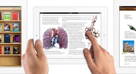

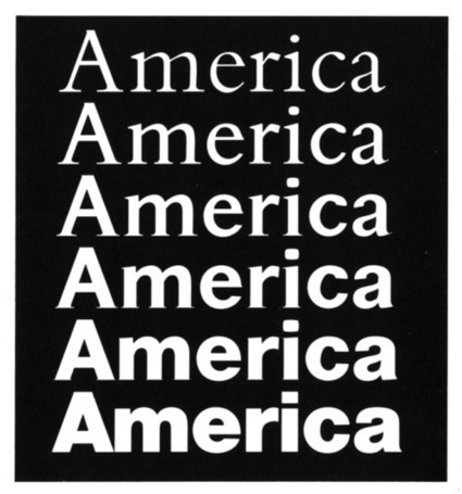

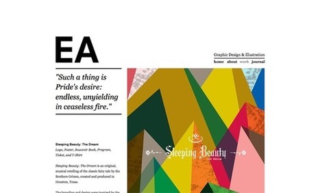















Design less and collaborate more. Interesting article about creating conversations into your web design.
From now on, all websites should be dynamic & collaborative. Constant work-in-progress, the same way we communicate or do things in real life. Static websites, however, are more like graveyards, some of them beautiful, but designed for tombs and dead anyway. With Dazib.com (soon to be released), we are working on an innovative solution for Web publication & "conversation"...