Must Design
79.5K views | +3 today
Must Design
Design Is Revolutionary
Your new post is loading...
Scooped by Martin (Marty) Smith
August 18, 2013 10:49 AM
Scoop.it!

5 Jazz Influenced Website Designs

5 Jazz Influenced Website Designs | Must Design | Scoop.it

5 Cool Jazz Website Designs


Hero Roll Static Text

http://www.jetztzeitclub.de/


Love this idea of rolling the hero image while keeping a single textural idea. The impact is to EPHASIZE the text while allowing the visual field to create interest and calm. The problem with heroes that roll and bring new messages is the website can become ADD. You never know where or what to look at. Here the roll reinforces a single message. Cool. 


Color & Texture Shock 

http://www.austynweiner.com/


Same image shift with single text here but an explosion of color and texture. This is an example of going to an extreme to create a sense of visual shock. The only liability with this technique is showing your visitors where to go next FAST since the shock needs to work FOR not AGAINST you. 


Hero with Insert

http://thecarcrush.com/blog/2013/8/y3uaah5ojl6zi4iia95h10iircb8o0


Love the lush images with inserts here. The cars are seductive and romantic, but the insert allows the text and descriptions to add instead of distract from the hero images. 


 Magazine Like

http://boompa.ca/


This waterfall, the infinite scroll, magazine shows how you can build a visual and copy story with large hero images water falling on top of one another. There is real visual organization here. Very cool. 

 
Radically Simple Ecom 

http://www.lushtype.com/


Love tis ide of radical simplicity in ecommerce. Big icons sell icons. By selling one thing the page is easy to understand, easy to buy yet very cool and engaging too. 


No comment yet.
Scooped by Martin (Marty) Smith
August 11, 2013 8:45 AM
Scoop.it!

Web 3.0 Design Inspirations Pinterest Board From @Pupixel

Web 3.0 Design Inspirations Pinterest Board From @Pupixel | Must Design | Scoop.it

Showcase of web 3.0 web sites (html5, css3, parallax, ecc...)

Marty
Great board from @Pupixel (an Italian web designer) sharing examples of web design leading the way to Web 3.0 - a semantic real time web.

No comment yet.
Scooped by Martin (Marty) Smith
August 1, 2013 5:08 PM
Scoop.it!

Pattern Tap Design Trend Confirms People NOT Things Sell

Pattern Tap Design Trend Confirms People NOT Things Sell | Must Design | Scoop.it

Great Pattern Tap newsletter this month confirms a post I wrote over a year ago:

Startups - People Not Things Sell
http://scenttrail.blogspot.com/2012/06/startup-websites-people-not-things-sell.html

Pattern Tap (a great design tool btw) notes how much PEOPLE are dominating our new visual marketing. Love it when a year old post gets such strong support from a truste source.

No comment yet.
Scooped by Martin (Marty) Smith
July 18, 2013 10:41 PM
Scoop.it!

Future Of Web Design 2

Future Of Web Design 2 | Must Design | Scoop.it

Web 3.0's Whaam!
Just as Roy Lichtenstein’s Whaam! 1963 seemed to blow abstract painting off the walls web 3.0 will change everything we call "website design". After creating The Future of Web Design #1 (http://sco.lt/7r6zkf) Haiku Deck I realized some shots were fired but not enough.

Web 3.0 powered by a ubiquitous web for people and things with semantic intelligence changes how we create websites and Internet marketing. Math will be a future web designer’s friend. 

Websites will float based on predictive analytics and real time behavior. Behavior responded to with tested creative designed for personas and segments to CONVERT is more Google-like than anything web designers create now.

David Merrill's siftables are the best demonstration of how content will become intelligently self aware AND agnostic to the kind of hubificaiton web designers practice now.

http://youtu.be/JP0w9lZoLwU Siftables

Hubificaiton is about bringing THEM to US. APP-ificaiton is about creating agnostic widgets. Widgets easily placed anywhere (as Amazon's mini-cart widget demonstrates here: http://sco.lt/4iahNZ).

Web 3.0's mobile ubiquitous web will reverse hubification's emphasis on traffic density (bring visitors into a hub). Distinctions will change too. THEM and US will fade in favor of relevant experience in a commons. 

In this context CONVERSION becomes an extension of an experience instead of the other way around. We rarely shop / search for things merely for the pleasure of the search.


We may start with one goal in mind and end up achieving a different set of goals, goals created on the fly in real time based on how the web responds to our journey, but our process feels like US.

Predictive analytics, personas, segments and an increasing amount of tested creative controlled by math means our unique feeling of US or ME may continue to exist, but THEIR sense of our next behavior make this feeling a distinction without a difference. 

If you fit a persona that persona predicts what relevant content you need and content wraps around you like a blanket. The feeling of having Big Brother on your shoulder could be overwhelming. Mutual benefit is why consumers won't revolt. Relevance is good since it saves our most valuable commodity - TIME. 

When websites convert 40% of their traffic, as Schwan's does now, their efficiency trumps density. Efficiency trumping density describes Web 3.0 perfectly.  

No comment yet.
Scooped by Martin (Marty) Smith
July 12, 2013 8:25 PM
Scoop.it!

Why Email Marketing Key to Web 3.0 Website Design

Why Email Marketing Key to Web 3.0 Website Design | Must Design | Scoop.it

Website design is about to change about as much as something can change and email marketing is already half way there. Email marketers such as @Bronto move massive amounts of information in real time.

Welcome to the future.

The future of web design will happen in real time, be logic based and require a mountain of creative controlled by predictive analytics in real time. If that sounds like email marketers are sitting pretty you win a cookie.

Bronto became Cure Cancer Starter's (http://www.curecancerstarter.org) email marketing and marketing automation partner today (http://sco.lt/55jx1F ).  Bronto joins Atlantic BT and the Story of Cancer Foundation (501c3) in the Tech Cures Cancer Movement. 

This deck is about where web design is headed (at light speed) and why thinking like an email-marketer is a good idea. 


Folllowedbthisvdeck up with Future of web Design 2: http://sco.lt/61eqNF 

#TechCuresCancer @CureCancerStart


Dolly Bhasin 's curator insight, July 13, 2013 11:53 PM

works well with customer facing sites, not B2B.

Martin (Marty) Smith's comment, July 15, 2013 12:23 PM
Dolly, disagree. The biggest myth is the significant difference between B2B and B2C marketing online, a myth you may believe. I've been an Ecom Director and now run marketing for an agency. The process of read the cookie, fire the creative is going to be very important for B2B websites for much the same reason as the tactic will be critical for B2C. MAD or Mutually Assured Destruction says if a competitor is firing more relevant information faster than your website they win. The logic discussed here applies equally well to B2B or B2C websites. The main difference is the conversion funnel. B2B conversion funnels are LONGER in time, but the advantage of wrapping a website around a visitor and then following with persona based email marketing is the key to web 3.0 no matter what side of the Rubicon your website resides upon (B2B or B2C). Feel free to support your statement with links or further posts, but your assertion hasn't been true to my B2C and now B2B experience. I still see read the cookie or behavior and fire the creative / content as one of the most valuable HTML5 and CSS3 advances. The fact few B2B relationship based sellers are there yet doesn't mean the tactic isn't beyond valuable.
Robin Martin's comment, July 15, 2013 3:28 PM
Thanks for sharing Marty!
Rescooped by Martin (Marty) Smith from Web Development & Design
July 9, 2013 10:16 PM
Scoop.it!

Long Shadow Generator

Long Shadow Generator | Must Design | Scoop.it

It seems that “long shadows” are the new trend these days, especially on Dribbble. Now you can apply this style nice and easy to any type of layer. It works with smart objects and is available in 2 directions at 45 degrees. Enjoy!


Via Youyouk, Carla C
Martin (Marty) Smith's insight:

Interesting "trend" I would love to see some test data on. M

Carla C's curator insight, July 9, 2013 6:23 PM

I'm not entirely sure how I feel about the long shadow trend, but this is a convenient way to test it out.

Martin (Marty) Smith's comment, July 9, 2013 10:14 PM
Agree with Carla and join her desire to test or hear about someone else's test. Marty
Scooped by Martin (Marty) Smith
July 4, 2013 6:09 AM
Scoop.it!

5 Common SEO Design Mistakes

5 Common SEO Design Mistakes | Must Design | Scoop.it
Martin (Marty) Smith's insight:

Website Design SEO Mistakes
It is easy to make unintended SEO mistakes during the design phase. Here are 5 common SEO mistakes to avoid during the design phase of your website.

5 Common SEO Mistakes During Design
1. Junk (JavaScript or too much code) In The Head.

2. Not using HTML5 or CSS3.

3. Tables not CSS.

4. Code doesn't W3C validate.

5. Not responsive & No Social Shares. 


Design is NOT a neutral act. Choices are being made daily that can and will impact a search engine spider's ability to understand how to categorize your information,

In a recent post about how Internet marketing isn't what you think it is (http://www.atlanticbt.com/blog/why-internet-marketing-isnt-what-you-think-it-is/) I discussed the importance of the "backend" or the behind the curtain elements that play such a major role in your website's success or failure.

The best designers understand that creating elegant beautiful pictures is only half the battle. If those pictures obstruct, delay or otherwise confuse search engine spiders all the good the design does with people can be undone.

Undone because if no one SEES your design its elegance can't be appreciated. This is why designers must understand basic SEO concepts such as keyword density and code efficiency.

As an Ecommerce Directors I encouraged our designer to use keywords in all things including file-naming conventions. Many designers will call files image3 or something equally nondescript. The file name may or may not play a role in SEO, but the discipline of using keywords is important.

It was rumored Steve Jobs wanted even the parts of his products that couldn't be seen looked great. Same concept here with file names. Naming image files with business intelligence makes it easier for those who follow behind AND the discipline reinforces the designer’s important role in SEO.


Avoid these common design SEO mistakes and your website will perform better.

No comment yet.
Rescooped by Martin (Marty) Smith from Business and Marketing
June 29, 2013 7:13 AM
Scoop.it!

The 7 Principles of Conversion-Centered Landing Page Design

The 7 Principles of Conversion-Centered Landing Page Design | Must Design | Scoop.it
Are you applying the principles of conversion-centered design to your landing pages? Well, you should be ...

Via Gregg Breward
Martin (Marty) Smith's insight:

Landing Page Design Is A CSF
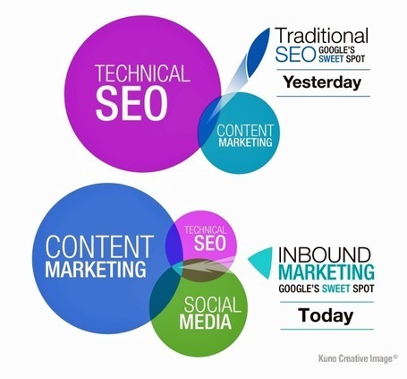
Landing Page Design is a Critical Success Factor. I saw an amazing statistic somewhere not long ago. The stat said those with more landing pages did much better than those with fewer. If we Freakonmics this stat we see there could be many reasons. 


Those with more landing pages may be better at email marketing, video marketing and design for conversion. The fact they have more landing pages is an indication that they understanding Internet marketing as a whole better than their cousins or other siblings. 

There is both ART and SCIENCE to creating landing pages that convert (like all things web design).  This post is an excellent summary of how to build a landing page that does what you want it to - convert visitors into customers. 

No comment yet.
Scooped by Martin (Marty) Smith
June 24, 2013 10:28 PM
Scoop.it!

Fonts & Colors That Drive the World’s Top Brands | Infographic

Fonts & Colors That Drive the World’s Top Brands | Infographic | Must Design | Scoop.it
See which colors, typefaces and styles come together to form the logos of the world's 100 most powerful brands.
Martin (Marty) Smith's insight:

Blue, Red and Balck dominate colors and sans serifs dominate fonts. This infographic goes great with Color Is Masters of us All infographic: http://sco.lt/7FcZ4T

No comment yet.
Scooped by Martin (Marty) Smith
June 20, 2013 3:20 AM
Scoop.it!

Museum Websites Inspire Great Design Ideas: Top 10 Art Museum Sites

Museum Websites Inspire Great Design Ideas: Top 10 Art Museum Sites | Must Design | Scoop.it
Could redesigned Web sites be the starchitecture for museums? We pick our favorite museum Web site designs, including the Whitney's kids-only digital playground.
Martin (Marty) Smith's insight:

Steal From These Top 10 Art Museum Websites
FoundObjects.com, now RIP sadly, sold cool gifts to museum stores. Even after leaving the specialty gift business for the B2B web dev agency biz I still use several of the sources I found back then including art museum websites.

This post highlights ten of the best art museum website designs. I agree with most of them especially the Walker in Minneapolis. They rock. When in doubt visit an art museum website such as these ten and #STEALTHIS.

No comment yet.
Rescooped by Martin (Marty) Smith from Incion Web Design Blog
June 14, 2013 7:03 AM
Scoop.it!

Responsive Website Design - Must Know Facts

Responsive Website Design - Must Know Facts | Must Design | Scoop.it
Responsive design is a relatively new term in web design. It was only coined three years ago in May of 2010, when web designer Ethan Marcotte used the term.

Via Incion
Martin (Marty) Smith's insight:

There are many reasons to create responsive design. This post shares most of them.

ramil navidad's curator insight, June 17, 2013 3:04 PM

it's all about responsive design now

Adapt or Die 

Rescooped by Martin (Marty) Smith from timms brand design
June 8, 2013 8:23 AM
Scoop.it!

21 Beautiful Examples of White Color Usage within Web Design

21 Beautiful Examples of White Color Usage within Web Design | Must Design | Scoop.it

Color White & Negative Space
White can be such a HUGE help. After the excitement of being able to communicate online died down web design tended toward the crowded and noisy.

The use of white as a COLOR and negative space in general can, in the right hands, create a sense of quiet in the storm. Depending on your brand, "quiet in the storm" can help.

One reason quiet can help is it is disruptive. Most web development tends toward mission creep. If you and your team can resist and focus on conversion the use of negative space (areas with nothing in them) and the color white can be a huge help.


Via brandideas
No comment yet.
Scooped by Martin (Marty) Smith
June 1, 2013 8:12 AM
Scoop.it!

Gamification - Designing for Engagement

Gamification is fundamentally rewriting the rules of engagement and design. We can leverage its techniques to create unprecedented connections with our customer
Martin (Marty) Smith's insight:

Building Engagement In

There are ways to BUILD engagement into a website's design. Here are three secrets to promote engagement not included in this excellent Slideshare:

* Place Email Subscription High Up and Prominent. 
* Include curated User Generated Content on every page.

* Create CTAs with CONTRAST.


Email Subscriptions
When your "Subscribe To Our Email List" Call to Action is high on the page in a Can't Miss It spot you communicate a clear "we want YOU" signal. 

UGC Everywhere
When you curate User Generated Content to your site you communicate how well you listen and care for community members. The website isn't all about YOU and what you think the inclusion of UGC says.


CTAs
I see to very common mistakes in websites I'm asked to review as Director of Marketing for Atlantic BT in Raleigh (http://www.atlanticbt.com ): NO CTAs or poorly contrasted CTAs. I PREFER CTAs to be buttons and usually test red, orange or green (depending on the background color). I'm convinced there is no ONE magic CTA color but the contrast is what makes a Call To Action helpful or not, clicked on or not, converting or not.  

Michael Allenberg's curator insight, June 2, 2013 7:17 AM

Engaging and experience should always go hand-in-hand, regardless of the implementation.

Scooped by Martin (Marty) Smith
August 16, 2013 12:00 AM
Scoop.it!

Design For Designers - Story of Cancer Foundation First Look & Website Design Tips

Design For Designers - Story of Cancer Foundation First Look & Website Design Tips | Must Design | Scoop.it
Story of Cancer Website First Look
Thought it would be interesting to share a very early design for Story of Cancer. I am NOT a graphic designer, but I…
Martin (Marty) Smith's insight:

The G+ post explains why I expose my amateur design skills to the pros (usually to a little condescension and derision :). I don't attach EGO to copy or website design anymore. EGO and GREAT aren't compatible when TEAM is required to do anything online.

This rough beta design for Story of Cancer Foundation is giving the great design team at WTE.net (my friends Eric and Cynthia Garrison) some ideas about what I'm thinkng. I "design for designers" because doing so makes sure my vision is in there (somewhat) and the process is FASTER.

Huge shout out to @HaikuDeck again (just wrote about why it ROCKS the other day on ScentTrail http://bit.ly/14xEvW1 and using it today to find royalty free images (really royalty free not the bait and switch most boards play) saved HOURS of image searching. THANK YOU HK.

We are going to have to ROCK and ROLL to get everything done by October, so "designing for designers" helps save time and they will be comfortable letting me handle filling in their designs if they see I can manipulate images and understand some design basics (and we all should).

You may think, "Wow this design sucks," and it may (only actual use can determine if a design is working or not), but its is FAST and EASY and it will help get the feedback needed to become great. Can't make money now (locked up in my head lol).


Be sure to share your ideas, thoughts, comments and we hope you will join and support Story of Cancer and the Tech Cures Cancer movement. Together we cure cancer in OUR lifetime (and remember I already have cancer so needs to be SOON please :). M

Link to the tips on G+
https://plus.google.com/u/0/102639884404823294558/posts/8KTyg2GwAbA


No comment yet.
Scooped by Martin (Marty) Smith
August 3, 2013 12:24 PM
Scoop.it!

Learning GREAT Website Design From Websites That Suck (2013)

Learning GREAT Website Design From Websites That Suck (2013) | Must Design | Scoop.it
These websites are contenders for the worst website of 2013.
Martin (Marty) Smith's insight:

Websites That Suck Is Great
Extend a bad itch to its most exaggerated point and you get websites that suck. When I started designing websites, a lifetime ago, I read Websites That Suck and it helped avoid mistakes (such as using FLASH). 

There is a great gallery of websites that may become the Worst for 2013. Read the commentary and remember to heed the website design lessons of Websites That Suck.  

No comment yet.
Scooped by Martin (Marty) Smith
July 20, 2013 1:47 PM
Scoop.it!

Future of Web Design 3: Semantic Web Is A Game

Future of Web Design 3: Semantic Web Is A Game | Must Design | Scoop.it

Future Of Web Design In 3 Parts
What does the future of web design look like? So much is up in the air this Haiku Deck is my third and the topic is far from exhausted:

Future of Web Design 1: Web design in a SoLoMo world.

http://sco.lt/61eqNF 

Future of Web Design 2: Web  design when THEY and US &  OUT THERE and IN HERE are the same. 
http://sco.lt/7r6zkf 

Future of Web Design 3: How does a semantic and mobile web change design, marketing and sales. 

What happens when TIME becomes a perpetual now, sales happens in real time and marketing is about curation? Web design as we've known it is about to change as much as something can change. 

Why? I scratched the surface of why in How Entropy Is Creating Web 3.0 Right Under Our Noses:
http://scenttrail.blogspot.com/2012/11/how-entropy-is-creating-web-30-right.html  

Bottom line is everything is changing FAST so rewards go to the quick and flexible. If you have the courage to throw out almost everything you believe about everything once again you may just WIN BIG.  


No comment yet.
Rescooped by Martin (Marty) Smith from A design journey
July 18, 2013 6:02 AM
Scoop.it!

Storytelling in Web Design

Storytelling in Web Design | Must Design | Scoop.it

Via The Digital Rocking Chair, Hans
Martin (Marty) Smith's insight:

Yes your design tells stories perhaps more than you realize.

Martin (Marty) Smith's comment, July 18, 2013 10:55 PM
Great comment Hannes. Marty
Tata Survi's curator insight, August 17, 2013 7:18 PM

Worth trying...

Mike Donahue's curator insight, August 28, 2013 10:05 AM

Had the good fortune to hear Denise present this earlier this year. Glad she put this down in writing because it really needs to be shared.

Scooped by Martin (Marty) Smith
July 12, 2013 7:36 AM
Scoop.it!

Implications Of Infograhic Revolution on Website Design

Implications Of Infograhic Revolution on Website Design | Must Design | Scoop.it

What does the Infographic Revolution mean for your website design efforts?

* Less is more.

* Get to the point.
* Tease Don't Smother.
* Interactive beats Lectures.
* Colors Matter.
* Design Matters.

Friends @Scoopit are creating the Lean Content Movement and it is a movement web designers should join. Lean sites can still SUCK if they don't deliver a meaningful experience. Think of "meaningful experience" as one of two things:

1. Visitors quickly find what they want.
2. Visitors are intrigued enough to explore.

3. Some combination of 1 and 2.

One common web design error is to SMOTHER visitors instead of teasing them. Designers think great design means sharing everything NOW. Turns out you want poeple to work A LITTLE to find cool things. If we don't work we don't value and until a visitor starts clicky you don't know enough to smother.

What is the most common social stance now? Head down looking at a phone right? We expect and want to be include now. Visitors don't want lectures. They want to be included, to see what their friends thought and to share their take - LET THEM.

Color and Design have and will always matter. Be aware of the social signals your color choices send. Know if your design is clean and easy or complex and confusing (and you want the former :).

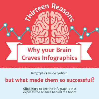
Note: The interactive Why Your Brain Craves Infographic seemed the best link for this post (and its fun :).

Andrés Romero's comment, July 12, 2013 8:17 PM
Excelente Infografía
ramil navidad's comment, July 15, 2013 7:31 AM
good article....
Scooped by Martin (Marty) Smith
July 8, 2013 9:31 AM
Scoop.it!

Top 25 Facebook Pages 2013 To Steal Your Design From

Top 25 Facebook Pages 2013 To Steal Your Design From | Must Design | Scoop.it
The list of most popular pages on Facebook in January 2013 doesn't look too different from September 2012 when we last covered the PageData Top 25. The No. 1 and No.
Martin (Marty) Smith's insight:

This list of the Top 25 Facebook pages should give your web designer ideas for how to create great Facebook pages. Always remember to LISTEN at least as much as you talk and employ GAMES and CONTESTS to help create community excitement and viral buzz. 

No comment yet.
Scooped by Martin (Marty) Smith
July 3, 2013 7:09 AM
Scoop.it!

19 Inspiring Examples of Text Over Images in Web Design

19 Inspiring Examples of Text Over Images in Web Design | Must Design | Scoop.it
In web design there are a lot of combinations that deliver a beautiful page, including the image + text duo. Combining beautiful images and nice/readable text
Martin (Marty) Smith's insight:

Web Design Tips

Text is hard to do well. Images are hard to do well. Tex over images is impossible except when you follow the lead of other great designers and learn how and when text over images can work like these 19 great and inspirational examples of text over images.

Note the balance where neither image nor text dominates. This is the rub of text over image design. Too much image and the text goes away. Too much text and the image doesn't seem to make sense or contribute anything.

Follow these great examples and your text over images will look great and contribute to your website design.

No comment yet.
Rescooped by Martin (Marty) Smith from Must Design
June 25, 2013 6:37 AM
Scoop.it!

Color Is MASTER of Us All [Infographic]

Color Is MASTER of Us All [Infographic] | Must Design | Scoop.it
The Art of Color Coordination

Such a helpful infographic. Beyond helpful for web design.

MrAnalytic's curator insight, May 19, 2013 4:36 PM

mucho bueno, señor!

James A Smith MCIM's curator insight, May 20, 2013 5:49 AM

Slightly off topic but thought it of potential general interest.

Tyler Rrokk's curator insight, July 14, 2013 8:15 PM

Excellent article and great insight!

Scooped by Martin (Marty) Smith
June 24, 2013 6:41 PM
Scoop.it!

Top 10 Websites for Designers Inspire - June 2013

Top 10 Websites for Designers Inspire - June 2013 | Must Design | Scoop.it
Every month HOW scours the web to discover the top design websites. We’re looking for the best promo sites, as well as design tools and resources.
Martin (Marty) Smith's insight:

Who isn't a "designer" of one thing or another these days? When in doubt I raid the places, resources and tools used by the pros. I'm not a designer, but boy do I have to design a lot of stuff.

Since I'm not a designer it helps if I can get a running start and STEAL (or be significantly influenced by) a great design. I never copy outright, but I look at cool stuff to get my creative juices flowing.

Nothing is immune from museums to Top 10 Websites for Designers :).

No comment yet.
Scooped by Martin (Marty) Smith
June 16, 2013 9:03 AM
Scoop.it!

#StealThis: 14 Essential Magazines for Graphic Designers Inspire

#StealThis: 14 Essential Magazines for Graphic Designers Inspire | Must Design | Scoop.it
In spite of the tremendous expansion of the Internet, the power of the printed word remains strong and popular. Print media is where it all began and today w
Martin (Marty) Smith's insight:

I've always used magazines for quick hits, for ways to shake up my visual thinking. How, Print and Communication Arts are design magazines I've used. Some of the magazines (now websites) on this list are new to me.

Good rule of thumb is consistently look at OPD (Other People's Designs) because yours get better and you find ideas you couldn’t have thought of any other way.

No comment yet.
Scooped by Martin (Marty) Smith
June 13, 2013 7:26 AM
Scoop.it!

Top 8 Web Design Tips [Marty Note]

Top 8 Web Design Tips [Marty Note] | Must Design | Scoop.it

Solid tips here with the exception of #4 and #6. My note explains why Internet type is more tricky than the tip in this post explains and why full screen photos should only be used by the most skilled. 

Martin (Marty) Smith's insight:

Top 10 Minus 2
This is an excellent post, but I removed two of the top 10 tips. I removed #4 Type because it isn't clear. Unique type in an image is fine since you know how it will render. Unique type in body text can be a disaster because you don't know how it will render.

The Internet is a billion computers all with different setups for type. When you render an exotic type in HTML text the receiving computer must have that same exotic type or it renders as a more common type (Arial, Veranda).

Let's call this "type roulette" and it is to be avoided. Exotic type in .JPGs or .PNGs or .GIFs (best format for type only images) render exactly as you see them. Type in body text is dependent on the receiving device so I tend to use non-serif universal type (easier to read non-serif type online).

There are ways to select how your type will render when it isn't available on the receiving computer, but I don't like the variability of playing font roulette. Type plays an important but floating point role in website design. I pick a type that will WORK, look pretty much the same on all receiving computers and be easy to read. Don't play font roulette.

I also removed #6 - Drop In Full Screen Photos
Yes this idea can be done well, but your designer better be VERY good. I prefer lots of white space on a website design. White space creates spacing and so highlights design elements NEXT to it. Strange to think of creating highlights by using negative space, but if you think of every great picture or painting you love there is always the use of negative space.

Warhol was famous for using BLACK to create his negative space. Great photographers such as Annie Leibovitz frame negative space in like huge arrows getting your eyes to go where they want them.

You may be the one in 100 designer who can use full screen photos and still create design tension and navigational hierarchy, but odds are better to say USE WHITE SPACE than full screen photos.

No comment yet.
Scooped by Martin (Marty) Smith
June 7, 2013 7:32 AM
Scoop.it!

Website Design: 100 Funniest 404 Pages

Website Design: 100 Funniest 404 Pages | Must Design | Scoop.it

Never underestimate the power of HUMOR or its application. Here are 100 funny 404 pages, the pages users get when something has gone wrong. The ability to turn a page that is FRUSTRATING into a funny gambit is the difference between a site that makes a few bucks and one that is worth millions.

Design for engagement means thinking about the customer at all times. Thinking about the customer means BEING the customer and not the Master Blaster Controler. Have fun and design fun in especially where its a surprise and you WIN.

No comment yet.