 Your new post is loading...

|
Scooped by
Martin (Marty) Smith
March 14, 2014 7:07 PM
|
10 Reasons Visual Content will Dominate 2014 What marketing strategies will we focus on in 2014? What will we leave behind? This article takes a look at the rise of visual content - and why 2014 will dominate in 2014:
1. 90% of information transmitted to the brain is visual. Visuals are processed 60,000X faster in the brain than text.
2. Videos on landing pages increase average page conversion rates by 86%.
3. Visual content is social-media-ready and social-media-friendly. It’s easily sharable and easily palatable.
4. Businesses who market with infographics grow in traffic an average of 12% more than those who don’t.
5. Posts with visuals receive 94% more page visits and engagement than those without.
6. 60% of consumers are more likely to click on a business whose images appear in search results.
7. Clear, detailed images carry more weight than product information or customer ratings say 67% of consumers.
8. Visuals show your products without telling people about them. This allows viewers to make their own decisions without feeling pressure from your business.
9. Visuals express ideas quickly - in a snapshot. This breaks through the overwhelming clutter of online content.
10. Visuals are becoming easier and easier to create as photo editing tools become more accessible
|
|
Scooped by
Martin (Marty) Smith
March 13, 2014 1:13 AM
|
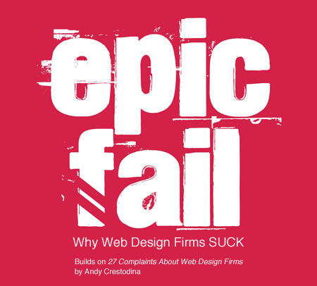
EPIC FAIL: Why Web Design Firms SUCK (in 2 parts)
This post builds on Andy Crestodina excellent 27 Complaints About Web Design Firms. This is really a story in two parts and one I know well.
I purchased web design services for seven years as a Director of Ecommerce and then sold them as Marketing Director for one of the largest web design firms in the southeast (Atlantic BT).
Scoop.it Notes are Here
http://sco.lt/9K9Ukj
Epic Fail notes are on Gplus
https://plus.google.com/102639884404823294558/posts/PocGtr2UaFh
|
|
Scooped by
Martin (Marty) Smith
March 10, 2014 6:43 PM
|
Awesome Responsive Design Website Designs for Inspiration. Selection of Awwwards winning Responsive Design websites. Fluid grids, flexible images and media queries are the three technical ingredients for responsive web design
|
|
Scooped by
Martin (Marty) Smith
March 8, 2014 12:00 PM
|
We asked 12 entrepreneurs which website features small businesses should avoid (or get rid of) at all costs.
|
|
Scooped by
Martin (Marty) Smith
March 7, 2014 7:55 AM
|
Flat design is a concept that was pretty popular a couple years ago and it's back with full strength this year, causing some interesting buzz around the so
|
|
Scooped by
Martin (Marty) Smith
March 6, 2014 11:22 AM
|
Yesterday an article on Medium, Snowfallen, caught my eye. It's about a technique for presenting longform writing online, by embellishing it with integrated
|
|
Scooped by
Martin (Marty) Smith
March 4, 2014 10:27 AM
|
Marty Note
Wow, you don't get much more money than Chuck Longanecker's 2012 predictions for web design's almost immediate future.
Chuck is CEO of Digital Telepathy and boy does he have a copious amount of telepathy based on just how TRUE each of these trends is turning out. Talk about hitting the NAIL directly on its head.
We all need to get into Chuck's head (lol) because understanding how our design tectonic plates are shifting doesn't get any better:
* Lean Design (YES).
* Animation and more sophisticated HTML5 party tricks (YES).
* Less is More (YES).
* Multi-screen, multi-platform (YES!).
Great stuff every web designer and Internet marketer should walk and talk.
|
|
Scooped by
Martin (Marty) Smith
March 2, 2014 12:45 PM
|
There are a many aspects of good web design, and whitespace is certainly one of them. Whitespace is the empty space around design elements such as images, text,
|
|
Scooped by
Martin (Marty) Smith
February 28, 2014 5:49 PM
|
When starting any website project, it's natural to want to concentrate your design efforts on the homepage and the header. As a result, the footer often becomes an afterthought - relegated to a poorly designed dumping ground for copyright information, legal disclaimers and spammy SEO links. But it shouldn't be this way.
|
|
Scooped by
Martin (Marty) Smith
February 26, 2014 3:24 PM
|
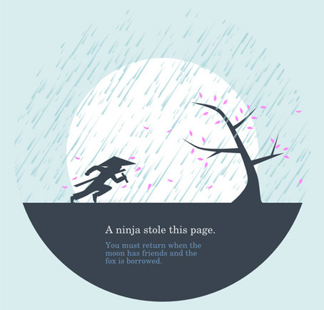
The 404 page is a standard response code in HTTP telling the user, in effect, that they've clicked on a broken link.
Marty Note
When I was Director of Ecommerce we had a period where our 404 (not found) page was shown so often it got indexed in Google. You don't want that (lol), but you DO want your 404 page to create a sense of missed opportunity.
Your "not found" page needs to create a sense of easy correction and reassurance. Your site (and by extension YOU) are for real. The 404 page that provides a sense of stability, missed opportunity and a clear path to correction can win back what might otherwise be a lost customer.
One way a website creates trust is to manage everything with a sense of commitment and quality. When our 404 page was showing up so much it got ranked I made sure to apologize and share a special offer code. There was a period when that offer was our most popular redemption (again NOT GOOD lol).
A visitor might "fish" your site typing a nonsense sequence to see what you offer. My thought was always HAVE AT IT (lol). For the honest traveler who ends up seeing your 404 (especially if YOU are at fault) having a great design and a promotion code can safe the day.
|
|
Scooped by
Martin (Marty) Smith
February 24, 2014 6:30 PM
|
Buy and sell handcrafted, mousemade design content like vector patterns, icons, photoshop brushes, fonts and more at Creative Market.
|
|
Scooped by
Martin (Marty) Smith
February 21, 2014 5:42 PM
|
2014 We Design Trends
1. Grid Layouts - Agree & Is Good!
Yes visual marketing + pinterest + mobile is making the grid ubiquitous. I created a Mondrian grid in 1999 when we launched FoundObjects.com (not gone sadly). Grids help share MORE information faster and in the same space than any other design element.
2. Image Captions - Agree and is GREAT
The area immediately under an image is HOT. Everyone looks there but few designers use captions to reinforce or explain the image. Paying more attention to keywords under images is a great idea.
3. Extended Form Elements with JQuery - Don't Know? Does anyone?
Can't comment on this trend as it is new to me and I don't program so its potential benefits are fuzzy at the moment.
4. Deeply Focused Landing Pages thanks to Mobile - Agree & Is Cool
Don't understand this trend except enough to say COOL and WANT ONE.
5. HTML5 Video Players - Agree and GLAD
Don't play your videos on YouTube only since you just make the rich get richer. Figuring out how to play videos "in your stack" is important and having your own HTML5 player is cool.
6. 3D vs. 7. Flat Design - I come down on Flat Design as the winner due to mobile.
8. Personal Portraits - Agree and Like
9. SVG Vector sweeps web as browser support escalates. Agree & Glad.
10. Fonts get cool thanks to server advance - cool and like but not a religion or anything lol.
11. Lazy Loading Animations - cool and can think of several uses.
12. Customized Image Galleries - cool and we need.
13. Mega Navigation Menus - Don't know but don't like idea, seems confusing where confusion can really hurt.
14. Expanding Search Bars - cool and will use.
15. Featured Detail List - LIKE and is cool and new to me.
16. Mobile First Design - Agree and am doing my first now with CrowdFunde.
17. HTML5 Canvas - cool and new to me.
18, Pixel Sprites and Browser Games - New to me but COOL!
19. Quick Registration via social - AGREE!
20, CSS3 Keyframe Animation - Cool, want one.
|
|
Scooped by
Martin (Marty) Smith
February 19, 2014 8:19 PM
|
We asked Randy Krum, Founder and President of InfoNewt, an infographic
design company, and editor of the Cool Infographics website, to share some
of his insights from working with and reviewing infographics.
|
|
|
Scooped by
Martin (Marty) Smith
March 14, 2014 6:00 AM
|
With the release of iOS7 just around the corner, clamor over the changes Jony Ive will institute is growing. The general consensus--on this site and elsewhere--is that Apple is about to get a flat makeover. But for the uninitiated, “flat design” can be a confusing term. So let’s talk it out, shall we?
|
|
Rescooped by
Martin (Marty) Smith
from WebsiteDesign
March 11, 2014 11:20 PM
|
Putting emotion into web design may seem a strange concept, but many sites have been doing it for years, and we are only now beginning to recognize it and talk about it.
Via Brian Yanish - MarketingHits.com
|
|
Scooped by
Martin (Marty) Smith
March 9, 2014 7:23 PM
|
This collection consist best of website design inspiration that mainly have flat website design examples like headlines, images or content areas. In this
|
|
Scooped by
Martin (Marty) Smith
March 7, 2014 8:37 PM
|
I’ve compiled a list of websites that produce great content, each of which has its own unique qualities. I’ll break them down and explain why they’re good and what you can take away.
KISSMetrics Misses The Mark 2 out of 3
I was looking for a great content/design mix and KISSmetrics got it right one out of the three times here. CopyBlogger is the only site in this group that both has great content and a great design.
The other two blogs may have great content, but their design is so off putting who is going to wade through their content? What makes Copyblogger work well?
* Snowfall design (long page scrolls down).
* Clear and LARGE Call-to-Actions (bet they've tested those big green buttons).
* Good use of icons that mask ads (very non-disruptive).
* Flat responsive design (probably looks great on mobile too). * Big headline with interesting sophisticated font treatment. * Video on homepage.
Ignore the other two suggestions here and focus on Copyblogger. Do you know a great content website? We are looking for great examples of DESIGN in content marketing. Share your favs and we will curate in.
|
|
Scooped by
Martin (Marty) Smith
March 6, 2014 8:34 PM
|
Working with a team at UNC Emergency Room trying to make their website more engaging. As the BEFORE (on the right) image shows their current site "talks to itself about itself". Ways to fix that include:
* Hero image that heeds the sight line rule.
* Clear Calls To Action.
* Move Social from bottom left to upper right.
* Prominent Join Our List subscription form.
* Curate Customer / Patient content in (coming soon).
Your visitors' eyes follow the eyes of people in your photos. The image son the right show what NOT to do - make images that look like they are self referential. Never have people in an image on your site talking among themselves. Nothing says "we don't care about you" louder than images that are either too "smart", "exclusionary" or busy.
If people in your images don't look at the camera have their site lines pint to a Call To Action. Don't create ideas that are exclusionary either such as Leading, Teaching and Caring. That sounds like "selfspeak" to me.
OR, if you must have "selfspeak" then shore it with icons the way the UNC design lead did and use those icons to begin a conversation not a lecture about each of those ideas.
I LOVE text on a homepage for SEO, but it can be very exclusionary as the BEFORE image on the right proves. Tease the read with a few sentences and a "read more". BTW, the only time I use Read More CTAs is when I've teased something.
I prefer "learn more" since it feels more like we are learning together and less like work. Use closed loop CTAs when you are completing a proised action. All other times use CTAs that are more creative and fun.
The next step for this design, and the one that will make it really welcoming, is to curate in User Generated Content (UGC). When you include your customers (or patients in this case0=) you break down the THEM vs. US walls better than anything I can think of. Important to break down those walls since you need UGC and social shares to survive these days even if your have a .edu in your URL.
|
|
Scooped by
Martin (Marty) Smith
March 5, 2014 11:49 AM
|
Web Design Example Intercore
There are a lot of things I like about this website design for the private equity firm Intercore such as:
The Good
* Responsive Design.
* Animated Storytelling (love the factoids fading in and out).
* Large Hero.
* Flat color palette (monochrome color schemes).
* Location of social media in CONTACT area.
The Bad
The biggest nit I have is the lack of social media, but that brings up an interesting choice too. I'm betting a private equity firm isn't dependent on the web either for customers or SEO so Intercore's decision to only have Facebook and to put that link low down on the contact page reflects their business model better than it would most (who need customers from the web and care about SEO).
I Liked the company and there is confusing information on their abaout page. Don't feel compelled to play shuffle the deck in social media. If I was going to explain their corporate umbrella the Facebook About age is not where I would do it (lol).
Interesting and good ideas well executed to steal here. Whoever created this site knew what they were doing from a design and content architecture perspective.
The Ugly
By zooming out on my laptop I found their Twitter link. This is one of the perils of responsive design. The link is also broken directing into the home page so will share the fact their Twitter is broken on their Facebook page.
|
|
Scooped by
Martin (Marty) Smith
March 3, 2014 8:43 PM
|
Storytelling is a powerful approach that can, when done right, compel users to convert more effectively than what any amount of optimization, crazy visual
|
|
Rescooped by
Martin (Marty) Smith
from Educomunicación
March 1, 2014 2:15 PM
|
To get an audience to commit to a relationship, you must show value, trust and possibly most importantly, create an emotional connection with them.
Via massimo facchinetti, Jose Cabanas
|
|
Scooped by
Martin (Marty) Smith
February 27, 2014 1:14 AM
|
What web design trends do you think we'll see in 2014? I'm betting on more simplicity, more cleanliness, and more focus on smaller screen sizes, among other things.
Marty Note 1. Flat UI - AGREE and general agreement.2. 'Mobile first' - AGREE! & trying to wrestle that pig to ground now with CrowdFunde.3. Yet more scrolling - Agree and coming from mobile too.
4. More HTML5 goodness - Agree.
5. More HTML5 badness - Yes goes hand-in-hand with #4
6. Micro UX - New to me, can't judge yet.
7. Less text - Agree we are moving to the visual web and lean content (more infographics, arresting images and graphics less text)
.8. Minimalist navigation - Agree and this is coming from MOBILE (working CrowdFunde's "mobile first" design right now and navigation is expensive in mobile.
9. CSS replaces images - Agree CSS Canvas is going to make many images needless weight on the page.
10. Video / moving backgrounds - AGREE!
11. Richer content experiences - Agree especially video.
12. Making the most of one page - Agree, but don't agree with single page sites (we aren't there yet).
13. Varied typography - Agree there is a lot happening on the server side with type.
14. Monochromatic design - New to me, but more likely than
15. Hypercolour - Not Sure color is easy to do BAD online and more color can make a mess.
16. Cards / tiles - Fascinating and new to me, read why cards are future of the web http://insideintercom.io/why-cards-are-the-future-of-the-web/
17. Bigger, better imagery (Agree, cloud caching and CDNs making this possible).
18. Fixed position content / navigation - Agree as social widgets already doing this
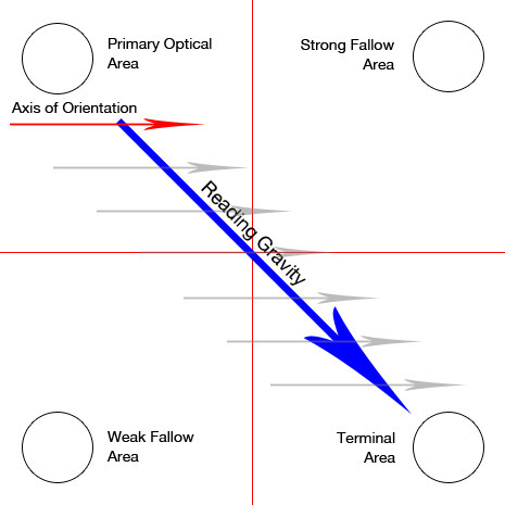
An article on Banner Blindness which explains the physcology behind it and enlists common techniques to reduce it and improve ad revenues.
Marty Note Interesting post and definitions that is true to my experience designing high converting ecommerce websites. There are ways to manipulate eye tracking with images and call-to-actions, but that area on the right the "strong fallow area" was a GUTTER.
REI is my favorite example at how to manipulate the "gutter" tendency to be a black hole or a roach motel (visitors check in but never out). REI takes a link they know everyone is looking for, their SALE link, they color it different than the rest of their menu (red).
REI defeats the "roach motel" aspects of the right gutter with intelligence and design. In my experience the SALE area shopper will ferret that link out no matter where you put it.
By taking an area that is normally a dead end and putting something the sale shopper will surely find they kill the proverbial two birds -
* Their SALE shoppers can beeline right to their favorite place to check BEFORE they do anything else.
* The SALE curios can easily find the link too so they lose nothing and gain an active link in an area that is typically weak. Just one reason why REI is one of the best-crafted ecommerce website:
http://www.rei.com
|
|
Scooped by
Martin (Marty) Smith
February 22, 2014 7:51 PM
|
There is no doubt that currently almost everything on the internet is becoming image-driven. If you think for a moment, it is only really catching up with print
|
|
Scooped by
Martin (Marty) Smith
February 20, 2014 9:22 PM
|
It almost seems that this year flat designs have taken over the world of graphic design by force, but especially in the arena of mobile apps with the first industry-shaking flat design being for the iPhone5. Reality is that flat design has been around longer than the emergence of the iPhone5, but of course it was Apple that helped to bring such cross-industry awareness to the design style.
|












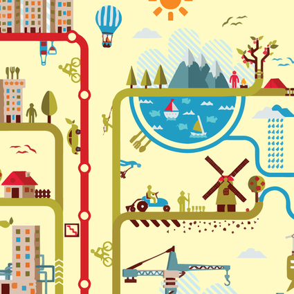


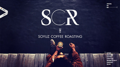





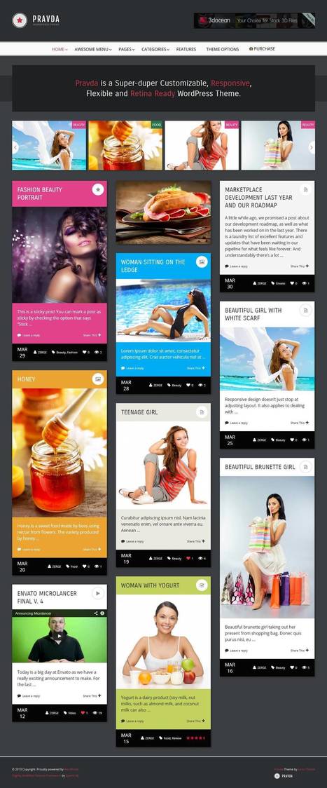






All I can say, is thank goodness for Visuals in content! I've always been a visual person being a visual learner. Information is easier to retain and comprehend when visuals are employed as it pulls you in.
The article's statistics further supports the importance of visuals. I love visuals!
see?
10 Razones por las que los contenidos visuales dominarán el 2014
¿En qué estrategias de marketing nos vamos a centrar en el 2014? ¿Qué vamos a dejar atrás?
Este artículo echa un vistazo al ascenso del contenido visual y por qué 2014 será el año de los elementos visuales.
.