 Your new post is loading...
An infographic from Social Media Marketo outlines 12 crucial steps your business can take to set up for success.
Via malek, Jeff Domansky
Real Money has done the math and shared their findings in the infographic Examining the Real Cost of Donald Trump's Wall, designed by DesignBySoap. It appears that the actual cost of the wall would end up being 2-3 times more expensive than the publicly released estimate. Luckily, even many of his supporters do not believe he will build the wall. You can see the details of Trump's plan, as well as some statistics on how Americans feel about it in the infographic above.
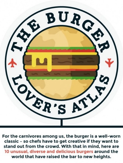
These tasty mouthfuls will stretch your idea of what can get go between two (or maybe three) buns. Would you like pickled lemon with that?
I would try all of these, and I bet some are shockingly good. People seem to like putting the french fries into the burger, which, since I like putting potato chips in my sandwiches, I have no right to hate on. It sounds pretty good actually.
I can’t decide if the Mos Rice burger or the Vada Pav is the biggest departure from a traditional burger. On one hand, at least the Vada Pav uses bread for the buns and has something fried in it. On the other hand, at least the Mos Rice has some layers of stuff in it instead of one ball of fried whatever. Actually, a ball of fried whatever is very in line with burger tradition, so I’m going to say that the Mos Rice is the least burger-like burger on this list....
If you want some insights into where the content marketing industry may be headed, it might just help to take a look at where it’s been. As we pointed out when CMI shared its History of Content Marketing infographic in 2012, brands have been telling their stories to audiences for hundreds of years. Not to mention that storytelling itself is one of the oldest forms of communication....
It’s not just a sausage in a bun; it’s a beautiful blank canvas. It’s a hot dog, which is a foodstuff eaten worldwide. Here are 40 distinctive varieties from around the globe — from iconic NYC “dirty water dogs” to fully loaded South American street-cart dogs to Japanese octo-dogs. There is a tubesteak out there for every craving that ever was.
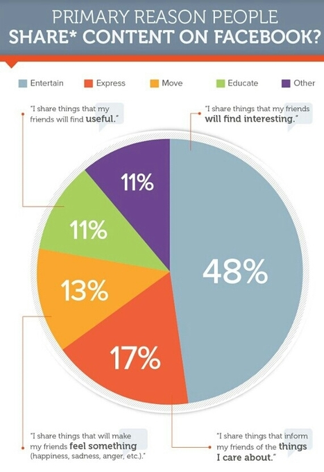
What motivates people to share content? This is one of the key questions all content marketers would love to understand more about. And while sharing, in itself, is rarely the end goal, shares do help spread the message and connect your content with a wider audience. To get a better understanding of what motivates content shares, content strategy group Fractl has conducted a study of what motivates Facebook users, specifically, to share a post. Fractl surveyed more than 2000 Facebook users to gain insight into what inspires them to click Like or Share on The Social Network. Among their key findings, Fractl's researchers found that: - Only 1 out of 10 respondents noted that their primary reason for sharing content was to educate their network, though more than half (55%) noted they do want to share useful content - Women are 26% more likely to share content more than once a day compared to men, while Baby Boomers are 19% more likely to share more than once per day than any other generation - 40% of respondents admitted to sharing content to make themselves look good. - Users with larger networks (over 500 friends) are 7% more likely to share content that maintains a certain image of themselves....
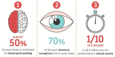
Think back to your first memory: Can you still see the watermelon pink dress you wore? Do you remember the unique checkered pattern of your father's jacket?
Our memories are often linked to visual and sensory elements, while the words spoken or read can be more hazy. That's because our brains have a high capacity for storing visuals in our long-term memory, while text enters our working memory, which is limited.
This contributes to why infographics and the inclusion of visual content in online information has been so successful. Readers crave visual breaks from the overload of text-based information that floods our daily browsing and work-related activities.
NeoMam Studios studied how people process visual information, how visuals affect the way we read, and why graphics are so appealing. Discover the science behind why our brains crave infographics....
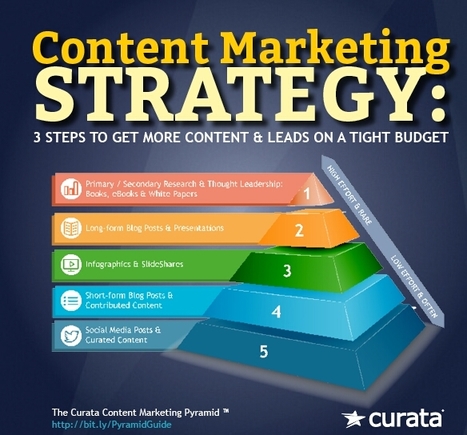
You were not given a content marketing budget in order to create content. You were given one to increase brand awareness and build your sales and marketing pipelines. Using the Content Marketing Pyramid helps you do just that. (For a deep dive, download Curata’s Content Marketing Pyramid eBook.) The Content Marketing Pyramid enables the development of content and related assets intended to reinforce common messages/themes through multiple content formats, distribution methods, and promotion channels across owned, earned, and paid media. The Pyramid assures optimal content consumption, reuse, reach and impact. It provides a common strategic process to align different parts of an organization around “content,” ensuring consistency across functional, geographic, and business unit boundaries....
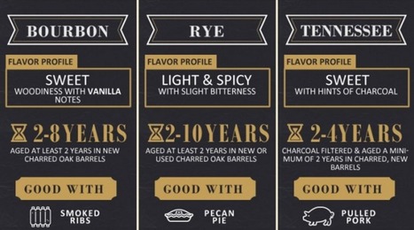
Drink up boys and girls. Today’s graphic will not only inform, but you’ll get to test your whiskey knowledge. How much do you know?

|
Scooped by
Jeff Domansky
January 16, 2016 3:02 AM
|
We've trawled the web to find the most informative and inspiring infographics - just look what we've uncovered!
Every picture tells a story, as they say, but sometimes it takes a clever combination of words and pictures to tell a story quickly, concisely and in an entertaining fashion.
The best infographics may look like they were simple to create in Photoshop, but designing an effective piece of data visualization is usually anything but....
So why are some infographics destined to die in obscurity while others get passed along to every corner of the web?
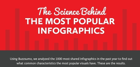
Content marketing researchers have been burning the midnight oil trying to figure out how to reliably produce viral content. After observing and analyzing a thousand different infographics across multiple industries and platforms, the team at SiegeMedia collected some interesting insights and patterns. As it turns out, going viral isn't entirely up to the hands of fate - the most popular content shared certain key characteristics.
Take a look at the following visual and learn what makes an infographic popular...
Great infoSocial media is an ever-changing beast. You almost can’t have a business in this day and age without a presence in the online world and specifically, at least, one of the big eight social media sites. Gone are the days where only teens frequented MySpace to chat with friends. Social media is here to stay, and people are looking online for your business so you’d better present your best.
Via Brian Yanish - MarketingHits.com, Jeff Domansky
Creating a really cool, memorable and–above all–shareable infographic comes down to investing the necessary time and attention in all the steps that lead up to an awesome data visualization.
In a previous series of posts, we discussed the steps to creating your own infographic. One of the key elements in this process is understanding that information can be categorized in one of five ways: - Chronologically
- Alphabetically
- Geographically
- Categorically
- Hierarchically
The visual format you choose will depend on how you want to organize your information. To help you identify which type of infographic will best serve your purpose and audience, we’ve compiled a list of the most-used types, along with advice on when to use them and examples of each....
|
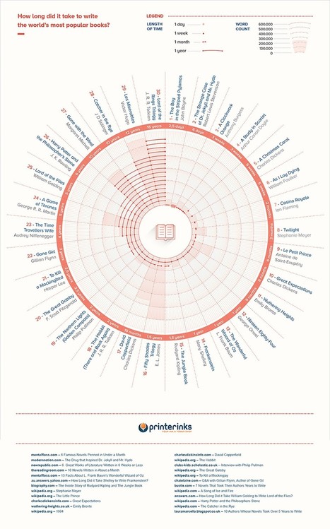
From William Faulkner to E.L. James this infographic has the answers. If you’ve ever wondered how long it took to craft some of history’s most famous books, you’ll want to check out this rad infographic from the kind folks at Printerinks. Tolkien takes top slowpoke honors for taking 16 years to write the Lord of the Rings while the quickest author on the list is John Boyne who wrote The Boy in the Striped Pyjamas in only 2.5 days! Check out the entire chart below
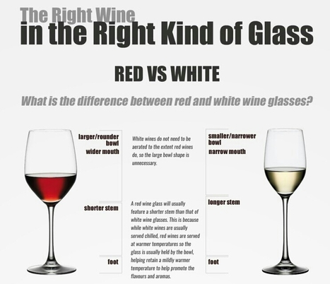
Just like how specific wines bring out the best flavors in certain foods, specific wine glasses bring out the best characteristics of each wine. The Right Wine in the Right Kind of Glass infographic from Wine Coolers starts off by showing us some general characteristic differences between red and white wine glasses, then shows us the correct wine glass to pair with each wine.
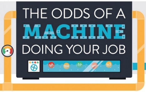
Spoiler Alert: The odds are high that a robot/algorithm is going to be better at your job than you are.
The ascendency of the robotic workforce is a complicated issue. On the one hand, millions of human rely on driving to earn a crust. On the other hand, over a million humans die in car accidents every year. Autonomous cars are guaranteed to greatly reduce both of these numbers. It’s hard to know how to feel about that.
If you’re not convinced that self-driving cars would increase road safety all that much, we’ve got an infographic on The Car of the Future that is sure to convince you.
Speaking of autonomous vehicles, I can’t agree that airline pilots are unlikely to be replaced by machines because they practically have been! Autopilot does the majority of the flying already, and it’s a small step from there to obsolescence. I also think it’s much more likely that police patrols get replaced by robots than this graph does, but let’s not dwell on that dystopian possibility....
|
|
Scooped by
Jeff Domansky
July 7, 2016 10:26 PM
|
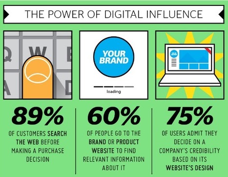
The Internet is currently one of the most powerful media and as such plays an important role in marketing. The first step towards successful online promotion, however, is a company’s website that needs to be optimized for excellent user experience. The infographic outlines some of the most important factors that determine a visitor’s overall experience with the website, as well as some interesting stats on users’ behavior. Today, it is important to have a website that is intuitive and, above all, optimized for display across multiple screen sizes. This way, a company can reach the maximum number of targeted users and make them engage. Therefore, both web designers and marketers need to take these aspects into consideration before they start planning an online development....
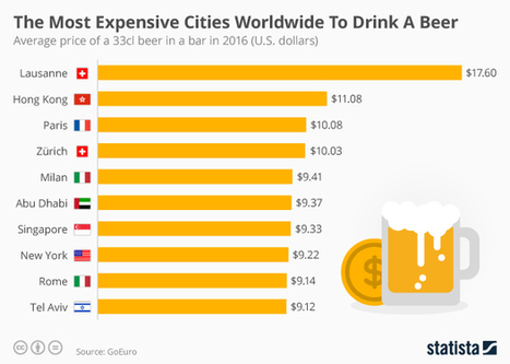
If you’re on a business trip to the city of Lausanne in Switzerland, you might have to think twice about drinking an evening beer on your company’s tab in one of the city’s bars. Eyebrows would certainly be raised in accounting at a 33cl beer that costs a whopping $17.60. Situated on the shores of Lake Geneva, the city has the highest beer prices in the world, according to a ranking released by GoEuro. The website compared the price of local and imported draught beer in hotel bars worldwide to compile their ranking. If you find yourself on a business trip to Lausanne, it might be better to visit one of the city’s supermarkets where a bottle of beer costs only $1.42 on average by comparison.Hong Kong also charges extortionate prices for alcoholic drinks in bars with a 33cl beer coming in at just over $11 on average. Paris and Zürich follow with beer prices in bars averaging $10.08 and $10.03 respectively. New York is the only US city to make the top 10 of GoEuro’s ranking with a 33cl beer in a bar costing $9.22 on average. Rome and Tel Aviv round off the ten costliest places to drink beer worldwide with both charging just over $9 on average. There is a massive disparity with the cheapest cities for beer drinkers, the majority of which can be found in Eastern Europe. Bratislava’s bars charge a mere $2.80 on average for a 33cl with Kiev and Cape Town coming second and third for the world’s most affordable brews.
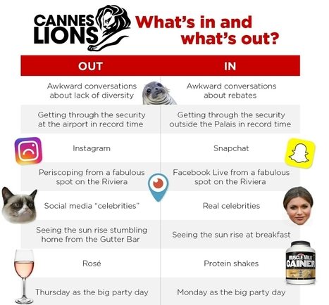
Over the years, the Cannes Lions International Festival of Creativity has morphed from a production company free-for-all to an agency shindig to a place where serious people insist that “serious business is actually getting done.” There is also, thankfully, a lot that remains unserious in Cannes. This is the cradle of cutting edge trends and what-were-they-thinking lapses in judgment. To make sense of what we’ve seen this week, here’s what’s in and out at Cannes 2016. (For easy reference, here’s last year’s list. Remember Periscope?)
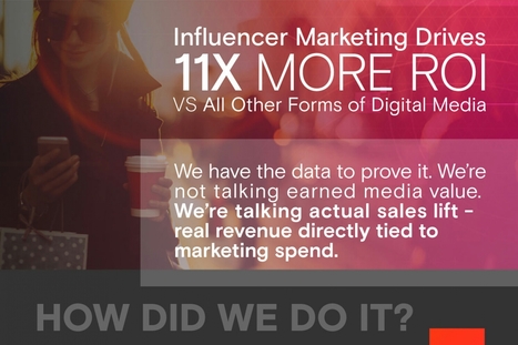
TapInfluence always knew influencer marketing was powerful and delivered results, but now they have the data to prove it in this infographic.
|
|
Rescooped by
Jeff Domansky
from visualizing social media
February 15, 2016 11:27 AM
|
Google has many different sources of revenue, but one of their most noticeable is the ads that appear next to search results for specific keywords. How much that keyword costs depends, in part, on how often people search for it -- the more people search for a certain keyword, the more expensive it is.
Via Brian Yanish - MarketingHits.com, massimo facchinetti, Lauren Moss
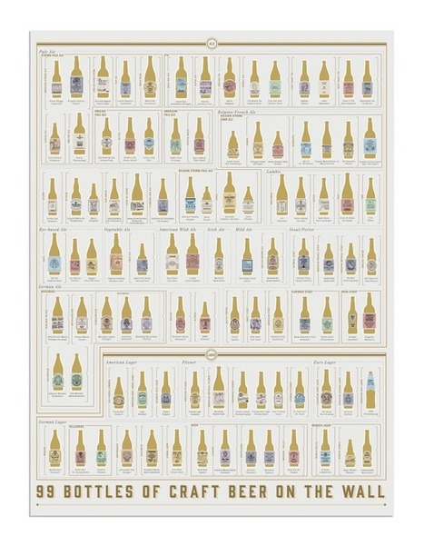
The guys at Brooklyn's Pop Chart Lab's already put out the most comprehensive beer infographic on the planet, but you'd die of alcohol poisoning if you tried to drink your way through it, even in a year. Inspired by the annoyingly repetitive school bus tune, Pop Chart's latest is a lot more manageable. The 99 Bottles of Craft Beer on the Wall chart is a scratch-off checklist of almost 100 craft beers.
|
|
Scooped by
Jeff Domansky
January 16, 2016 2:51 AM
|
It's fair to say that 2015 has been an explosive year for infographics. Thanks to viral posts that explore everything from the risks of drinking diet coke, to quick funny hits exploring the creative process, the last twelve months have seen some amazing data visualizations.Unsuprisingly, some of the most beautiful and educational infographics in 2015 have been all about design, so we've collected 10 of the best below to round off your year and kickstart your creativity for 2016....
When the worlds of content and data meet, infographics are born. That means 2015 was a pretty great year.
At Visually, we don’t believe in wasting time, so we’ve pulled together all the best and brightest infographics in one place. To give the search for the best a little direction, we tried to select infographics that: - Use design to succinctly tell a story that images, data, or words couldn’t have conveyed on their ownInclude a narrative that keeps the viewer engaged (as opposed to a list of facts or data points) - Require little or no additional context to be understood - Create an emotional connection to the information that’s being shared.
Mull over these fine specimens to get fired up for some awesome content creation in 2016. Or if you want to dig deeper, check out the complete list of our staff picks from the Visually Community. You know you want to!...
|
|
Scooped by
Jeff Domansky
December 8, 2015 1:51 AM
|
Being a visual designer can be challenging and invigorating at the same time. On the downside, you are expected to perpetually work at your creative peak, while also pleasing other people’s aesthetic preferences. On the positive side, you get to create fun and beautiful artwork for a living.
To inspire you in your daily work as a graphic artist, we’ve compiled a list of insightful infographics with useful tips and design hacks. Valuable for both amateurs and professionals, these visual guides will surely become a part of your own personal collection of design manuals that can also be shared with your colleagues and friends....
|


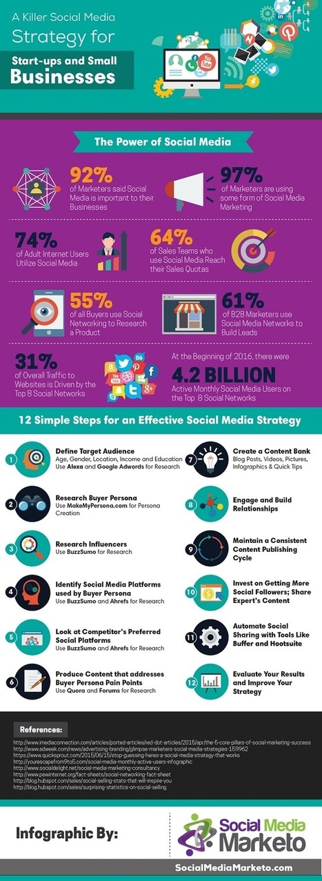


12 steps to more effective social media.