


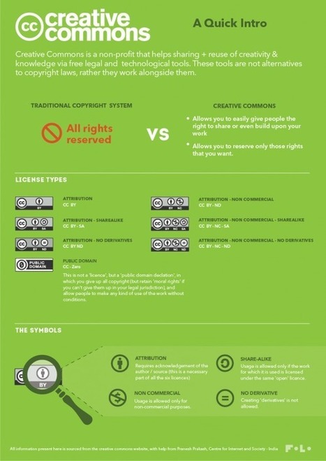


Curated by Beth Kanter
What is Responsive Design?
Responsive Design creates the optimal user experience for different use cases and enviroments, all built into one website. For example, an interface that automatically scales and re-arranges for a mobile device vs. a full-scale monitor, is using responsive design.
What is Responsive Information Design?
Responsive information design is very similar, but it involves being responsive to the incoming data as well. It defines a set of best practices for designing data visualizations and infographics where the nature of the data that is being visualized is not 100% known at the time of its design. In other words:
The aim of Responsive Information Design is to produce a
robust visual representation for information with varying
forms, shapes, and sizes.


 Your new post is loading...


