 Your new post is loading...

|
Scooped by
association concert urbain
August 23, 2015 10:05 AM
|
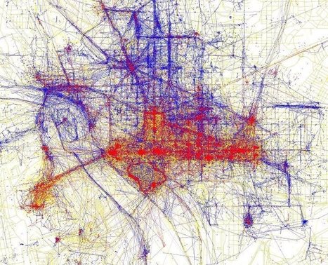
"Tourists and locals experience cities in strikingly different ways. To see just how different these two worlds are, have a look at the map of Washington D.C. above based on where people take photos. The red bits indicate photos taken by tourists, while the blue bits indicate photos taken by locals and the yellow bits might be either."
|
|
Scooped by
association concert urbain
January 1, 2015 8:32 AM
|
Elwood was a senior geographer working on the ground-floor of the very global positioning systems (GPS) and geographic information systems (GIS) he will throw up for discussion in his TEDx talk.
His question: Are we surrendering our innate mental map making abilities to technology and relying on and trusting it too much? And for TEDx audiences only, he’ll toss out ideas on ways to prevent that from happening.
Tags: mapping, GPS, cartography, TED, 201.
|
|
Scooped by
association concert urbain
August 6, 2014 4:40 AM
|
Watch the commuting patterns of New York, San Francisco and Los Angeles.
|
|
Scooped by
association concert urbain
July 11, 2013 2:02 AM
|
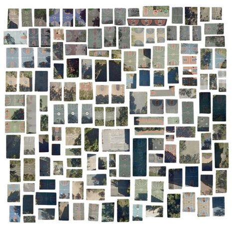
Every Outdoor Basketball Court in Manhattan
Is there meant to be any commentary on humanity's sometimes ugly effect on the landscape? Of course there is an environmentalist bent in pieces like the collections of landfills and waste ponds, but on a much broader note, what I'm trying to illuminate is the utter humanness and strangeness of the marks we've left on the earth. Only humans would build boxes of chlorinated water in the ground to occasionally splash around in, or engineer something as complicated as a water slide for the sole purpose of entertainment. Imagery taken from the inhuman perspective of a satellite provides us enough distance to appreciate the time and species-bound specificity of our surroundings, and to see ourselves reflected in them.
|
|
Rescooped by
association concert urbain
from visual data
April 29, 2013 8:11 AM
|
Thanks to the open data movement and Google Map Maker, anyone with a computer can create a map. These maps tell a story, but it's a subjective one. And while that can be a powerful tool, it can also skew perspectives and cloud a debate. "We should really teach people to read maps in that way," says Laura Kurgan, an associate professor of architecture at Columbia University. "Maps are arguments, just like a piece of written journalism is an argument."
Via Lauren Moss
|
|
Rescooped by
association concert urbain
from APHG EMiller
October 4, 2012 9:39 AM
|
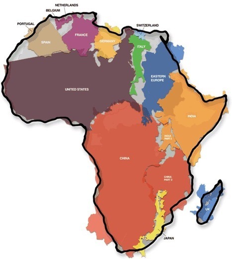
This is another old classic image that I might have shared earlier but it merits repeating. As Salvatore Natoli (a leader in geography education) once said, "In our society we unconsciously equate size with importance and even power." This is one reason why many people have underestimated the true size of Africa relative to places that they view as more important or more powerful. Tags: mapping, Africa, perspective, images.
Via Erin Miller
|
|
Rescooped by
association concert urbain
from Energy Nexus
July 5, 2012 11:19 AM
|
To enable as many cities as possible to have their own 3D city model, the specialists from 3D Reality Maps, perfected the next generation of high resolution 3D landscape models, and the technology for 3D modeling of cities.
Via Sakis Koukouvis, Lockall, DanielePiccolo
|
|
Scooped by
association concert urbain
May 8, 2012 4:19 PM
|
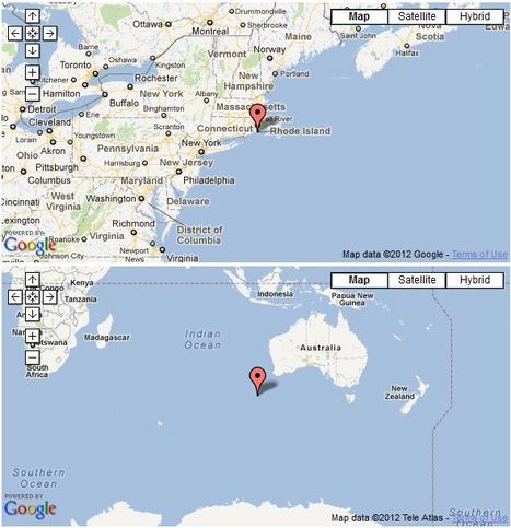
In geography, the antipodes of any place on Earth is its antipodal point; that is, the region on the Earth's surface which is diametrically opposite t... I know that most Americans have learned at an early age that if you dig a hole through the center of the Earth, you'll end up in China. Geologic and impossibilities aside, most Americans would actually end up in the Indian Ocean as displayed by this clever pairing up maps that shows the user the Antipode of any given place on Earth. Try it out! http://www.antipodemap.com/
|
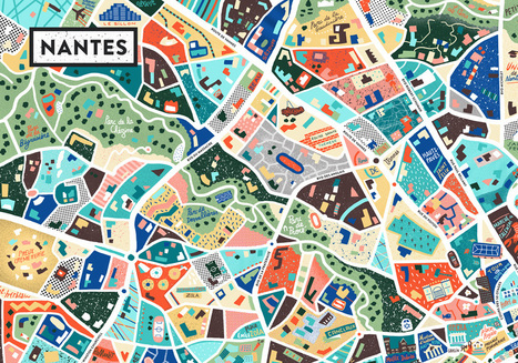
L’artiste Antoine Corbineau s’est lancé dans le projet de peindre la ville de Nantes, à sa façon. Son travail mélange la cartographie et l’illustration
Via Desarts Sonnants
|
|
Scooped by
association concert urbain
August 15, 2014 4:54 AM
|
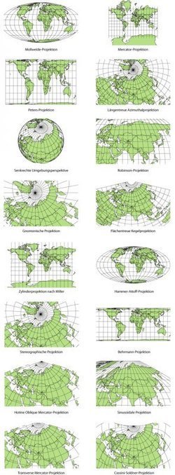
Elizabeth Borneman explores how cartography and cartographic projections help and hinder our perception of the world. "How do you think the world (starting with our perceptions) could change if the map looked differently? What if Australia was on top and the hemispheres switched? By changing how we look at a map we truly can begin to explore and change our assumptions about the world we live in."
Geography doesn’t just teach us about the Earth; it provides ways for thinking about the Earth that shapes how we see the world. Maps do the same; they represent a version of reality and that influences how we think about places.
Tags: mapping, perspective.
|
|
Rescooped by
association concert urbain
from visual data
January 26, 2014 4:50 AM
|
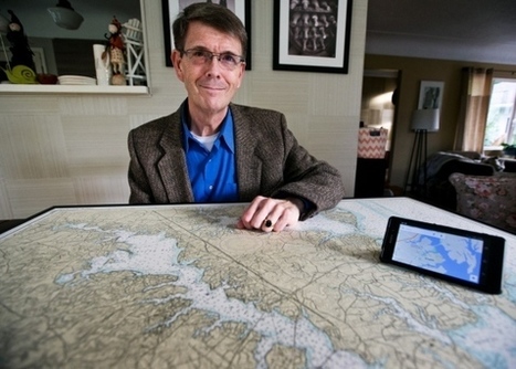
When the United States decides to recognize a new government, or an existing country changes its name, Leo Dillon and his team at the State Department spring into action. Dillon heads the Geographical Information Unit, which is responsible for ensuring the boundaries and names on government maps reflect U.S. policy. The team also keeps an eye on border skirmishes and territorial disputes throughout the world and makes maps that are used in negotiating treaties and truces. Dillon’s been at the State Department since 1986, and he says his job remains as fun as ever. “The landscape of political geography is constantly changing,” he said. “Every day I come in here and there’s something new.” We spoke with Dillon to learn more about it...
Via Lauren Moss
|
|
Scooped by
association concert urbain
May 12, 2013 4:36 AM
|
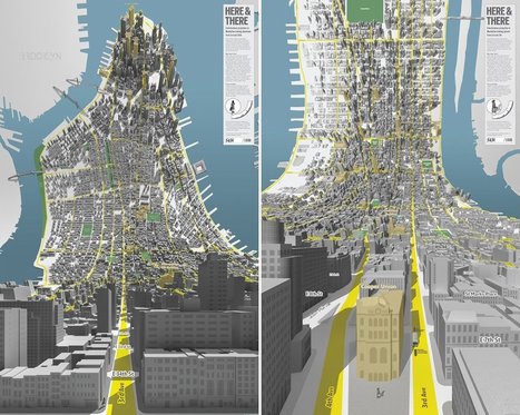
"London-based design firm BERG created these two 3D maps of Manhattan, which look like a scene out of "Inception" (via Curbed NY)."
|
|
Rescooped by
association concert urbain
from green infographics
October 15, 2012 11:55 AM
|
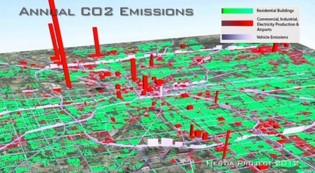
A team of researchers from Arizona State University have developed a new software system, called Hestia, that is capable of estimating greenhouse gas emissions across entire urban landscapes, all the way down to street level and individual buildings. The project, known as Hestia after the Greek goddess of home and hearth, allows the team to combine extensive public database “data-mining” with traffic simulation and building-by-building energy-consumption modeling. According to researchers, Hestia’s increased detail and accuracy will help cities, and possibly even other nations, identify where an investment in energy and greenhouse gas savings would have the greatest impact...
Via Lauren Moss
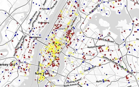
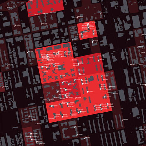
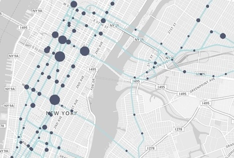
What do 1.6 billion mass transit trips through the city look like? In 2011, MetroCards were swiped through the turnstiles of the New York City subway system 1.6 billion times. Each swipe was, itself, a data point, and it came connected to myriad others about the day of the week, the subway stop, the identity of the rider. Did the commuter have a student MetroCard, or a senior citizen one? What about a seven-day pass, or a 30-day one? As a sheer byproduct of moving so many people around the city, the New York Metropolitan Transit Authority constantly churns out information like this. And, thanks to the rapidly expanding movement for open data, it’s now available to the public – if we can just begin to figure out what to do with it. "This is such a big sprawling thing," says John Geraci, who heads the New York office of faberNovel, a Paris-based company that consults with cities, non-profits and private companies on how to act more like startups. "This data was not created really with this in mind, with the idea of being seen by people. It’s like data exhaust." Geraci’s firm has just created a data visualization site playing with all of this information to at least begin to tempt our imaginations on what we could learn from it...
Via Lauren Moss, Sylvia Fredriksson
|
|
Scooped by
association concert urbain
June 11, 2012 2:16 PM
|
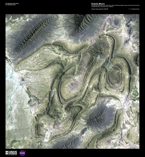
The USGS is celebrating 40 years of the LANDSAT Program by having a competition to select the top 5 "Earth as Art" images from the more than 120 scenes from their curated collection. All readers can select 5 images on the USGS website and the poll closes on July 6, 2012 (The image above is from Coahuila, Mexico).
|
|
Scooped by
association concert urbain
April 20, 2012 4:50 PM
|
The National Geographic Education team has produced a fabulous site that has online GIS tools for understanding the environment of the Cheasapeake Bay watershed. Students can upload their data, click on various layers, and use drawing and measuring tools. Other "Fieldscope" projects are available as well at: http://education.nationalgeographic.com/education/program/fieldscope/
|


Very interesting
cities photos