La rédaction Web consiste à guider le lecteur dans l’espace-écran et à situer l’information dans son contexte. Un héritage issu du wayfinding en design.
Via Atisy Joëlle

 Your new post is loading...
 Scoop.it! La rédaction Web consiste à guider le lecteur dans l’espace-écran et à situer l’information dans son contexte. Un héritage issu du wayfinding en design. Via Atisy Joëlle 
No comment yet.
Sign up to comment
Scoop.it!

Une façon amusante et facile de créer de magnifiques icônes plates, ombragées, de bureau, de médias sociaux! Via Marc Cervennansky, Didier Fosse
Scoop.it!

Why are videos so important for a better web experience? and what impact will HTML5 have on videos?
Scoop.it!

Do you have a presentation coming up? You'll need to grab and hold your audience attention. In this article you'll find 8 great tips. Read now...
Scoop.it!

It doesn't matter whether Aereo wins or loses its Supreme Court case. Broadcasting is going to change, because consumers demand it.
Scoop.it!

Si vous besoin de faire des captures-écran sous Windows, mais aussi des captures vidéos pour ensuite les annoter et les partager sur le net, foncez télécharger le freeware TinyTake. Ce petit logiciel permet de réaliser des captures images complètes, par zone ou par fenêtre, mais aussi des vidéos de votre bureau ou de votre webcam, … Via FrancoisMagnan, Béatrice Austin
Scoop.it!

Ana Cristina Pratas's curator insight,
April 22, 2014 1:35 PM
"Game thinking, from an instructional game designer’s perspective, is approaching the design of a learning event from the perspective of learner actions and activities that lead to a meaningful outcome while navigating some sort of risk. Meaningful outcomes involve overcoming challenges and solving problems through thoughtful decision making by the learner. It also involves risk; games include the risk of giving up territory, of having to start over , or of not successfully completing the endeavor. With nothing at risk, there is little to gain."
Scoop.it!

Pour les Webmasters voici la Licence 100% gratuite géoservices IGN Fr 2014 pour usage grand public Avec cette licence géoservices IGN pour usage grand public – gratuite, vous pourrez:
http://licence-gratuite.blogspot.fr/2014/04/webmaster-licence-gratuite-geoservices.html Via blasco IA
Scoop.it!
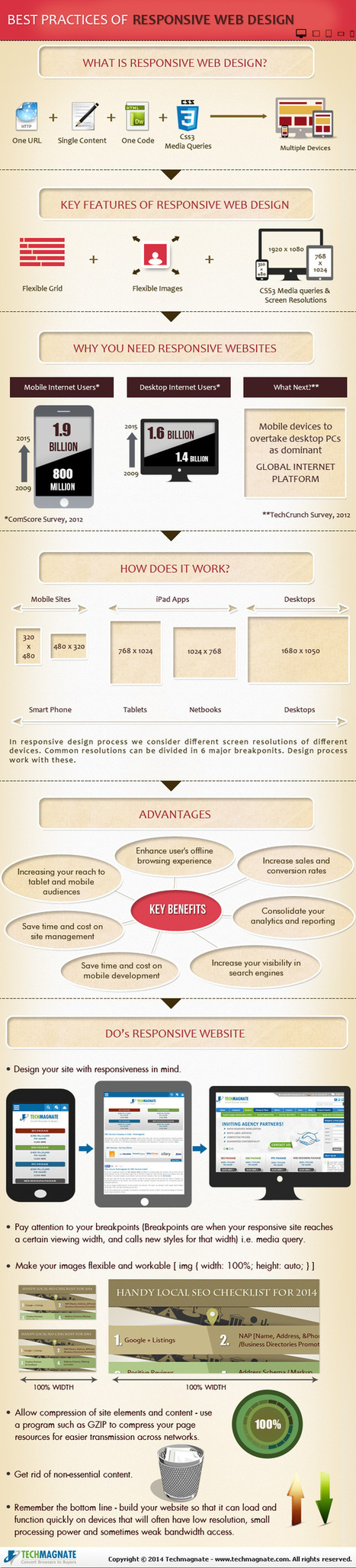
Responsive design for a website is often used in the context of mobile users. Given the fact that more and more users are using mobile devices such as their smartphones and tablets to access the web, both for browsing and otherwise, it is extremely important that website designs become responsive towards all devices and screen sizes. Find more advantages, benefits and best practices of responsive design at the infographic and article link. Via Lauren Moss, Boyé

Massimo Petrucci's curator insight,
April 22, 2014 4:27 AM
Interessante infografica che mostra le dimensioni ideali degli oggetti web e delle immagini quando si progetta un template resposive. 
Mr Tozzo's curator insight,
April 23, 2014 5:42 AM
6 Best Practices of Responsive Web Design [Infographic]

Pallab Kakoti's curator insight,
April 24, 2014 4:56 AM
Responsive designs are the window into the future of web portability to drive higher per user engagement by embedding the concept of Probability Scores. An aggregate of Content Scores & Engagement Scores are debated prior to finalizing which sections gets a higher Probability Score that will eventually determine content position in the responsive design layout. Probability Scores aims at achieving better per user click through rate owing to its full width auto adaptive content display interface that adjust the landing page content based on the device.
Earlier websites used to feed different URLs for different devices. For example m.sitename.com or mobile.sitename.com indicated that the URL is for mobile or smart devices. But now things have changed thanks for responsive design attributes that determines the device that is trying to access the site URL before optimizing the content layout to adjust automatically with the device interface. This way the same URL is serving any device that is trying to access the website which again is compliance for search engine algorithm.
Responsive design has the advantage to every inch of the device or browser interface to maximize the user’s engagement intent possibility. Compelling visual storytelling theme powered by catchy headlines or titles richly feed with an interesting content copy furthermore elevates user interest to engage. This nature in elevating intent & urge to get involved have statistically indicated the favourability of lead generation & conversion rates from responsive designs.
Mobile devices will overtake PC user worldwide citing encouraging statistics to enthuse responsive design for websites, emails & landing pages. Responsive design layouts devised with #ProbabilityScores are based on the overall marketing objectives & branding goals. An implosive content marketing strategy with a creative team of visual storytellers delivers inspiring results and therefore the greater goodness is in the adoption of Responsive Site Design.
#ProbabilityScores <> #ContentScores <> #ContentEngagement Visit the blogs4bytes Responsive Content Design HomepageCheck out the Responsive Content Scores for the blogs4bytes Homepage
http://sonicrituals.brinkster.net/ps/probabilityscores.png
Responsive Design, Parallax Campaigns, Hashtag Marketing, SEO & SMO all blend into one to serve a hot cup of result driven digital marketing performance with #blogs4bytes // Follow the conversation.
Scoop.it!
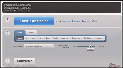
Voila en ce mardi un site ou plutôt comme j'aime souvent les nommer une trousse à outils audio - vidéo gratuite en ligne. Un site qui va vous donnez accès à six outils voir sept tous vraiment très intéressants, que ce soit, un découpeur audio, un convertisseurs multi formats audio, un fusionneur audio, un convertisseur multi formats vidéo, un enregistreur de voix et un découpeur vidéo, tous ces outils sont gratuits et disponible en ligne via un simple navigateur web. Via Frédéric DEBAILLEUL, Marie-Hélène Fasquel-Erhart, Juergen Wagner, Jean-François Grassin, Françoise Chatelain
Scoop.it!

April 21, 2014
Scoop.it!

"Un template aux couleurs basiques noir, blanc et rouge, complètement responsive pour navigateurs et supports mobiles, proposé en téléchargement gratuit." Via Pascal Gibert
|
Scoop.it!

Les méthodes pragmatiques et cyniques pour organiser la fermeture d’un site Des sociétés qui mettent en scène la faillite de …
Scoop.it!

"Un template basique, mais efficace en html5 et CSS3, responsive pour supports mobiles et la majorité des navigateurs web, proposé en téléchargement gratuit." Via Pascal Gibert
Scoop.it!

Responsive web design (RWD) is generally regarded, as CMSWire writer Tom Murphy noted today, "just fine for now." But a new survey from Trilibis, a provider of mobile development solutions, claims mobile performance on responsive design websites is often "unacceptable." Four out of five RWD websites provide suboptimal page weight and load time on mobile devices, according to the survey, "Responsive Web Design: Why Image Optimization Is Crucial Topic: Customer Experience. Via Nicolas Deloyer
Scoop.it!

This is a social media sizing cheat sheet and we find it very useful here at infinpixels. There are many other sizing cheat sheets on the web but as a designer Via Maria Margarida Correia
Scoop.it!

The best way to create terrible e-Learning is to dump content in an authoring tool (as if it was PowerPoint) add some questions and call it a course. Everybody knows (or should know) that learning development starts with defining clear learning objectives. This blog post precedes the course and tool to explain to you the basics on how to create good learning objectives.
Via Xavier Van Dieren
Scoop.it!

Discover the world with Google Maps. Experience Street View, 3D Mapping, turn-by-turn directions, indoor maps and more across your devices. Via Patrick W.
Scoop.it!
12 outils 2.0 gratuits pour réaliser des quiz avec une vidéo associée Via Olivier Leguay, Françoise Chatelain
Scoop.it!

An educator's guide to open educational resources (OER), including online repositories, curriculum-sharing websites, sources for lesson plans and activities, and open textbooks.
|