


Follow, research and publish the best content
Get Started for FREE
Sign up with Facebook Sign up with X
I don't have a Facebook or a X account
Already have an account: Login

Journalisme graphique
142.4K views |
+0 today
La veille de Wedodata, studio de datavisualisations : wedodata.fr
Curated by
Karen Bastien
 Your new post is loading...
 Your new post is loading...
Your new post is loading...
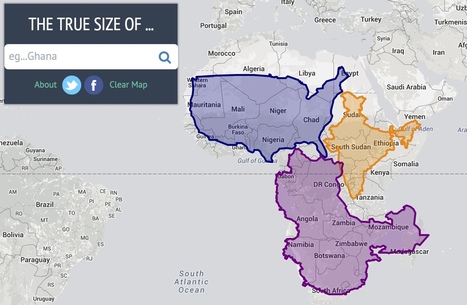
Drag and drop countries around the map to compare their relative size. Is Greenland really as big as all of Africa? You may be surprised at what you find! A great tool for educators.
Karen Bastien's insight:
Compare Countries With This Simple Tool 

Stephane Bilodeau's curator insight,
September 7, 2015 11:29 AM
"It is hard to represent our spherical world on flat piece of paper. Cartographers use something called a "projection" to morph the globe into 2D map. The most popular of these is the Mercator projection. Every map projection introduces distortion, and each has its own set of problems. One of the most common criticisms of the Mercator map is that it exaggerates the size of countries nearer the poles (US, Russia, Europe), while downplaying the size of those near the equator (the African Continent). On the Mercator projection Greenland appears to be roughly the same size as Africa. In reality, Greenland is 0.8 million sq. miles and Africa is 11.6 million sq. miles, nearly 14 and a half times larger.
This app was created by James Talmage and Damon Maneice. It was inspired by an episode of The West Wing and an infographic by Kai Krause entitled "The True Size of Africa"."

Vincent Lahondère's curator insight,
September 3, 2015 4:50 AM
Vous recherchez un site pour pratiquer l'infographie et (ou) la cartographie interactive.
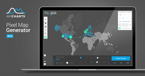
Create a stunning interactive maps with simple-to-use user interface. Save it as image or JavaScript code for easy publishing on your own website.

How does knowledge grow? Sometimes it begins with one insight and grows into many branches. Infographics expert Manuel Lima explores the thousand-year history of mapping data -- from languages to dynasties -- using trees of information. It's a fascinating history of visualizations, and a look into humanity's urge to map what we know.
Stephane Bilodeau's curator insight,
August 22, 2015 7:48 AM
Very interesting. Manuel Lima studies how information is organized - connected — into diagrams that illustrate the many unexpected twists of big data.
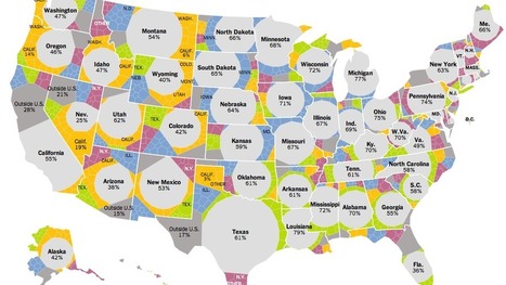
Many Americans born in blue states have moved to red states since 2000, helping Democrats in national elections.

Monitor the activity of the agency Sid Lee Paris in real time.
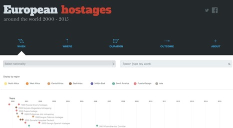
The first comprehensive database of all known
Karen Bastien's insight:
The European Hostage Project is a comprehensive database of cases from January 1, 2000 to March 31, 2015 in which Europeans were taken hostage by non-state groups outside of Europe. It covers the 28 European Union countries, plus Norway and Switzerland, and is the fruit of a months-long collaboration between Agence France Presse and 2nd-year graduate students at the Journalism School of the Institute Français de Presse.

Every day, there are 3 billion+ searches on Google. See how those searches reflect the way the world thinks about climate change.

Patrice Mitrano's curator insight,
June 24, 2015 2:56 AM
Spectaculaire et très fluide (joli rendu de la terre) mais absence de méthodologie à regretter, et d'unités en Y sur les graphiques...

From
www

Take our sports quiz and we'll have our best stab at suggesting which events from the Commonwealth Games could match your physical and mental abilities.
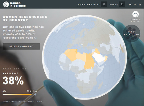
Infografía interactiva de la UNESCO para los países del mundo.

Visualising the housing crisis in London and the UK based on real stats.

The most controversial Wikipedia articles worldwideWHEN disputes arise on Wikipedia, contributors are encouraged to go to a “talk page.” But often an “edit...
|
During the last 60 years Aral Sea has almost completely dryed up. This shrinking is considered to be “one of the planet’s worst environmental disasters”.
Un dessin vaut mieux que de long discours. Le refrain est connu. Le développement de l'usage des infographies dans la presse , dans les médias, dans l'édition ces dernières années est une tendance lourde.

CDI Collège Gabriel Rosset's curator insight,
December 4, 2015 3:50 AM
Pour mieux mémoriser, mieux comprendre des informations, notamment statistiques ou géographiques rien de mieux qu’un diagramme, une cartographie ou un schéma explicatif. Rien de mieux qu’une bonne infographie. 
GROUPE ISORE's curator insight,
March 29, 2016 6:54 AM
Pour mieux mémoriser, mieux comprendre des informations, notamment statistiques ou géographiques rien de mieux qu’un diagramme, une cartographie ou un schéma explicatif. Rien de mieux qu’une bonne infographie. 
MFQM Pays de la Loire's curator insight,
April 1, 2016 4:57 AM
Pour mieux mémoriser, mieux comprendre des informations, notamment statistiques ou géographiques rien de mieux qu’un diagramme, une cartographie ou un schéma explicatif. Rien de mieux qu’une bonne infographie.

From
citie
CITIE, a new piece of research by Nesta, Accenture and the Future Cities Catapult, is a resource designed to support city leaders to develop policy catalyse innovation and entrepreneurship - www.citie.org
Readers: Veronica Johnson from Investintech.com recently sent me this infographic that I want to share with you. If you or your company have any insightful infographics or data visualizations you w...
To mark each mid-year and end of year milestone I try to take a reflective glance over the previous 6 months period in the data visualisation field and compile a collection of some of the most significant developments. These are the main projects, events, new sites, trends, personalities and general observations that have struck me as being important to help further the development of this field.

Over time, civil rights expand, but there is far less clarity about the direction of public opinion on other issues.
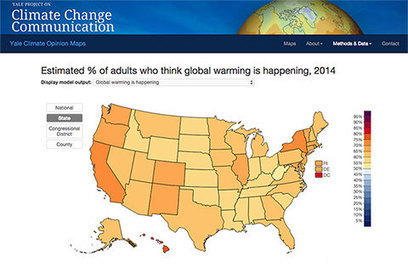
Public opinion about global warming is an important influence on decision making about policies to reduce global warming or prepare for the impacts, but American opinions vary widely depending on where people live. So why would we rely on just one national number to understand public responses to climate change at the state and local levels?

cB's curator insight,
June 20, 2015 12:12 AM
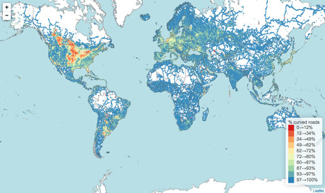
La méthode connait plusieurs biais. On peut citer : la couverture incomplète d'OMS, la non prise en compte des angles importants, les changements de toponymie qui font compter deux routes....
source : https://github.com/rory/openstreetmap-bendy-roads ;
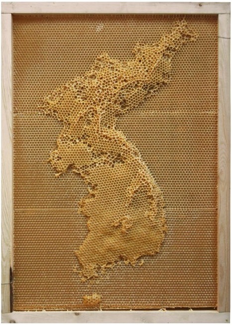
In an exploration of the connection between humans an nature, artist Ren Ri uses beeswax as his medium and the bee colony as the builder. Yeah. Because a colony will follow the queen bee and build ...
|


1 point = 20 migrants !!!