Your new post is loading...

|
Scooped by
Karen Bastien
November 17, 2015 12:09 PM
|
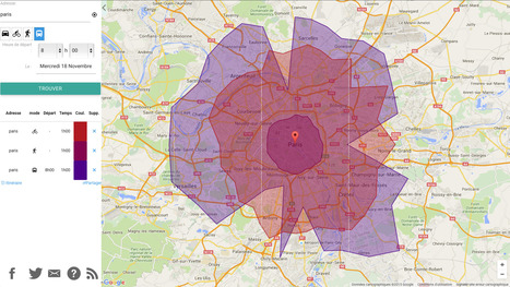
Oalley est une carte interactive qui vous permet de trouver jusqu'où vous pouvez aller en un certain temps en voiture.
|
|
Scooped by
Karen Bastien
November 16, 2015 12:19 PM
|
In this interactive data visualization you can investigate how the 146 million employed persons in 2014 were divided up between ~550 different occupations
|
|
Scooped by
Karen Bastien
November 12, 2015 3:55 PM
|
Every day is a bit different, but here is a wideout view of how Americans spend their days. Compare with your own time use.
|
|
Scooped by
Karen Bastien
November 6, 2015 7:44 AM
|
La liste est disponible sous forme de carte sur le site opendatainception.io. Lorsque vous développez une solution permettant de lancer des portails Open Data en quelques minutes, une question revient régulièrement : Où puis-je trouver des données propres et utilisables ? Notre première réponse est généralement : “Avez-vous pensé aux portails Open Data ?” Si …
|
|
Scooped by
Karen Bastien
November 5, 2015 2:11 AM
|
Playing with time can mess up your head, so we drew a picture for you. This is what daylight and darkness look like in most of the United States over the course of a year.
|
|
Scooped by
Karen Bastien
October 22, 2015 7:45 AM
|
|
|
Scooped by
Karen Bastien
October 16, 2015 7:54 AM
|
Through the lens of self-quantification, the data viz guru recounts how much the world has changed in just a decade.
|
|
Scooped by
Karen Bastien
October 15, 2015 5:23 AM
|
|
|
Scooped by
Karen Bastien
October 8, 2015 6:13 AM
|
Interactive graphic of Formula 1 calendars, results, tracks, teams and drivers
|
|
Scooped by
Karen Bastien
October 7, 2015 1:22 PM
|
|
|
Scooped by
Karen Bastien
September 22, 2015 1:13 PM
|
The US in an energy monster. How does your state stack up?
|
|
Scooped by
Karen Bastien
September 18, 2015 10:08 AM
|
In 1964, Paul VI became the first pope to leave Italy since the days of Napoleon. Since then, papal visits have been part evangelical, part political and part rock star.
|
|
Scooped by
Karen Bastien
September 15, 2015 12:51 PM
|
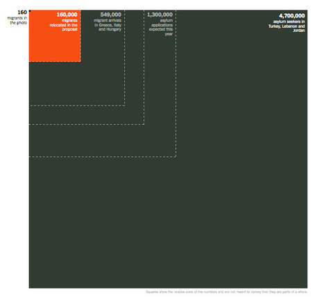
The latest E.U. proposal addresses just a fraction of a human crisis numbering in the millions.
|
|
|
Scooped by
Karen Bastien
November 17, 2015 4:34 AM
|
The world is facing its biggest refugee crisis since the second world war. The words used to describe people moving between countries greatly influences attitudes towards them. Migrant, refugee, human being – what is the best way to refer to the world’s 60 million uprooted people?
|
|
Scooped by
Karen Bastien
November 12, 2015 4:49 PM
|
|
|
Scooped by
Karen Bastien
November 8, 2015 2:24 PM
|
Discover the full portfolio of Andreessen Horowitz & the technologies worth investing in. Dive into the different categories and find out the best ranked tech companies
|
|
Scooped by
Karen Bastien
November 5, 2015 2:57 AM
|
|
|
Scooped by
Karen Bastien
October 30, 2015 4:47 AM
|
Le nombre d'adoptions internationales ne cesse de chuter. Pourquoi ? Analyses et données chiffrées dans cette datavisualisation interactive.
|
|
Scooped by
Karen Bastien
October 21, 2015 6:36 AM
|
|
|
Scooped by
Karen Bastien
October 15, 2015 9:24 AM
|
|
|
Scooped by
Karen Bastien
October 15, 2015 3:10 AM
|
Histography is an interactive timeline that spans across 14 billion years of history, from the Big Bang to 2015
|
|
Scooped by
Karen Bastien
October 8, 2015 2:58 AM
|
Want to develop a better work routine? Discover how some of the world’s greatest minds organized their days.
|
|
Scooped by
Karen Bastien
September 28, 2015 11:19 AM
|
COP 21 : une application interactive de Novethic.fr pour cartographier le risque carbone et les actions des États, des investisseurs et des entreprises.
|
|
Scooped by
Karen Bastien
September 21, 2015 9:08 AM
|
These striking visualizations of tennis matches show what we can learn from sports tracking data.
|
|
Scooped by
Karen Bastien
September 17, 2015 7:10 AM
|
Map created by congosto in CartoDB
|