Today is first day of Cohort 3 at Iron Yard Code Academy in Durham. I'm enrolled in Front End Engineering to update skills learned in 1999 (so lots to learn).

 Your new post is loading...
 Scoop.it! Today is first day of Cohort 3 at Iron Yard Code Academy in Durham. I'm enrolled in Front End Engineering to update skills learned in 1999 (so lots to learn). 
No comment yet.
Sign up to comment
Scoop.it!
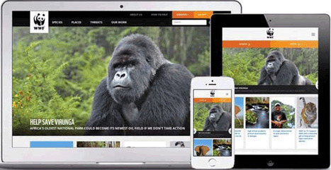
Cyber-Duck are an award winning London digital Web Design agency. We can offer a full professional service from web design to programming web technologies
Martin (Marty) Smith's insight:
As these examples show better than thousands of words can responsive web design is about more than design. How you architect your information to handle the accordion nature of phones, pads, lap and desktops is paramount. Figuring out how to snippetize everything from images to written content is the new challenge.
Scoop.it!

Mobile responsive design tools for testing your website or apps before it goes live. You'll find both FREE and paid solutions.
Martin (Marty) Smith's insight:
This post is important and valuable on two fronts. First we all need to start thinking MOBILE FIRST and that is a very different way to think. Second the great list of new to me tools is worth a scan and test.
Scoop.it!

When In Doubt Ask * Build flexible frameworks customers can modify. * Individual expression happens.
Scoop.it!
|

|
Scooped by
Martin (Marty) Smith
December 9, 2014 3:16 PM
|
Scoop.it!

Knowing your website's navigational taxonomy can mean the difference between millions in traffic and money. Here are 5 Simple Navigational Taxonomy Rules.
* It's About THEM not YOU.
* Create A Commons.
* It's FREE and EASY.
* Srart with Brands & Work OUT.
* Find Engagement & Work IN.
Easy to follow rules so your site's nav WINS traffic, hearts, minds, SEO and loyalty needed to be around for a bit.
|
|
Scooped by
Martin (Marty) Smith
December 5, 2014 8:35 PM
|
Scoop.it!
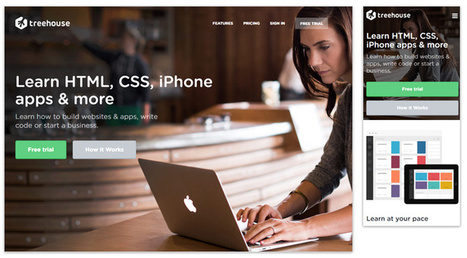
When I think of responsive web design I think of Transformers: Websites in Disguise. With one set of code you can build a website layout that runs flexibly...
Marty Note
Yesterday we shared thoughts on the marketing side of responsive web design along with some design basics. Responsive design creates a flexible membrane adapting itself to any receiving device.
Creating responsive design is INVOLVED. You can trash your SEO (Search Engine Marketing) without really knowing it, confuse your web designers and customers and do more damage than good.
I like this Jake Rocheleau "ultimate guide' because its a natural part 2 to yesterday's responsive basics (http://sco.lt/4ob6DR ). Responsive design is a MUST, but, as you will agree after reading Jake's Ultimate Guide, not to be undertaken lightly or without some reading about what is happening under the covers.
Great job by Jake and V
|
|
Scooped by
Martin (Marty) Smith
December 1, 2014 12:31 PM
|
Scoop.it!

2015 will see full integration of concepts brewing for years including:
* Social Shopping.
* Social / Mobile / Connected Web.
* Gamification.
Wireframing boxes within boxes is over as this Haiku Deck shares what's likely to happen to #webdesign in 2015.
|
|
Scooped by
Martin (Marty) Smith
November 26, 2014 11:46 PM
|
Scoop.it!

Near There Now Videos
We fell over some cool new content. Flying into Philadelphia we captured our landing as a way to play with our new iPhone Six Plus. The results were fun and interesting. Thirty seconds of the back way into Philly was fun to shoot and strangely beautiful (especially the video over the Delaware river with the boat).
The video turned out to be 30 seconds of strange beauty. Next we tried in our car and got much the same results after a few practice shoots that proved shooting video in a car is easier than texting.
Next we wondered what it would be like if EVERYONE shared their Near There Now videos. We might see cool back ways into London,n Paris and Berlin too. Here is a sneak peak of NearThereNow.com:
http://8c6.d6d.myftpupload.com/
(Will have a better URL after Godaddy does their thing)
|
|
Scooped by
Martin (Marty) Smith
November 14, 2014 1:17 PM
|
Scoop.it!

Team Curagami (http://www.Curagami.com ) has, over the course of our combined careers, helped thousands of clients build websites and about 99% have cart before the proverbial horse. "What is our design going to look like," they ask.
Most think "web design" is creating the look and feel of a site. Actually the look and feel, while important, is at least #6 on the "do these things to create a great web presence" list. Here are the first 5 things on that list:
1. Elevator Pitch - Who Are You?
If we were riding in an elevator could you explain your business before we reached your floor? If NO is your answer you are not alone and you need to go back to the drawing board and practice until you have your "elevator pitch" down. All things flow from that defining snippet.
Tags can help define your elevator pitch. Curagami.com Cool Tools For Ecommerce Merchants explains what we do in 5 words. Note that I don't have the the site yet so do as we are saying not as we do (always :).
2. Pain Point - Whose Your Tribe?
We create stuff to DO SOMETHING. Your product or service must help some tribe. Curagami helps ecommerce merchants understand content marketing because finding the balance beam between content that works and content that hurts is a CSF (Critical Success Factor) for ecommerce merchants. So our tribe begins with ecom merchants and we address the PAIN of understanding content marketing. We don't LIMIT ourselves. We don't say, "Go away" to B2B SaaS clients but they are cream on the top of our core tribe and mission.
3. UCA - What Are Your Customers' Aspirations
Unique Customer Aspirations is a metrics we developed as Marketing Director for Atlantic BT. UCA speaks to the transformation your content, product and service creates. Yes Curagami helps merchants make more money, but we also relieve the STRESS of not knowing what to do and why. We help merchants have confidence in their content. No one can build sustainable online community (everyone's master goal whether they know it or not) without being confident in their ability to create, share and curate content. Content is king online and the implications of that statement go far and wide. It's not enough to know your tribes shape you must know their CHARACTER too. Our tribe is STRESSED OVERWHELMED and WORRIED. Anything we do to relieve any of that makes our content sticky and sure to be shared.
4. Know Difference Between Content CREATION and CURATION
Being able to create content is important. We suggest our clients create about 10% of content from unique brand based strings. 90% of the content we want clients to share, discuss and riff off of comes from gurus, customers and THE OTHER. The other is anyone other than you and keeping tabs on your category information, knowing what matters most to your readers and why and understanding the need to tuck ego in back pocket and share competitive information is one of the hardest skills we teach. Web marketing is MOSTLY about THEM not YOU so knowing when you need to blog vs. when you need to comment is key.
5. Know Social Marketing Basics
I'm staying at The Blackwell Inn in Ohio while being treated at Ohio State's James Cancer Center. I've tweeted several positive comments @theBlackwell. Noneof those comments have been ReTweeted and they don't follow me.
ERROR.
My social following dwarfs theirs so breaking the FOLLOW BACK rule hurts 'em. By not picking up my @tweets they discourage such shares and lose the value of that communication (that they actually LISTEN and CARE). I think they do listen and care, but they don't have the skills to do so ONLINE. Before you create a website you need to know what's up in social media.
The Blackwell's lackof knowledge isn't fatal since they are located on Ohio State's campus and are the ONLY such hotel so located. They can SUCK at social media (for a bit) without pain. Doubtful your website, especially if it brand spanking new can afford such a deficit.
Since the master goal of your site is the creation of sustainable online community NOT understanding the implied contracts and un-stated ways social media works can be DEADLY.
Know those 5 things and we can begin to discuss wireframes, look and feel and visual marketing :). Marty
One More Thing - reason this stuff is so important, as my friend Frank Pollock would explain, is the web is a lie detecting amplifier. If you lie it will be shared with the world and known instantly or before, so don't lie. If you are CONFUSED, as many SMBs are, get STRAIGHT before you put crayon to paper and design a site or risk having your confusion being your main message.
|
|
Scooped by
Martin (Marty) Smith
November 11, 2014 6:34 PM
|
Scoop.it!
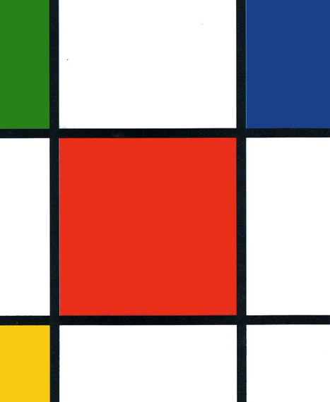
Web Design Basics
Love these five web design basics:
* Learn TYPE Design.
* Pick Great Fonts That Fit Your TONE.
* Pick 3 Color Palette & STICK TO IT.
* Photos = RIGHT SIZE.
* When In Doubt, Give It SPACE.
This last tip is our favorite. Nothing we hate more than claustrophobic web design. Problem is claustrophobia is easy to create. We all WANT to do so much.
When I was an Ecommerce Director we studied our links carefully. We found that 5% of our links received 90% of the clicks. That equation turned out to be a fractal. No matter how small we cut it, no matter how we shifted the design, a small % of the links dominated.
This means MOST of what WE, as designers, think is important isn't. We learned to be Google - Vicious about what we added. Adding meant something had to COME OFF the design. This strange User Interface math means you have more ROOM than you realize.
Find what matters and LINK IT. Design what matters and eliminate the flotsam and jetsam so you have SPACE around what matters since it is that SPACE that signals IMPORTANCE to your visitors. .

Fabulous#design #advice from Marty Smith. It reminds me that when you are not an #expert in something, get someone who is to help guide your #success

Awesome web design advice. Highly recommended. 9/10
|
|
Scooped by
Martin (Marty) Smith
November 6, 2014 6:30 AM
|
Scoop.it!

Web Design
Cha Cha Changes are ahead for web design. Our social / mobile / connected world is blowing up our wireframes. and that's a good thing.
|
|
Scooped by
Martin (Marty) Smith
October 31, 2014 8:04 PM
|
Scoop.it!
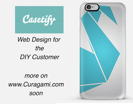
*Web Design For DIY*
The Do-It-Yourself revolution is blowing up thanks to mobile apps and social media. This link includes one of our favorite examples: http://www.Casetify.com where we just created our http://www.Curagami.com logo case for iPhone 6Plus.
We are working on a series of posts about how to engage and empower your DIY customers & you can help. Send ideas, comments and your experiences with DIY marketing and we will curate into the piece with attribution and a link (martin (at) curagami.com).
Find more DIY Marketing thoughts and a secret code you can use to get $10 off your Casetify.com creations (8PGZX3). Sharing a code like that is powerful brand ambassador fuel.
Share your DIY tips and check out more notes on GPlus:
https://plus.google.com/102639884404823294558/posts/Nezb4QZgayx
|
|
Scooped by
Martin (Marty) Smith
January 5, 2015 4:36 PM
|
Scoop.it!

HOW art director Adam Ladd shows us 10 more of the top design websites, many of which are sure to give you the graphic design inspiration you crave.
Great resources from one of my favorite web design teachers.
|
|
Scooped by
Martin (Marty) Smith
December 30, 2014 3:56 PM
|
Scoop.it!

How I Use Haiku Deck
I use Haiku Deck when I know what I think I know and when I'm trying to discover what I DON'T KNOW. When I know what I think I know, and what Internet marketer can ever really KNOW anything, I use Haiku Deck as a visual marketing tool. Haiku' shortens my "elevator pitch" and matches storytelling Ted-like visuals.
When I don't know what I don't know I use Haiku Deck too. Working on a "business plan" right now and using Haiku to suggest hings I may not have considered. Their search is so targeted AND VISUAL it helps when I am this far up the funnel. Google and refinement will come later.
Really like the Haiku Deck team too. They created a great example of HERO MARKETING with their Featured and Popular galleries. .Any POINT OF AGGREGATION is more powerful than any individual (these days) as we discussed re: +The Huffington Post, so Haiku's intelligent move was to create a Featured and Popular gallery. Those two initially highly curated spaces moved the team from creators to curators.
The PaigeRank 5 they've earned is proof of the power of the community (since most SaaS sites earn about a PR2 or 3). By aggregating their users content they kill two birds with a single brilliant stroke - they create proof cases more powerful than whitepapers AND they provide a home for a constantly changing amount of COOL content THEY didn't have to create.
Love this tool as it shows so many of my favorite #webdesigning and #marketing ideas. Let me know when you create your first deck and I will be sure to share across my social nets :). Marty
Thanks to Haiku Deck for making 7 Reasons You Must Curate Content a Honorable Mention in their top decks of the year post too!
7 Reasons Deck
https://www.haikudeck.com/content-curation-7-reasons-why-you-must-uncategorized-presentation-r6fCU7CcEa
Top Haiku Decks 2014
https://blog.haikudeck.com/inspiring-presentations-2014/

|
Suggested by
Levent Cem Aydan
December 26, 2014 9:59 AM
|
Scoop.it!

This article is written after a huge research about top web design trends for 2015. If you want to design an awesome website you should read this blog.
Just a few of the 2015 Web Design Trends discussed:
* Storytelling
* SVG Animations
* More Scrolling & Less Clicking
* Full Image / Video Backgrounds
Many more on this excellent 2015 Web Design Trends post from @Levent Cem Aydan
|
|
Scooped by
Martin (Marty) Smith
December 17, 2014 3:42 PM
|
Scoop.it!

Design Is Revolutionary
Don't have to be Steve Jobs to know design is revolutionary. Our Web Design Revolution feed on Scoop.it is one of our favorites. We love THINKING visual because most of us (save one poor CTO) are marketing geeks who visualize in our sleep.
If you visualize in your sleep consider contributing a Scoop or two or three to The Web Design Revolution in 2015. Several easy ways to contribute:
1. If you are on @Scoop.ituse the Suggest Feature. We appreciate all the great suggestions we've already received and promise a new focus on collaboration in 2015.
2. If you aren't on Scoop.it you are missing one of the best "do less, get more" tools we know, but you can still contribute ideas for stories we should include by:
email: martin(at)Curagami.com
Twitter: @Curagami
Call For Help NOW
Right now we are interested in creating a year-end mashup of all the web design predictions for 2015. If you have a favorite prognosticator and they write about what they think is going to happen in web design next year send us the link and we will mash your contribution up into a summary with early views going to contributors.
Thanks for a great year and hope you will contribute to The Revolution in 2015.
|
|
Scooped by
Martin (Marty) Smith
December 10, 2014 11:55 AM
|
Scoop.it!

Now it’s time to analyze the web designs that have emerged this year, and place predictions for the possible trends that lie ahead for 2015.
Marty Note
Promise to create a mashup of all web design trends postings to identify common consensus and outliers.

|
Suggested by
David Fournier
December 8, 2014 9:37 AM
|
Scoop.it!

Explore the top web designing trends for 2015. The infographic discusses the top 6 predictions that are set to rule the web designing world in 2015.
Liked and agreed with all 6 of these 2015 Web Design Trends when I read the post without the infogfpahic. Infographic helps and I bet wil get more shares :). M

I like“Card” design, no, it\s not new, but I find it a good tool for designers working on responsive websites. Cards are a great way to keep things modular
|
|
Suggested by
David Fournier
December 4, 2014 8:41 AM
|
Scoop.it!

Responsive web design is the practice of creating websites that display evenly on all devices. Understand the basics of responsive web design with examples.
Marty Note
Don't make the common mistake of thinking responsive design is all about look and feel. Yes some WordPress templates can make it FEEL that way since they are built to accordian with different receptions created by phone, laptop and computers.
The important idea for marketers to understand is to THINK Mobile First. Thinking mobile first brings a slew of changes such as:
* Flat web design.
* Limited Colors.
* Less functionality that is easier to understand.
* Content snippets instead of novels.
* Emphasis on VISUAL MARKETING.
* Need to make content & communication feel & act like a game.
Those last bullets speak to the gamification of marketing so implied by smartphones and a mobile / social / connected world. Mobile means never having to say you're sorry because you listen and curate more than you talk, create sustaining community and engagement and understand all the implications of "the network is the computer".
Just shared an overview of Marketing Timelines on G+ (https://plus.google.com/102639884404823294558/posts/EkXN57uJyjq ). All that said, you still need to understand Responsive Design 101 so appreciate this Scoop.it suggestion from @David Fournier. .
|
|
Scooped by
Martin (Marty) Smith
November 29, 2014 11:00 AM
|
Scoop.it!

Ten Web Trends To Look For In 2015
Cool list from Elegant Themes and they should know since missing a "must have" new feature means no one buys your themes. My faves are Ghost Buttons and Interactive Storytelling. Heck if any 3 of these happen as described 2015 is going to be a breakthrough web design year.
|
|
Scooped by
Martin (Marty) Smith
November 25, 2014 12:04 AM
|
Scoop.it!
Top 5 Black Friday Websites Curagami's annual list sees Big Boys move in. Amazon tops the list. There are surprises & we share our Black Friday scorecard.
1. Amazon.
2. Sears.com.
3. Dell.com
4. Walmart.com
5. Nordstrom.com
Find out how we rated these websites TOPS in Black Friday preparation, free shipping and merchandising:
http://www.curagami.com/featured/top-5-black-friday-websites/
|
|
Scooped by
Martin (Marty) Smith
November 12, 2014 7:30 PM
|
Scoop.it!

Bauhaus is not only one of the most important design movements in history, but an especially relevant style for Web Designers. Alex and Simone tell you why.
Marty Note
Wow, love this post by SitePoint.com's Web Developer Alex Walker and graphic designer Simone Sala because it both EXPLAINS Bauhaus Design Principles and then applies them with examples to the web. #toogood
The Bauhaus stressed form and function. Removing ornamentation in favor of clarity, ease of use and beauty. Sounds like MOBILE DESIGN to me.
Mobile is so SMALL it forces the right choices. Look how "mobile design" is not impacting web design. Mobile stared trends such as limited color palettes and flat graphics because of limitations (of smart phones), but those limitations can also help FREE up a website and point it more clearly at true north.
True north online is where visitors know what to do and why easily and are so engaged by your content they want to do (what you want them to do) AND they want to share the experience with friends. Mobile's "game console-like" BEING is reshaping marketing (see Marketing's Big Bang Manifesto https://plus.google.com/102639884404823294558/posts/Tf9GNsX35qn ).
Great, helpful post.
|
|
Scooped by
Martin (Marty) Smith
November 10, 2014 9:33 AM
|
Scoop.it!

In an ambitious 9 part series Business 2 Community @b2community explores the meaning and relevance of 9 design principles created by one of lions of design - Dieter Rams. You may not think you know who Dieter Rams is, but you do.
If you've ever shaved with a Braun electric shaver or admired its lines then you know Dieter Rams.This series explores Rams' 10 Design Principles:
Good Design Is Innovative
Good Design Makes a Product Useful
Good Design Is Aesthetic
Good Design Makes A Product Understandable
Good Design Is Unobtrusive
Good Design Is Honest
Good Design Is Long-lasting
Good Design Is Thorough Down to the Last Detail
Good Design Is Environmentally Friendly
Good Design Is as Little Design as Possible
Lots to learn from Dieter.
|
|
Scooped by
Martin (Marty) Smith
November 4, 2014 8:59 AM
|
Scoop.it!
Here A Wiki, There A Wiki, Everywhere A Wiki
What is a Wiki if not an invitation to create online community. The "open source" like collaboration Wiki's provide is a blueprint for creation of online community. After months working on http://www.Curagmai.com we've discovered how close Wikis are to...well everything.
Wiki Ideas To Steal Include:
* Open Source Like Content Collaboration.
* Use community to steer and de-spam ecosystem.
* Depend mostly on social reward.
* A healthy and competitive contest never hurts.
* Feature and thank contributors.
* Provide ways for contributors to know where they stand vis-à-vis other contributors.
* Create ways contributors can follow and communicate with each other.
* Include ways for contributors to create mini-tribes.
* Make sure "rules of the road" are understood and published.
* Communication with sponsoring agents must be easy too.
* Normalize greatness by sharing across ecosystem.
* Role of sponsors becomes more curators than creators.
* Ask for help.
* Provide social rewards (such as features) to contributors.
* Create ways to identify contributors in the world (t-shirts, stickers).
* Appreciate, be nice and thankful (always no matter what).
Following a few simple rules will dramatically increase the most important content you can't buy (User Generated Content or #UGC) and build sustainable online community. Sustainable online community means costs go DOWN even as other material rewards (UGC, followers, traffic, money) go UP.
This Haiku Deck is about why we are all in the Wiki business whether we realize it or not AND how to design for the Wiki-ization of marketing, brands and online community.