Icons are the most important and essential part of any web design and therefore must be designed with great precision and professionalism, as it can make or ruin the whole image you are trying to create.

 Your new post is loading...
 Scoop.it!
Icons are the most important and essential part of any web design and therefore must be designed with great precision and professionalism, as it can make or ruin the whole image you are trying to create.

No comment yet.
Sign up to comment
Scoop.it!

One of the most popular aspects of any current day website or news-type blog is the inclusion of social sharing options and buttons that allow readers and visitors to share the website content through social networks such as Facebook, Twitter and Google+. Although most websites and an increasing number of mobile apps make use of some form of social sharing, it is relatively new on the grand scale of things and will only increase with time.
Scoop.it!

With over 900M users, there’s no shock that brands and marketers have turned their attention to setting up shop on Facebook. With the ability to interact with, target and market to people who are in a place prepared to be social, it’s an absolute no-brainer. However, I’ve noticed the trend of TV commercials mentioning “Follow us on Facebook” or “Visit us on Facebook” way more than mentioning a website. Remember when you couldn’t escape a 30-second commercial that ended with “Check out our website at www.”? Moving this focus to Facebook makes sense, but also leaves me with the question of “what will be next”? I ask this question because Facebook became the hip and cool alternative to visiting a boring and bland website. It’s now a way for a brand to show people that they’re “in the know” and speak to a “new generation.” Blah blah blah. I say blah, because have you visited one of these brand’s Facebook pages lately? It’s full of crap like the old boring websites were.
Scoop.it!

Remove'em provides you with options to remove bad backlinks pointing to your site. Via Martin (Marty) Smith

Martin (Marty) Smith's comment,
June 9, 2012 3:10 PM
Yes, in fact my friends who run this company.... well lets just say their hats weren't pure white if you know what I mean :), more shades of grey. Now they are becoming experts at cleaning up what used to be their stock in trade. Go figure (lol). Thanks for the pick up and I just grabbed that amazing Amazon infographic from MarketingHits.
Marty 
Brian Yanish - MarketingHits.com's comment,
June 9, 2012 3:42 PM
lol, I guess that makes them experts on bad links.
Sidenote: I checked out Atlanticbt, WOW nice work. You've got some talented people. Thanks so much for your rescoops. I think I may end up moving up to a business acct., have some ideas I want to test out via ScoopIt
Martin (Marty) Smith's comment,
June 9, 2012 8:35 PM
Brian, test 'em and I will ReTweet and ReScoop 'em :). Thanks for the nice comment about Atlantic BT. Great company I love working for, having fun and that is what is all about. I like my Pro account even if that $80 a month does bite a little. Figure good value for money though :). Marty
Scoop.it!

Google tool offers browser-size analytics Google has added a browser-size feature to its analytics suite, allowing Web designers and developers to check the size of the screens being used by their sites' visitors. "Analyzing the percentage of visitors for whom page elements fall beneath the fold or off to one side is difficult, so we've created a visualization that lets you quickly determine which portions of your page are visible to which percentages of visitors," Google says in a statement. READ MORE.
Scoop.it!

First Of All, What is Responsive Web Design? In a nutshell, responsive web design (RWD) is a technique which uses fluid layouts (which "stretch" to as much screen real estate as possible) in addition to the CSS "@media queries," which apply different style sheets (CSS) based on the current screen size of the device. With responsive design, your website will fit virtually any device with a full browser: smartphones, iPad + other tablets (both landscape and portrait modes), and even TVs.
Responsive Web Design: Ultimate List of Advantages and Disadvantages Responsive design is not a one-size-fits-all solution to mobile.
ADVANTAGES of Responsive Web Design.
DISADVANTAGES of Responsive Web Design.
When Using Responsive Web Design Makes Sense (And Doesn't) RWD is not a cookie-cutter solution; therefore, it works for some sites better than others.
If your website contains fewer than 50 pages, does not include advanced functionality, and user intent is not significantly different on the mobile devices, chances are, RWD would be a great solution to improve the mobile users' experience
Google has taken an official stand on building smartphone-optimized websites and says that responsive web design is Google's recommended configuration.
By Slavik Volinsky - http://bit.ly/Nm0DiE Via maxOz
Scoop.it!

Navigation menu serves as a backbone for a website as it allows the visitors to navigate the different sections of the website in an easy to use manner. With an effective navigation menu, the website definitely increases its chances of being explored and visited more. Taking this into account, we thought to compile some interesting examples of effective and memorable navigation menu to inspire you.
Scoop.it!

Launching your own web design business might seem a daunting task, especially in the current economic climate. After all, you will be competing against well-established companies with impressive portfolios and solid experience. But don’t let this stop you. You can do this. I set up a web design business that has been trading successfully 6 years ago. And I did it with very little experience originally. You can do it in your spare time at first. It took me two years before I could quit my “day job”. The secret is to never give up. Why not focus on the things you can do to start a successful web design business? This article will review the key skills needed in order to achieve your entrepreneurial goals.
Scoop.it!

From
www

Measure your website's effectiveness: Do new visitors do the things you want them to?
With all the dollars spent on pay-per-click advertising (PPC) and search engine optimization efforts (SEO), it is easy to forget that the single largest factor that determines the success of your online marketing efforts is the effectiveness of your website's landing page. The math can be staggering. Let's say you spent $10,000 a month on your online advertising efforts to drive users to your website to complete an action–fill out a form, purchase a product, etc. And let's assume your conversion rate–that's the percent of visitors that actually complete the action–is 4%. Now you face a lofty goal: to increase results by 50%. You could increase your total budget by $5,000 per month. Or you could try making some tweaks to your landing page to see whether you can increase your conversion rate by just two percentage points. (Translation: You just need to get an additional two out of every 100 people to take the desired action on your site.)
Scoop.it!
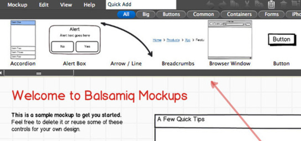
So you’ve just taken some killer photos with your new DSLR, or you captured a great video with your iPhone — what’s next? While it feels natural to just post media quickly to your FacebookPage, sometimes great photos or video need their own home in the form of a personal website. But on the other hand, it’s not easy to make a website layout that complements the rich media. In order to make a great website, professional web designers take advantage of mockup tools to analyze layout, design and functionality. Taking advantage of these applications (some of which are 100% free) is a wise move — especially if you’re interested in creating a professional website for your photography or video.
Scoop.it!

Let’s take a look at how (or indeed if) it’s possible to design and build a website entirely on an iPad. We’ll use a variety of apps to conceive, wireframe, design, code and deploy a simple HTML web page. Ever since tablets breached into mainstream usage, we’ve taken a quick stance on working out the best way to support these new devices for consumption of web content. I’ve written numerous articles across our blogs about this topic, as have many of my fellow writers. Books have been published. Panels have been held. But what if the tablet could be a viable platform, not only for consumption, but for creation? There’s been a recurring meme that touch devices are no good for productivity, and there’s no hope for getting any real work done on one. Yet, its svelte form and portability make it a fantastic device, especially for freelancers, who aren’t necessarily tied down to a specific workplace.
Scoop.it!

Content has always been king, but more recently content marketing has started to get more of the attention it deserves in organizations with budget allocated to creating content. In recent years, we have also witnessed many new software platforms entering the market to help companies create content. As many of you would attest, it’s always easy to go out and spend money on creating content or any marketing campaigns for that matter. Alternatively, in my experience almost all companies have access to lot of content in-house, but for some reason they are either not surfacing them or not using their resources efficiently to create new content that can help them with their content marketing efforts. Content creation is a huge undertaking. For now we’ll focus on 10 strategies to create great content in your company.
Scoop.it!

Unless you’ve been living under a rock – which is not a very comfy existence, so I doubt you have – you probably already know that you have, like, no time to get your first-time visitors’ attention once they land on your home page or other entry page (e.g., PPC, email).
Here’s some July 2011 data (from Google) on home page bounce rates*: On average, 47% of visitors to a site will bounce Bounce is higher for visitors arriving direct (i.e., they typed in your URL) and via organic search – at 47.2% and 47.9%, respectively – than for those arriving via PPC (41.4%) Bounce is higher on iPhones than it is on desktop/laptop computers
Scoop.it!

t now seems that every designer under the sun is offering free PSD’s to help entice new business and increase traffic to their websites. I’ll hold my hands up high as i’m one of these people. But out of all these free PSD’s how many of them do we actually find useful?
Scoop.it!

The Internet Corporation for Assigned Named and Numbers will hold a press conference next week to unveil the generic top-level domains that companies and organizations have applied for. According to ICANN's announcement today, the agency received over 1,900 applications before it closed registration on May 30. Major companies and organization, as well as startups and even geographical regions, applied for their own top-level domains, the organization said.
Scoop.it!

In order to be most successful, your business doesn’t just need a website—you need a website catered to your specific goals and needs. And in order to make this happen, it’s crucial that you’re precise about what those goals and needs are. Do you know what you want to achieve with your marketing efforts? Does your website have a defined purpose? If you’re unsure of your site’s specific goals and need help sorting them out and developing a site strategy to generate a real return on investment (ROI), this post is for you.
Scoop.it!

This is our weekly selection of our favorite web designs from the past week.
Scoop.it!

Despite the fact that there are millions of WordPress themes available on the internet, people and especially WordPress users constantly find for the fresh collection of premium WordPress themes for their blogs and websites.
Scoop.it!

Ok – so your company has a website. But what does it look like? How does it represent you to the world? Does it have the things people look for? Does your website have the navigation bar across the top, with proper meta-tags, and a design that fits your industry? Do you have blogs, social media icons, sign-up forms, and landing pages with lots of useful content? If your website doesn’t have these things, well…if your website was an outfit, it would probably look something like this.
Scoop.it!

This is a collection of the best responsive WordPress themes. These responsive, fluid, or adaptive WordPress themes, automatically adjust according to the screen size, resolution and device on which they are being viewed. This means your website will look great whatever the screen size or device the visitor uses to visit your site. Responsive designs solve the problem of making a website work for the endless number of new devices and resolutions being used to access the web. In particular the growing popularity of interfacing with the web on mobile devices. Everything from iPhones, smartphones, iPads and tablets, mobile phones, video game consoles, TVs, netbooks, Kindles and other e-readers are used to access the web. Themes with a responsive design mean your website will display perfectly on all these devices, without the need for separate mobile themes, plugins or stylesheets. Responsive WordPress themes are becoming more and more popular, and there is a growing number of responsive themes becoming available to cater for all types of websites including: magazine, portfolio, gallery, personal blog, business, ecommerce, music and even real estate websites. We profile the best responsive premium WordPress themes below.
Scoop.it!

With the steadily increasing popularity of smartphones,tablets and other mobile devices, many companies find themselves asking whether or not to build a separate mobile website. When this dilemma arises, one must keep the consumer in mind. When we’re on the go, we want our websites to be fast, usable and clutter free. The websites that don’t fit the simple needs of the consumer will lose viewers to those who have a mobile solution. So the real question is, “should I separate or integrate?”
Scoop.it!

You cannot plan for and design a responsive, content-focused, mobile-first website the same way you’ve been creating websites for years.
Scoop.it!

Responsive WordPress themes are those that adopt to different web surfing devices like mobile phones, tablets. Check these cool themes now!
Scoop.it!

A ‘Coming Soon’ page is designed to inform the visitors or users about an upcoming and new app or service and let them sign up for the latest updates.
Scoop.it!

We all know that microsites are a great way to attract visitors with insightful and educational content. Well, what if you could increase the interaction and sharing potential of your microsites? Gamification is all about that. So, what is gamification? According to the site, gamification.org, it’s defined as: The concept of applying game-design thinking to non-game applications to make them more fun and engaging. When you combine gamification elements into your microsite design, you’ll build something entertains your visitors and gets them to spend more time on your site while also providing helpful information – a win for them and for you. This article has the top three reasons why you should incorporate gamification into your microsite design:
|