Your new post is loading...

|
Scooped by
Beth Kanter
March 27, 2013 11:41 AM
|
The rapidly growing user bases of photo-centric sites like Instagram and Pinterest, and the recent photo-centric redesign of Facebook's news feed are just two o
|
|
Scooped by
Beth Kanter
March 9, 2013 12:10 AM
|
The slides provide an overview on the Data Visualization trend for HorizonWatching Community members. Summary information about the Data Visualization trend is
|
|
Scooped by
Beth Kanter
March 5, 2013 12:22 PM
|
Slides and audio from a SXSW panel featuring Dave Gray, Sunni Brown, Mike Rohde, and Austin Kleon.
|
|
Scooped by
Beth Kanter
February 6, 2013 6:02 PM
|
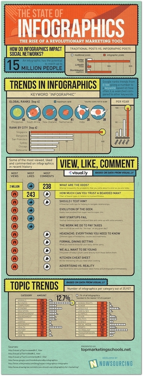
Social media infographics are all the rage, but many of them are terrible. Mark Smiciklas, author of The Power of Infographics explains how to do it right.
|
|
Rescooped by
Beth Kanter
from visual data
January 30, 2013 9:47 PM
|
Data Visualization is driven by data. Its form is often derived from optimizing the efficiency of inputting data (and information about that data) into a human brain. It is a very pragmatic practice, built around numbers and logic.
And yet it is beautiful. It evokes emotions. It can be aesthetically pleasing, or hideous. It communicates complex concepts and provokes thought. It is consumed for enjoyment. Some visualizations even share similarities with poetry. There are several stages in the life cycle of data visualizations, and while the core of the practice is driven by rational thinking, any number of stages in the process have opportunities for subjective decisions or artistic interpretations...
Via Lauren Moss
|
|
Rescooped by
Beth Kanter
from visual data
January 30, 2013 9:46 PM
|
It turns out 2012 was a huge year for the infographic—internet culture likes its data presented with charming representative imagery.
Business, technology, and social media comprised the most popular topics for this exploding medium, according to data, Singapore searched the term “infographic” more than any other global city.
The year’s most popular infographic was “What Are the Odds,” which explores how improbable it is that you (or this infographic, for that matter) came into existence in the first place...
Via Lauren Moss
|
|
Rescooped by
Beth Kanter
from visual data
January 30, 2013 9:45 PM
|
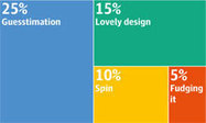
A pictorial display of statistics, the infographic is a huge hit in the internet age. But as one on rape figures has recently shown, they can be highly misleading.
A picture apocryphally speaks a thousand words, but its 21st-century counterpart – the infographic – often says much less. It's no surprise that the grabby and easily shared format has taken off in the internet era, and the latest graphic to go viral is one on a tough and complex problem: rape and criminal justice...
Via Lauren Moss
|
|
Rescooped by
Beth Kanter
from visual data
January 8, 2013 1:17 PM
|
The last in a series of infographics about visual data design, we have covered why it's useful to create them, created an embed code generator for you and written an article on promoting infographics. We felt a fitting end to the series would be - you guessed it - an infographic.
This infographic (about infographics of course) goes through 4 stages of creating an infographic: research, design, publishing and promotion offering tips at each stage. If you are thinking about making your own infographics this not only provides some great tips but acts as a good example of an infographic itself...
Via Lauren Moss
|
|
Scooped by
Beth Kanter
January 8, 2013 12:26 PM
|
One powerful way to tell your orgs story is with an infographic. Here are five tips and five tools for creating effective infographics,
|
|
Scooped by
Beth Kanter
January 8, 2013 12:13 PM
|
Humans are visual creatures. Most of us process information based on what we see. 65 percent of us are visual learners, according to the Social Science Research Network.
|
|
Rescooped by
Beth Kanter
from Data Visualization Topics
December 30, 2012 4:41 PM
|
|
|
Scooped by
Beth Kanter
December 23, 2012 11:24 AM
|
When I wrote that Radar was investigating data journalism and asked for your favorite examples of good work, we heard back from around the world. I received emails from...
|
|
Scooped by
Beth Kanter
December 18, 2012 11:03 AM
|
Ideas for creating engaging visual content, then getting your fans share them and promote your brand.Get the latest blog articles on business ideas and...
|
|
|
Scooped by
Beth Kanter
March 9, 2013 12:11 AM
|
InstaBRAND is an 37 page eBook written by Christian Adams for brand and social media managers on the growing trend and importance of crafting a visual storytell
|
|
Scooped by
Beth Kanter
March 5, 2013 3:47 PM
|
See-Suite. Visual Communication Strategies
|
|
Rescooped by
Beth Kanter
from visual data
February 8, 2013 4:19 PM
|
Big data can feel impersonal, overwhelming and cold. But stark statistics are now being used to make intimate statements through art and public advocacy.
The past few years have seen the widespread availability of a large amount of data, thanks largely to the internet. Census reports are easily searchable, campaign polling is expertly parsed and analysed, and online dating behaviour provides a glimpse into human sexuality.
Now more artists are using these impersonal details to make an impassioned statement; visit the article link for examples.
Via Lauren Moss
|
|
Rescooped by
Beth Kanter
from visual data
January 30, 2013 9:47 PM
|
The quick reference guide to big data and data analytics; from the definition to the history and future applications of big data.
Via Lauren Moss
|
|
Rescooped by
Beth Kanter
from visual data
January 30, 2013 9:47 PM
|
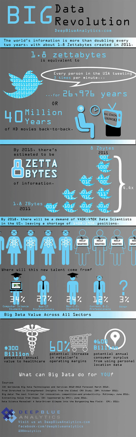
Is Big Data still a big mystery to you?
In recent years, the volume of information coming into companies has exploded, so that many IT organizations are dealing with extremely large sets of data.
IT leaders are rethinking many aspects of how they manage and deliver information, from investments in infrastructure and analytics tools to new policies for organizing and accessing data so they can deliver more of it, faster. They are concerned that if they don't have the right tools and architectures to deal with all that information, then big data can be a big problem. Check out these infographics on Big Data to see the impact...
Via Lauren Moss
|
|
Rescooped by
Beth Kanter
from visual data
January 30, 2013 9:46 PM
|
No matter what happens, there will always be a demand for data visualization tools. Data on its own can be pretty boring and brightening it up with images and other visual tools, it can make normally inaccessible information much easier to digest. (Editor’s Note: It’s also great for information reading literacy, and the new Common Core demand for multimedia “texts.”)
There are a number of fantastic tools out there that will present your data in an accessible manner. All of the tools listed below are free and chances are you’ve used one or two of the tools mentioned before.
Via Lauren Moss
|
|
Scooped by
Beth Kanter
January 8, 2013 5:55 PM
|
Given at the Society of News Design conference in Cleveland, 2012
|
|
Rescooped by
Beth Kanter
from visual data
January 8, 2013 1:17 PM
|
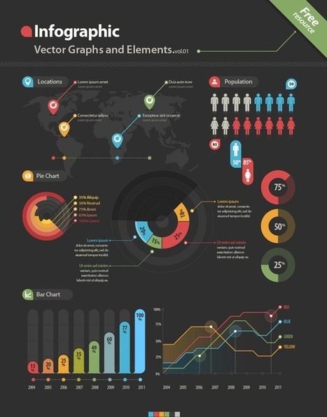
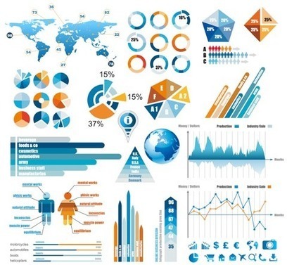
A collection of resoureces and links to free infographic design vector elements, including various graphics, charts, labels, pictograms, symbols, maps and more- for use in designing infographics and data visualizations. Simply open the files in a vector based program and edit...
Via Lauren Moss
|
|
Scooped by
Beth Kanter
January 8, 2013 12:22 PM
|
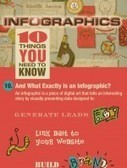
Tweet Tweet Any time you hear someone mention infographics you’ll usually hear the word viral in the same sentence. The idea is that great infographics just go viral.
|
|
Rescooped by
Beth Kanter
from Measuring the Networked Nonprofit
December 30, 2012 4:41 PM
|
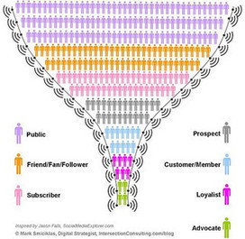
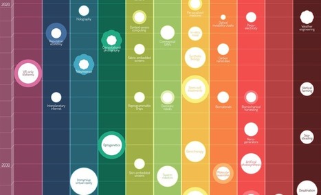
Graphs are a visual treat, as they can present complex information in a quick and easy manner. Mostly graphs are used to reveal a trend, compare statistics or
|
|
Scooped by
Beth Kanter
December 30, 2012 3:31 PM
|
|
|
Rescooped by
Beth Kanter
from visual data
December 22, 2012 12:11 PM
|
2012 might be the year which we reached 'peak infographic'. You can’t have an issue or a piece of data without putting it into a picture so it’s easier for people to understand. While this has mostly resulted in a glut of ugly graphics that don’t actually do anything with data (and you’ll see some of these below), it’s still an incredibly simple way to get information to you fast. And this year, some of our most compelling content has appeared in the format. These are some of our favorites.
Via Lauren Moss
|