

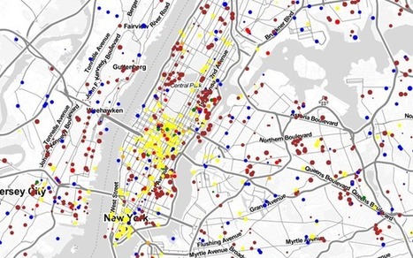

Watch the commuting patterns of New York, San Francisco and Los Angeles.
Get Started for FREE
Sign up with Facebook Sign up with X
I don't have a Facebook or a X account


 Your new post is loading...
 Your new post is loading...
Your new post is loading...
Watch the commuting patterns of New York, San Francisco and Los Angeles. 

Take a look at a set of maps that tell encoded stories of politics, natural disasters and social movements.
There are many nice Flickr visualizations of global cities but never anything quite this comprehensive across space and time: Meet Luminous Cities, a creation of the London-based mapping and digital arts firm TraceMedia, built with support from the Centre for Spatial Analysis & Policy at the University of Leeds and the Centre for Advanced Spatial Analysis at University College London. The project is trying to "uncover the archeology of data traces left by social media" in cities across the globe... Via Lauren Moss
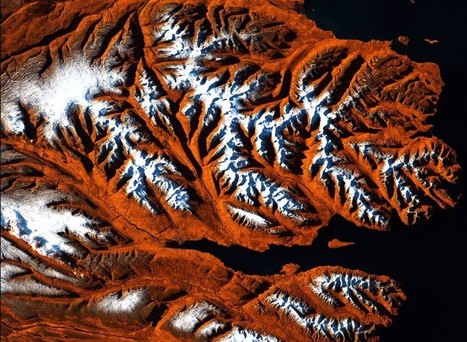
Of all the cosmic bodies studied in the long history of astronomy and space travel, the one that got the least attention was the one that ought to matter most to us—Earth. That changed when NASA created the Landsat program, a series of satellites that would perpetually orbit our planet, looking not out but down. Landsat was built for public monitoring of how the human species was altering the surface of the planet. The space agency, along with the U.S. Geological Survey (USGS), has accumulated a stunning catalog of images that, when riffled through and stitched together, create a high-definition slide show of our rapidly changing Earth, which for the first time date all the way back to 1984.
These Timelapse pictures tell the pretty and not-so-pretty story of a finite planet and how its residents are treating it — razing even as we build, destroying even as we preserve. Visit the article link to see an exclusive timelapse of climate change, deforestation and urban sprawl unfolding as Earth evolves over 30 years... Via Lauren Moss

Ishola Adebayo's comment,
July 31, 2013 9:07 AM
good day Sir, pls need help on fixing scan line errors on lansat7 ETM images from 2003 using for example ArcMap9.3 or ENVI4.5 or.........thank you so much

Courtney Barrowman's curator insight,
May 27, 2015 10:55 AM
summer work KQ2 key concepts: remote sensing, deforestation, desertification, land use, geospatial
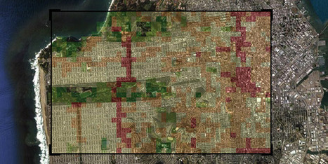
The Neighborhood Visualizer , developed by MIT PhD candidate David Quinn and Lisbon research student Daniel Wiesmann, aims to bring about a better understanding about urban patterns that relate to material use and energy use.
Built on top of a selection of open-source tools, the web-based map reveals the currently available data on material (i.e. kg/person) and energy use (i.e. kWh/person) in about 42 different US cities. 'Materials' include parameters like asphalt or gravel roads, or the use of masonry, glass or timber in residential housing, all based on estimations of urban form. Users can select specific neighborhood areas and create heatmaps that are normalized by population or household size. Further analyses are automatically generated as PDF files. Via Jandira Feijó
|
The 'extended urbanization' of space. Right now, there are about 1,100 satellites whizzing above our heads performing various functions like observation, communication, and spying. There are roughly another 2,600 doing nothing, as they died or were turned off a long time ago. How did each of these satellites get up there? And what nations are responsible for sending up the bulk of them? The answers come in the form of this bewitching visualization of satellite launches from 1957 – the year Russia debuted Sputnik 1 – to the present day. (The animation starts at 2:10; be sure to watch in HD.) Launch sites pop up as yellow circles as the years roll by, sending rockets, represented as individual lines, flying into space with one or more satellites aboard. More information at the link. Via Lauren Moss

Patrice Mitrano's curator insight,
May 27, 2014 8:07 AM
Frise chronologique très impressionnante et détaillée (par type d'orbite de satellites) !
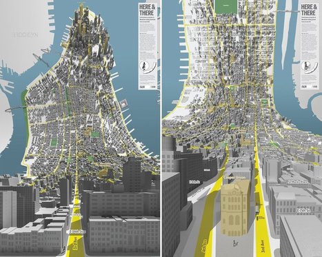
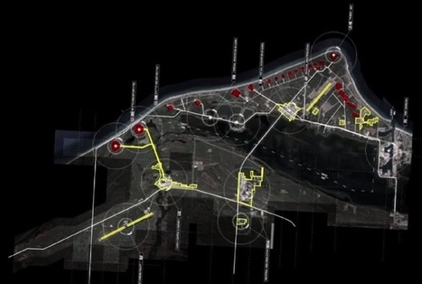
"London-based design firm BERG created these two 3D maps of Manhattan, which look like a scene out of "Inception" (via Curbed NY)."
Beth Kanter
Another way to articulate the importance of sense-making.
Think about it this way: Tools are not always actual objects designed to help us with physical activities. A notebook, whether it is a Moleskine or an Evernote digital document, is a tool that expands our memory. A digital calculator, whether it is an inexpensive machine bought in the nearest Dollar Tree or an app downloaded to your iPhone, frees you from the burden of having to retain and execute many complex mathematical algorithms. Non-physical tools (or sets of tools and practices), such as statistics and the scientific method, evolved to let us gaze beyond what we would normally see, and to overcome our deepest biases and lazy habits of mind. The same is true for great visual displays of information... Via Lauren Moss
|


possibly useful for studying complexity
APHG-U7