URBANmedias
76.1K views | +1 today
Follow
URBANmedias
le mediation des aménagements urbains
Your new post is loading...
Rescooped by association concert urbain from visual data
March 24, 2014 4:58 AM
Scoop.it!

STUNNING Maps of World Topography

STUNNING Maps of World Topography | URBANmedias | Scoop.it

Robin Edwards, a researcher at UCL CASA, has created these stunning topographic maps using the high resolution elevation data provided by the British Oceanographic Data Centre. The transitions from black (high areas) to blue (low areas) give the maps a slightly ethereal appearance to dramatic effect.


Via Lauren Moss
No comment yet.
Rescooped by association concert urbain from visual data
July 14, 2013 8:13 AM
Scoop.it!

Luminous Cities: A New Mapping Project Shows HOW Events are Tied to Place

Luminous Cities: A New Mapping Project Shows HOW Events are Tied to Place | URBANmedias | Scoop.it

Take a look at a set of maps that tell encoded stories of politics, natural disasters and social movements.


There are many nice Flickr visualizations of global cities but never anything quite this comprehensive across space and time: Meet Luminous Cities, a creation of the London-based mapping and digital arts firm TraceMedia, built with support from the Centre for Spatial Analysis & Policy at the University of Leeds and the Centre for Advanced Spatial Analysis at University College London.

The project is trying to "uncover the archeology of data traces left by social media" in cities across the globe...


Via Lauren Moss
No comment yet.
Rescooped by association concert urbain from visual data
April 29, 2013 8:11 AM
Scoop.it!

How a Map Is Like an Op-Ed: Geography as a Storytelling Tool

How a Map Is Like an Op-Ed: Geography as a Storytelling Tool | URBANmedias | Scoop.it

Thanks to the open data movement and Google Map Maker, anyone with a computer can create a map. These maps tell a story, but it's a subjective one. And while that can be a powerful tool, it can also skew perspectives and cloud a debate.

"We should really teach people to read maps in that way," says Laura Kurgan, an associate professor of architecture at Columbia University. "Maps are arguments, just like a piece of written journalism is an argument."


Via Lauren Moss
No comment yet.
Rescooped by association concert urbain from visual data
September 8, 2012 10:01 AM
Scoop.it!

Are Our Transit Maps Tricking Us?

Are Our Transit Maps Tricking Us? | URBANmedias | Scoop.it
Subway maps distort the reality on the ground for all kinds of reasons. What happens when we make decisions based on them?

London’s city center takes up about two percent of the city. On the Tube map, it looks four times as big.

Over in New York City, Central Park—which is a skinny sliver, much longer than it is wide—was depicted in some 1960s and ‘70s IRT maps as a fat rectangle on its side.

So public transit maps are distorted, quite on purpose. All of them enlarge city centers. Many use a fixed distance between stations out in the boonies, even if, in reality, they’re spaced wildly differently. Curvy lines are made straight. Transfers are coded with dots, lines, and everything in between.

According to Zhan Guo, an assistant professor of urban planning and transportation policy at NYU Wagner, certain cities allow for more flight of fancy than others. San Francisco and New York have a lot of geographic markers, so passengers will only accept so much map distortion.

New York’s grid system further discourages excessive futzing. In Chicago, the line is elevated, which leaves even less leeway. But in a place like London, with twisty streets, few geographical markers other than the Thames, and an underground system, you can pull a lot more over on people...


Via Lauren Moss
No comment yet.
Rescooped by association concert urbain from Nouveaux paradigmes
January 27, 2014 5:05 AM
Scoop.it!

"Les (hyper) métropoles vont SUPPLANTER les nations" (Jacques Attali)

"Les (hyper) métropoles vont SUPPLANTER les nations" (Jacques Attali) | URBANmedias | Scoop.it
Les métropoles de demain seront altermodernes, c'est-à-dire à la fois durables et attractives, plus soucieuses de l'environnement, de l'humain et du « vivre-ensemble ».

Une métropole durable n'est pas seulement une métropole verte, elle se définit par de multiples facettes : économiques, sociales, politiques, culturelles et écologiques. Les nouvelles technologies y dessinent un nouvel avenir. 


1- NOUVEL ÉCHELON D'IDENTIFICATION DANS UN MONDE DE PLUS EN PLUS NOMADE, LES MÉTROPOLES VONT CHANGER LE PAYSAGE GÉO-ÉCONOMIQUE

• Les métropoles concentrent les activités créatrices de richesses et seront donc le principal moteur de l'économie de demain.

• Dans un monde qui exigera de plus en plus de fédéralisme, les métropoles vont devenir un nouvel acteur à part entière, allant jusqu'à supplanter la nation pour les plus puissantes d'entre elles.

• Ce rôle va accroître la compétition des métropoles entre elles, les plus attractives formant un réseau de villes hypernomades de passage.


2- CE NOUVEAU STATUT DÉPENDRA DES TRANSFORMATIONS ET INVESTISSEMENTS OPÉRÉS PAR LES MÉTROPOLES, EXPOSÉES À DE NOUVEAUX DÉFIS

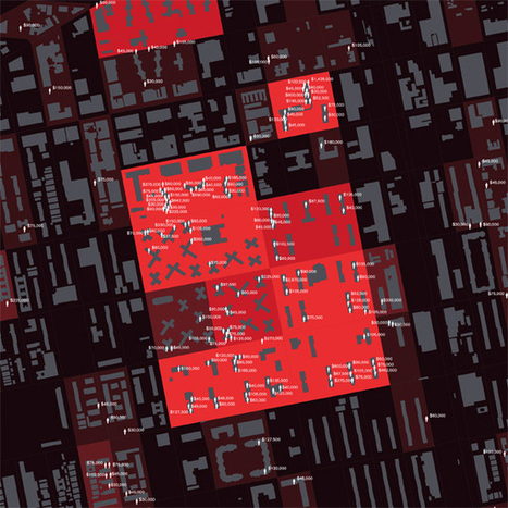
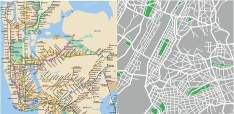
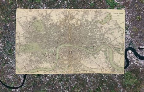
• Mettre le big data au coeur des projets de rénovation des métropoles.

• Mettre les TIC au service d'un développement durable des métropoles, à travers des smartgrids.

• Faire de la densité urbaine un atout de développement est donc un enjeu majeur pour les métropoles.


3- LES ÉVOLUTIONS TECHNOLOGIQUES ET STRUCTURELLES CONDUIRONT À UNE PLUS GRANDE INTÉGRATION DES POPULATIONS

• L'importance de la mise en valeur du tissu avoisinant

• Impliquer l'ensemble des populations dans le projet de développement métropolitain.


Via Hubert MESSMER , Christophe CESETTI
Jean-Michel Crosnier's curator insight, August 30, 2016 9:16 AM
Voilà un beau sujet de conférence pour le thème du festival de géopolitique de Grenoble 2017 ("Le pouvoir des villes"). @jmcrosnier
Rescooped by association concert urbain from visual data
May 11, 2013 3:26 AM
Scoop.it!

Why Historical Maps Still Matter So Much, Even Today

Why Historical Maps Still Matter So Much, Even Today | URBANmedias | Scoop.it

With 150,000 or so old print maps to his name, David Rumsey has earned his reputed place among the world's "finest private collectors." He continues to expand his personal trove as well as the digitized sub-collection he makes open to the public online — some 38,000 strong, and growing.


He's created a series of interactive maps that layer old prints onto the Google Earth and Google Maps platforms, and this summer he plans to launch a geo-referencing tool (similar to one recently introduced by the British Library) that lets users get involved in the digital mapping process themselves.

While preparing for this next expansion of his online map empire, Rumsey remains fascinated by "the power of putting these images up and letting them go," he says.

"Maps have a way of speaking to people very straightforward," he says. "You don't have to have a lot of knowledge of map history or history in general. To me they're perfect tools for teaching history to the public."


Via Lauren Moss
No comment yet.
Rescooped by association concert urbain from green streets
November 11, 2012 12:37 PM
Scoop.it!

Harvard’s New Ecological Urbanism App: A Glimpse of Our Urban Future

Harvard’s New Ecological Urbanism App: A Glimpse of Our Urban Future | URBANmedias | Scoop.it

The Harvard Graduate School of Design released its Ecological Urbanism app last month. The interactive app adapts content from the GSD book of the same name, which explores how designers can unite urbanism with environmentalism.


Combining data from around the world, the app “reveals and locates current practices, emerging trends, and opportunities for new initiatives” in regard to the future of cities.


A collaboration between the school and Second Story Interactive Studios,the app stems from the GSD’s Ecological Urbanism conference and dovetails with the duo’s ongoing efforts to explore sustainability in our cities of the future.

More than 100 participating architects and designers have provided content for the project, including such heavyweights as OMA, Rem Koolhaas, Kara Oehler, and Stefano Boeri. And the ever-evolving app allows designers and academics to add research and project updates as they happen...


Via Lauren Moss
No comment yet.
Rescooped by association concert urbain from Datavisualisation & géopolitique
July 28, 2012 4:39 AM
Scoop.it!

Visualizing the New York Subway System's 'Data Exhaust'

Visualizing the New York Subway System's 'Data Exhaust' | URBANmedias | Scoop.it
What do 1.6 billion mass transit trips through the city look like?

In 2011, MetroCards were swiped through the turnstiles of the New York City subway system 1.6 billion times. Each swipe was, itself, a data point, and it came connected to myriad others about the day of the week, the subway stop, the identity of the rider. Did the commuter have a student MetroCard, or a senior citizen one? What about a seven-day pass, or a 30-day one?

As a sheer byproduct of moving so many people around the city, the New York Metropolitan Transit Authority constantly churns out information like this. And, thanks to the rapidly expanding movement for open data, it’s now available to the public – if we can just begin to figure out what to do with it.

"This is such a big sprawling thing," says John Geraci, who heads the New York office of faberNovel, a Paris-based company that consults with cities, non-profits and private companies on how to act more like startups. "This data was not created really with this in mind, with the idea of being seen by people. It’s like data exhaust."

Geraci’s firm has just created a data visualization site playing with all of this information to at least begin to tempt our imaginations on what we could learn from it...


Via Lauren Moss, Sylvia Fredriksson
No comment yet.