


Responsive Web Designs
Responsive design, forming a website's information so it looks great on any device, is becoming mission critical. Here are 65 of the best responsive designs in 2014 via SocialDriver.com.
Via Martin (Marty) Smith
Get Started for FREE
Sign up with Facebook Sign up with X
I don't have a Facebook or a X account


 Your new post is loading...
 Your new post is loading...
Your new post is loading...
Responsive Web Designs Via Martin (Marty) Smith 
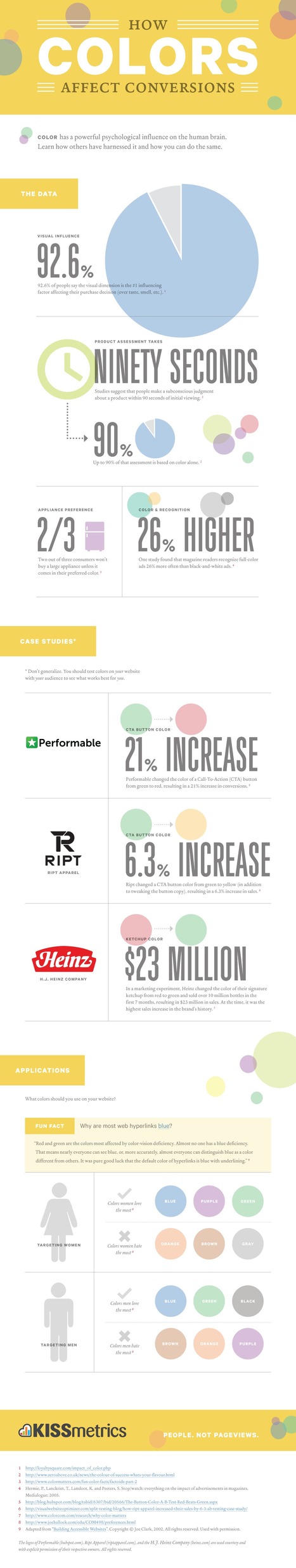
Color has a powerful psychological influence on the human brain. Learn how others have harnessed it and how you can do the same. Via Martin (Marty) Smith

Martin (Marty) Smith's curator insight,
May 19, 2013 4:28 PM
Color Is MASTER of Us All Infographics:
As people begin to experiment with the creation and interpretation of visualizations and including them in presentations, a not-so-apparent shift will take place in the background where the traditional ‘analyst’ role slowly morphs to give way to a new breed — the storytellers — who will be more strategic and consultative in nature and not data-waiters, statisticians or always comfortable with extreme analytics. Visualization, as we know it, is starting to spread through individual contributors and niche companies forging the path. A lot of these individuals are learning as they go and using available tools and technologies, but invariably data access and computing capabilities to specific information are limitations that still require heavy investments. As people begin to experiment with the creation and interpretation of visualizations and including them in presentations, a not-so-apparent shift will take place in the background where the traditional ‘analyst‘ role slowly morphs to give way to a new breed — the storytellers — who will be more strategic and consultative in nature and not data-waiters, statisticians or always comfortable with extreme analytics, but can create, interact, discover and explain relationships in the information and become the go-to people leadership looks for to understand and make quick decisions for their business through data... Via Lauren Moss
|
Beautiful Unusual Navigation Designs for Inspiration. Selection of Awwwards websites with a strong presence of unusual navigation. An effective navigation design is crucial for a website Via Martin (Marty) Smith
Martin (Marty) Smith's curator insight,
June 26, 2014 9:29 PM
Navigation feels old and moldy. There are few things MORE critical than navigation. We've moved from left nav sitting firmly in the "golden triangle" to horizontal top navigation. 
BOUTELOUP Jean-Paul's curator insight,
June 27, 2014 2:21 AM
Merci ! il est bon de repenser aussi le webdesign pour une nouvelle expérience utilisateur
![2013 The Year of Responsive Design [Infographic] | Rapid eLearning | Scoop.it](https://img.scoop.it/_amQFrkyVgwvjDhX4Ia9lTl72eJkfbmt4t8yenImKBVvK0kTmF0xjctABnaLJIm9)
With a multitude of mobile devices coming out almost every week, how can marketers ensure that their content is optimized for different device types, screen sizes, and capabilities?

Jeff Domansky's curator insight,
December 30, 2012 3:06 PM
Useful insight into Responsive Design and why it’s the going to be one of the biggest marketing trends in 2013. 
Dolly Bhasin 's curator insight,
December 30, 2012 10:43 PM
43% planning a trip! VIOLA! I am on right track!
From Karen: In a presentation rut? Looking for better tools that actually allow you to more easily create a narrative or allow for easier story sharing than PowerPoint? Then check out this article and the recommended tools!
Although tools like Powerpoint and Keynote have become the de facto standard for giving presentations, they are often limiting in their design and ease of use. And while tools like SlideShare help users share their presentations online, they often don’t give enough context to the slides.
To provide solutions to these pain points, traditional presentation tools are being completely re-thought from the cloud down to help presenters deliver a better presentation, and share it relevantly after it’s done.
Thank you to fellow curator Baiba Svenca for originally curating this article! Via Baiba Svenca

's comment March 14, 2012 4:30 PM
Thank you for re-scooping this article! Have a wonderful week :)
|


I like Salesforce and SquareSpace and was surprised I didn't hate the Microsoft design.
Unusual and creative responsive designs that look great on a huge monitor and a tiny smartphone screen - that's great