 Your new post is loading...

|
Scooped by
Martin (Marty) Smith
January 22, 2019 10:22 AM
|
Mobile app users are a different breed. They go to mobile apps for different reasons than websites. In sum, they want a faster, concentrated, and more convenient experience. However, since smartphone screens have limited space, it’s not really feasible to include an expansive menu or set of filters to aid in the navigation of an app.
|
|
Scooped by
Martin (Marty) Smith
June 27, 2017 9:28 AM
|
Mobile Marketing Tips
This is a MUST READ post if you're a marketer trying to understand how mobile is changing...well everything. Shorter, sharper, and seamless is our quick summary. Shorter and more VIDEO-centric because who reads anymore.
Sharper because the phone is flatter, less able to share nuance and variations. Simplify, simplify and simplify some more is a good way to think about "mobile first" re-design.
Finally, the opening point about how mobile and LIFE merge for millennials is worth reading several times. A life that isn't on a millennials smartphone has no validation. It simply doesn't exist.
|
|
Scooped by
Martin (Marty) Smith
May 5, 2015 12:45 PM
|
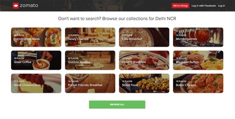
Best of Indian Web Design with Zomato.com A Clear Standout
Indian web design is marked by innovation, clear Calls-To-Action and graceful use of current and future technology. "In India my generation," my friend Ravi told me the other day, "went right to mobile skipping laptops and desktops altogether".
I was looking at these sites with my laptop and expect they look great on smart phones too. Nothing like having must of your customers using mobile tech to make mobile first in both responsive templates and impressive data architecture (easy to see how these sites would accordion in mobile.
The foodie site Zomato.com lives up to its great name. The content, despite their not being "here" yet, is fresh, beautiful to look at and engaging. Zomato is about FOOD and, much like India herself, has few preconceived notions about what that means. .
Instead they curate with clear passion and grace. Every Indian site we studied had a clear sense of GET TO IT many American sites could learn from. Indian web designers know how to "tease", charm and win clicks by providing just the right information at the right time.
Many American designers seek to overwhelm and thus end up speaking to themselves about themselves. Better to box not look for the haymakers we seem to love so much here these great Indian web designed sites illustrate.
|
|
Scooped by
Martin (Marty) Smith
January 15, 2015 6:21 PM
|
Web designers shouldn't be SEO experts since keeping up with DESIGN is a full-time job. Nothing has made that truth more apparent than my first week learning CSS, SCSS and the like at The Iron Yard Code Academy in Durham, NC this week.
But web designers are where SEO rubber meets the Google Road so understanding a handful of ideas is critical to the online success of any designers creations. This deck was created to share with The Iron Yard's Cohort 3 Front End Engineering class Friday January 16th.
Includes our favorite FREE SEO tools and how we use them. Good luck and let us know your SEO / Design experience and we will curate into an upcoming post on http://www.curagami.com.
|
|
Scooped by
Martin (Marty) Smith
December 10, 2014 11:55 AM
|
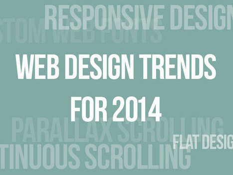
Now it’s time to analyze the web designs that have emerged this year, and place predictions for the possible trends that lie ahead for 2015.
Marty Note
Promise to create a mashup of all web design trends postings to identify common consensus and outliers.
|
|
Scooped by
Martin (Marty) Smith
November 12, 2014 7:30 PM
|
Bauhaus is not only one of the most important design movements in history, but an especially relevant style for Web Designers. Alex and Simone tell you why.
Marty Note
Wow, love this post by SitePoint.com's Web Developer Alex Walker and graphic designer Simone Sala because it both EXPLAINS Bauhaus Design Principles and then applies them with examples to the web. #toogood
The Bauhaus stressed form and function. Removing ornamentation in favor of clarity, ease of use and beauty. Sounds like MOBILE DESIGN to me.
Mobile is so SMALL it forces the right choices. Look how "mobile design" is not impacting web design. Mobile stared trends such as limited color palettes and flat graphics because of limitations (of smart phones), but those limitations can also help FREE up a website and point it more clearly at true north.
True north online is where visitors know what to do and why easily and are so engaged by your content they want to do (what you want them to do) AND they want to share the experience with friends. Mobile's "game console-like" BEING is reshaping marketing (see Marketing's Big Bang Manifesto https://plus.google.com/102639884404823294558/posts/Tf9GNsX35qn ).
Great, helpful post.
|
|
Scooped by
Martin (Marty) Smith
October 31, 2014 8:04 PM
|
*Web Design For DIY*
The Do-It-Yourself revolution is blowing up thanks to mobile apps and social media. This link includes one of our favorite examples: http://www.Casetify.com where we just created our http://www.Curagami.com logo case for iPhone 6Plus.
We are working on a series of posts about how to engage and empower your DIY customers & you can help. Send ideas, comments and your experiences with DIY marketing and we will curate into the piece with attribution and a link (martin (at) curagami.com).
Find more DIY Marketing thoughts and a secret code you can use to get $10 off your Casetify.com creations (8PGZX3). Sharing a code like that is powerful brand ambassador fuel.
Share your DIY tips and check out more notes on GPlus:
https://plus.google.com/102639884404823294558/posts/Nezb4QZgayx
|
|
Scooped by
Martin (Marty) Smith
October 17, 2014 1:07 AM
|
Best Mobile App Design
Mobile apps are great web design teachers. Flat, clean and simple are mobile design trends any web design can benefit from. This excellent Quora thread shares powerful mobile app design best in class. Our favorite Pattern.dk.
|
|
Scooped by
Martin (Marty) Smith
September 29, 2014 12:06 PM
|
Responsive Web Designs
Responsive design, forming a website's information so it looks great on any device, is becoming mission critical. Here are 65 of the best responsive designs in 2014 via SocialDriver.com.
|
|
Scooped by
Martin (Marty) Smith
August 14, 2014 5:07 PM
|
You'll never feel left out at a hipster web design party with these 15 key terms under your belt
|
|
Scooped by
Martin (Marty) Smith
July 28, 2014 2:01 PM
|
Mobify is a mobile e-commerce optimization platform used by leading online retailers to deliver exceptional responsive shopping experiences.
|
|
Scooped by
Martin (Marty) Smith
April 28, 2014 10:00 PM
|
2014 Web Design Trends - Marty Note
Not a secret we are seeing flatter more responsive design in 2014, but I liked the format of the way Script Tutorials explained each trend with examples and wireframes.
2 of these ideas, Video Backgrounds and Interactive Infographics could be huge. Video backgrounds was a new idea to me even halfway through the year.
|
|
Scooped by
Martin (Marty) Smith
April 16, 2014 8:14 PM
|
The Bauhaus ethic applied principles such as "honesty of construction", "truth to ma...
|
|
|
Scooped by
Martin (Marty) Smith
June 29, 2017 3:23 PM
|
Rock Mobile Or It Rocks You You want to be on the right side of the "mobile" revolution, but where is that exactly. This post shares critical information about screen size that will help your mobile design rock!
|
|
Scooped by
Martin (Marty) Smith
February 14, 2016 11:21 PM
|
Voice Search = Next Big Thing
As of 2014 we know 55% of teens and 41% of adults use voice search on a daily basis. Now with virtual assistants like Siri, Alexa and voice recognition.
Marty Note:
The way you get your content into their voice box is all about how you structure DATA. This post gives a great overview of schema and how to use it to win hearts, minds and loyalty as Siri shows your stuff instead of theirs.
Might want to sprinkle a little predictive analytics and AI-like branching too. Read this post and understand the new SEO.
|
|
Scooped by
Martin (Marty) Smith
May 2, 2015 2:57 PM
|
Parallax scrolling is a popular design technique used on websites in order to create an illusion of movement on the screen, to help engage website visitors and move visitor yes where you want them AND parallax scrolling plays beautifully on mobile devices!.
Here are 60 examples of great parallax scrolling.

|
Suggested by
WDP
December 28, 2014 9:11 AM
|
Mobile responsive design tools for testing your website or apps before it goes live. You'll find both FREE and paid solutions.

|
Suggested by
David Fournier
December 8, 2014 9:37 AM
|
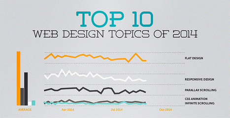
Explore the top web designing trends for 2015. The infographic discusses the top 6 predictions that are set to rule the web designing world in 2015.
|
|
Scooped by
Martin (Marty) Smith
November 6, 2014 6:30 AM
|
Web Design
Cha Cha Changes are ahead for web design. Our social / mobile / connected world is blowing up our wireframes. and that's a good thing.
|
|
Scooped by
Martin (Marty) Smith
October 20, 2014 9:04 PM
|
The "Web Design" category of general interest covers its fair share of ground. Informative articles on everything from UX to client management, to conversion psychology,...
|
|
Scooped by
Martin (Marty) Smith
October 4, 2014 1:18 PM
|
This infographic illustrates what responsive web design is, how it works, and why you should make the switch.
|
|
Scooped by
Martin (Marty) Smith
August 18, 2014 3:05 PM
|
Designing Tomorrow's Ecommerce
I'm writing a blog post for Curatti that will go live at midnight tonight that discusses the "best practices" of "Tomorrow's Ecommerce". I'm also writing a Curagami blog post (also published at midnight) about how social shopping will change Tomorrow's Ecommerce.
Tomorrow's Ecom Current Best Practices (Curatti tonight)
Tomorrow's Ecom Social & Mobile Web (on Curagami now)
The Haiku Deck that bridges both of these posts is linked above and here:
http://shar.es/1nkJef
As we publish each post we will link them here.
|
|
Scooped by
Martin (Marty) Smith
July 29, 2014 2:30 PM
|
Like the World Wide Web itself, the world of website design is constantly in flux as technologies change and design standards evolve. What worked in 2013 may
|
|
Scooped by
Martin (Marty) Smith
June 26, 2014 9:29 PM
|
Beautiful Unusual Navigation Designs for Inspiration. Selection of Awwwards websites with a strong presence of unusual navigation. An effective navigation design is crucial for a website
|
|
Scooped by
Martin (Marty) Smith
April 23, 2014 8:41 PM
|
Fantastic CSS3 Website Designs for Inspiration. Selection of Awwwards winning CSS3 websites. CSS3 is a powerful tool for web designers to enhance the appearance of a website.
|


![Web Design Trends 2015 [Infographic] | Must Design | Scoop.it](https://img.scoop.it/L41KKlVHAbH6NFwnMzAQbDl72eJkfbmt4t8yenImKBVvK0kTmF0xjctABnaLJIm9)

![How Responsive Web Design Works [Infographic] | Must Design | Scoop.it](https://img.scoop.it/5fsHa4eLiyWsI6RKVn4v8jl72eJkfbmt4t8yenImKBVvK0kTmF0xjctABnaLJIm9)


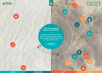


What changes do you need to make to be "mobile first" with your search bar and search results? This Smashing Magazine post shares reasons why virtually any mobile application needs a search bar.
You’re going to find a lot of use for search in mobile apps: