Must Design
75.6K views | +0 today
Follow
Must Design
Design Is Revolutionary
Your new post is loading...
Scooped by Martin (Marty) Smith
January 15, 2015 6:21 PM
Scoop.it!

SEO For Web Designers New @HaikuDeck by @Scenttrail

SEO For Web Designers New @HaikuDeck by @Scenttrail | Must Design | Scoop.it

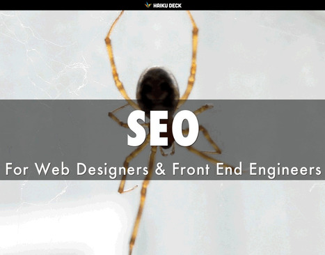
Web designers shouldn't be SEO experts since keeping up with DESIGN is a full-time job. Nothing has made that truth more apparent than my first week learning CSS, SCSS and the like at The Iron Yard Code Academy in Durham, NC this week.

But web designers are where SEO rubber meets the Google Road so understanding a handful of ideas is critical to the online success of any designers creations. This deck was created to share with The Iron Yard's Cohort 3 Front End Engineering class Friday January 16th.

Includes our favorite FREE SEO tools and how we use them. Good luck and let us know your SEO / Design experience and we will curate into an upcoming post on http://www.curagami.com.


No comment yet.
Suggested by David Fournier
December 8, 2014 9:37 AM
Scoop.it!

Web Design Trends 2015 [Infographic]

Web Design Trends 2015 [Infographic] | Must Design | Scoop.it
Explore the top web designing trends for 2015. The infographic discusses the top 6 predictions that are set to rule the web designing world in 2015.
Martin (Marty) Smith's insight:

Liked and agreed with all 6 of these 2015 Web Design Trends when I read the post without the infogfpahic. Infographic helps and I bet wil get more shares :). M

malek's curator insight, December 8, 2014 11:24 AM

I like“Card” design, no, it\s not new, but I find it a good tool for designers working on responsive websites. Cards are a great way to keep things modular

Scooped by Martin (Marty) Smith
October 4, 2014 1:18 PM
Scoop.it!

How Responsive Web Design Works [Infographic]

How Responsive Web Design Works [Infographic] | Must Design | Scoop.it
This infographic illustrates what responsive web design is, how it works, and why you should make the switch.
Martin (Marty) Smith's insight:

Responsive Web Design 
Here is an email I wrote to a friend this morning about responsive:

NO ONE understands mobile seo btw (lol). Not a huge leap to think that what makes a site responsive could also confuse the spider. Could also HELP the spider since the re-imagining of the information architecture should do things like:


* Move from novels to linked snippets. 
* Rely on tags (tags are about to be HUGE because they create new dimensions into the data). 
* Can open a site's content for social (reduce distance between THEM [customers] and US [site creators / managers]).
* Create clear meta data (goes with connected snippets). 

That last bullet puts stress on current database thinking and tech. With this many windows into the same data a developer must know about how to cononicalize a URL (or the dupe penalties will be crushing). Responsive websites become an evolving puzzle. As new pieces get created they must fit the existing framework or blow the whole thing up. 

That said, I don't see any way BUT thinking mobile first from here on out. In the end that is going to be a good thing for all of us, but transitioning is a bear :). Marty 


Tony Guzman's curator insight, October 6, 2014 11:28 AM

This infographic describes what responsive website design is and how to best accomplish it.

Scooped by Martin (Marty) Smith
June 26, 2014 9:29 PM
Scoop.it!

RETHINK Web Design: Unusual Web Navigations Inspire | AWWWARDS

RETHINK Web Design: Unusual Web Navigations Inspire | AWWWARDS | Must Design | Scoop.it
Beautiful Unusual Navigation Designs for Inspiration. Selection of Awwwards websites with a strong presence of unusual navigation. An effective navigation design is crucial for a website
Martin (Marty) Smith's insight:

Navigation feels old and moldy. There are few things MORE critical than navigation. We've moved from left nav sitting firmly in the "golden triangle" to horizontal top navigation.

Neither of these options inspire and both are feeling long in the tooth and stupid. The social / mobile web requires a RETHINK about navigation. Can we find ways to make very page a homepage?

Can navigation be more relevant and less middle of the road boring? Here are some navigation examples from AWWWARDS.com that don't solve the problem...yet. But the dialogue helps begin the process of reducing our dependency on static, boring, "has-been" ideas like left or horizontal nav.

Are you as surprised that navigation hasn't been on the "top changes" list for web design in 2014? Has to be on our 2015 list because every current option is BAD and getting worse.

BOUTELOUP Jean-Paul's curator insight, June 27, 2014 2:21 AM

Merci ! il est bon de repenser aussi le webdesign pour une nouvelle expérience utilisateur

Scooped by Martin (Marty) Smith
March 30, 2014 11:26 AM
Scoop.it!

Hot, Flat, Colorful: 33 Examples of Ultra-Hot Flat Web Design Trend

Hot, Flat, Colorful: 33 Examples of Ultra-Hot Flat Web Design Trend | Must Design | Scoop.it
Currently, one of the biggest trends in the web design industry is the flat design style. In case you are not yet familiar with the term, flat design is essentially design without the drop shadows, gradients, and textures that have been common in web design for some time. Flat design uses solid colors and often typography figures prominently into the design. In this post we'll showcase 33 excellent examples of the flat web design trend. Hopefully they can provide some inspiration that can be put to use in your own work. Buffalo
Martin (Marty) Smith's insight:

Mobile is the secret driver of many of 2014's hottest web design trends. One of the hottest is flattening out web design. Small screens can't handle shading and three dimensionality as well as bigger screens, so flat is one of the HOTTEST web design trends as these 33 examples share. .

Alaina Duty's curator insight, September 25, 2015 1:45 PM

Here are some great examples of some bold, attention-grabbing color combinations incorporated in flat design.

Suggested by WDP
December 28, 2014 9:11 AM
Scoop.it!

Ready for Mobile? Comprehensive List of Testing Tools

Ready for Mobile? Comprehensive List of Testing Tools | Must Design | Scoop.it
Mobile responsive design tools for testing your website or apps before it goes live. You'll find both FREE and paid solutions.
Martin (Marty) Smith's insight:

This post is important and valuable on two fronts. First we all need to start thinking MOBILE FIRST and that is a very different way to think. Second the great list of new to me tools is worth a scan and test.

No comment yet.
Scooped by Martin (Marty) Smith
October 31, 2014 8:04 PM
Scoop.it!

Web Design For DIY the @Casetify Example

Web Design For DIY the @Casetify Example | Must Design | Scoop.it

*Web Design For DIY*
The Do-It-Yourself revolution is blowing up thanks to mobile apps and social media. This link includes one of our favorite examples: http://www.Casetify.com where we just created our http://www.Curagami.com logo case for iPhone 6Plus.

We are working on a series of posts about how to engage and empower your DIY customers & you can help. Send ideas, comments and your experiences with DIY marketing and we will curate into the piece with attribution and a link (martin (at) curagami.com).

Find more DIY Marketing thoughts and a secret code you can use to get $10 off your Casetify.com creations (8PGZX3). Sharing a code like that is powerful brand ambassador fuel.

Share your DIY tips and check out more notes on GPlus:
https://plus.google.com/102639884404823294558/posts/Nezb4QZgayx

No comment yet.
Scooped by Martin (Marty) Smith
September 29, 2014 12:06 PM
Scoop.it!

65 Best Responsive Web Designs 2014 via SocialDriver.com

65 Best Responsive Web Designs 2014 via SocialDriver.com | Must Design | Scoop.it

Responsive Web Designs
Responsive design, forming a website's information so it looks great on any device, is becoming mission critical. Here are 65 of the best responsive designs in 2014 via SocialDriver.com.

Martin (Marty) Smith's insight:

I like Salesforce and SquareSpace and was surprised I didn't hate the Microsoft design.

Helen Stark's curator insight, September 30, 2014 3:53 AM

Unusual and creative responsive designs that look great on a huge monitor and a tiny smartphone screen - that's great

Scooped by Martin (Marty) Smith
April 23, 2014 8:41 PM
Scoop.it!

15 Best CSS3 Websites Inspire Consistent With 2014 Design Trends - via AWWards

15 Best CSS3 Websites Inspire Consistent With 2014 Design Trends - via AWWards | Must Design | Scoop.it
Fantastic CSS3 Website Designs for Inspiration. Selection of Awwwards winning CSS3 websites. CSS3 is a powerful tool for web designers to enhance the appearance of a website.
Martin (Marty) Smith's insight:

Strong first few pages of examples here. My favs include 

Cat Magnet for actually telling a fish story (nice large CTA too). 
Design Council - love the flat, few colors with red as accent. 

True - don't like blocking the face, but works here. 

Stealable Ideas ae consistent with 2014 design trends:

* Big heros (tells a better story).

* Limit color palette. 
* Flatten out the design so it looks good on mobile too.
* Large Call-to-actions (DECLARE what you want your customers to do).

That last bullet, using a clear CTA, seems to be the hardest one to sell designers who feel to DECLARE is to shout. I disagree. I view DECLARATION in this context as helping by MAPPING and POINTING.

No one wants their TIME wasted and when you point them in the right direction with a large, high contrast CTA you've created a helpful hint. Subtle, when you have seconds, seems an unsupportable luxury. When DON'T we want to be CLEAR and help our visitors know how to journey along our paths?

A: NEVER :). M  


No comment yet.
Scooped by Martin (Marty) Smith
March 10, 2014 6:43 PM
Scoop.it!

15 Best Responsive Design Websites | Web Design Inspiration [@PeterShamN is Great]

15 Best Responsive Design Websites | Web Design Inspiration [@PeterShamN is Great] | Must Design | Scoop.it
Awesome Responsive Design Website Designs for Inspiration. Selection of Awwwards winning Responsive Design websites. Fluid grids, flexible images and media queries are the three technical ingredients for responsive web design
Martin (Marty) Smith's insight:

My favorite is Petersham Nuseries @PetershamN. Peter Sham may be the best content / commerce site I've encountered. Social is a tad hard to find, but the smooth synergy between storytelling content and commercial selling is elegant, well architected and seamless.

Love this (great, intimate content):

"The teahouse has evolved to now offer a seasonally inspired, Italianate lunch menu, as well as daily homemade cakes, loose whole leaf teas and filter coffee. Horticulturally, the nurseries expanded with the reopening of the Greenhouse III to extend the onsite propagation alongside the expansion of the cutting and kitchen gardens directed by Lucy Boyd, whilst the development of the community and education based Petersham Platform sees the Nurseries' fundamental ethos central to the growth within our walls opened up to those outside it.
 

The success and ripening can be attributed to the ideas and determination of eldest daughter Lara Boglione. Since 2011 Lara has been the driving force behind the development of the Nurseries. Her passion lies in sustainability, gastronomy, agriculture and education, an ethos that is spread across all business functions. Lara explains: “We hope to have created a place of calm, away from the bustle of London, somewhere that respects and is in tune with nature and positive living."


Peter Sham is more than just an amazing responsive site. The site is a great example of how content and commerce can live in harmony. 
 

No comment yet.