


 Your new post is loading...

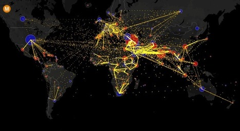

Visualizing the flow of the world's migrants from country to country.
Based on data from the U.N. Population Division, this map shows the estimated net migration (inflows minus outflows) by origin and destination country between 2010 and 2015.
Blue circles = positive net migration (more inflows). Red circles = negative net migration (more outflows). Each yellow dot represents 1,000 people.
Hover over a circle to see that country’s total net migration between 2010 and 2015. Click a circle to view only the migration flows in and out of that country.
For more info about this map, read the article, All the World’s Immigration Visualized in 1 Map.
Tags: migration, USA, mapping, population, unit 2 population.


a. Write the countries with the most and the less people who change their countries. Explain if They are leaving or coming to different countries.
b. Could you undestand whiches causes could be the rigin in each country ( Ex : war, poor...)
Good Luck