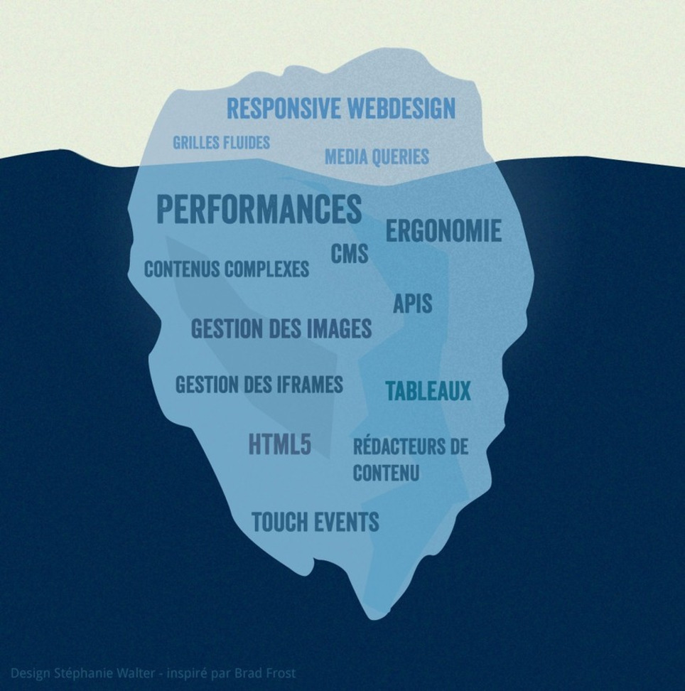
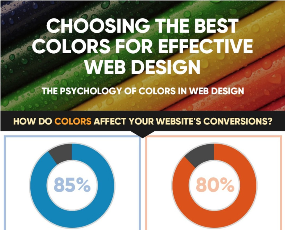
Color is such a fundamental part of the way we perceive the world that we often take it for granted. Think about it: From the youthful and vivid orange on someone’s attire to the gray and gloomy sky above us, colors have the power to mold our perceptions of others and even the circumstances we find ourselves in.
This is why one of the most powerful tools in a designer’s arsenal is color. It can either make or break a design; it can be the determining factor in engaging viewers or sending them promptly on their way.
As a non-designer, I often find it difficult to find just the right colors for my amateur projects. Whether I’m creating a simple image to support my content or more elaborate projects such as a slide deck or infographic, I frequently spend a good amount of time looking for the perfect color scheme. I ask myself questions like: Do I want my design to be inviting? Provocative and bold? Or intelligent and elegant?
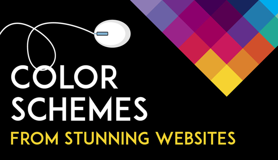
Unless you’re a seasoned designer, it takes time and effort to find a color combination that works, which is why the design team at Visme decided to provide our users with a handy list of beautiful color schemes from websites that have been recognized by Awwwards, the most prestigious award for Web designers and developers....
Via
Jeff Domansky


 Your new post is loading...