 Your new post is loading...
Color is such a fundamental part of the way we perceive the world that we often take it for granted. Think about it: From the youthful and vivid orange on someone’s attire to the gray and gloomy sky above us, colors have the power to mold our perceptions of others and even the circumstances we find ourselves in. This is why one of the most powerful tools in a designer’s arsenal is color. It can either make or break a design; it can be the determining factor in engaging viewers or sending them promptly on their way. As a non-designer, I often find it difficult to find just the right colors for my amateur projects. Whether I’m creating a simple image to support my content or more elaborate projects such as a slide deck or infographic, I frequently spend a good amount of time looking for the perfect color scheme. I ask myself questions like: Do I want my design to be inviting? Provocative and bold? Or intelligent and elegant? Unless you’re a seasoned designer, it takes time and effort to find a color combination that works, which is why the design team at Visme decided to provide our users with a handy list of beautiful color schemes from websites that have been recognized by Awwwards, the most prestigious award for Web designers and developers....
Via Jeff Domansky
We're boiling down 13 of the most prominent web design trends emerging in 2015. Will they change your understanding of a "modern website"? You be the judge.
Marty (@Scenttrail) Notes:
1. Make it big (Agree but not as easy to do well as they make it look). 2. The multimedia experience (agree and same as #1) 3. The Parallax effect mutations (Horizontal Scrolling) Agree 4. Animated storybook (Agree and cool). 5. Flat design (agree & effect of mobile) 6. No more boxes (Agree and YES!). 7. Tiles (Pinterest effect and agree). 8. Navigation widgets (Agree!) 9. Integrating Google maps (Agree where appropriate). 10. Mashup interfaces (AGREE grab those APIs :). 11. Minimize (Seems to contradict #1, but agree). 12. World Wide Wait (speed is going to be KEY). 13. Designer automation (Agree, can do a lot with templates now).
Via Martin (Marty) Smith

|
Rescooped by
Brian Yanish - MarketingHits.com
from Must Design
January 28, 2015 3:53 PM
|
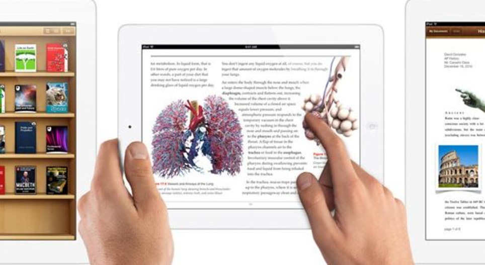
Sometimes, as the old saying goes, pictures really do tell 1000 words. And if that’s the case, what’s better than a picture with 1000 words included on it?
Via Martin (Marty) Smith
Is your website ready for 2015? Here are 5 of the new trends to look out for in the coming year. From Mobile Focus, Interactive, Flat, Simple, and Single Page Designs – stay ahead of the curve and get on trend for the New Year. Our easy to follow visual guide will show you the way.
Via Lauren Moss
Digest...
Parallax design sites are growing in use because they embrace the fluidity of the Web, provide simplicity, and offer a scrolling technique that creates a neat 3-D effect. You should be aware of some concerns when deciding whether to use a parallax design. Concerns include the following. Load times Parallax design is highly animated with a lot of scripts, so it can decrease the load time of a website. Browser support Not all browsers are able to support the parallax design. That inability can lead to problems for the user. Not mobile-friendly Parallax scrolling is also not ideal for mobile as it makes the website bloated. Parallax adds layers of code to a website. Deficient for analytics If all your content is on one page, understanding what content is capturing visitors can be difficult. There can be workarounds to this obstacle, such as using event tracking or tying a pageview in Google Analytics to sections of parallax scrolling, but parallax design does add a layer of complexity to analytics. SEO SEO and new design techniques often don't mesh. In addition to being deficient on the analytics side, many parallax websites are not built with SEO in mind. Content often takes a backseat to the visual, and parallax pages typically aren't geared towards specific topics and targeted websites. External websites may only have one page to link without linking to specific subpage with more relevant content. ___________________________________ ► Receive a FREE daily summary of The Marketing Technology Alert directly to your inbox. To subscribe, please go to http://ineomarketing.com/About_The_MAR_Sub.html (your privacy is protected).
Via Joemktg
|
|
Rescooped by
Brian Yanish - MarketingHits.com
from Must Design
August 30, 2014 9:48 AM
|
Marty Note
Food Websites are great places to learn key elements of web design such as:
* Sensual and romantic images.
* Great mouth watering headlines.
* Visual marketing storytelling.
I like http://www.whitmansnyc.com/ and Soup Peddler. Whitmans BRANDS a hamburger beautifully. Food is HARD to shoot. Food can easily look TERRIBLE in a picture especially a picture with limited web resolution. Whitmans solves that problem creatively with a thin transparent layer between us and the burger. Well done!
Soup Peddler, in the example shown, is the ONLY site that includes PEOPLE. Foodies have "widget-itis" worse than techies. Widget don't sell as well as PEOPLE.
The SINGLE possible exception to that rule might be a foodie site, the one in 10M foodie sites that creates INCLUSION with their food. Whitman's is close since a hamburger is a universal thing, but the site remains a tad sterile due to lack of community.
If you scroll down below Whatman's hero you will see another pet peeve. WHY do web designers EVER let someone show an interior image WITHOUT PEOPLE.
Yes the lines are clean and the emptiness is sort of beautiful, but think about the NONVERBAL communication sent by an empty room. How long do you stay in an empty room when there is a party going on next door?
Food Heroes
So, foodie sites need people. There are several ways I would work people into the equation so the story being told feels more inclusive and fun:
* Chef as Hero.
* People with SMILES looking UP at chef or waitstaff.
* Fan as hero (with story).
Food heroes (largest image on the page = hero) need to be QUIET and CONFIDENT. Too much NOISE or any WEAKNESS and we don't trust a website (or eat their food).
The CHEF is a hero that WORKS for any restaurant. Seeing Wolfgang Puck creates a brand. Seeing a chef wearing whites with a slightly stained towel over his (or her) shoulder says, "My food is so amazing you haven't LIVED until you've eaten here".
Instead of EMPTY rooms the picture is smiling, well dressed people looking up at the Chef or waitstaff listening in rapt attention. Better if dishes are gone b/c signals meal is over and everyone is still smiling (a tacit endorsement).
DON'T STAGE THIS PHOTO. Shoot it when a group is in for dinner (with permission and releases). Share the event and caption the photo. NEVER stage actors in food websites. Canned art + food says NO TRUST and DANGEROUS.
If your fans are MODEL good looking TELL THE STORY of the event that prompted the picture. What was being celebrated, shared or discussed. If the group is a nonprofit your restaurant supports MORE THE BETTER as you can tell 2 stories in one (risky but worth it).
Finally, you can feature a fan in your hero, BUT same "no canned or artificial" photos here either. ALSO, click me through to a page of pictures of other fans and stories (why they wanted to share their picture and story about FOOD i.e. make sure people know they aren't related :).
Food is SO individual, what I like and what you like can be very different, so think about the 5 stories you need to tell that "star" your content (i.e. tells the stories that cover the rainbow of your food's tribes).
One story shares love of sauces and sweet. Another story tells the visual romance story. Another might discuss meeting the chef and getting to know the "people behind the scenes".
Sharing different and strategically savvy stories creates the "like me" connection with the different tribes your food, restaurant and content should attract. Every restaurant has a passion. Share that passion.
Also share the reception the food creates, the passion others have for the food. Tell those stories in those ways and your foodie (or other) website wins hearts, minds and loyalty.
Via Martin (Marty) Smith
You probably heard about the modern web design term at least once, but how can be used correctly with an online shop? What are the requirements?
Marty Note (here is how I shake out on each of these recs)
Big Hero Or Sliders Agree With Caveat!
Depends on what you do immediately to the right or under your large hero. Hero's create HOT SPOTS on the right and immediately below, hot spots that convert and hot spots NO ONE uses (goofystupid). If you are running an ecommerce site you aren't selling the picture, but you do need the attention it can grab. Make sure you put a Call-To-Action to the right or immediately below. People don't like to click within a hero (especially a big one), so CTA below even if it is a restatement.
http://www.charitywater.org/
Does a good job with a large static hero and a "can't miss" CTA with 3 critical links almost directly below the hero. & I DO NOT like sliders.
Warmer Colors - AGREE!
Websites are inherently COLD so warming them up with strong accent colors is a must. Remember to figure in the images you like to include. You can use more warm color if your images always have white backgrounds. If not, you may achieve "warmer" with images instead of needing to modify your design.
Interesting Grids - AGREE!
Thanks to Pinterest the GRID is getting creative. Grids are a great way to share a lot of information fast.
Flat Design - Agree!
The web doesn't do 3D well (yet), so flattening out your design can help make buying decisions easier. Include zooms if applicable and remember to ask your customers to share pics of your products on them or in their homes (great User Generated Content).
Animation
Vine has me convinced there are ways to create animations that help and don't hurt, but be careful. An animation that doesn't stop (like Vine videos) can be obnoxious. I prefer giving control of animations to the click over auto-play. If someone ASKED to see the animation its different than if you just start playing it and it doesn't stop.
Mobile Friendly UI - Agree!
Your responsive design must master the swipe, spin and scroll of the mobile experience. If your site isn't FUN and easy to spin, snip and buy from your customers won't. Spoke with a friend at lunch in the craft space today and her traffic is now HALF mobile, so make sure your content is FUN to use on a phone or pad and takes advantage of the mobile UI.
Via Martin (Marty) Smith
|
|
Rescooped by
Brian Yanish - MarketingHits.com
from Must Design
February 16, 2014 12:23 AM
|
It's amazing what can be done with CSS these days. Support for the latest CSS3 properties is strong in the latest versions of all the major browsers - even Internet Explorer - and the possibilities for typography, animation and interactivity have never been greater. But finding web design inspiration can be tricky.
Via Martin (Marty) Smith
A infographic featuring web design trends for 2013 created by Enfuzed. This is the original!
Via Martin (Marty) Smith
|
|
Rescooped by
Brian Yanish - MarketingHits.com
from Must Design
October 3, 2013 11:03 PM
|
This holiday season will be the Christmas of MOBILE devices. Here are some amazing examples of the art and science of responsive design.
Via Martin (Marty) Smith
|
|
Rescooped by
Brian Yanish - MarketingHits.com
from Must Design
September 22, 2013 9:47 PM
|
Predicting the future is tough, but with the fast-moving nature of the web, it’s good to know what lies ahead. Craig Grannell talks to top industry figures about the web design trends you should be mindful of over the coming 12 months.
Via Martin (Marty) Smith
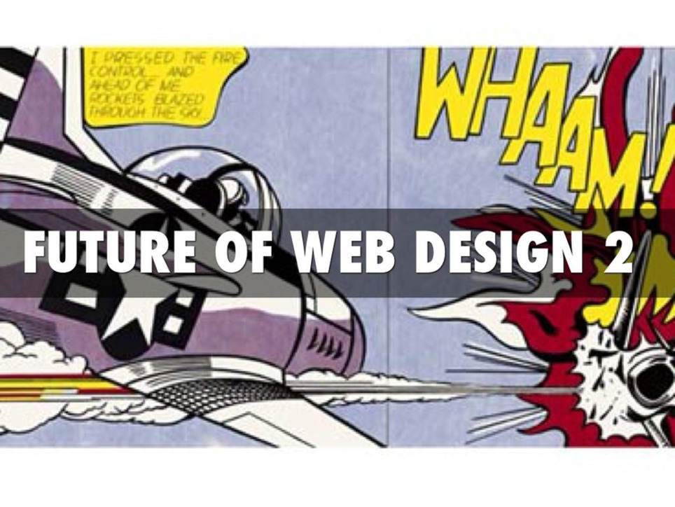
Web 3.0's Whaam!
Just as Roy Lichtenstein’s Whaam! 1963 seemed to blow abstract painting off the walls web 3.0 will change everything we call "website design". After creating Future of Web Design (http://sco.lt/7r6zkf) Haiku Deck I realized some shots were fired but not enough.
Web 3.0 powered by a ubiquitous web for people and things with semantic intelligence changes how we create websites and Internet marketing. Math will be a future web designer’s friend.
Websites will float based on predictive analytics and real time behavior. Behavior responded to with tested creative designed for personas and segments to CONVERT is more Google-like than anything web designers create now.
David Merrill's siftables are the best demonstration of how content will become intelligently self aware AND agnostic to the kind of hubificaiton web designers practice now.
http://youtu.be/JP0w9lZoLwU Siftables
Hubificaiton is about bringing THEM to US. APP-ificaiton is about creating agnostic widgets. Widgets easily placed anywhere (as Amazon's mini-cart widget demonstrates here: http://sco.lt/4iahNZ).
Web 3.0's mobile ubiquitous web will reversing hubification emphasis on traffic density (bring visitors into a hub). Distinctions will chante too. THEM and US will fade in favor of relevant experience (the commons).
In this context CONVERSION becomes an extension of an experience instead of the other way around. We rarely shop / search for things merely for the pleasure of the search. We may start with one goal in mind and end up achieving a different set of goals, goals created on the fly in real time based on how the web responds to our journey, but our process feels like US.
Predictive analytics, personas, segments and an increasing amount of tested creative controlled by math means our unique feeling of US or ME may continue to exist, but THEIR sense of our next behavior mean this is a distinction without a difference.
If you fit a persona, that persona predicts what relevant content you need when the feeling of having Big Brother on your should could be overwhelming. Mutual benefit is why consumers won't revolt.
When websites convert 40% of their traffic, as Schwan's does now, their efficiency trumps density. Efficiency trumping density describes Web 3.0 perfectly.
Via Martin (Marty) Smith
Never underestimate the power of HUMOR or its application. Here are 100 funny 404 pages, the pages users get when something has gone wrong. The ability to turn a page that is FRUSTRATING into a funny gambit is the difference between a site that makes a few bucks and one that is worth millions.
Design for engagement means thinking about the customer at all times. Thinking about the customer means BEING the customer and not the Master Blaster Controler. Have fun and design fun in especially where its a surprise and you WIN.
Via Martin (Marty) Smith
Won’t it be simpler to have just a single website that could work everywhere? Responsive web design technology does exactly this. With the gaining popularity of smartphones, More and more websites are accessed via mobile devices. Websites that aren’t optimized for mobile browsing scare away visitors. Responsive web design can be a solution to this problem. If done correctly, responsive web design doesn’t only provide a better mobile browsing experience, but it can also improve the loading time by optimizing the content for smartphones Analysts at Morgan Stanley claim that the world is currently going through fifth technological revolution since the last 50 years. This one is based on the evolution of mobile internet. According to statistics, mobile Internet usage has been growing staggeringly over the past few years and is expected to overtake desktop Internet usage by the year 2013. What is Responsive Web Design?A website that is designed to established standards laid down for responsive web designing will be able to adopt its design and layout to fit the specifications of the device calling it. It does this by dynamically adopting to different screen sizes and by reformatting the positioning and look of the constituent elements of the website. So what may appear to be a website with large images spread through three columns on a computer screen, will appear to have smaller images in a single column on a mobile screen. All of this does not need multiple codes written for each type of device. A single set of code which accepts various specification parameters from the device will do the job. CSS3 is used to give the generated website the desired look and feel.
Via Martin (Marty) Smith
|
|
Scooped by
Brian Yanish - MarketingHits.com
April 24, 2013 7:26 PM
|
Want your website to look great on smartphones, tablets, PCs and even TVs? Learn how to go fully responsive.
The Web and the mobile browsers remain one of the top ways that users interact with websites and if they have trouble on their smartphone, there is a good chance they are not coming back. That’s where responsive design can help. Responsive design is a concept where you build your website once and then format it so it can adapt to any screen size that accesses it. Designers use HTML5 and CSS to build the sites and set parameters so the content will resize itself whether the user is in vertical or horizontal viewing mode, on a tablet, desktop or smartphone or even a screen as large as a television...
Via Lauren Moss
|
|
Rescooped by
Brian Yanish - MarketingHits.com
from visual data
March 14, 2013 10:51 PM
|
Within the typographic communities, people have debated on the issue: Do serifs contribute to the legibility of typefaces, and are sans serif typefaces less legible?
Like many things, these two different fonts have pros and cons. This infographic takes a look at the argument of serif vs sans serif...
Via Lauren Moss
Let's try and fix how the poor design, usability or content of your website is driving visitors to your site away in seconds ?
Via Martin (Marty) Smith
Use of colors in Web design by Nida Aslam, Front End Designer, Incepio
Via Baiba Svenca
|
|
Scooped by
Brian Yanish - MarketingHits.com
December 30, 2012 12:49 AM
|
With a multitude of mobile devices coming out almost every week, how can marketers ensure that their content is optimized for different device types, screen sizes, and capabilities?
|


![How DESIGN TREND Is Your Ecom Website Going Into The Holidays? [Infographic] | WebsiteDesign | Scoop.it](https://img.scoop.it/il0_u2_RgImL_b4v3PyUOXUNgYEWb61gm8pPsijhXNo=)


![Responsive Website Design & Web 3.0 [Infographic] | WebsiteDesign | Scoop.it](https://img.scoop.it/qkEnVxRW7mM79UODF8Yf-XUNgYEWb61gm8pPsijhXNo=)


![10 Tips To Build A Responsive Website [Infographic] | WebsiteDesign | Scoop.it](https://img.scoop.it/eRraDMqmkZcM4QW_DTYFZHUNgYEWb61gm8pPsijhXNo=)


![Serif vs Sans: The Final Battle In Typography [Infographic] | WebsiteDesign | Scoop.it](https://img.scoop.it/0kaV-lxNx3WpSw-IUC7JqXUNgYEWb61gm8pPsijhXNo=)


![2013 The Year of Responsive Design [Infographic] | WebsiteDesign | Scoop.it](https://img.scoop.it/_amQFrkyVgwvjDhX4Ia9lXUNgYEWb61gm8pPsijhXNo=)


A list of 50 color schemes from award-winning websites, and how to apply them in Visme using the hex color codes.
LOVE me some colour schemes!
A list of 50 color schemes from award-winning websites, and how to apply them in Visme using the hex color codes.