

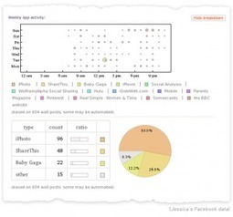

"Une analyse complète sou forme d'infographie de votre présence et de votre activité sur le réseau social Facebook. Un résultat impressionant fourni par le moteur Wolfram."
Via Geemik Maria Açucena Da Silva
Get Started for FREE
Sign up with Facebook Sign up with X
I don't have a Facebook or a X account


 Your new post is loading...
 Your new post is loading...
Your new post is loading...
"Une analyse complète sou forme d'infographie de votre présence et de votre activité sur le réseau social Facebook. Un résultat impressionant fourni par le moteur Wolfram." Via Geemik Maria Açucena Da Silva 
No comment yet.
Sign up to comment
Benoit Deldicque : "Depuis bientôt plus d'un an, le phénomène Open Data avance en France avec la mise à disposition gratuite de données par les collectivités locales ou encore des entreprises privées… Via Michelle Laurissergues

Josh Smith: "What starts as boring data will become a boring infographic unless a great story can be found." Via The Digital Rocking Chair, Dolly Bhasin
Visually-compelling content can take many forms, from creatively produced videos to engaging Facebook photos. Today, we thought we would give a quick course in one of the the highest forms of visually powerful content: Infographics. Mashable defines infographics as graphic visual representations of information, data or knowledge used to present complex information quickly and clearly. Infographics are becoming more common in the building industry, particularly on websites and blogs catering to architects and designers. The best infographics try to articulate one of five key communications challenges. Read the complete article for an example of each of these challenges in action on popular industry websites... Via Lauren Moss

For those who can make sense of the explosion of data, there are job opportunities in fields as diverse as crime, retail and dating. What is Big Data? A meme and a marketing term, for sure, but also shorthand for advancing trends in technology that open the door to a new approach to understanding the world and making decisions. There is a lot more data, all the time, growing at 50 percent a year, or more than doubling every two years, estimates IDC, a technology research firm. It’s not just more streams of data, but entirely new ones. For example, there are now countless digital sensors worldwide in industrial equipment, automobiles, electrical meters and shipping crates. They can measure and communicate location, movement, vibration, temperature, humidity, even chemical changes in the air... Via Lauren Moss
The company has experienced meteoric growth over the last year, fueled by global expansion. And they're good at telling the story. A company’s annual report is a go-to reference when sizing up a company’s health and prospects. All those facts and figures arranged in black-and-white tables also make up the perfect cure for insomnia. Why do corporate documents have to be so boring? They don’t, as the info-data genius Nick Felton revealed in 2005, when he began issuing his own highly personalized form of annual reports chock full of biographical details presented with design gusto. (You may recall that Felton is also responsible for inspiring Facebook’s new Timeline format.) It took a few years, but companies are finally catching on to the idea of leavening snooze-inducing data with exciting colorful graphics and easy-to-read figures. The latest to jump on the Felton bandwagon: Airbnb, which comprises a global network of local renters providing alternates to pricey hotel rooms. The big news here--rendered in eye-catching red--is that the three-year-old company is celebrating its 5 millionth nightly booking (4 million of which were made in the last year alone). That meteoric growth has a lot to do with its global expansion: 75% of its business now involves an international guest, host, or both--a fine argument for opening six new offices in major international cities by March 2012... Via Lauren Moss

'It's about having a holistic, functional system.' To frame this series, I'd like to share with you the Two Things about web measurement. Since first thinking about this, I've revised them a few times, but I think I've settled here: I believe that if you stick to these two things as non-negotiable truths, you'll get the most out of the measurement you do...
Via Lauren Moss

Belle Chua's curator insight,
January 1, 2014 11:19 PM
Crafting your way to understand and making sense of web measurement
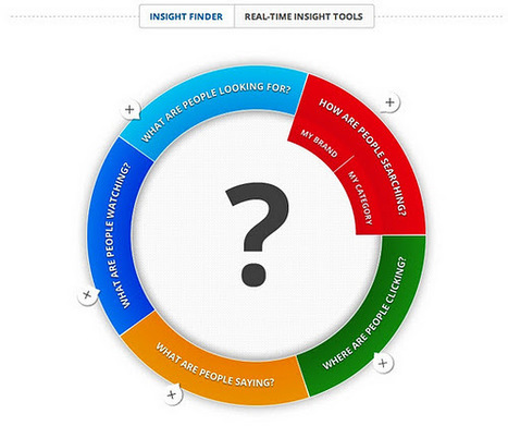
Google has graduated Think Insights from beta. This tool now compiles real-time data from Google search and other platforms, combining those facts with additional studies, infographics, and more. Users can find the site at ThinkwithGoogle.com, and then explore tools that focus on different sectors of the virtual world. Google described the site as an "information and resource hub for marketers" in the Official Google Blog post announcing Think Insights' graduation. The post also indicated that Google will continue to use the site as a data-centric storehouse for "consumer trends, marketing insights, and industry research." That storehouse is filled with specific insights from Google (frequently compiled as infographics) as well as studies, reports, a research library, a fact and statistic sheet, and planning tools. While some of the information comes directly from Google, a large portion of the studies are the result of independent or collaborative research... Via Lauren Moss
http://www.ted.com With the drama and urgency of a sportscaster, statistics guru Hans Rosling uses an amazing new presentation tool, Gapminder, to present da... Via Ana Cristina Pratas
|
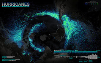
A few days ago, I tweeted about the beautiful map shown- Hurricanes and Tropical Storms since 1851. I added a note about the projection, which may be unusual for someone who was born in Europe, the US, or Continental Asia, as it is centered on the South Pole. Rob Simmon, a data visualizer at NASA Earth Observatory, replied: "I disagree with the map projection choice, far too much distortion of the data, especially in the Northern Hemisphere." That's a legitimate concern. Distorsion is a major challenge when designing maps. I gave Rob's comment some thought, as it is somehow related to the core idea in The Functional Art: Information graphics are tools; before choosing visual shapes to encode data we should define the tasks our graphics should help readers with. Additionally, in interactive visualizations we may want to explore information from different angles. In the video lectures that you get with the book, I point out that designers usually forget that sometimes it may be necessary to represent data more than once, with different kinds of charts, maps, and diagrams, each adapted to a particular function... Via Lauren Moss
Réunis le 15 juin 2012 au 104 par la FING, des experts et observateurs du numérique étaient invités à réfléchir au sens du "monde de données", qui englobe de plus en plus nos vies. D’où vient l’explosion des "data", sait-on la quantifier, quelles possibilités ouvre-t-elle ? Bref, que faire face à cette "inondation" de données ? Pour vous éviter la noyade : retour sur les principales conclusions de la conférence…

Just starting out in visualising your data? Looking for something simple to use?
As Tim O’Reilly tweeted last week, “Data Science is the new black.” Data has definitely got people talking, and thinking, and rethinking the implications, and that includes a growing number of leading journalists and journalism schools…and media funders.
Consider just three recent happenings: -Earlier this year, data camps were held at both Columbia University and University of Texas.
Read the complete article for more on data journalism... Via Lauren Moss
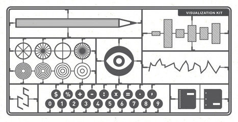
This seems like a straightforward question, but it’s proven to be a difficult one to answer. Even visualization researchers – people who think about the subject all day and every day – don’t have a clear definition of what visualization is. Is it synonymous with information graphics? Does visualization have to be computer generated? Does data have to be involved, or can it be abstract? The answers vary depending on who you ask. To me, visualization is a medium. It’s not just an analysis tool nor just a way to prove a point more clearly through data. Visualization is like books. There are different writing styles and categories, there are textbooks and there are novels, and they communicate ideas in different ways for varied purposes. And just like authors who use words to communicate, there are rules that you should always follow and others that are guidelines that you can bend and break... Via Lauren Moss

Fàtima Galan's curator insight,
September 12, 2013 6:50 AM
"Visualization is like books. There are different writing styles and categories, there are textbooks and there are novels, and they communicate ideas in different ways for varied purposes. " 
Patrice Mitrano's curator insight,
January 30, 2014 5:16 AM
De très nombreux exemples d'infographies, malheureusement pas toujours aboutis. A croiser avec d'autres infographies ou représentations sur des sujets identiques ou bien à rapprocher des données sources.
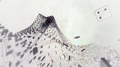
Information visualization is all the rage recently with everyone trying to turn their data (or any data really) into a beautiful piece of art. Typically most of these projects fail at doing justice to the data they’re trying to visualize. Enter data hero Michael Rigley, BFA of California College of the Arts’ graphic design program. His data visualization animation is does truth to the numbers in his piece about tracing what happens to the data that we spew into the digital landscape every day. Take a look at some of the sample screens from his animation and be sure to catch the video. Via Lauren Moss

Laurent Fanichet discusses the best way to back-up the data generated by your experiments... Via Sakis Koukouvis

This article was written by Marshall Kirkpatrick for ReadWriteWeb
You make data. A lot of it. From Web browsing to link sharing to photos published online, from phone bills to medical records to online banking - almost all of us produce an incredible amount of electronic data that slips right through our fingers...
Here's What Went Live 10/19 In case you didn't see it: Very exciting!
Singly 1.0 began rolling out to developers Oct. 19, 2011
****Those first users will be able to build apps that search, sort and visualize contacts, links and photos that have been published by their own accounts on various social networks but also by all the accounts they are subscribed to there.
****Want to search the contents of every link shared by every person you're subscribed to on Twitter (at least as far back as Singly can access)?
****Want to make a slideshow of all the Instagram photos your contacts have posted that have a certain hashtag in them? Or were on a weekend? Or whatever other criteria you can think of? Those kinds of things are possible now.
http://www.readwriteweb.com/archives/singly_platform_launch.php
Curated by JanLGordon covering "Content Curation, Social Media & Beyond"
Via janlgordon

Absolutely fascinating!
Intro:
In 2008 the number of devices connected to the Internet surpassed the number of people connected, and in 2020 there will be 50 billion things connected, 7 times the world’s population, according to Dave Evans of Cisco.
The infographic below highlights some of the key features of the Internet of things, including the pace of growth, how external data can be aggregated so that your alarm clocks, cars, and coffee makers make decisions to fit with your schedule, and that some cameras and computers are now just a cubic millimeter.
An amazing statistic is that by end of 2011, 20 typical households will generate more Internet traffic than the entire Internet in 2008. That is slightly unbelievable, and I would like to know how they define ‘typical’ and what data is generated for Internet communication.
However it is important to recognize that the Internet of things is one of the most important ways to understand our connected future. Pervasive connectivity, and the amazing things we will be able to do with that, will shape our lives.
Via janlgordon

Tom George's comment,
September 6, 2011 1:48 PM
Hey Jan,
I hope you had a great Labor Day weekend. Hope to see you share some content soon? That is on Internet Billboards! LOL Nice curation as usual. Thanks Tom |


