As a venture-based Silicon Valley startup, Minerva has developed slowly over the last seven years. As a new form of higher education, progress from concept to enrollment was lightning fast. Learn more about what sets them apart here.
Get Started for FREE
Sign up with Facebook Sign up with X
I don't have a Facebook or a X account


 Your new post is loading...
 Your new post is loading...
Your new post is loading...
 Scoop.it!
As a venture-based Silicon Valley startup, Minerva has developed slowly over the last seven years. As a new form of higher education, progress from concept to enrollment was lightning fast. Learn more about what sets them apart here. 
No comment yet.
Sign up to comment
Scoop.it!

In this blog, we offer 3 features to help practitioners operationalize a personalized approach in competency-based systems.
Scoop.it!

Education used to be simple: there was a blackboard, a teacher and desks in a classroom. Today, a student can practice English online, upload homework through..
Scoop.it!

Millennials on both ends of the age spectrum have grown up with limitless access to information, which ha
Scoop.it!

Quotes are inspirational messages that catalyze change in behaviour. We present 13 best eLearning quotes from top influencers.
Scoop.it!

developmental math redesign from professional standards
Scoop.it!

So how do we prepare students to excel in this changing world? The answer is personalized learning.
Scoop.it!

My husband and I have been talking about a trip to Europe to "travel back to our roots" for years, and as soon as the kids were out of the house, we finally began planning it. He wanted to see Ireland and Germany, but for me, France was at the top of my list. I have French relatives on both side
Scoop.it!
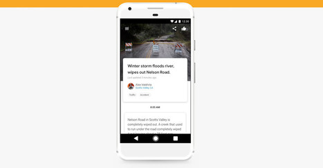
Google Bulletin is a new app from Google that lets users post local, community news straight to the web without needing a blog or website. The app is in a limited pilot program in Nashville and Oakland for now.
|
Scoop.it!
Post 6 of our #RemakeLearning series shares discussions from the #EdResearchSummit that included the 10 aspects of the #FutureofLearning.
Scoop.it!

There is one question that almost everyone asks when discussing artificial intelligence: Will it replace human beings, or augment them?
Scoop.it!
Business Insider France est un site d’information sur l’économie, les technologies, les entrepreneurs, l’innovation, les découvertes et bien plus encore. En texte, en images, en vidéos et en graphiques, de l’actualité essentielle et percutante.
Scoop.it!
The e-learning or digital content ecosystem is quickly evolving, and mobile learning, multi-device content, mobile responsive content (call it what you will) is here to stay. #1: Define What “Mobile” Means to You—and Your Clients Mobile learning can be defined as many different types of learning experiences. #2: Decide on a Minimum Device Set Once you are clear on what mobile learning and mobile responsive mean to you, you are in a better position to decide on a minimum device set. #3: Understand Your New Design Parameters The good news: It’s finally time to say goodbye to fixed screen, click-next, sleep-inducing e-learning content! #4: Adjust Your Storyboarding Process If you’ve been an instructional designer as long as I have, you’ll have experimented with different types of storyboarding. For me, Microsoft PowerPoint works the best. Example #5: Integrate Scrolling into the Design Process If you are not careful, your instructional designers will simply transfer their fixed screen design ideas into long scrolling pages.
Scoop.it!

Are the offerings and experiences designed by L&D for their employees becoming irrelevant? Three forces ar
Scoop.it!

Studying online doesn't have to mean being isolated behind a computer screen – there are plenty of ways to connect with your coursemates and tutors
Scoop.it!
The motivational similarities and brain response between a recreational drug user and a professional salesperso
Scoop.it!
Today we are recognizing 10 interesting high schools schools and 10 networks that promote deeper learning.
Scoop.it!

What happens when you pack a small room with cutting-edge education practitioners and solution providers? A serenade, of course, followed by a game o
Scoop.it!

Tom Vander Ark - What learning will look like in 2035 is hard to predict but we can predict a wider variety of approaches and options.
Scoop.it!

Brainly.com - For students. By students. Brainly is the place to learn. The world’s largest social learning network for students.
Scoop.it!

"Virtual schools" are on the rise, but studies find they're not doing a good job. Now one school in New Hampshire is pointing the way to online ed's future.
|