


This chart tracks the ratio of the Dow Jones Industrial Average to the price of gold. The number tells you how many ounces of gold it would take to buy the Dow on any given month.

|
Scooped by
cnxsoft
onto Economy and Investments July 22, 2013 12:42 AM
|

No comment yet.
Sign up to comment

 Your new post is loading...
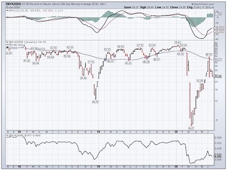


This chart makes me feel very pretty good about Gold, at least versus US stocks.