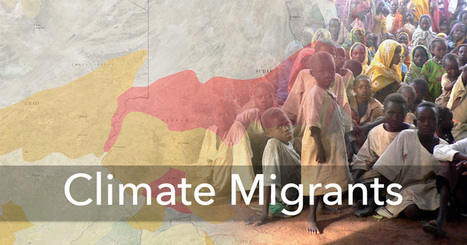

Climate change has already displaced tens of thousands of people. If it continues unabated, it could lead to one of the largest mass human migrations in history.
Get Started for FREE
Sign up with Facebook Sign up with X
I don't have a Facebook or a X account


 Your new post is loading...
 Your new post is loading...
Your new post is loading...
Climate change has already displaced tens of thousands of people. If it continues unabated, it could lead to one of the largest mass human migrations in history. 
No comment yet.
Sign up to comment

"ChronoZoom is an open source community project dedicated to visualizing the history of everything to bridge the gap between the humanities and sciences using the story of Big History to easily understand all this information. This project has been funded and supported by Microsoft Research Connections in collaboration with University California at Berkeley and Moscow State University. You can browse through history on ChronoZoom to find data in the form of articles, images, video, sound, and other multimedia. ChronoZoom links a wealth of information from five major regimes that unifies all historical knowledge collectively known as Big History." An overwhelming amount of information in one location...this will take time to explore! Via Beth Dichter, Smithstorian
What, exactly, is genius? In their latest project, Italian visualization wizard Giorgia Lupi and her team at Accurat — who have previously given us a timeline of the future based on famous fiction, a visual history of the Nobel Prize, and a visualization of global brain drain inspired by Mondrian — explore the anatomy of genius, based on Genius: A Mosaic of One Hundred Exemplary Creative Minds by literary titan Harold Bloom.
Via Lauren Moss
Data is everywhere and well-designed data graphics can be both beautiful and meaningful. As visualizations take center stage in a data-centric world, researchers and developers spend much time understanding and creating better visualizations. But they spend just as much time understanding how tools can help programmers and designers create visualizations faster, more effectively, and more enjoyably.
As any visualization practitioner will tell you, turning a dataset from raw stuff in a file to a final result in a picture is far from a single-track, linear path. Rather, there is a constant iteration of competing designs, tweaking and evaluating at once their pros and cons. The visualization research community has recognized the importance of keeping track of this process.
Read the complete article to learn more about the future of the practice and the tools that enable designers to create thoughtful infographics and visualizations... Via Lauren Moss
A visual history of human sensemaking, from cave paintings to the world wide web.
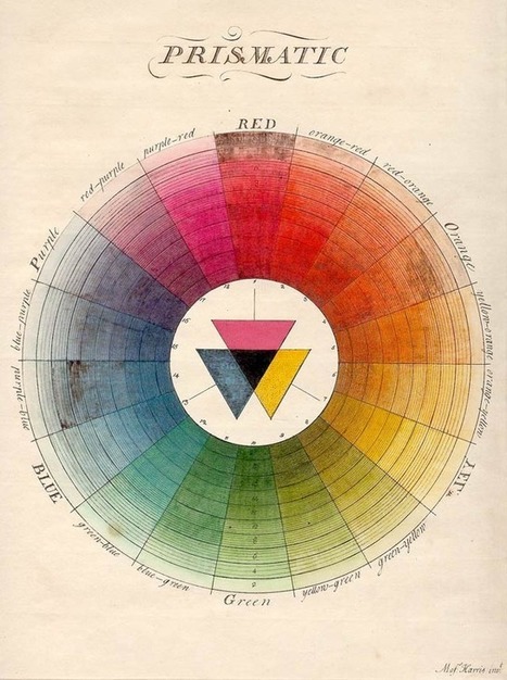
100 Diagrams That Changed the World by investigative journalist and documentarian Scott Christianson chronicles the history of our evolving understanding of the world through humanity’s most groundbreaking sketches, illustrations, and drawings, ranging from cave paintings to The Rosetta Stone to Moses Harris’s color wheel to Tim Berners-Lee’s flowchart for a “mesh” information management system, the original blueprint for the world wide web. But most noteworthy of all is the way in which these diagrams bespeak an essential part of culture — the awareness that everything builds on what came before, that creativity is combinational, and that the most radical innovations harness the cross-pollination of disciplines. Via Lauren Moss

Patrizia Bertini's curator insight,
December 30, 2012 5:59 AM
I see! - goes together with embodied cognition? It seems so... Infographics as a key? 
bancoideas's curator insight,
December 30, 2012 9:28 AM
Ideas acerca de las ideas que tenemos sobte nosotros/as mismos/as y el mundo que co-construimos 
Denise Eler's curator insight,
June 30, 2015 7:26 PM
Quando um gestor pede que uma apresentação de 80 slides seja condensada em 3 slides, ou uma página A3, não tenha dúvida: isto vai exigir de você mais que capacidade de síntese textual. Pensar visualmente, especialmente, criando diagramas é uma competência valiosa. Vejo isso durante meus cursos e vivência com profissionais das mais variadas indústrias. A boa notícia é que dá para aprender ;) |
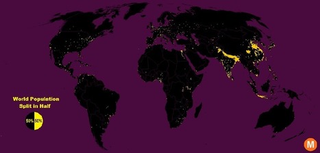
"Data viz extraordinaire Max Galka created this map using NASA’s gridded population data, which counts the global population within each nine-square-mile patch of Earth, instead of within each each district, state, or country border. Out of the 28 million total cells, the ones with a population over 8,000 are colored in yellow."
Tags: population, density, mapping, visualization.

Brian Weekley's curator insight,
July 27, 2016 10:47 AM
Great simple map of world population. Scroll down and look at the U.S. It reflects the global trend. This also has political implications, as evidenced by voting patterns in the 2012 presidential election. Elections are dependent upon votes, which come from people, which are primarily clustered in cities. Election campaigns would use this data to plan their schedules as to where to focus their campaigning efforts. For the folks in Wyoming, they rarely see candidates other than during the primaries. And these world populationclusters have been relatively consistent historically, particularly in south and east Asia. Northern India has serious carrying capacity challenges. Notice the clusters along the Nile- evidence of arable land.
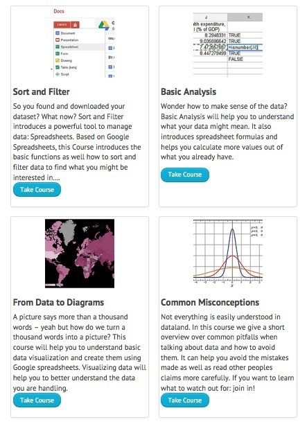
Learn how to find, process, analyze and visualize data
Via Robin Good, Miloš Bajčetić, Judy O'Connell, Joyce Valenza, Jim Lerman

Louise Robinson-Lay's curator insight,
June 22, 2013 6:29 PM
great for preparing data and analyzing it.

TeresaSiluar's curator insight,
April 27, 2014 11:28 AM
Uso de mapas mentales en la curación de contenidos.
My classmates and I are in the Design for Social Innovation program because we identified problems in our communities, companies, or cultures and are keen to figure them out. But before talking about any solution or outcome, one must first frame the problem—by thoughtfully examining the system it’s part of to understand where and how to get involved. Learning to use systems thinking, a holistic approach to problem solving that emphasizes contextual understanding, has helped me with team management, project planning, creative work, and even relationships. And for wicked problems like healthcare that confront business, nature, and society, it’s proving to be imperative.So, where to even begin? “We have to invent boundaries for clarity and sanity,” advises systems thinking pioneer Donella Meadows. Sometimes a simple infographic works to tell the story. Designing visual maps and models helps us immediately find connections and describe relationships. Creating models helps in seeing the big picture and one's place within it.Via Lauren Moss

Martin (Marty) Smith's comment,
January 28, 2013 7:14 PM
I think "design" and "programming" are rushing at each other at light speed. Web pages will be made from branching if,then,else algorithms soon. Can't just drip paint on a canvas, so design's function will be making those algorithms make visual sense.

Gordon Shupe's curator insight,
February 8, 2013 6:38 AM
Info graphics don't really include digital photography, generally, but they are a fascinating way of displaying understanding, telling a story, and implying solutions.
2012 might be the year which we reached 'peak infographic'. You can’t have an issue or a piece of data without putting it into a picture so it’s easier for people to understand. While this has mostly resulted in a glut of ugly graphics that don’t actually do anything with data (and you’ll see some of these below), it’s still an incredibly simple way to get information to you fast. And this year, some of our most compelling content has appeared in the format. These are some of our favorites. Via Lauren Moss

Lauren Moss's curator insight,
December 21, 2012 5:40 PM
A curated infographic gallery from FastCompany... |