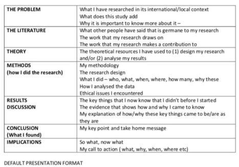
Conference presentations. We almost always have one coming up somewhere. So we are often thinking about how best to organise what we have to say. Now, there’s a lot written about conference p…
Get Started for FREE
Sign up with Facebook Sign up with X
I don't have a Facebook or a X account


 Your new post is loading...
 Your new post is loading...
Your new post is loading...
Conference presentations. We almost always have one coming up somewhere. So we are often thinking about how best to organise what we have to say. Now, there’s a lot written about conference p… 
No comment yet.
Sign up to comment
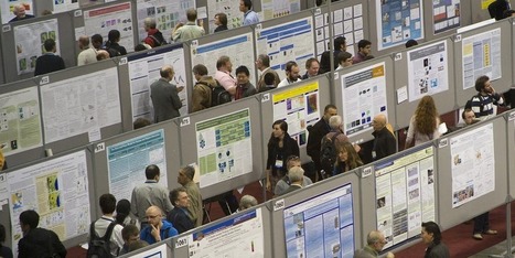
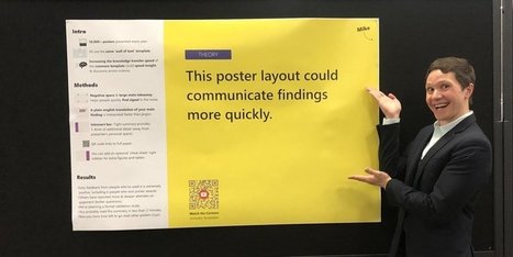
Scholars around the world share their latest research findings with a decidedly low-tech ritual: printing a 48-inch by 36-inch poster densely packe
Read this exciting blog for all the best tips and tricks on how to make an outstanding poster which will stand out at your next conference.

Conference season is upon us! Around the world, thousands of scientists face a daunting task: designing a scientific poster. It should be sleek, yet informative; eye-catching, yet professional; and…
When your speakers do have slides, the general consensus is that less is more. A single, strong, graphic image or succinct line of text will tell your speaker’s story better than a crowded collage of pictures or long paragraph. Remember, people need to process everything a speaker is saying while simultaneously absorbing the slides.
Find out the biggest mistake presenters make when using PowerPoint slides. You might be putting your efforts into the wrong thing.
Peter Mellow's insight:
Some good ideas here, but remember that these sorts of presentations may be 'sales' focused.

For artist and musician David Byrne, the medium is the message. Infographic guru Edward Tufte wants to kill the messenger.

I suffer from something called Ménière’s disease—don’t worry, you cannot get it from reading my blog. The symptoms of Ménière’s include hearing loss, tinnitus (a constant ringing sound), and vertigo. There are many medical theories about its cause: too much salt, caffeine, or alcohol in one’s diet, too much stress, and allergies. Thus, I’ve worked …


Bored students is the least of it – the bullet point-ization of information is making us stupid and irresponsible

Blamed for a rise in passive behaviour, and a decline in curiosity among young people, this software is divisive – loved by some, hated by others – but has it had its day?

PIRatE Lab's curator insight,
January 26, 2018 11:59 PM
This story seems mire about "hate" than love, but there are still a few morsels of interesting stuff in here.
|

We’re excited to announce a major milestone in PowerPoint Designer usage, new Designer capabilities, and that our AI effort is moving beyond Designer with our new Presenter Coach.
Peter Mellow's insight:
Presenter Coach looks interesting. I've always said you need to practice talking with your PPT deck slides before the actual presentation. Multiple times! But being able to get some feedback is really valuable. People are best, but AI is good if you don't have people around.
The NGV Collection contains approximately 75,000 works of art and approximately 90% of its records are available for viewing here. More than 30,000 images of works in the Public Domain are available to download at high resolution for free for publications and non-commercial use by clicking on the download icon. We are constantly improving and adding to the information on this website through research and scholarship, with updates being made to records on a regular basis and images added when they become available.
From
www

Scientists often share their latest research on posters displayed at big conferences. Posters are a long-standing tradition, but one reformer says they're mostly terrible and need to change.
Peter Mellow's insight:
Link thanks to Laura Gaskin.

In short, a poster should be as close to an infographic as possible.

The top 5 graphic design trends of 2019 will help you push boundaries and ignite your creativity. Use Adobe Creative Cloud products to bring your ideas to life.

In recent years, the slideshow presentation has become so ubiquitous in our schools that it has become rare to walk into a lesson and not see one on display. However, teaching from a slideshow can either support or hamper learning, depending on the slideshow design. In my English classroom, I use
"Hello. My name is David Byrne, and I'm going to do an introduction to PowerPoint."
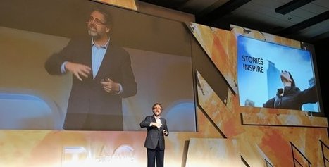
Presentations can be among the most painful experiences in both school and the working world -- and that includes listening to them. The way most of us give presentations is broken and ineffective, but it doesn't have to be that way. What if small changes in the way we prepared to speak could drastically improve our dynamism and effectiveness? Gordon will explain a smart and simple approach to creating presentations that engage audience and inspire action.
From
kerryj
"Love it, hate it, want to ignore it – PowerPoint is part of many people’s working and academic lives. But it’s not all bullet points, crappy clip art and watermarked images of authors who forget good digital citizenship. PowerPoint can also be used as a simple image creator and editor." Via EDTECH@UTRGV

EDTECH@UTRGV's curator insight,
July 10, 2018 12:56 PM
When I need to create a quick graphic or edit a picture, I regularly turn to PowerPoint as my default image editor.
Design systems create a bridge between designers and developers. They describe the rules, constraints, and principles of your company’s design language. Design systems aren't exactly new. If you've ever visited New York City, there's a good chance you've benefited from the subway design system to navigate around—officially named the New York Transit Authority graphic standards manual, designed by the infamous Massimo Vignelli. Design systems don't just provide brand guidelines, they provide a way to consistently implement functional design. In today's incarnation of design systems, it's expected that they provide one source of truth for code, along with documentation and design resources. For teams building digital products, design systems can improve workflow efficiency and enable teams to deliver a better experience to customers.
Kim Flintoff's insight:
Design systems create a bridge between designers and developers. They describe the rules, constraints, and principles of your company’s design language.

I have been using Pecha Kucha (click here to hear it pronounced in Japanese: http://www.forvo.com/word/pecha_kucha/) in my courses for a couple of years now, and I have found the basic constraints of this presentational format to be very useful for my student presentations. If you are not familiar with Pecha Kucha, basic information about the history…
|