

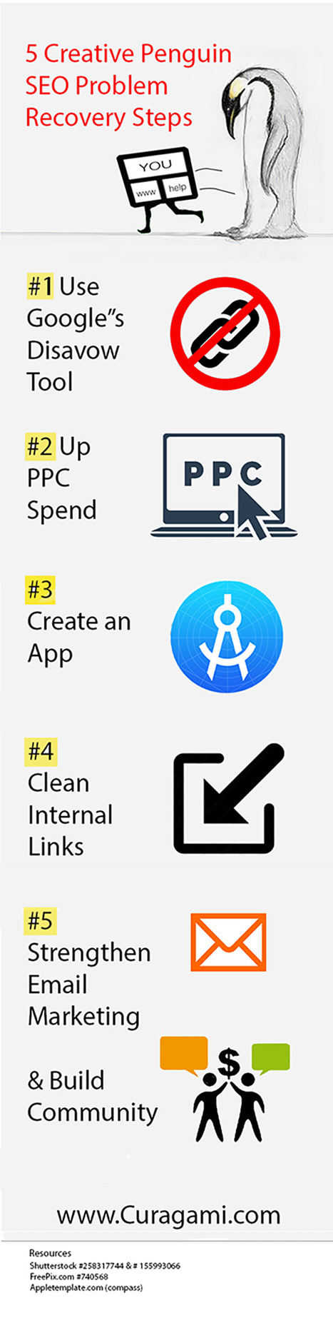
Five Penguin SEO Problem Recovery Steps is a summary of creative steps you to take when your website's traffic gets hammered by seo problems.
Get Started for FREE
Sign up with Facebook Sign up with X
I don't have a Facebook or a X account


 Your new post is loading... Your new post is loading...
Five Penguin SEO Problem Recovery Steps is a summary of creative steps you to take when your website's traffic gets hammered by seo problems. 
No comment yet.
Sign up to comment
![Web Design Trends 2015 [Infographic] | Must Design | Scoop.it](https://img.scoop.it/L41KKlVHAbH6NFwnMzAQbDl72eJkfbmt4t8yenImKBVvK0kTmF0xjctABnaLJIm9)
Explore the top web designing trends for 2015. The infographic discusses the top 6 predictions that are set to rule the web designing world in 2015.
Martin (Marty) Smith's insight:
Liked and agreed with all 6 of these 2015 Web Design Trends when I read the post without the infogfpahic. Infographic helps and I bet wil get more shares :). M

malek's curator insight,
December 8, 2014 11:24 AM
I like“Card” design, no, it\s not new, but I find it a good tool for designers working on responsive websites. Cards are a great way to keep things modular
5 Web Design Implications Evolution Of Web Design Our @Curagami Evolution of Web Design Infographic (http://sco.lt/74Nvsn_ broke daily view records for our startup. Here are 5 Web Design Implications implied by that infographic:
What about you? What design changes do you see ahead? As we move to "community" how can our design support and create trust?
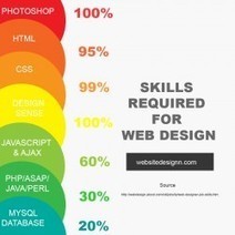
Take a look at the top skills that you require if your designing a website .
Martin (Marty) Smith's insight:
I would add patience, ability to work in a team and a generosity of spirit :). M

lorrinda's curator insight,
February 19, 2014 8:04 AM
...plus the skill of copywriting is most helpful. lorrinda
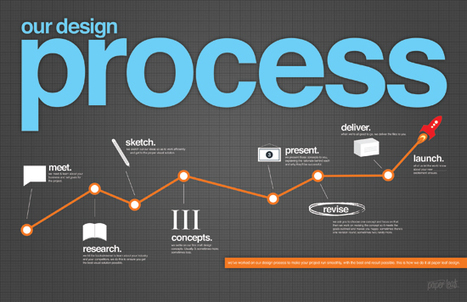
Over here at Paper Leaf Design, we make much ado about communication & process. In our minds, these two elements are key to a successful design project
Martin (Marty) Smith's insight:
I like this infographic of Paper Leaf's design process. Linked artcile is excellent too. My process is less linear. Image little tornadoes of circles at each of those linear steps with bullets bouncing hither and yon and see inside the creative chaos my teams depend on (lol).
![EYES and How They MOVE Around A Website [infographic] | Must Design | Scoop.it](https://img.scoop.it/hq4_dMRx6ZSnPz9l40RoQzl72eJkfbmt4t8yenImKBVvK0kTmF0xjctABnaLJIm9)
Engage website visitors better by designing your site to match how people's eyes move on the page. Here are some surprising eye tracking stats to help.
Putting together a great looking website is a great start, but it is just a start.
True web design requires you to venture beyond the aesthetic and into the worlds of User Experience and Conversion Rate Optimization. Knowing how the viewers of your site really see it can help to shine light on new and/or missed opportunities within your current design. It may also bring out the need for new elements or changes.
While there are plenty of options for improving CRO, eye tracking analysis provides some of the most useful information for optimizing your biggest digital marketing asset, your website.
A good design will catch people’s eye, but a great design will keep people on your site and get them engaged with your content. And while you shouldn’tunderestimate the power of good copy, your design is what people notice first.
We teamed up with our friends over at Single Grain to put together the infographic below in hopes that it will help everyone get a better, basic understanding of what eye tracking is and what it can do. Via massimo facchinetti, Mike Power
Martin (Marty) Smith's insight:
Eyes move different on a website and this infographic takes you through how to design to maximize HOT ZONES people create by how they view websites.

Gaël Berthier ArdècheTourisme's curator insight,
February 19, 2014 4:36 AM
Optimiser l'experience utilisateur et le ROI grâce au eye-tracking

Steve Baker's curator insight,
February 19, 2014 7:37 AM
Designing clean, effective websites that work and deliver clients 
Gonzalo Moreno's curator insight,
February 22, 2014 6:55 AM
One of my students' favorite topics... XD
Little doubt enterprise crowdfunding will play an important role in ecommerce next year. As the first Ecommies shared on Curatti.com Ecommerce is stuck in its own mud (http://curatti.com/is-ecommerce-stuck-in-the-mud/ ).
Enterprise crowdfunding is about to explode too and eCommerce will be changed by the addition of a new low cost, high return marketing channel that reminds us of what email marketing used to be before everyone started curating email with mobile devices, driving open rates down even as the size of many lists increase.

This is the most shared, visited and viewed post on Design Revolution. December is always HOT for trend predictions. Interesting to look over December's predictions to see if they are coming true:

Amanda Groover's curator insight,
December 15, 2013 10:43 PM
Marketing in this decade not only needs but REQUIRES the ability to think outside of the box! Look at some of the trends appearing in a marketing campaign near you in the next year! 
Jakarta Web Developer's curator insight,
August 11, 2014 5:15 PM
Web and Graphic Design Trends 2014 – Infographic via istock (Midyear Check) 
Alfredo Corell's curator insight,
August 12, 2014 3:06 PM
Interactive infographic:
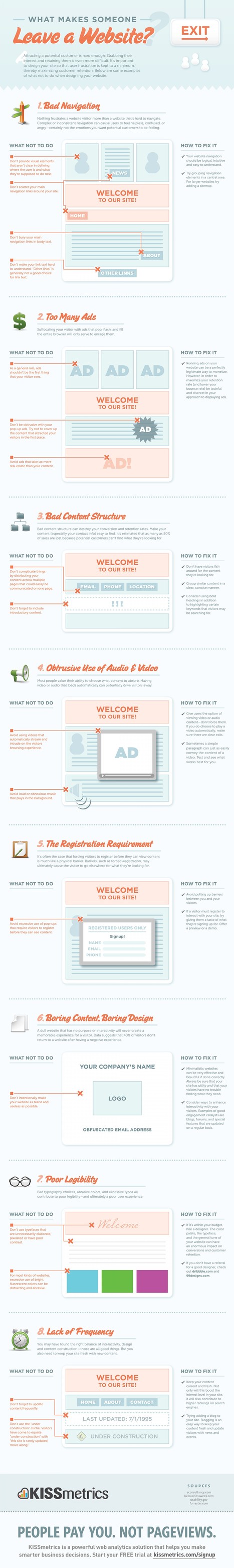
Attracting a potential customer is hard enough. Grabbing their interest and retaining them is even more difficult. It's important to design your site
Martin (Marty) Smith's insight:
Of these 8 very deadly sins the most deadly in my experience is the first one. When customers don't know where you want them to go and what you want them to do or where they came from (within you site) they get confused. Confused customers do many things buying is never one of them.

Michael Allenberg's curator insight,
November 13, 2013 7:36 PM
An info graphic about UX... WIN WIN!!! 
Louise Robinson-Lay's curator insight,
November 15, 2013 3:53 PM
More on great design for maximum impact. This time, websites.
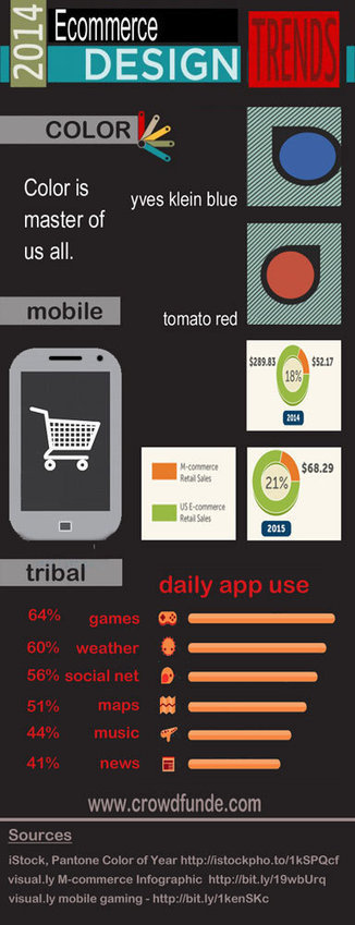
![Color Is MASTER of Us All [Infographic] | Must Design | Scoop.it](https://img.scoop.it/Kz1Zt8f2ZttL8kN2rA-1yzl72eJkfbmt4t8yenImKBVvK0kTmF0xjctABnaLJIm9)
From
pinterest

The Art of Color Coordination Such a helpful infographic. Beyond helpful for web design.

James A Smith MCIM's curator insight,
May 20, 2013 5:49 AM
Slightly off topic but thought it of potential general interest. 
Monica S Mcfeeters's curator insight,
May 24, 2013 12:07 PM
I thought this looked like a great helpful online reference on color. When you have someone that needs review this info it's nice to have a go to link handy.
User Experience UX Software Design 2013 Trends. Agree, big 2013 design trends include: * Content Marketing heavily influenced by mobile first and mobile's content constraints (speed, small, UI).
Would add bubbles about the size of "mobile first" for: * Real Time "read the cookie, fire the design" triggers. * Move to branching business logic controlling design elements.
I may be the only champion of the freedom from design boxes movement. I just don't see UX and design functioning in such limited ways for much longer. Design is most impactful when it is relevant and we have enough persona and behavior information to "read the cookie, fire the design" now. Oh, this isn't the ONLY time I've been up on a soapbox all by my lonesome.
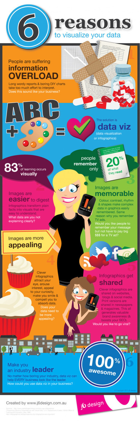
This piece was posted by Loren Sorenson for Hubspot, I selected it because as she says "If you aren’t prepared for the visual content revolution, you may be left in the dust.
Not convinced? Let's take a look at exactly how visual contentis positively contributing to marketing strategies -- it may just give you the push you need
"Learn why visual content is a critical part of your content creation strategy.
Here are some highlights:
**People remember only 20% of what they read
**83% of learning is visual
Condenses and Explains Large Amounts of Information
**Today, there is too much information on the Internet you have about 3 seconds to catch someone’s eyes so they'll consume your information.
Gives Your Brand an Identity
**Visual content draws people in, letting viewers better understand your brand's identity
Drives User Engagement
**If you've ever read a book with a child, you probably know they find pictures more interesting than words; but are adults really that different?
Selected by Jan Gordon covering "Content Curation, Social Business and Beyond"
Read full article here: [http://bit.ly/Ifujbp] Via janlgordon

janlgordon's comment,
April 11, 2012 3:21 PM
Beth Kanter
Thank you for adding me to the wiki and for your kind words, it's greatly appreciated. Yes this is the conversation of the moment so to speak. I'm sure your presentation was amazing. Would love to hear it if you have a replay. 
Beth Kanter's comment,
April 11, 2012 10:08 PM
Jan: There's a link in the wiki to the live stream of the session - and a lot of notes and resources ... I love this topic! I'm holding myself back from created another scoop.it on it ...
janlgordon's comment,
April 13, 2012 10:05 PM
Beth Kanter
Thanks for looking forward to seeing this info. Knowing you, I can imagine that you want to start another scoopit on this topic but it's not necessary because you're already doing a wonderful job covering it now.
I love a good infographic! After all, knowledge is power and the visualization of data makes absorbing information all the easier. Well-designed infographics have a way of pulling me into a subject... Via Ken Morrison, Jim Lerman
|
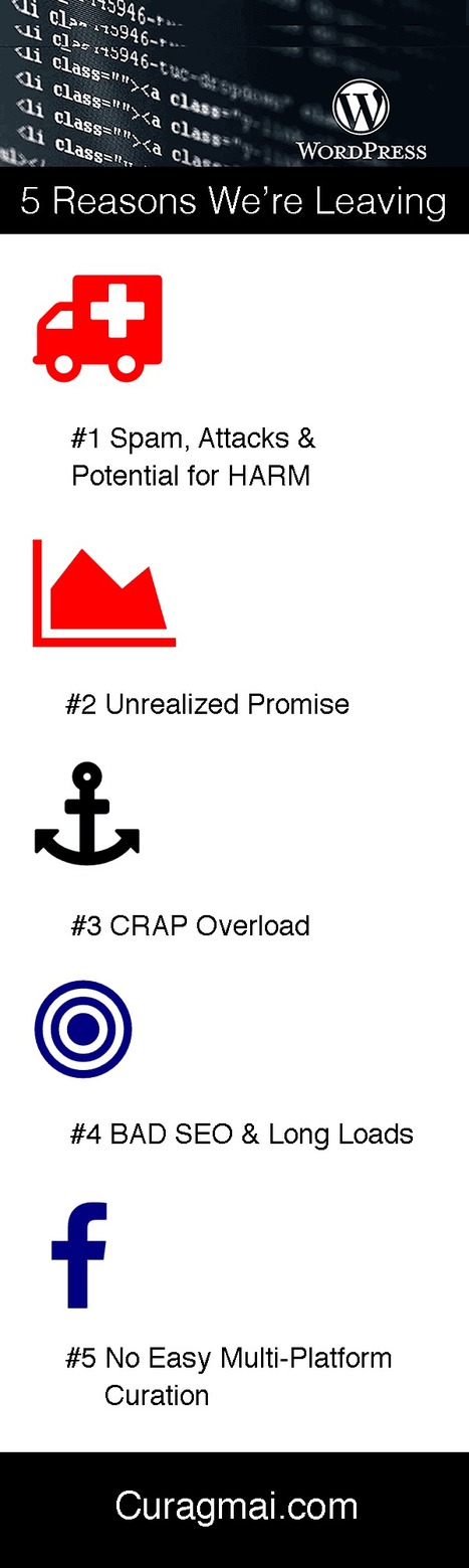
. * Unrealized Promise * BAD SEO and poor site performance (load times) Ugly and Google friendly gets more traffic than beautiful and Google nasty.
![How Responsive Web Design Works [Infographic] | Must Design | Scoop.it](https://img.scoop.it/5fsHa4eLiyWsI6RKVn4v8jl72eJkfbmt4t8yenImKBVvK0kTmF0xjctABnaLJIm9)
This infographic illustrates what responsive web design is, how it works, and why you should make the switch.
Martin (Marty) Smith's insight:
Responsive Web Design * Move from novels to linked snippets. * Rely on tags (tags are about to be HUGE because they create new dimensions into the data). * Can open a site's content for social (reduce distance between THEM [customers] and US [site creators / managers]). * Create clear meta data (goes with connected snippets). That last bullet puts stress on current database thinking and tech. With this many windows into the same data a developer must know about how to cononicalize a URL (or the dupe penalties will be crushing). Responsive websites become an evolving puzzle. As new pieces get created they must fit the existing framework or blow the whole thing up. That said, I don't see any way BUT thinking mobile first from here on out. In the end that is going to be a good thing for all of us, but transitioning is a bear :). Marty

Tony Guzman's curator insight,
October 6, 2014 11:28 AM
This infographic describes what responsive website design is and how to best accomplish it.
We asked Randy Krum, Founder and President of InfoNewt, an infographic
Martin (Marty) Smith's insight:
Don't be fooled by infographic naysayers. Yes there are BAD infographics, yet when I tracked the top 10 for my 125,000 views on Scoopit Infographics owned more than half of almost every feed's top 10. Translation - we need to create infographics and other forms of data visualization.

Tyler Richendollar's curator insight,
March 6, 2014 10:30 AM
If 8 tips weren't enough, here are 3 more.
![Planning, Design, and Optimizing a Website Simplified [Infographic] - Marketing Technology Blog | Must Design | Scoop.it](https://img.scoop.it/zjmiQrejQyhlAZ_HYIxMpDl72eJkfbmt4t8yenImKBVvK0kTmF0xjctABnaLJIm9)
Infographic: Planning, Design, and Optimizing a Website by Douglas Karr on Marketing Technology Blog
Martin (Marty) Smith's insight:
Anything you can find to help SIMPLIFY concepts related to creating or optimizing a website is valuable. This Infographic creates an interesting visual map, a map that makes the process feel easier and less daunting.

noorazeanty's curator insight,
June 10, 2014 12:00 PM
Planning, design and optimising a website simplified by internet initiatives. Website simplified infographic design is a process of website design in a simplified way using effective planning, design layout and strategic implementation.
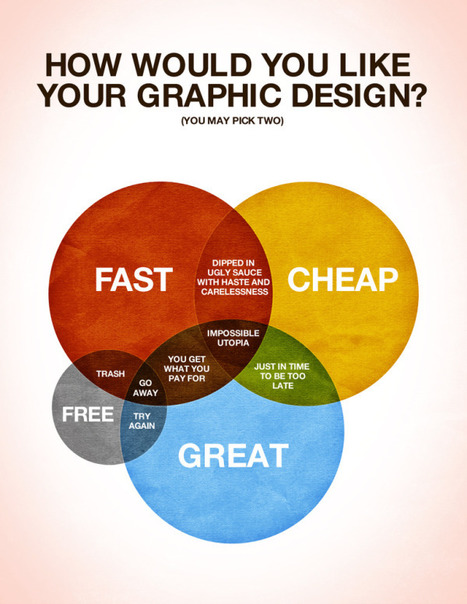
Designed by Colin Harman , How Would You Like Your Graphic Design? made me laugh this morni...
Martin (Marty) Smith's insight:
Nothing I've seen so focuses the impossible task of designers (graphic or product) as this infographic. We want greatness but rarely are willing to PAY for it. Here is a hint and something we all know is true -
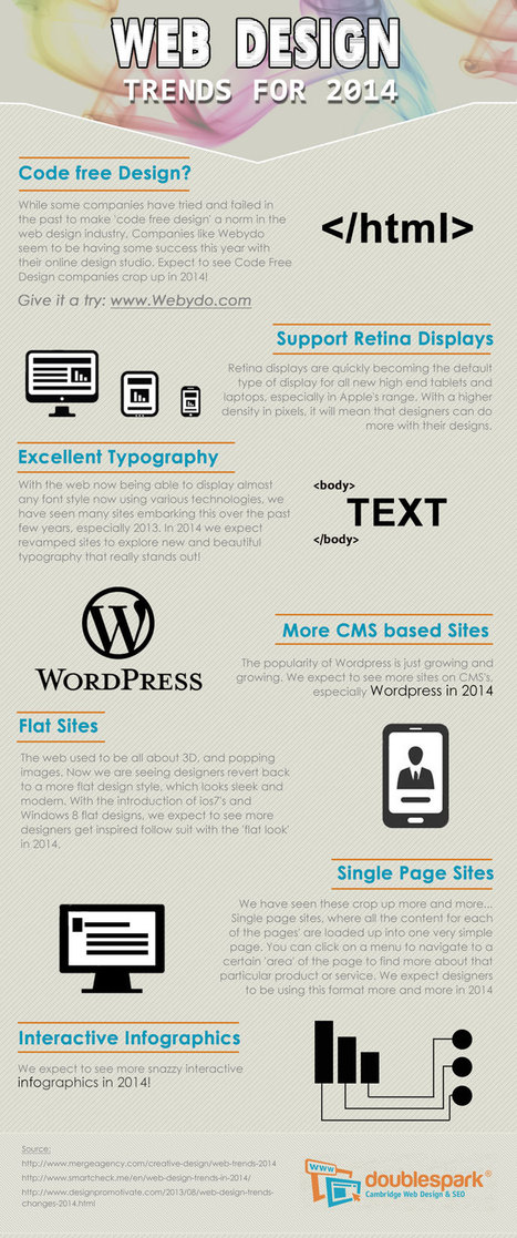
Web Design Trends 2014 * Simplicity. * Long Pages.

Fierce Traveler's curator insight,
January 1, 2014 3:14 PM
Thankfully, after a year of building, I'm on track...but really? Infografic travel?
Brush up on what’s trending in the creative world with this quick look at the top visual design themes and tools for 2014.
Martin (Marty) Smith's insight:
Fun infographic from istock on trends for 2013 from nurturig fathers to beards. Smart designers and Internet marketers find ways to create "bridge content" to surf trends like this. Atlantic BT held an annual "beard off" others might right content for how their product or service helps "nurturing fathers".
Amanda Groover's curator insight,
December 15, 2013 10:43 PM
Marketing in this decade not only needs but REQUIRES the ability to think outside of the box! Look at some of the trends appearing in a marketing campaign near you in the next year!
Jakarta Web Developer's curator insight,
August 11, 2014 5:15 PM
Web and Graphic Design Trends 2014 – Infographic via istock (Midyear Check)
Alfredo Corell's curator insight,
August 12, 2014 3:06 PM
Interactive infographic:
What do we predict will be the web design trends in 2014? Here is an infographic with our predictions Curating content INTO a website (or blog) is an important trend no one has quite figured out yet either. Start with traditional ORM (Online Reputation Management) tools. Use ORM to crack some APIs so when something relevant happens to your company, brands or products out there in social media's north forty you
From
visual
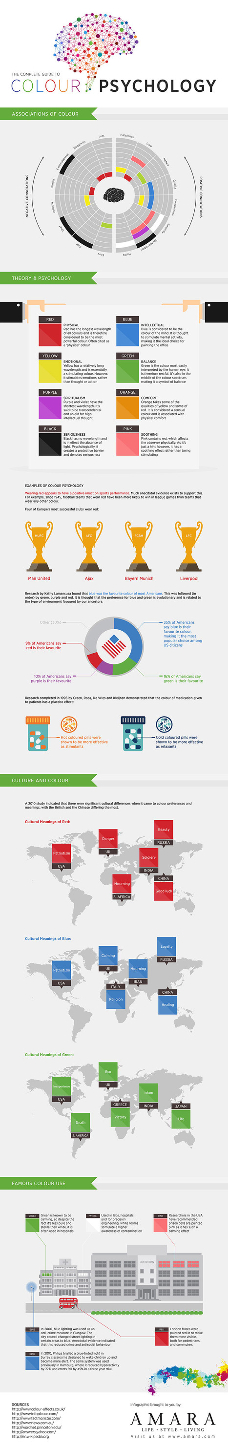
Amara presents the complete infographic guide to colour psychology. Covering the theory behind different colour psychology, cultural meanings, connota
Martin (Marty) Smith's insight:
Cool infographic on "color spychology". Take with a, "Always an exception to every rule" and your website deisgns will have great "color psychology".
The Art of Color Coordination Such a helpful infographic. Beyond helpful for web design.
James A Smith MCIM's curator insight,
May 20, 2013 5:49 AM
Slightly off topic but thought it of potential general interest.
Monica S Mcfeeters's curator insight,
May 24, 2013 12:07 PM
I thought this looked like a great helpful online reference on color. When you have someone that needs review this info it's nice to have a go to link handy.
![Branding: How It Works in a Social Media Age [INFOGRAPHIC] | Must Design | Scoop.it](https://img.scoop.it/thwPL1oXBQFDmgl9UC6eaDl72eJkfbmt4t8yenImKBVvK0kTmF0xjctABnaLJIm9)
Branding and social media — they seem to go together so well, yet they're both widely misunderstood. While social media can serve as a gigantic megaphone for your brand, social ...
Martin (Marty) Smith's insight:
Worth taking another look at this excellent branding infographic.

Jack Tang's comment,
March 15, 2013 1:14 AM
Media and branding is always been mention together. The fastest to get your brand well known by everyone is though media channels like TV ads and internet. According to research, that TV ads advertisement has the biggest revenue in the industry

An, SungBin's comment,
March 15, 2013 1:33 AM
because of these days internet immprovement, most of companies advertise there brand and products through internet like facebook and twitter. in article there are more facebook users than a twitter user in US. however, more people in twitter are saying only positive reactions to certain brand.

Kevin Chai's comment,
March 15, 2013 3:17 AM
The article seems to be focused on a comparison between the effectiveness of marketing on Facebook or Twitter, with very little information regarding other sources of social media. Facebook is a decidedly more effective marketing tool than Twitter is, with their brand much more likely to spread there than on Twitter. However, Facebook is also a little bit more objective, due to how lenient females are on Twitter. While it does give a little bit of detail regarding how effective the two social media platforms are, much of these statements are something that we already knew and so this article does not contribute much to the understanding of branding.
We've telling you about Pinterest for a couple of months.
Via AnnaGenis
|


