Curation Revolution
55.0K views | +0 today
Follow
Curation Revolution
Curation the next web revolution.
Your new post is loading...
Scooped by Martin (Marty) Smith
Scoop.it!

How Animation Will Make Your Website Fun - Curagami

How Animation Will Make Your Website Fun - Curagami | Curation Revolution | Scoop.it

Animations Rock Storytelling & Engagement

Watching Annie Leonard's The Story of Stuff we realized an important idea - animations can tell hard stories better than humans. If Leonard were to lecture for 9 minutes on the devasting impact of products we love such as iPhones on the planet we'd tune out. 

But when she hands her story over to animation we tune in. We built this Curagmai post after reading Why Rich Animations Are Crucial for Design sharing our reasons for why your online communication should include animation now: http://www.curagami.com/how-animation-will-make-your-website-fun/ 

Martin (Marty) Smith's insight:

Our Curagami post inspired by Why Rich Animations Are Crucial for Design

No comment yet.
Scooped by Martin (Marty) Smith
Scoop.it!

Holidays Are Hot: 5 Holiday Website Design Tips via @HaikuDeck

Holidays Are Hot: 5 Holiday Website Design Tips via @HaikuDeck | Curation Revolution | Scoop.it
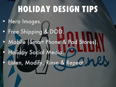
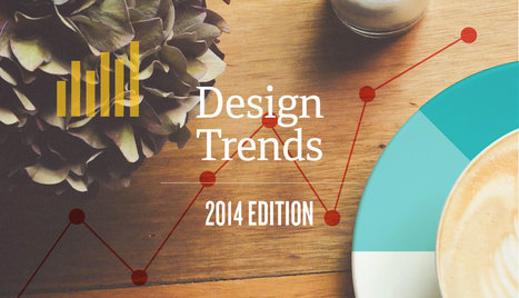
This holiday selling season (2014) will happen as close to real time as any thanks to the social / mobile web. Listening and curating are going to be important, but so is tapping the nostalgia and spirit of the season in creative and collaborative ways.
No comment yet.
Scooped by Martin (Marty) Smith
Scoop.it!

Turn Visitors Into Your Customers With Persuasive Web Design

Turn Visitors Into Your Customers With Persuasive Web Design | Curation Revolution | Scoop.it

Persuasive Web Design

Clarity – the Basic RequirementVisual FirstSet the Visual in Proper HierarchyAdd a Call to ActionKeep User Behaviors in Mind

Martin (Marty) Smith's insight:

add your insight...

No comment yet.
Scooped by Martin (Marty) Smith
Scoop.it!

6 Best Practices For Visual Content Marketing | Visually Blog

6 Best Practices For Visual Content Marketing | Visually Blog | Curation Revolution | Scoop.it
Become storytellers: Modern marketing is less about selling and more about creating brand experiences fueled by brand storytelling. You only have about eight seconds to catch consumers’ attention. To make those seconds count, thoroughly investigate your customers.


Some ways to do this: Start with exhaustive persona profiles to build buyer paths from high-level awareness down to purchase so that you’re creating the right types of offers to deliver the appropriate content at every stage of the buying process.


Persona research should include: raw data (surveys, internal sales, and analytics data), interviews with sales and support teams, and discussions with or polls sent to existing customers. Add Interest to Email. Despite news of its demise, email is still a marketing workhorse.


However, businesses must stop the “spray and pray” method in lieu of incorporating smarter strategies driven by automation to get the most out of the medium. Ways to standout in... keep reading

malek's curator insight, July 18, 2014 12:45 PM

With detailed images, you can get the attention of up to 67% of your targeted audiences.

And,,,,,,,,you can download a free guide

juandoming's curator insight, July 18, 2014 12:54 PM

add your insight...

massimo scalzo's curator insight, July 20, 2014 5:07 AM

Martin Smith again on the importance of Visual Content Marketing, Storytelling and Persona !  Really Worth Reading !

Scooped by Martin (Marty) Smith
Scoop.it!

8 Visual Marketing Lessons from Vogue - Curatti

8 Visual Marketing Lessons from Vogue - Curatti | Curation Revolution | Scoop.it

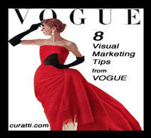
You may catch Marty combing through Vogue, Elle and Vanity Fair at B&N. Why? Fashion mags are great visual marketers - 8 Visual Marketing Tips From Vogue. Here are 8 Visual Marketing Lessons from Vogue:

Be specific & BIG NUMBERS are great ways to be specific.

Be branded – take advantage of existing brands such as Shades of Grey.

Be topical – March is “fashion week” in NYC and both magazines have extensive features.

Be welcoming – note how both models look directly out at the viewers (my favorite online engagement pose).

Use SOUND – “Sexy, Shiny, Bouncy Hair sounds fun. “Full on Fashion Force” sounds forceful. Words create rhythm and sounds that adds to or detracts from compelling images.

Juxtapose – “street chic” and “fashion force” are examples of creative juxtapositions.

Use Action Verbs – which of these action verbs AREN’T on either cover? grab, be bold, upgrade, must have, takes on, and rock? Yep, all of those “action verbs” are in sub-headlines.

Simple Colors – ONLY colors used for headlines and sub-heads are black, white and red.


malek's curator insight, March 18, 2014 9:15 AM

@Martin (Marty) Smith proves again simplicity is the tip of sophistication.  A clean dozen of how-to.  For a visually wired species like human being, it's always the eye placement and the body positioning.

janlgordon's comment, March 21, 2014 2:45 PM
Loved this post and so did the community, still retweeting and buzzing about it - good job Marty!
Two Pens's curator insight, April 9, 2014 3:13 PM

It's hard to walk into a B-2-B client using Vogue as an ex. but everything they do has relevance. Takes an openminded client to know it.

Scooped by Martin (Marty) Smith
Scoop.it!

Piktochart Infographic & Graphic Design Tool for Non-Designers [Scenttrail Review]

Piktochart Infographic & Graphic Design Tool for Non-Designers [Scenttrail Review] | Curation Revolution | Scoop.it

Piktochart is an easy infographic design app that requires very little effort to produce simple and high quality graphics. Create free infographics here.

Marty (@Scenttrail) Review
I used Piktochart yesterday to create an infographic to support my 5 Easy Email Marketing Tips (http://sco.lt/7T6pTF ). I am NOT a graphic designer, but I found Piktochart helped me think like one.

Creation of my first "infographic", and I put infographic in quotes not to offend any true infographic pro, took about two hours. Piktochart's User Interface is excellent, intuitive and drag and drop friendly.

At first I tried to do everything IN Piktochart. Then I noticed they have a robust import tool so I created a draft in the tool, took a screen shot, sized the screen shot up to their 600 x 400 and worked on it in photoshop.

Piktochart, if you are reading this, you may want to make an export tool that is as easy to use as your import tool. If I could export a block at a time it would be ideal. Even when I was finished and published I manipulated some spacing of the infographic by selecting and moving blocks in Photoshop.

The tool comes complete with icons like the bulls eye and pad. I couldn't understand how to color my fonts (their styling options seem to not come up the way they are supposed too) so I added the text color in Photoshop and important the resulting block overlaying what was there.

My process made the graphic HEAVY since I had 2 copies of everything, so it would be great to export, work on a block in Photoshop, import it back in and then overlay on a blank canvas. The only way I can see to do that now is start over.

Creating visual support for our blog posts is so important Piktochart is a great new tool for any content marketer / blogger. Interesting to note my infographic of 5 Easy Email Tips got 3x the views and shares of my written Scoop. We know the visual marketing revolution is upon us, so getting as good as someone like Mark Smiciklas (http://www.intersectionconsulting.com/ ).

Piktochart is a great and timely tool! Highly recommended. Marty

malek's curator insight, February 21, 2014 6:47 PM

A guided tour into Piktochart by a no-designer. You can't help but like the story behind the infographic. 

Raj Nadar's comment February 22, 2014 5:35 AM
I had built my visual online CV on this and I'm a no-tech no designer guy, was very easy to create still, thank you for sharing
malek's comment, February 22, 2014 3:07 PM
@Raj Nadar great utilization of piktochart
Scooped by Martin (Marty) Smith
Scoop.it!

How To Buy Web Design - ScentTrail Marketing

How To Buy Web Design - ScentTrail Marketing | Curation Revolution | Scoop.it

After 2 years Director Marketing for Triangle, NC's largest web design company Marty Smith left to start CrowdFunde. Here are his "inside baseball" tips on buying web design something everyone has to do these days.

Loved this comment from my friend @malek


One word of anti-wisdom in conventional business.

"Buying Web Design Rule One: Never Spend In Advance of your ROI. Start with $10K, make $100K, spend another $10K, make another $50K, spend another"

Against all odds (personal experience and education), I buy into Marty's wisdom. Welcome to the wild west of buying a web design.


###
What about you? What are your thought on buying web design?

malek's curator insight, February 7, 2014 7:02 AM

One word of anti-wisdom in conventional business.

"Buying Web Design Rule One: Never Spend In Advance of your ROI. Start with $10K, make $100K, spend another $10K, make another $50K, spend another"

Against all odds (personal experience and education), I buy into Marty's wisdom. Welcome to the wild west of buying a web design.


Rescooped by Martin (Marty) Smith from Must Play
Scoop.it!

Future of...Everything Is In The Clouds | via @CloudTweaks

Future of...Everything Is In The Clouds | via @CloudTweaks | Curation Revolution | Scoop.it

Cloud gaming is gaining considerable momentum for a number of reasons and is positioning itself as the future of how games will be played.

Marty Note
I've been doing a lot of 2-14 trends work over the last few weeks. The major impact the cloud brings seems to be forgotten or left out. I received a dramatic demonstration in how much use of "the cloud" can change website design when we created http://www.curecancerstarter.org.   

We used to limit webpage size to 100K (code + graphics) because to go any larger meant slowing down load times to an unacceptable level. Every half a second we added we lost money, so we were very careful about the size of our pages.

Being careful about the size of our pages meant we had to live in a "lowest common denominator" world where our communication was compromised by environmental constraints. Some restraints remain, but the new caching provided by the cloud creates all kinds of new design headroom that just didn't exist before.

The cloud means we can design cooler, more functional, more engaged sites that feel dynamic and highly personal. The cloud changes all :). M  

Martin (Marty) Smith's curator insight, January 7, 2014 6:03 PM

GaaS despite its funny initials could provide a peek into the future of....well everything. We've already seen a MONSTER TREND toward appification (smaller code updated more frequently) and along comes "cloud gaming".

Benefits of "cloud gaming" include:

* More room on your hard drive (some games can take 14 gigs).
* Games are saved in the cloud so hard drive crash = no worries.

* Better Game Play (thanks to way memory is handled).
* More efficiency will change game development (eventually).

Love this paragraph despite only partially understanding it:

"With recent breakthroughs in hybrid streaming, such as what CiiNOW has done by streaming video and graphics primitives at the same time, it’s much easier to send complex information to mobile devices, tablets and computers at lower bandwidth. Some games are provided through file streaming, a method in which a small percentage of the game is initially installed on a graphics-capable device to allow immediate play.

During play, the remainder of the game continues to download. For movie, TV or less graphic intensive games, video streaming- or video on demand- eliminates the necessity of a game console. Although game consoles or PCs will probably continue to be prevalent, cloud gaming will likely continue to gain popularity as a way to experience new games without having to buy entire game systems."

What I can understand from those points is something we found with CureCancerStarter.org. Use of cloud services allows for "larger" pages to load faster. The impact on web and game design of building in cloud benefits is hard to over estimate.


Rescooped by Martin (Marty) Smith from BEST-CAEXI
Scoop.it!

Using Story in Design, Innovation, Problem Solving

Using Story in Design, Innovation, Problem Solving | Curation Revolution | Scoop.it
How narrative intelligence can help everyone design solutions and generate useful data.

Via BEST-CAEXI
Martin (Marty) Smith's insight:

Agree with Karen (as usual), and that is a book I would read. 

Michael Allenberg's curator insight, October 4, 2013 7:34 PM

I am becoming a HUGE advocate of designing experiences in conjunction with contextual storytelling!

malek's curator insight, November 5, 2013 7:17 AM

story design process can offer an intuitive planning framework that makes it easier for us to wrangle and resolve complex challenges.

tollywoodfilms's curator insight, November 5, 2013 8:09 AM

d

Scooped by Martin (Marty) Smith
Scoop.it!

Future of Web Design Triptych: 3 Haiku Decks about Future of Web Design

Future of Web Design Triptych: 3 Haiku Decks about Future of Web Design | Curation Revolution | Scoop.it

Future of Web Design 1: http://sco.lt/7r6zkf


Future of Web Design 2: http://sco.lt/61eqNF


Future of Web Design 3: http://sco.lt/9AGC5R

James's curator insight, March 27, 2014 10:13 PM

This article speaks of what the future of Web Design will be, this source is great because it speaks of future trends and software that will be developed for Web Design.

Scooped by Martin (Marty) Smith
Scoop.it!

Is Your Website EPIC? Here's How Your Website Can Become A Hero's Journey

Is Your Website EPIC? Here's How Your Website Can Become A Hero's Journey | Curation Revolution | Scoop.it

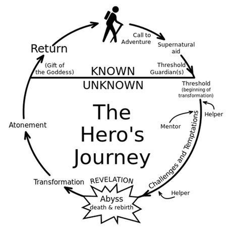
Most Internet marketers agree. Your website must be heroic, a quest of and for greatness. But how can your marketing make customers heroes? Here's How:

Ways To Make Your Customers Heroes Online

* Gamification (nothing like social kudos to reinforce a heroic journey).

* Curate and Use UGC (User Generated Content). 

* Contests (who has the best Tough Mudder Pinterest board etc...).

* Leaderboards (part of gamification, but a constant reminder that a game is going on NOW). 


Website design tips and several examples of "heroic" websites are included. If you know of great heroic online experiences please share so we can curate in.  

Elsie Barone's curator insight, May 16, 2013 2:36 PM

Very Good Information;

Scooped by Martin (Marty) Smith
Scoop.it!

Internet Marketing For Lawyers - Atlantic BT

Internet Marketing For Lawyers - Atlantic BT | Curation Revolution | Scoop.it
This post helps lawyers understand how to create an online brand, tell stories with keywords, support with social media, and create websites that WIN.
Martin (Marty) Smith's insight:

Wrote this piece after having great conversations with lawyers in Raleigh about what they did and didn't understand about Internet marketing. The interesting part of thise conversations was what many of my lawyer friends thought they knew they didn't and what they thought they didn't know they weren't as far away as they thought. 

Welcome to the strange serendipity and mystery wrapped in enigma that is Internet marketing my legal brothers and sisters.  

No comment yet.
Scooped by Martin (Marty) Smith
Scoop.it!

2013 The Year of Responsive Design [Infographic]

2013 The Year of Responsive Design [Infographic] | Curation Revolution | Scoop.it
With a multitude of mobile devices coming out almost every week, how can marketers ensure that their content is optimized for different device types, screen sizes, and capabilities?
Jeff Domansky's curator insight, December 30, 2012 3:06 PM

Useful insight into Responsive Design and why it’s the going to be one of the biggest marketing trends in 2013.

Dolly Bhasin 's curator insight, December 30, 2012 10:43 PM

43% planning a trip! VIOLA! I am on right track!

Scooped by Martin (Marty) Smith
Scoop.it!

Ultimate Guide To Creating A Great News Page via @mkramer

64 Ways To Think About a News Homepage - TheLi.st @ Medium - Medium

This has to be the most comprehensive, well thought out post we've ever seen on creating a news page. They focus on "news homepage", but the lessons apply well to a page every website needs - News. 

News is becoming increasingly important. We are drowning in information, but your ability to filter, curate and share what is really important builds following, increases traffic and shares. News pages need to be constructed in particular ways to as the post points out.

Build in some Feedly, Twitter widgets or Buzz Sumo (or other ways to make the page ping automatically. Don't go 100% feeds since that opts out of the principal benefit - showing your ability to filter, curate and influence by what you choose.

Best curator at exposing his filter preferences and building substantial following I know is Brian Yanish at Marketing Hits (@Marketinghits). 

Create a great news page, have some of it fire with a robot and curate the rest and your following, traffic and return will grow.  

No comment yet.
Scooped by Martin (Marty) Smith
Scoop.it!

No Trends or Fads Says Dieter Rams via @HaikuDeck by G. McGuickin

No Trends or Fads Says Dieter Rams via @HaikuDeck by G. McGuickin | Curation Revolution | Scoop.it

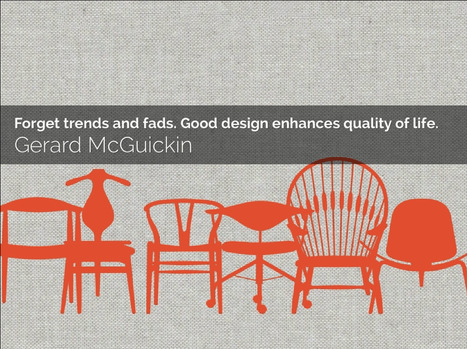
Things that matter don't go out of style, but they can be HARD to find, remember and sustain...unless you are Dieter Rams.
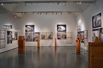
No comment yet.
Scooped by Martin (Marty) Smith
Scoop.it!

Making Process Visible & A Lesson In Web Design: Mario Botta at Bechtler Museum

Making Process Visible & A Lesson In Web Design: Mario Botta at Bechtler Museum | Curation Revolution | Scoop.it

Curator As Hero
I won't copy my linked GPlus (https://plus.google.com/102639884404823294558/posts/3KLUrc157bC ) post except to say look at the ceiling. I left the top of this image so you can see THE LIGHTS.

I like to do this exercise in department stores too. Looking at the lights gives you a sense for how some a hard working team created the subtle emphasis that now guides your learning and eye. Seeing the lighting always tells you how DRAMATIC the act of curating is too.

NOW ask yourself how you create drama, emphasis, light and shadow on your website? I share more #webdesign thoughts on the linked post. Bravo to the team at the Bechtler Museum in Charlotte, NC for their hard work on the Mario Botta exhibit. KUDOS!

No comment yet.
Scooped by Martin (Marty) Smith
Scoop.it!

Evolution of Web Design & Marketing Infographic via @Curagami

Evolution of Web Design & Marketing Infographic via @Curagami | Curation Revolution | Scoop.it
Pushing web design forward too fast blows up trust from internal stake holders and visitors. There is an organic path the journey to online community takes.
Brian Yanish - MarketingHits.com's curator insight, July 3, 2014 12:07 AM

Marty I agree. So many businesses still think "Build it and they will come".
The website gets built, they spend thousands promoting it and doing social media and yes the visitors come. One small problem no one discussed with the website development company or budgeted for follow up analytics and review of the design and content to see what changes can be made to improve the ux. So many visitor never comes back and that's where the problem is with most websites. Percentage of return visitors is key.

Scooped by Martin (Marty) Smith
Scoop.it!

5 big visual design trends for 2014 | Graphic design | Creative Bloq

5 big visual design trends for 2014 | Graphic design | Creative Bloq | Curation Revolution | Scoop.it
It's never a great idea to blindly follow trends, but it's good to know what they are. It's kind of similar to the old maxim that 'you have to know the rules to break the rules'. But in fractured and disjointed world, working out what the latest visual design trends actually are can be difficult.
Martin (Marty) Smith's insight:

Some of these trends we are seeing over and over, but "filtered" is new to me. Glad to see the death of "sock" photos. Those Stepford pics have to go .

No comment yet.
Suggested by Iulian Grigorescu
Scoop.it!

eCommerce Websites Convert Better With Modern Web Design Techniques

eCommerce Websites Convert Better With Modern Web Design Techniques | Curation Revolution | Scoop.it

You probably heard about the modern web design term at least once, but how can be used correctly with an online shop? What are the requirements?

Marty Note (here is how I shake out on each of these recs)

Big Hero Or Sliders Agree With Caveat!
Depends on what you do immediately to the right or under your large hero. Hero's create HOT SPOTS on the right and immediately below, hot spots that convert and hot spots NO ONE uses (goofystupid). If you are running an ecommerce site you aren't selling the picture, but you do need the attention it can grab. Make sure you put a Call-To-Action to the right or immediately below. People don't like to click within a hero (especially a big one), so CTA below even if it is a restatement.

http://www.charitywater.org/
Does a good job with a large static hero and a "can't miss" CTA with 3 critical links almost directly below the hero. & I DO NOT like sliders.

Warmer Colors - AGREE!
Websites are inherently COLD so warming them up with strong accent colors is a must. Remember to figure in the images you like to include. You can use more warm color if your images always have white backgrounds. If not, you may achieve "warmer" with images instead of needing to modify your design.

Interesting Grids - AGREE!
Thanks to Pinterest the GRID is getting creative. Grids are a great way to share a lot of information fast.

Flat Design - Agree!
The web doesn't do 3D well (yet), so flattening out your design can help make buying decisions easier. Include zooms if applicable and remember to ask your customers to share pics of your products on them or in their homes (great User Generated Content).


Animation
Vine has me convinced there are ways to create animations that help and don't hurt, but be careful. An animation that doesn't stop (like Vine videos) can be obnoxious. I prefer giving control of animations to the click over auto-play. If someone ASKED to see the animation its different than if you just start playing it and it doesn't stop.


Mobile Friendly UI - Agree!
Your responsive design must master the swipe, spin and scroll of the mobile experience. If your site isn't FUN and easy to spin, snip and buy from your customers won't. Spoke with a friend at lunch in the craft space today and her traffic is now HALF mobile, so make sure your content is FUN to use on a phone or pad and takes advantage of the mobile UI.

No comment yet.
Scooped by Martin (Marty) Smith
Scoop.it!

Ready For The Visual Marketing Revolution? 12 Tips From Infographics Experts Column Five

Ready For The Visual Marketing Revolution? 12 Tips From Infographics Experts Column Five | Curation Revolution | Scoop.it

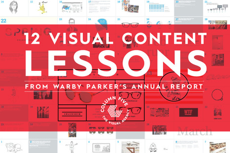
Making Warby Parker's Annual Report VISUAL
As Beyonce proved when she rethought her last album to be more visual the visual marketing revolution is here (Beyonce covered here http://sco.lt/7Pci1p). Here are 12 GREAT Visual Marketing Tips from Column 5 the Infographics experts:

1. Be Visual. 
2. Show YOUR Personality.

3. Only share NEWSWORTHY news.

4. Let People See Your Engine (able to look behind the curtain).

5. Focus on and Feature Your POEPLE.

6. Make IT Easy To Share (and IT is everything).

7. Present DATA in context.

8. Don't forget the TANGENTIAL. 
9. Share the LOVE. 
10. Product Tie-Ins should happen NATURALLY and ORGANICALLY.

11. Share VALUES.

12. Pat yourself on the BACK every now and again. 

My favorite is FEATURE YOUR PEOPLE. Clients ask me and/or complain they have no good content. Nonsense you have amazing content sitting at desks or on the shop floor.


Telling your product's story by proxy, by telling the stories of the people that work on it, is a brilliant way to create STICKY content that isn't self-serving and feels more TRUE.  


No comment yet.
Rescooped by Martin (Marty) Smith from MarketingHits
Scoop.it!

Blue Instagram Photos = More Likes [study]

Blue Instagram Photos = More Likes [study] | Curation Revolution | Scoop.it

When visual analytics platform Curalate set out to quantify the impact that different image qualities have on Instagram, it discovered that photos with blue as the main color got the most likes. Reds and oranges on the other hand tended to receive 24 percent less likes than blue-tinted shots.


Via Brian Yanish - MarketingHits.com
Martin (Marty) Smith's insight:

Neither the clear and overwhelming impact COLOR plays online nor blue winning surprises me, but it does suggest taking more pictures on bright Carolina Blue days than not. 

Joan Stewart's curator insight, November 8, 2013 2:45 AM

Colour and Photographs, an interesting find by thenextweb.com

La mirill@ digital's curator insight, November 8, 2013 11:56 AM

El azul en tus fotos de Instagram hace que tengas más "me gusta" según un estudio. Muy interesante!

Rescooped by Martin (Marty) Smith from digital marketing strategy
Scoop.it!

Creating Hero's Journey Websites: Using Storytelling To Improve Your Online Marketing

Creating Hero's Journey Websites: Using Storytelling To Improve Your Online Marketing | Curation Revolution | Scoop.it
An introduction to the "Hero's Journey" method of storytelling Your product or services will likely solve a problem for your customers,  

No matter how boring you view this product, it sits within a ‘story arc’ that can always be made interesting to consumers facing the challenges that it solves.


Via malek
Martin (Marty) Smith's insight:

Creating Hero's Journey Websites
I'm a big Joseph Campbell fan and this piece does a good job of explaining and then applying the Hero's journey to business narrative. The hero's journey is all around us all the time (as the piece implies).

UGC (User Generated Content) is my favorite place to find the hero's journey. Customers will share the same kind of dragon fighting stories faced by our young hero in the example in this post IF you ask for feedback, prize the feedback you receive and gamify UGC enough so that it is clearly important.

Gamification is  another favorite tactic to solidify the hero's journey. Nothing like a little competition to increase the challenge and produce amazing results fast. The other point this piece misses is WHO is the hero of your journey.

I like to design websites where YOU (the visitor) are the hero. Visitors become heroes by sharing, finding "like me" tribes and figuring out the environment well enough to suggest improvements. The more your website creates a hero's journey the more fascinating and experiential it becomes.

If fascinating and experiential sound like good things congratulations you are on a hero's journey.

More On GooglePlus: https://plus.google.com/102639884404823294558/posts/apVB5CabhxB

malek's comment, September 24, 2013 8:38 AM
Thank you Marty for insightful comment. Contributing the angle of Gamification provides more richness to the subject.
Martin (Marty) Smith's comment, September 24, 2013 5:24 PM
Great Malek Scoop and Nick Simonton comment. This is a favorite topic. Nick I was scheduled to attend McKee's Story seminar last year and then got sick and could go, but still on my bucket list to attend. Marty
Bad Spoon's curator insight, September 25, 2013 2:21 AM

Une nouvelle présentation pas à pas du "Voyage du Héros", la technique de storytelling la plus efficace à ce jour

Scooped by Martin (Marty) Smith
Scoop.it!

Color Is MASTER of Us ALL: Colors and Conversion

Color Is MASTER of Us ALL: Colors and Conversion | Curation Revolution | Scoop.it
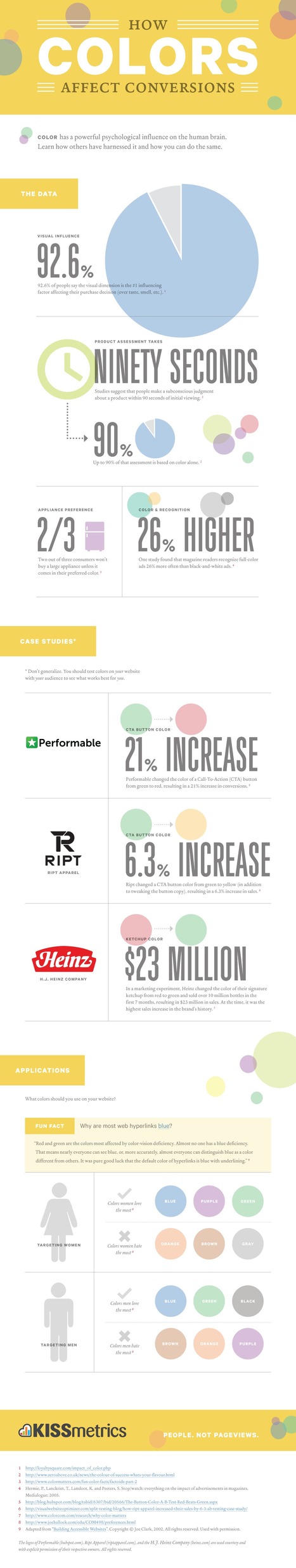
Color has a powerful psychological influence on the human brain. Learn how others have harnessed it and how you can do the same.
Martin (Marty) Smith's insight:

Color Is MASTER of Us All Infographics:

Color and Conversion (here on Curation Revolution)

Color Cordination (http://sco.lt/7FcZ4T on Design Revoluiton)

Color Preference By Gender (http://sco.lt/6pO773 On BI Revolution)

No comment yet.
Scooped by Martin (Marty) Smith
Scoop.it!

How Much Damage is Your Website Doing to Your Business?

How Much Damage is Your Website Doing to Your Business? | Curation Revolution | Scoop.it
Let's try and fix how the poor design, usability or content of your website is driving visitors to your site away in seconds ?
Martin (Marty) Smith's insight:

Great piece about BOUNCE RATES and how to structure content to bring them down. Also great general idea - that having a website does not equal benefiting from the site. When the clueless create websites they can do more damage than good via bad tagging, poor meta data (especially titles) and bad structure producing high bounce rates and so never earning Google's trust. 

Don't think just because you finally got that website up it is doing you any GOOD (lol). Internet marketing requires a PRO to advise you at some point otherwise you fly the plain into the mountain and feel good about it all the way in.  


Brian Yanish - MarketingHits.com's curator insight, March 12, 2013 9:08 AM

Marty that is so right, just because you hit the "go live" button doesn't mean that you are done. Unfortunately many website owners stop there. The reasons can be for a number of things, lack of budget, of knowledge, or just simply thinking it's done. 


A great marketing company well watch the analytics and trends on the site (good or bad) and make suggestions to their clients.

Scooped by Martin (Marty) Smith
Scoop.it!

Ask Big Questions Social Platform Earns A #StealThis

Ask Big Questions Social Platform Earns A #StealThis | Curation Revolution | Scoop.it
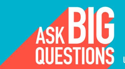
Can we change the world through better conversation? We believe we can. We don't have many opportunities today to develop relationships with people of different backgrounds who may hold different viewpoints.
Martin (Marty) Smith's insight:

#StealThis

I like the immediacy of this platform. You signup with Twitter (or Facebook) and you post. May have to steal this idea for Cure Cancer Starter. Well done, great use of social as simultaneously platform, infrastructure and content. Cool. 

Gets better. When you post they respond with @(your twitter) responses. They just let me know you can use Facebook too and immediately incorporate friends. This is a very cool use of social media tools as platform. There are several valuable lessons here in the use of OPP (Other People's Platforms) including:

* Use scaled platforms so people don't have to repeat on yours.

* Don't make people learn new things use established conventions.

* Make it falling off a log easy to signup and create an account.

* When any says anything, RESPOND.

* RESPOND with real people, heart and soul (no canned junk).

* Be present to the conversations happening and everything works better.


Cool idea well done, and, as I said on my Facebook page, bound to be the future of something.  


No comment yet.