Your new post is loading...

|
Scooped by
the bureau
March 25, 2013 6:39 AM
|
Browse through fifteen examples of brands who have created excellent homepages -- from a form and a function standpoint.
You never get a second chance to make a first impression. That’s why your homepage is undoubtedly one of the most important pages on your website. In fact, it's the very reason why we just launched a brand new homepage designlast week. For any given company, the homepage is its virtual front door -- and face to the world. If a new visitor doesn't like what they see, their knee-jerk reaction is to hit the "back" button. That's right. Despite mom's best advice, unfortunately, a lot of people still judge a book by its cover. What makes a homepage brilliant, and not "blah?" Well, it's really about more than looks along -- it also has to work well. That's why the most brilliant homepages on this list don't just score high in beauty, but also in brains. Get ready to learn about excellent homepage design through these 15 real-life examples! Elements of a Brilliant Homepage DesignAll of the homepage designs shown here utilize a combination of the following elements. Not every page is perfect, but the best homepage designs get many of these right: - Clearly answers "Who I am," "What I do," and/or "What can you (the visitor) do here." If you're a well-known brand or company (i.e. Coca Cola) you may be able to get away with not having to describe who you are and what you do; but the reality is, most businesses still need to answer these questions so that each visitor knows they are in the "right place." Steven Krugg sums it up best in his best-selling book, Don't Make Me Think. If visitors can't identify what it is you do within seconds, they won't stick around long.
- Resonates with the target audience. A homepage needs to be narrowly focused -- speaking to the right people in their language. The best homepages avoid "corporate gobbledygook," and eliminate the fluff.
- Compelling value-proposition. When a visitor arrives on your homepage, it needs to compel them to stick around. The homepage is the best place to nail your value proposition so that prospects choose to stay on your website and not navigate to your competitors.
- Usability and mobility. All the homepages listed here are highly usable, meaning they are easy to navigate and there aren't "flashy" objects that get in the way of browsing, such as flash banners, animations, pop-ups, or overly-complicated and unnecessary elements. Many of them are also mobile-optimized, which is an incredibly important must-have in today's mobile world.
- Calls-to-action (CTAs). Every homepage listed here effectively uses primary and secondary calls-to-action in order to direct visitors to the next logical step. Examples include "Free Trial," "Schedule a Demo," "Buy Now," or "Learn More." Remember, the goal of the homepage is to compel visitors to dig deeper into your website and move them further down the funnel. CTAs tell them what to do next so they don't get overwhelmed or lost. More importantly, CTA's turn your homepage into a sales or lead-generation engine, and not just brochure-wear.
- Always changing. The best homepages aren't always static. Some of them, like Whitehouse.gov, are constantly changing to reflect the needs, problems, and questions of their visitors. Some homepages also change from A/B testingor dynamic content.
- Great overall design. A well-designed page is important to building trust, communicating value, and navigating visitors to the next step. As such, these homepages effectively use layout, CTA placement, whitespace, colors, fonts, and other supporting elements.
www.thebureau.fr/blog/
#createforsuccess
|
|
Scooped by
the bureau
March 22, 2013 6:50 AM
|
WHY DOES THE NEW EBAY LOOK A LOT LIKE PINTEREST? ENVY? MAYBE. BUT PHOTO-FORWARD CONTENT IS REALLY JUST A GREAT WAY FOR USERS TO WINDOW SHOP.
If your browsing habits are anything like my own, you stopped going to eBay half a decade ago. It’s not necessarily that my penchant for old stuff has diminished--in fact, I’m more interested in vintage furniture and electronics than I’ve ever been before. It’s just that. I mean. It’s eBay. It’s a relic from the Geocities era. “When eBays of the world first came online, the transaction needed to work. That was the bar,” eBay VP of Design Marie Floyd Tahir tells me. “It was like, oh my god, I can get this thing! I actually got my item! We’re so far from that now.” The Internet was far from that bar, but eBay was not. The world had cell phones and social media, yet eBay had the same search-and-sort format it always had. So with that in mind, just over a year ago, Tahir and her team set out to give eBay its biggest homepage facelift since launch.
INSPIRATION AND DISCOVERY SEEMED UNTAPPED.
The most significant change is that they’ve instituted a new feature called the Feed. Fans of Pinterest will find it familiar. You put in a few key terms--like “Rolleiflex cameras” or “Dom Perignon”--and eBay will generate a custom, interest-centric, endlessly scrolling board of images for you to explore. Adding, deleting, and customizing these items (with a dauntingly specific list of categorical parameters) is extraordinarily easy. Better still, you can preview how new search terms will look, and everything is downright instantaneous to implement.
www.thebureau.fr/blog/
#createforsuccess
|
|
Scooped by
the bureau
March 20, 2013 6:56 AM
|
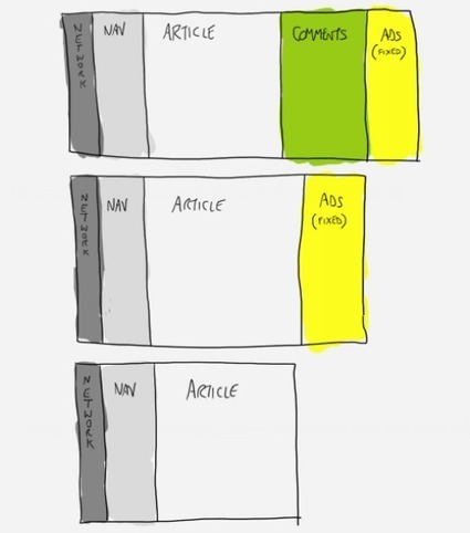
Web design isn't what it used to be. Web design used to be a fixed process. Except for some browser quirks here and there, and for the regular lockdown of creativity of course, it was a fairly straightforward operation. It used to be the defining of a canvas and as long as we kept the design within the 960 horizontal pixels of a grid, everything would be safe and sound.
That was during the time when the web only lived on the desktop, behind the monitor of a computer. But as all of us know things have changed. Since then, we have deliberately taken the web out of the desktop and placed it in basically every screen we could imagine. We’ve put it in our hands, we’ve put it in our laps, we’ve put it in every space where we can find use for it.
|
|
Scooped by
the bureau
March 20, 2013 6:12 AM
|
This article discusses some of the lesser practiced elements of the responsive web design ecosystem, under the umbrella of responsible web design: context-sensitive interactions, performance and progressive enhancement.
Responsive Web design has been evolving rapidly ever since Ethan Marcotte coined the term two years ago. Since then,techniques have emerged, become best practices and formed part of our ever-changing methodology. A few obvious examples are the multitude of responsive image techniques, conditional loading, and responsive design and server-side components (RESS), among many other existing and emerging strands stemming from the core concept of responsive Web design. I’m going to discuss a few of the lesser practiced elements that are quietly becoming part of the responsive Web design ecosystem under the umbrella of responsible Web design. Responsible Web design practices are mainly concerned with responding to the user’s context by providing the ideal scenario in which they can experience your product. Like responsive Web design, the responsible practices detailed in this article are open to interpretation and modification. I have covered what I feel are the most important elements: context-sensitive interactions, performance and progressive enhancement.
www.thebureau.fr/blog/
|
|
Scooped by
the bureau
March 7, 2013 5:59 AM
|
How classic typographic theory can help you determine the right logical breakpoints for your responsive website.
There are several tactics for deciding where to put breakpoints in a responsive design. There is the rusty idea that they should be based on common screen sizes, but this doesn’t scale well. There are no “common” screen sizes. Another popular tactic is to create a breakpoint wherever the layout breaks.
This sounds much better. But it still leaves us with the question, How do you determine whether the layout is broken? One logical answer is to look at classic readability theory and to define our breakpoints based on that.
According to Robert Bringhurst, “Anything from 45 to 75 characters is widely regarded as a satisfactory length of line for a single-column page set in a serifed text face in a text size.” And Josef Müller-Brockmann writes that, “A column is easy to read if it’s wide enough to accommodate an average of 10 words per line.” A few variables determine the exact number of characters or words, but this is the basic theory: If you start with a small screen and you grow it, every time the width of the main content grows wider than either 75 characters or 10 words, something should happen. Simply said, these are your breakpoints.
www.thebureau.fr/blog/
|
|
Scooped by
the bureau
March 1, 2013 6:06 AM
|
Fast-growing mobile traffic is forcing most websites to refresh their mobile versions that are focused on high-end touch-screen iPhone and Android phones and move away from the mobile themes that were built for screens of dying Nokia and Blackberry phones. There are two major approaches:
- Responsive Web Design (RWD)
- Separate HTML5/JS app (mobile web app, running on m. domain)
RWD approach of redesigning your web from scratch is picking quite some buzz lately and due to fact that it is pretty much standard HTML/CSS technology, which is widely adopted and easy-to-master technology, it is gaining popularity among web developers? At the same time some are betting on HTML5/JS technology with hope that it soon should be able to provide an experience almost identical to that of a native app. It requires little bit deeper knowledge of client side programming in frameworks like Sencha or JQuery and is more popular amongst native app developers that are looking for cross-platform solutions. To understand the benefits and drawback of both, we need to understand the fundamental architectural differences for each technology.
www.thebureau.fr/blog/
|
|
Scooped by
the bureau
February 11, 2013 7:04 AM
|
The anatomy of a perfect website
"It's getting easier and easier for non-designers to make basic websites. In seconds you can have your own site in Tumblr, WordPress, or Posterous (to name a few) but have you considered how users will experience your site and what they want to see?"
|
|
|
Scooped by
the bureau
March 25, 2013 6:24 AM
|
Responsive web design could be a specific sort of internet development and design that utilizes CSS3 with fluid proportion-based grids to adapt the layout of a design to viewing setting. Merely place this implies that an internet web site designer creates a site or a page that responds to the device a user is viewing the positioning on. Thus a user visiting a web site on, say, they’re portable, can see roughly identical web site someone viewing from a laptop or portable computer.
The responsive web design took place as a response to the growing quality of transportable web devices like mobile phones and tablets. Associate degree already fairly common and growing grievance from users of such devices was the website inability to adapt properly giving users a less-than favorable expertise.
So here now with this infographic we have come-up with basic tips about responsive design that can help people build their own responsive website.
www.thebureau.fr/blog/
#createforsuccess
|
|
Scooped by
the bureau
March 21, 2013 6:16 AM
|
the power of blue in web design
|
|
Scooped by
the bureau
March 20, 2013 6:37 AM
|
For starters, we’d like to say thank you for the amazing reception our free eBook Web design and Mobile Trends for 2013 has had since its launch last week, and especially to all those who made it possible by sharing their insightful opinions. Today we’re doing a review of the end conclusions, where we will identify and analyze 10 of the key trends. It’s no easy task putting together a short summary of all the interviews, but as far as we’re concerned, there are a few memorable statements in the book which nicely encapsulate the conclusions we’ve come to: Bruce Lawson:“If I go to a train website, I don't really want to see a picture of Richard Branson smiling at me, I don't want to read the Chief Exec's ambitions and life history. All I want to know is what time my train is and how much it is.” Karen McGrane:“Mobile is not the Lite version. You don’t get to decide which device people use to visit your website. They do.” Simon Foster:“I always keep it in mind that no matter how beautiful I make a website the average user only really wants to spend about 10 seconds on it.”
This project reveals the need to prioritize content and the user’s point of view. Almost all the participants expressed concerns about accessibility and application performance across the multiple devices that exist today and will only continue to increase in number. This wasn’t the case a few years ago, as Rachel Andrew points out: “We were all saying ‘in a few year’s time we’re going to have massive screens and all this space and people are going to have really fast connections’ and what’s happened is we’ve all ended up on tiny little screens with crappy bandwidth.”
So years ago the tendencies would have been very different. We would have been focusing more on development of visual effects, animation etc...But the future is unknowable. We have to reach our target users, wherever they live, whatever device or browser they use, and serve them our content in the most efficient way possible. Though this is what web standards evangelists have been shouting from the rooftops for years. All the trends discussed here are interdependent and fundamentally defined by three principles:Content oriented, UX-centered and Simplicity, which make up the new paradigm we’ll need to work with when we come to face the deluge of devices that’s looming on the horizon.
www.thebureau.fr/blog/
|
|
Scooped by
the bureau
March 8, 2013 5:57 AM
|
Relativement technique, l’infographie met en avant, sur un ton décalé, 10 conseils clefs à destination des designers et développeurs. - Mettre en place une mise en page simple. Les balises « Div » superflues sont à bannir !
- Utiliser les « médias queries », indispensables à un design adaptatif.
- Définir les frontières. Sur cet aspect, l’agence identifie 6 points de ruptures majeurs en fonction des différents terminaux.
- Privilégier une mise en page flexible pour que le design soit adapté à tous les appareils.
- Dompter les images. Splio livre ici quelques astuces techniques pour que les images, elles aussi, s’adaptent aux différents terminaux.
- Recourir aux : « Max » et « Min ». L’idée est d’empêcher le design de s’élargir ou de se réduire à des proportions ridicules sur des appareils très larges ou très petits.
- Définir une unité au début du contenu et l’utiliser pour calculer le reste.
- Organiser le contenu sur une seule colonne pour les mobiles basse résolution.
- Supprimer les rubriques inutiles à une navigation sur mobile.
- Et enfin vérifier son meta Viewport.
www.thebureau.fr/blog/
|
|
Scooped by
the bureau
March 6, 2013 5:09 AM
|
In working with both web designers and search engine optimizers, one thing I've noticed is this: They're often at odds with each other. t's unfortunate that too many web designers think SEO is snake oil (or evil, or unethical -- whatever you want to call it) and many SEO "experts" have no clue about design.
Thousands of SEO companies around the world aggressively, or not-so-aggressively, follow the SEO principles they read on the web. But when it comes to decisions that affect usability, readability, aesthetics, and the simple functioning of a website, they're either innocently ignorant or willfully so to accommodate their SEO principles.
Usability is what matters most. Is your site pleasing? Is the content clear? Is it formatted so as to present friendly, readable, and distraction-free content? Do ads block your way around the website? Have you cloaked any links or text? Is the navigation simple and clear? And most importantly, can you get to read the content immediately or do you have to scroll through a maze before getting to the meat of your site?
www.thebureau.fr/blog/
|
|
Scooped by
the bureau
March 1, 2013 5:52 AM
|
Everywhere we look, mobile devices are popping up. As we move forward in 2013, mobile usage is widely expected to become even more influential on SEO tactics as more and more users really heavily on mobile search. A new development last year was a concept that Google supports, known as responsive web design. Let’s consider where your site should be in regards to responsive web design.
It seems safe to assume that the concept of responsive web design is familiar, but here are the basics. John Lynch clarified the foundational idea by suggesting that there are 3 characteristics that typically contribute to responsive web design. - Fluid grid
- Media queries
- Responsive images
Essentially, the website is broken down into a combination of components that can easily shift around to accommodate various screen sizes on a wide variety of mobile devices.
www.thebureau.fr/blog/
|
|
Scooped by
the bureau
January 28, 2013 9:43 AM
|
The SEO of Responsive Web Design
Responsive web design means that you don't have separate mobile, tablet, and PC versions of your site: the site adapts to whatever size screen it's being displayed on.
www.thebureau.fr/blog/
|