 Your new post is loading...
 Your new post is loading...

|
Scooped by
Jeff Domansky
March 16, 2013 11:09 PM
|
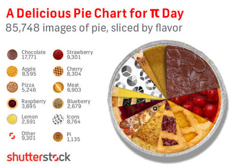
In honor of Pi Day (3/14) we took a dive into our library to suss out some Pie Knowledge, and ended up with the above appetizing infographic revealing the flavor breakdown of the 85,748 “pie” search results from our library. Yes, we know that “Pi” equals 3.14159… and not “Pie,” but we couldn’t resist the delicious comparison. Any way you slice it, this is some tasty data, and our mouths water for data here at Shutterstock.

|
Scooped by
Jeff Domansky
February 21, 2013 2:23 PM
|

|
Scooped by
Jeff Domansky
February 18, 2013 12:53 PM
|
Recently we came across this great infographic by AXZM detailing the five elements of inbound marketing for your business. While they seemed to have channeled Captain Planet to design and categorize this infographic; using Earth, Fire, Air, Water, and the fifth element “Aether” that binds all other forces together.
It’s a great guide for a marketer or business owner just starting out in marketing. Each element is tied to an inbound marketing tactic and is partnered with a brief description of the benefit of each tactic, popular platforms, tools used and/ or best practices to implement. What is Inbound Marketing? Inbound marketing is a relatively new marketing concept where marketers aim at getting discovered by potential customers who are actively looking for your product or solution. This idea of “being where your customers are looking” contrasts the traditional way of marketing through television commercials, cold calling, direct mail, trade shows, etc....

|
Scooped by
Jeff Domansky
February 9, 2013 11:00 PM
|
Creative infographic looks at the advantages and ROI from blogging.

|
Scooped by
Jeff Domansky
February 7, 2013 9:36 AM
|
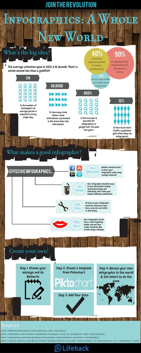
Infographics are great at getting links (and thus high rankings in Google)…but why stop there. Why Infographics? · 65% of people are Visual Learners · A web visitor is likely to leave your site within less than 10 seconds after arriving · With the world’s information currently doubling every two years, – People are suffering from information overload...

|
Scooped by
Jeff Domansky
February 6, 2013 10:28 PM
|
...Communicating visually is one of the most effective ways to explain complex concepts and relationships, and can be a great way to explain your services/products and create valuable site content. I often use diagrams and whiteboarding in order to communicate new features and concepts internally with my team. I've compiled a list of tools you can use to create visualizations, or simply use to communicate visually with your teammates....

|
Scooped by
Jeff Domansky
January 24, 2013 11:49 PM
|
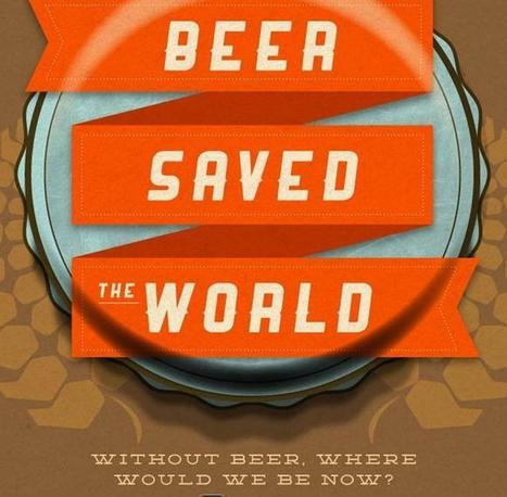
From the history of beer to what to do with an empty, these infographics will provide you with a whole variety of knowledge about one of man’s most loved drinks: beer.

|
Scooped by
Jeff Domansky
January 17, 2013 3:32 PM
|
Most companies have been brought up on a diet of pushing ads in front of people to sell their stuff. On a social web it is about engaging through content first. ...Content’s role in this is about creating such great value whether that is entertainment or education that it engages your customers and prospects.... Here are 5 Infographics that share some valuable insights into how the content marketing game plays out on the world wide web....

|
Rescooped by
Jeff Domansky
from Data Visualization & Open data
January 8, 2013 3:56 PM
|
This post is #6 in DailyTekk’s famous Top 100 series which explores the best startups, gadgets, apps, websites and services in a given category. Total items listed: 112. Time to compile: 8+ hours. ... I love a good infographic! After all, knowledge is power and the visualization of data makes absorbing information all the easier. Well-designed infographics have a way of pulling me into a subject I’d normally never care to know about. As a designer I can attest to the crazy amount of time it takes to make a compelling, useful infographic. I have to say I knew about many of the great links, resources and tools I’ve linked to here on this post before but I dug deep and found some new and exciting infographic tools that I’m willing to bet you haven’t seen before...
Via Jesse Soininen

|
Scooped by
Jeff Domansky
January 4, 2013 4:03 PM
|
As 2013 begins, social media marketing has already grown a bit old school. Today, the marketing world is still hot on the social media marketing trail, but the trail has diverged. There are different paths with cheerleaders along the way no matter which path a marketer follows. Ideally, marketers should find the path down the middle that marries all of the elements of social media marketing, but most are not there yet. Many of today’s marketers are still choosing a single path to focus on or jumping back and forth. For example, those paths include the data and metrics focus, the storytelling focus, the visual focus, and more. This article hones in on the visual focus with the help of two great infographics that visually share the data and tell the story of visual storytelling. Appropriate, don’t you think?...

|
Scooped by
Jeff Domansky
December 11, 2012 11:24 PM
|
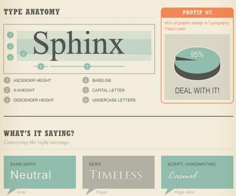
Type is all around us. It is a key component in the design process. The font you choose affects the aesthetic of your design, and one bad font can ruin everything. (Are you listening, fans of Comic Sans?
Everything you design, type, create has a purpose. Before choosing a font, determine your purpose. It makes font selection much easier. Many fonts send a “message” so choose wisely. And stay far, far away from Comic Sans....

|
Scooped by
Jeff Domansky
November 30, 2012 11:31 PM
|
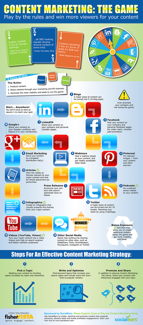
After you've written a major piece of content, do you know how to market it effectively? Its vital that you do. This infographic "Content Marketing: The Game" is a fun look at 14 methods that will help you win at the serious business of content marketing. The infographic was created by the creative folks at Fisher Vista for SocialEars - software for content marketers who want to get found, be shared and increase engagement...

|
Scooped by
Jeff Domansky
November 19, 2012 10:01 PM
|
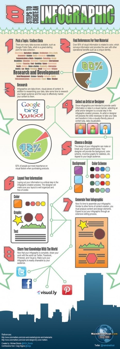
Defined as “graphic visual representation of data, knowledge or information,” Infographics are being used in a variety of ways to tell a story. Like everything on the web, the ‘good, bad and ugly’ of Infographics are all too apparent. Whether you use software such as Adobe Illustrator or use free infographic creator tools, knowing the do’s and don’ts of Infographic design is key to enhancing your credibility and trustworthiness in this age of information overload and cynicism. Here are some suggestions on how to design your information to be heard, felt, seen and acted on... [Useful info graphics tips and resources ~ Jeff]
|

|
Scooped by
Jeff Domansky
March 3, 2013 10:57 PM
|
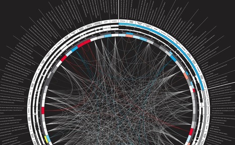
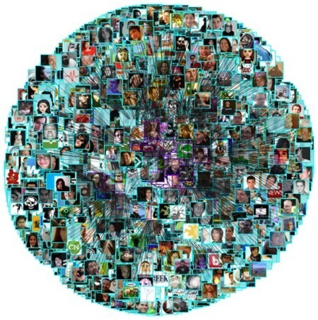
I just created a new Twitter account, and it got me to thinking about all the data visualization I've seen for Twitter tweets. I felt like I'd seen a lot, and it turns out there are quite a few. Here they are grouped into four categories - network diagrams, maps, analytics, and abstract. Twitter is a social network with friends (and strangers) linking up with each other and sharing tweets aplenty. These network diagrams attempt to show the relationships that exist among users....

|
Scooped by
Jeff Domansky
February 18, 2013 10:36 PM
|

|
Scooped by
Jeff Domansky
February 16, 2013 10:31 AM
|
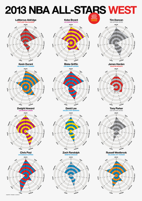
Rami Moghadam has just published two infographic posters detailing the stats for each of the players on the NBA All-Star teams. 2013 NBA All-Stars East and 2013 NBA All-Stars West both use radar charts to highlight each player’s strongest areas....

|
Scooped by
Jeff Domansky
February 8, 2013 11:30 AM
|
You don't have the luxury of ignoring climate change. Just because Congress — and global climate summits — can't seem to prepare for climate change, doesn't mean the private sector can get away with the same. Mother Nature doesn't do bailouts. The danger signs are clear. Yet for years, climate change has been off limits for federal policymakers, who have been rendered nearly catatonic over the unproven idea that dealing with climate change or any environmental problem would be too costly for a delicate economy. On the contrary, tackling climate change is an investment that pays off economically as well as socially. A report from Deutsche Bank showed in 2010 that a portfolio with an overweight to climate solutions would have outperformed a benchmark portfolio over the previous 5 years, indicating that climate as an investment was "not merely an investment sector that may hold future promise; it is a sector that has already delivered and is continuing to deliver." Moreover, not fixing the problem is quite likely to cost considerably more than addressing it. Particularly now, while there is still time for us to avert even greater damage. Companies that emit a lot of greenhouse gases should know that at some point the burgeoning impacts of climate change will prompt government to act, either at the federal or state level, or both. This leaves business leaders with two options: wait for whatever the government does and react, or pro-actively plan for a carbon-constrained future....

|
Scooped by
Jeff Domansky
February 7, 2013 9:32 AM
|
In your list of links, is an infographic that you are proud of. Whether it’s your own brain child or the brain child that you paid someone a lot of money to create— you want to introduce it to the world! It’s been my experience that infographics tend to rank higher and generate traffic faster than your standard blog posts. With that said, your infographic has a lot of potential and power. Are you ready to pitch it hard enough so that your visual message is heard all over the web? Based on what I’ve done in the past, here are some tips so that your awesome infographic doesn’t go unnoticed!...

|
Scooped by
Jeff Domansky
February 2, 2013 3:35 PM
|
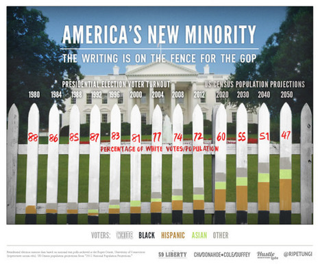
The demographics of America are changing, and America’s New Minority from 59 Liberty...

|
Scooped by
Jeff Domansky
January 24, 2013 11:06 PM
|
Researching may sound easy: with a quick Google search, almost anything can be found. But the internet also holds some gems for when you want to get that social or trend based angle. Here are the top five websites that make my job easier. They can also be interesting to play about with too!...

|
Scooped by
Jeff Domansky
January 8, 2013 6:56 PM
|
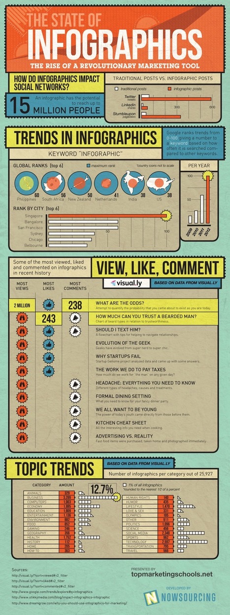
Did you know that infographics shared on Twitter receive almostten times as many retweets as traditional posts? And it’s not just our favourite micro-blogging social network that eats these data visuals for breakfast – infographics shared on LinkedIn receive, on average, seven times as many shares as other submissions, and those added to Stumbleupon’s “ocean of awesome” generate 746 percent more pageviews than other kinds of content....

|
Rescooped by
Jeff Domansky
from elearning&knowledge_management
January 7, 2013 4:29 PM
|
Learn how to create stunning infographics - without spending hundreds of dollars on a graphic designer or losing your mind - in just 30 minutes or less.
From word clouds to network data visualizations, infographics have become a primary format for content in a relatively short period of time. Although the ‘infographic’ is nothing new, its proliferation and evolution has been nothing short of exponential in the past few years.
Whether you love them or hate them, the rising popularity of infographics can’t be denied.
Via Baiba Svenca, Abi Woldhuis, BookChook, michel verstrepen, Dolly Bhasin , Mayra Aixa Villar

|
Scooped by
Jeff Domansky
December 20, 2012 9:20 PM
|
By my best estimate I think we've probably been sent around 700,000 infographics this year, many of which were of excellent quality. Obviously there have been a few duds along the way, but the best way for us to share all the decent graphics we are sent is in our regular Friday roundup of the best six we've received that week. And the logical conclusion to our weekly roundup is a final collection of the best infographics we've seen in 2012. Just to be clear, there were no strict criteria in the judging process, it's just a subjective roundup of 14 of my favourites from the past 12 months. So here they are...

|
Rescooped by
Jeff Domansky
from Digital Storytelling
December 1, 2012 2:14 PM
|
The rise of visualizations You've seen infographics on websites, embedded SlideShare present... Businesses of all sizes are relying more and more upon visualization of data and information to make concepts easier for people to digest and remember, but why is this trend surging in marketing and tech circles?... [Influence of social visuals grows ~ Jeff]
Via José Carlos

|
Scooped by
Jeff Domansky
November 22, 2012 10:33 PM
|
It’s Thanksgiving, so what are you thankful for? How about social media? Users of social networking sites are certainly grateful for Thanksgiving itself, particularly when it comes to eating – the phrase ‘Thanksgiving dinner’ is picking up tens of thousands of mentions on Twitter, with stuffing cited as the side dish of choice amongst participants. (Although, on Pinterest, photos of green beans are, oddly, getting the most pins. I guess you have to be there.) Pumpkin pie is edging out apple pie as the top dessert, while the New York Times, PBS and Men’s Heath magazine rate as the top social influencers who are talking about turkey. These, and other Thanksgiving social media facts, can be found in the infographic....
|
 Your new post is loading...
 Your new post is loading...











![Twitter, Facebook, Pinterest – Feast On These Thanksgiving Social Media Facts [INFOGRAPHIC] - AllTwitter | Public Relations & Social Marketing Insight | Scoop.it](https://img.scoop.it/rCUh23DsxiPTGQECGH3BkDl72eJkfbmt4t8yenImKBVvK0kTmF0xjctABnaLJIm9)


Some infographics are just very tasty.