 Your new post is loading...
 Your new post is loading...

|
Scooped by
Jeff Domansky
October 22, 2015 1:05 AM
|
The success of infographics has evolved since that time. Just a few years ago, infographics became extremely popular with the eruption of digital marketing and search engine optimization.
With their popularity came several changes in the way they were presented. Only the best of the best were shared on social media, resulting in higher brand awareness and consumer engagement.
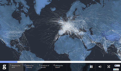
As the traditional infographic evolved to keep up with consumers’ changing tastes, it brought the world the interactive infographic, which is becoming the most sought after form of data representation to date, even rendering some static infographics as outdated and irrelevant.
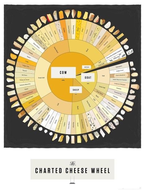
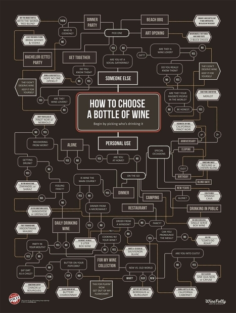
To help you stay ahead of the game with your graphic design and create an infographic with the potential to go viral, take a look at this list of awesome interactive infographics....

|
Scooped by
Jeff Domansky
October 15, 2015 11:37 PM
|
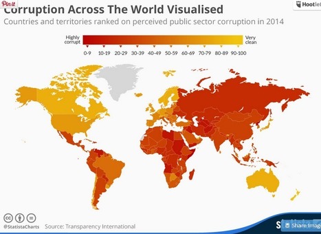
Poorly equipped schools, counterfit medicine and elections decided by bribes are just some of the consequences of public sector corruption. According to Transparency International, nowhere on earth is deemed totally free of corruption. Somalia and North Korea in particular stand out on this map - both scored only 8 out of a potential perfect score of 100. Denmark, New Zealand, Finland and Sweden were rated the least corrupt nations worldwide, according to Transparency International....

|
Scooped by
Jeff Domansky
September 30, 2015 11:10 PM
|
How much more memorable are visuals compared to text?
One oft-referenced answer is that people remember visuals 6 times better than text—an answer referenced in Buffer’s article on the anatomy of a perfect blog post and an answer that led to a lot of great discussion. After reviewing the original research, it’s clear that pictures are more memorable than words. So the next question became:
People remember visuals better than text. But which visuals exactly?
I’ve spent some time collecting the best research and science on pictures, images, infographics, and more, and I’m excited to share with you what I’ve found—along with some specific ways to use these insights in your marketing!

|
Scooped by
Jeff Domansky
September 19, 2015 6:02 AM
|
Infographics have become the design darling of visual marketing.
It’s no wonder organizations and individuals are taking advantage of them as a communication tool. We’ve scoured the web to compile a collection of 45 inspiring infographics that show what’s possible in this design category. Browse through them to get some ideas for your next project....

|
Rescooped by
Jeff Domansky
from visualizing social media
February 15, 2016 11:22 AM
|
Google has many different sources of revenue, but one of their most noticeable is the ads that appear next to search results for specific keywords. How much that keyword costs depends, in part, on how often people search for it -- the more people search for a certain keyword, the more expensive it is.
Via Brian Yanish - MarketingHits.com, massimo facchinetti, Lauren Moss

|
Scooped by
Jeff Domansky
August 14, 2015 1:20 PM
|
While great infographics come in a variety of forms, the common thread is that they're visually pleasing and designed in a way that makes complex topics easy to understand whether you're a novice in the subject or an expert.
Here are 10 brands from all different industries -- from home furniture to health care -- that totally nailed their infographics this year so far. Check 'em out and get inspired!...

|
Scooped by
Jeff Domansky
June 26, 2015 8:46 PM
|
Your infographics are effective marketing tools to build brand awareness. This is due to the fact that visuals used in the illustration of content can convey your business message to the audience easily and so your brand stays in the memory of the audience for a longer time.
You can also use infographics offline for marketing activities. For example, you can take out printed versions of infographics to distribute them on the sidelines of an event or use them on brochures and leaflets to promote your products and services....

|
Scooped by
Jeff Domansky
June 23, 2015 9:17 AM
|
There are different types of Infographics, such as flowchart, timeline, versus Infographics, data visuals and more.With the advent of advanced designing tools, the process of creating Infographics has become more exciting. Here I am presenting a list of useful online tools that will help you to ease your designing process to a great extent. Though they cannot replace Adobe Photoshop, they can surely help you to craft basic Infographics easily....

|
Scooped by
Jeff Domansky
May 2, 2015 10:53 AM
|
So, how do you prepare your next awesome infographic for your business? Well, if you are looking for templates that will help you create your own infographic for your business, you have come to the right place!
In this post, I have put together an assortment of our best infographic templates that offer everything you would ever need to display your data in a beautiful and effective way. Starting from as low as $4, these infographic templates are all yours to customize, extend and publish!...

|
Scooped by
Jeff Domansky
April 11, 2015 2:33 AM
|
The main reason why infographics are so successful is that they transpose written data into a visual representation of the ideas that information contains. Visual data is absorbed much more quickly and easily, which leads to faster understanding. The majority of the population learns best through visual stimuli as shown in research undertaken into Individual learning styles, which is why for advertising companies, such as those involved in ecig marketing, relevant information is delivered in a visually interesting, coherent and direct way.

|
Scooped by
Jeff Domansky
March 25, 2015 1:59 AM
|
Infographics are a fun way to present information on the internet. The random visitor might just click the x sign at the right corner of the page and contribute to your bounce rate if he encounters a business blog that has annals of text. But give him an infographic and he stays. Simple, he thinks (and he’s right there) that it’s easier to lift information off an infographic than from a text post. Information, numbers, ideas, statistics and conclusions pop out in an infographic. It is tough to miss important information in an infographic presentation. But write a well researched article on a Word document and publish that on your blog- well, the results might not quite match up to an infographic built from the same data. Less is more. Indeed!...

|
Scooped by
Jeff Domansky
March 2, 2015 2:45 AM
|
Data is crucial. However, displaying a chunk of plain data can be monotonous. Infographics visualize plain data and make it visually more appealing. Data turned into infographic has a higher potential to go viral and be effective. While many of us are designers who can design amazing infographs, Infographic Generators can come in handy to Designers and non-designers alike. They can be a time saving resource. So here is a list of 17 fantastic Infographic Generators I compiled together:...

|
Scooped by
Jeff Domansky
February 19, 2015 3:31 AM
|
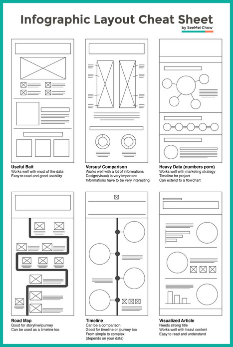
Infographic layouts refer to the arrangement of your visual elements and your content. When you begin working on a piece of infographic, you should have a story to tell hence, you will need to select a layout that best suits your story. Using the right layout will ensure good readability and convey your message well.
We have put together a cheat sheet for your quick reference to the right arrangement to use, here are six common ones you can quickly work with....
|

|
Scooped by
Jeff Domansky
October 21, 2015 10:50 AM
|
Do you want to make your infographics iconic? Okay, so we don’t mean “iconic” in the usual sense. We mean using icons in your infographic design. Icons are those little illustrative graphic images/clip art that represent an object, action or idea. They are often stylized and simplified designs. N
Using icons can make your infographic design more cohesive and more professional. With Venngage you can choose from over 10,000 icons in our icon library and stylize them to your preference by editing their colors, sizes and positions. Here are some tips for how to use icons in your infographics....

|
Scooped by
Jeff Domansky
October 6, 2015 9:28 AM
|
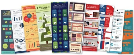
Infographics are a powerful tool for capturing the attention of your target audiences. In fact, businesses that publish infographics grow their traffic an average of 12% more than those that don't.
The hard part, of course, is finding the time and resources to create these infographics.That's why we've created ten fully customizable infographic templates that will give you the inspiration and foundation you need to build your own infographics right in PowerPoint....

|
Scooped by
Jeff Domansky
September 19, 2015 6:19 AM
|
A 2013 study by Louis Alfieri published on Educational Psychologist suggested that case comparison activities commonly led to greater learning outcomes over other forms of case study including sequential, single case, and non-analogous, as well as traditional instruction.
Today, we are going to learn how to take advantage of this concept and apply it to design an excellent educational infographic.Keep reading!...

|
Scooped by
Jeff Domansky
September 14, 2015 4:07 AM
|
This PRO infographic template narrates the power of visual storytelling with key details and statistics about the topic. It depicts why visual storytelling is effective and powerful (and you’d probably know why we’re advocating it too!).
This template can also be repurposed easily to share a business idea or a school project in the form of an infographic and it helps to convey the information visually and comprehensively. Use this infographic to convince your audience with your own ideas!...

|
Scooped by
Jeff Domansky
August 22, 2015 11:05 PM
|
It’s only August, but voting is already underway for the March 2016 South By Southwest (SxSW) Interactive conference. Long thought of as the breeding ground for new ideas and creative technologies, we can gleam industry insights from the SXSW Interactive Festival. This year, I decided not to wait until the conference to delve into the veritable buffet of groundbreaking panels vying for festival space. This year’s PanelPicker interface received more than 4,000 proposals, which is an all-time record!
While a quick search of infographics yields only 11 results, a mere TWO actually have the word “Infographics” in the title. The industry discourse has shifted away from “how-to” models to “how to do it right.” Infographics have become a key format of the larger conversation: Visual Storytelling.
A quick search for “Visual Storytelling” yields over 200 talks in PanelPicker, along with hundreds more for “data visualization” and “visual content”. Infographics are now used as one of many effective tools in the Marketer’s toolbox, and an accepted part of the larger conversation happening in the content marketing industry.
Visual storytelling is vital to content marketing success. The following types of visual content are at the forefront of the proposals for next year’s SXSW Interactive Festival.

|
Scooped by
Jeff Domansky
August 10, 2015 11:39 AM
|
When it comes to digital marketing, there are few techniques more widely used than the infographic. And when used effectively, they can provide a serious boost to any content marketing campaign. As noted by Forbes, “When your content is compelling, design can and should be used to communicate this information.” Many companies have found infographics to be an effective manner to communicate content in a clear and concise manner.
The problem is, many infographics produced today are pretty horrendous. Many are confusing or simply fail to provide relevant facts. And while some infographics are able to stand on their own, others become completely useless when removed from the context of the article with which they were originally published. Perhaps that’s part of the reason why infographic production has fallen in decline in recent years.
But effective infographics can supercharge a content marketing campaign, and indeed, continue to be more effective than other types of online content. Research by BuzzSumo found that on average, infographics vastly outperformed all other types of content in terms of online shares—especially on social media....

|
Scooped by
Jeff Domansky
June 24, 2015 9:38 PM
|
The mere thought of creating your own infographic can be scary and often is thought of as a complex task that can entail tens of hours.
Visme is about simplifying the infographic creation process, so we thought: why not use our own tool to show you how to create your own infographic?
We collaborated with Randy Krum of Cool Infographics, an expert in data visualization and author of the book “cool Infographics” to create a simple interactive infographic that breaks down the process of designing an infographic into 5 easy to understand steps.
Check it out and rollover each section for more information....

|
Scooped by
Jeff Domansky
June 9, 2015 1:32 AM
|
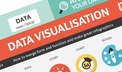
The following infographic, created by Zhenia Vasiliev, breaks down the basics of data visualization. It shows how beginners can merge form and function, and design meaningful infographics.
Key highlights: - Analyse your data: Analysis is the key. Before we can visualize the data we need to understand it. - Come up with a story: Story is finding a single strand of meaning in an endless sea of information. It has a beginning, middle and end. - Make it visible: Visualization is a creative act of making. Making the data visually elegant evident and engaging. - Entertain to educate: Good data design need to illuminate and inform the viewer, elucidate and illustrate the facts and stats....

|
Scooped by
Jeff Domansky
April 18, 2015 2:38 AM
|
Creativity and great ideas can be dosed in a masterly way of aninfographic. Those 14 infographics is proof of that. They are tremendously useful information, it does so with full creativity and originality. Although most of them are about web design, some of those is also for SEO professionals or graphic designers themselves. I recommend you take a look at them because from the visual and composition view are very well developed....

|
Scooped by
Jeff Domansky
April 6, 2015 2:33 AM
|
Wouldn't it be great if creating infographics was just as simple as writing regular ole text-based blog posts? Unfortunately, the reality is that making visual content like this usually takes a lot more time, effort, and let's face it -- skill -- than the written word.
Usually.But considering the popularity and effectiveness of visual content in marketing today, you can't just afford to throw in the towel. That's why we decided to take all the pain and suffering out of infographic creation.
Seriously -- don't throw in the towel just yet. You, too, can create professional-looking, high-quality infographics ... quickly! And I'm going to prove it. First things first ...

|
Scooped by
Jeff Domansky
March 8, 2015 10:49 AM
|
Well, I’m here to tell you that it’s definitely possible to create some awesome infographics in any category that you choose, EVEN if you’re not a designer. In this blog post, I’m going to introduce you to three awesome tools to create the best infographics, tell you how to use them AND how you can share your infographics in different channels all over the web. So, let’s get started!..

|
Scooped by
Jeff Domansky
February 19, 2015 10:26 AM
|
Websites are taking the advantage of infographics storytelling ability. Today’s websites are more focusing on the core content and are looking to present the content in a visually pleasing way to enhance user experience.
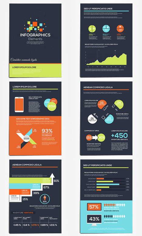
Today we have put together very useful free infographic elements to help you build all your information into one creative package. All these elements are free, feel free to use them in your projects....
|


 Your new post is loading...



















![How to Create an Infographic in Under an Hour [+10 Free Templates] | Public Relations & Social Marketing Insight | Scoop.it](https://img.scoop.it/jKldflV4zNqvqJirZoFfwTl72eJkfbmt4t8yenImKBVvK0kTmF0xjctABnaLJIm9)


Since the beginning of the century, infographics have had a powerful impact on the way we view web media.