

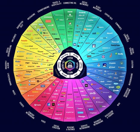

Big data's big promises are left in a big dust pile because we don't optimize the last mile: Data presentation. Learn from eight real-world how-to examples."
Via Bovee & Thill's Online Business Communication Magazines
Get Started for FREE
Sign up with Facebook Sign up with X
I don't have a Facebook or a X account


 Your new post is loading... Your new post is loading...
Big data's big promises are left in a big dust pile because we don't optimize the last mile: Data presentation. Learn from eight real-world how-to examples." Via Bovee & Thill's Online Business Communication Magazines 
No comment yet.
Sign up to comment
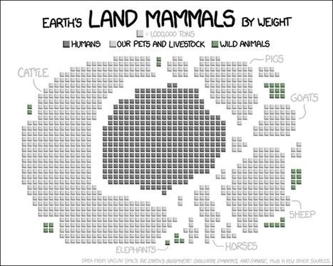
Randall Munroe, a former NASA roboticist who nows draws clever geeky webcomics at XKCD, used data from Vaclav Smil's The Earth's Biosphere: Evolution, Dynamics, and Change ("plus a few other sources") to create a visualization of all of Earth's land mammals, which include us, by weight. It does certainly put things in perspective, especially when you compare wild land mammals to us and our livestock and pets. Via Lauren Moss
|
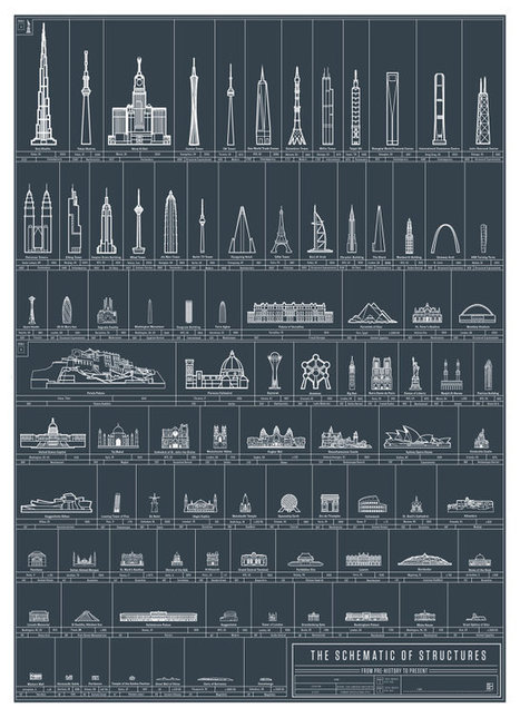
Yet another creation has rolled off the powerhouse infographics assembly line over at Pop Chart Lab, and this time, the indefatigable taxonomizers of alcohols and famous quotes have turned their attention to works of architecture. The Schematic of Structures organizes what the designers describe as "90 eminent edifices erected and perfected throughout history." Arranged by height, the infographic lines up some of the greatest works envisioned and built by man since prehistory, from the Neolithic Cairn of Barnenez and the Parthenon to more modern creations like London's Gherkin and the Burj Khalifa. Via Lauren Moss
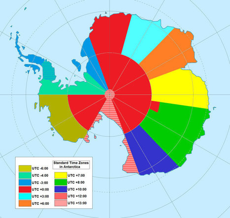
If you’re a visual learner, then you know maps, charts and infographics can really help bring data and information to life. Maps can make a point resonate with readers and this collection aims to do just that. A few of these maps are important to know, some interpret and display data in a beautiful or creative way, and a few may even make you chuckle or shake your head. If you enjoy this collection of maps, the Sifter highly recommends the r/MapPorn sub reddit. You should also check outChartsBin.com. There were also fantastic posts on Business Insider and Bored Panda earlier this year that are worth checking out. Enjoy! Via Lauren Moss
|


