Design, Science and Technology
45.7K views | +1 today
Follow
Design, Science and Technology
#ideas #design #science #technology #inspiration #media #information
Your new post is loading...
Rescooped by Antonios Bouris from visual data
Scoop.it!

City Layouts Created with OpenStreetMap Data

City Layouts Created with OpenStreetMap Data | Design, Science and Technology | Scoop.it

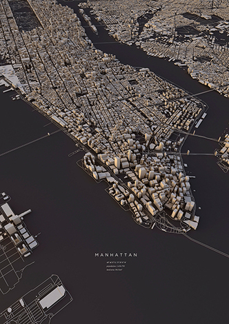
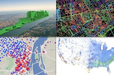
Topography, architecture and traffic routes give every city a unique structure.
'These conditions create the typical and individual inner structure of a city. I didn’t only want to show these structures in the conventional way from above, but also including the exact three-dimensionality of topography and buildings – a real world visualisation.
The OpenStreetMap data enabled me to visualize the satellite-based information using DEM Earth in Cinema 4D. The results are some extraordinary views of large capitals and small towns.'


Via Lauren Moss
No comment yet.
Rescooped by Antonios Bouris from visual data
Scoop.it!

How Fractals Bring Imaginary Cities to Life

How Fractals Bring Imaginary Cities to Life | Design, Science and Technology | Scoop.it
Artist Emily Garfield maps places that don't exist. "I think that's related to the way cities grow in real life."

Emily Garfield like to say that she grows cities. With pen, ink, and watercolor, the Boston-based artist creates maps of imaginary places that tap into the essence of urban form.

Garfield has long been interested by the presentation of architecture in visual art. The inviting, surrealist arcades and sidewalks of the Italian painter Giorgio de Chirico inspired Garfield to begin producing her own street-level dreamscapes as an art student at Brown University.

But it was when she created her first aerial view of a fantasy city—an abstract web of streets, bridges, and blocks—that she got a particularly positive response from other people. Even without any text, Garfield's drawings were strongly recognizable as maps...


Via Lauren Moss
No comment yet.
Rescooped by Antonios Bouris from green infographics
Scoop.it!

Nine maps that show how climate change is already affecting the US

Nine maps that show how climate change is already affecting the US | Design, Science and Technology | Scoop.it

Climate change isn't just a problem for future generations — it's already affecting broad swaths of the United States.

That's the upshot of the National Climate Assessment, a massive new US government report detailing the current and future impacts of global warming around the country. The report is particularly useful in detailing how specific regions and sectors will be affected — and outlining some possible ways we could adapt.

There's a lot of information in the report, but find nine highlights at the link.


Via Lauren Moss
No comment yet.
Rescooped by Antonios Bouris from visual data
Scoop.it!

Favorite Digital Maps of 2013

Favorite Digital Maps of 2013 | Design, Science and Technology | Scoop.it

'The digital maps we loved in 2013 didn't simply illustrate novel or useful information. They did it in ways we'd never seen before, manipulating time, dimensions, perspective, even the atmosphere. These maps weren't just interesting in content; they were innovative in design. That's our new bar for 2014.

So this December, instead of sharing our top 10 maps of the year, we're looking at 10 ways we've learned to think about maps in entirely new ways. This may well have been the year when maps ceased to impress us for what they convey and began to stun us instead for how they did it.'


Via Lauren Moss
No comment yet.
Rescooped by Antonios Bouris from visual data
Scoop.it!

Subway Maps Of Cities Around The World Redesigned In A Circular Format

Subway Maps Of Cities Around The World Redesigned In A Circular Format | Design, Science and Technology | Scoop.it

Mapmaker Max Roberts has created a new way to map out subway lines.  Conventional maps usually emphasize “straight lines, clean angles and geographical accuracy”. Unlike those maps, Roberts’ circular design is a blend of “aesthetics and usability”. 

Roberts discovered this “completely new way of designing maps” when he was designing a map for the London Underground that took into account the circular nature of the Orbital rail link. He realized the potential of the new design in forcing “cities into an unprecedented level of organization” and the coherence achieved. Sacrificing geographical accuracy, his schematic design shows how elements in the map relate to each other logically, while taming the web of criss-crossed lines usually found in subway maps.

View maps of the New York City Subway, the London Underground and the Paris Metro at the article link, or head over to hiswebsite to see more circular maps of other cities. 


Via Lauren Moss
Niki Brown Beck's curator insight, December 5, 2014 9:44 PM

New perspective (transportation)

Rescooped by Antonios Bouris from Eclectic Technology
Scoop.it!

40 maps that explain outer space

40 maps that explain outer space | Design, Science and Technology | Scoop.it
From the moon to the cosmos, this is the universe we live in.

Via Beth Dichter
Beth Dichter's curator insight, March 18, 2015 10:38 PM

Outer space fascinates learners...and this post from VOX provides 40 maps that are divided into sections:

* The Solar System

* Earth

* Space History

* The Moon

* Mars

* The Rest of the Solar System

* Beyond the Solar System

If you teach Earth Science many of these maps may be of interest. One map that many students may find of interest is takes a look at the universe based on the moon being 1 pixel. It is located at this link.

Kathy Lynch's curator insight, March 21, 2015 11:41 AM

Thx Beth Dichter! This is terrific!

Kathy Lynch's curator insight, March 21, 2015 11:52 AM

Thx Beth Dichter

Rescooped by Antonios Bouris from visualizing social media
Scoop.it!

40 Maps That Explain The Internet

40 Maps That Explain The Internet | Design, Science and Technology | Scoop.it

The internet increasingly pervades our lives, delivering information to us no matter where we are. It takes a complex system of cables, servers, towers, and other infrastructure, developed over decades, to allow us to stay in touch with our friends and family so effortlessly. Here are 40 maps that will help you better understand the internet — where it came from, how it works, and how it's used by people around the world.


Via Lauren Moss
Coolwired's curator insight, August 31, 2014 10:04 AM

This informative site sheds light on the pervasive workings of the Internet.

Mel Leggatt's curator insight, November 20, 2014 11:36 AM

A really excellent visual resource for understanding how the Internet has and continues to evolve.

Vincent Lahondère's curator insight, January 4, 2018 6:06 AM

Cette série de cartes accompagnées de commentaires en anglais est absolument remarquable car elle permet de comprendre comment internet s'est imposé à travers le monde.

Rescooped by Antonios Bouris from visual data
Scoop.it!

50 Maps Showing Where and What Happens in Cities Across the Globe

50 Maps Showing Where and What Happens in Cities Across the Globe | Design, Science and Technology | Scoop.it

“Where people post geotagged photos to Flickr from and geotagged tweets to Twitter from.” via Eric Fischer

Red dots are locations of Flickr pictures. Blue dots are locations of Twitter tweets. White dots are locations that have been posted to both. 


Via Lauren Moss
Patrice Mitrano's curator insight, February 4, 2014 8:51 AM

voir aussi la page Flickr d'Eric Fischer, l'auteur de ces images spectaculaires : http://www.flickr.com/photos/walkingsf/

Rescooped by Antonios Bouris from visual data
Scoop.it!

40 Maps That Will Help You Make Sense of the World

40 Maps That Will Help You Make Sense of the World | Design, Science and Technology | Scoop.it

If you’re a visual learner, then you know maps, charts and infographics can really help bring data and information to life. Maps can make a point resonate with readers and this collection aims to do just that.

A few of these maps are important to know, some interpret and display data in a beautiful or creative way, and a few may even make you chuckle or shake your head.

If you enjoy this collection of maps, the Sifter highly recommends the r/MapPorn sub reddit. You should also check outChartsBin.com. There were also fantastic posts on Business Insider and Bored Panda earlier this year that are worth checking out. Enjoy!


Via Lauren Moss
No comment yet.
Rescooped by Antonios Bouris from 21st Century Tools for Teaching-People and Learners
Scoop.it!

TEFL Lesson Ideas: Using maps & technology in class…

TEFL Lesson Ideas: Using maps & technology in class… | Design, Science and Technology | Scoop.it

Suggestion of a few tools with which you can get your students mapping!


1. Create an animated “flightpath” of a journey with Tripline

2. Add voice recording to a map with Map Maker and Vocaroo

3. Record and share your impressions of different places with Woices


Read more...


Via Gust MEES
No comment yet.