


These 22 charts and maps all told me something I found surprising. Some of them genuinely changed the way I think about the world.
Get Started for FREE
Sign up with Facebook Sign up with X
I don't have a Facebook or a X account


 Your new post is loading...
 Your new post is loading...
Your new post is loading...
These 22 charts and maps all told me something I found surprising. Some of them genuinely changed the way I think about the world.
Beth Dichter's insight:
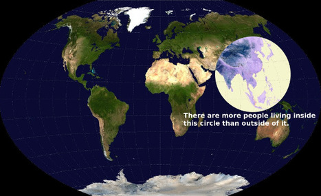
If you are looking for some maps that will have students scratch their heads and consider come concepts in a new light this post will provide you with 22 choices. The one above intrigued me. It shows a map of the world, and has a circle that shows where more people live than the rest of the world. I suspect this image would bring up many questions, and that many would be interdisciplinary. Click through to the post to find many other great maps and charts. 
|
The ASIDE blog takes a look at population using a variety of data visualizations: The Miniature Earth Project, Who is the World's Most Typical Person?, and Breathing Earth. All are "eye-catching presentations of images, data and design. The clarity and simplicity in the use of information mixed with sound, be it music or sizzling emissions, coalesce into an effective message. Their delivery engages the viewer to think and ask questions, and our students are fascinated by each one."
|


Some cool stuff to share with your students.
agregar su visión ...
If you are looking for some maps that will have students scratch their heads and consider come concepts in a new light this post will provide you with 22 choices. The one above intrigued me. It shows a map of the world, and has a circle that shows where more people live than the rest of the world. I suspect this image would bring up many questions, and that many would be interdisciplinary. Click through to the post to find many other great maps and charts.