


 Your new post is loading...

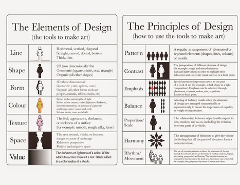

"In order for our learners to see how designing information changes how it is viewed, the students this year placed their visual infographics side-by-side with their linear notes to see the transformation. It was the “ah ha” moment, when they could examine how the delivery of content mattered and how the deliberate choices in font hierarchy, color selection, and placement changed the way others perceived the ideas."


Useful reference for a graphically challenges creature of language such as myself :-)
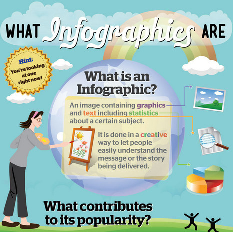
NLP Strategies.
Visual and linear learning design should come together to create a learning tool. Infographics are an example of this.