WebsiteDesign
32.7K views | +5 today
Follow
WebsiteDesign
Welcome to our sharing page on website design
Your new post is loading...
Rescooped by Brian Yanish - MarketingHits.com from Must Design
Scoop.it!

Neon Web Design Trends in 2014

Neon Web Design Trends in 2014 | WebsiteDesign | Scoop.it
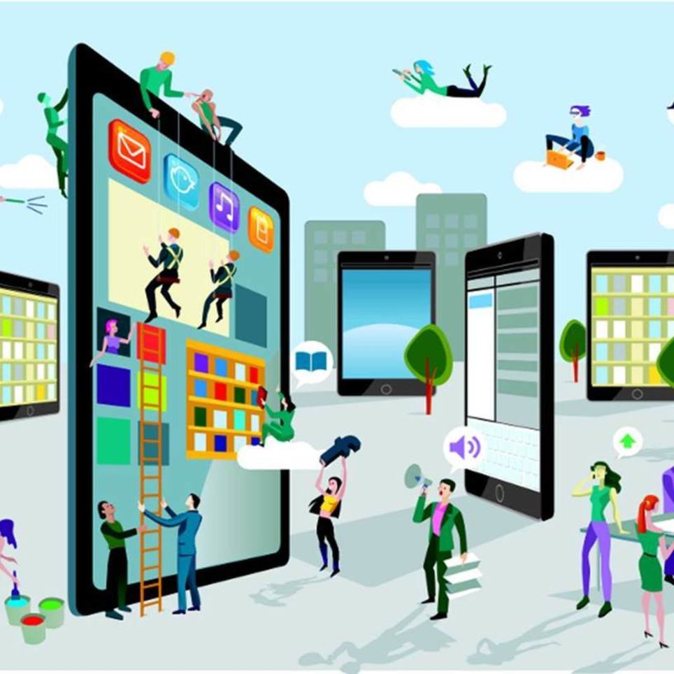
Why keeping up with web design trends is vital In today’s fast-evolving trends, people’s interests are being influenced briskly by the web, wherein onlin


Marty Note
Like #7, use of Neon Colors as accents. Color is so tricky online its use as "accents" is the best idea. Will see if I can find a "neon color accent" example and shsre it, but sounds like a cool trend I've only read about from this Chinese social agency.

Other trends noted include ones we've seen in several of these "what's up for 2014" posts including:

* Simple.

* Flat.
* All in one.

* Responsive.
* scrolling.


Via Martin (Marty) Smith
No comment yet.
Rescooped by Brian Yanish - MarketingHits.com from A design journey
Scoop.it!

6 of the Best and Worst Parallax Scrolling Websites for Design Agencies

6 of the Best and Worst Parallax Scrolling Websites for Design Agencies | WebsiteDesign | Scoop.it

Via Hans
Brian Yanish - MarketingHits.com's insight:

Ah, parallax scrolling websites. You’re one of the current hot “it” web design strategies. Parallax scrolling itself refers to different layers of the website moving at different speeds when a user scrolls down the page. I first became aware of parallax scrolling when I was a kid playing Nintendo. Look at the layers, see how the foreground is moving faster than the background? That’s parallax scrolling.

Hans's curator insight, January 1, 2013 11:13 AM

Lately, parallax scrolling has become a trend many design agencies use to show their web development techniques. But I can't really make my mind, do I like it or not... Sure, it looks pretty exciting the first time because I don't expect the web site layers to move with different speeds, just like the first Super mario game did to create a feeling of depth. But except that? Sometimes it's just a superfluous effect, which adds optical effort in order to find and consume content. A classic battle between usability and desirability in the UX honeycomb. In general, parallax scrolling is suitable for narrative sites and enhances the message when done correctly, but should be carefully designed or avoided for sites with returning visitors and frequently used features.

Posicionamiento Web's comment, July 22, 2013 3:35 PM
http://www.seobuzzinternetmarketing.com/blog/how-to-create-a-parallax-scrolling-website-with-seo/