

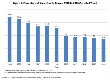

The Census reports that a record-low share of Americans are moving. A recent paper suggests government policies might be curbing mobility.
Get Started for FREE
Sign up with Facebook Sign up with X
I don't have a Facebook or a X account


 Your new post is loading...
 Your new post is loading...
Your new post is loading...
The Census reports that a record-low share of Americans are moving. A recent paper suggests government policies might be curbing mobility. 

Maria Isabel Bryant's curator insight,
February 22, 2017 9:19 PM
On residential patterns....
Sign up to comment
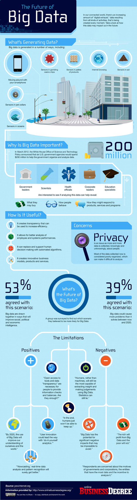
Big data is not new. It has existed for ages and can be attributed even to the initial years of computing. However, one might do well to consider why is there an increased buzz around this now. The answer is quite simple: Significant advances that have been brought about by x86 hardware have actually helped in bringing computing power to the masses. However, with new technologies, cloud computing has extended this power. Now, users have extended perimeters, while still being able to control costs effectively... Via Lauren Moss
|
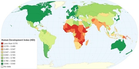
"This map shows Human Development Index (HDI) for 169 countries in the World. The HDI is a comparative measure of life expectancy, literacy, education, and standard of living for countries worldwide. The HDI sets a minimum and a maximum for each dimension, called goalposts, and then shows where each country stands in relation to these goalposts, expressed as a value between 0 and 1, where greater is better. The Human Development Index (HDI) measures the average achievements in a country in three basic dimensions of human development: health, knowledge and standard of living."
Tags: development, statistics, worldwide.

Caroline Ivy's curator insight,
May 18, 2015 10:41 AM
This article discusses the Human Development Index (HDI), what it is, and how it is calculated.
This chart displays that the top three spots on the HDI are occupied by Norway, Australia, and the Netherlands respectively, with the USA coming in fourth. As HDI is calculated by comparing aspects like literacy, standard of living, education, and life expectancy, why are two European countries and Australia in the top 3? Something to be looked at is the in-migration of each country. Immigrants arrival in large numbers in some countries can lower HDI if they are refugees or come from a country with a lower HDI, for they may be illiterate, have a low education, and therefore a low life expectancy. With in migration to the US tightly controlled but in constant motion, their HDI could be pulled down to 4th. As Norway and Australia and the Netherlands are not the main destination for refugees, their HDI could be higher. 
Cody Price's curator insight,
May 27, 2015 12:49 AM
The HDI is the human development index which ranks countries in many different aspects. The higher the country the more developed and modern it is. The least amount of death and the longest lives are here. It is more stable the higher the country.
This relates to the topic in unit 6 of HDI. this map shows the basic HDIS of the world and the patterns formed by the HDI layout of the world. 
Anna Sasaki's curator insight,
May 27, 2015 2:04 AM
This map shows the Human Development Index around the world. The HDI depends on a set list of variables, ranking them from 1st to last. Nations considered to be "Western" are more developed than nations in regions such as Africa and Asia, although all nations are slowly but steadily developing, improving their Human Development Index ranking. The HDI shows development in nations, although leaving out Inequality factors. This map also allows us to see spatially what regions tend to be more developed as well as developing.
![10 Amazing #SocialMedia Statistics [INFOGRAPHIC] | :: The 4th Era :: | Scoop.it](https://img.scoop.it/w7o92dIBdem4QnASs1Hy2Dl72eJkfbmt4t8yenImKBVvK0kTmF0xjctABnaLJIm9)
Did you know that Twitter is grabbing more new registrations than Facebook, with more than half of its entire userbase compromised of people who have signed up in the last year, compared to just 19 percent for Mark Zuckerberg’s baby? What if I said that almost a quarter (23 percent) of Facebook users check their account five or more times each day, Twitter users are 33 percent more likely to be Democrats or – sorry Foursquare – that 74 percent of Americans are unfamiliar with the concept of ‘checking in’.
These, and several other amazing social media statistics, can be found in the infographic on social media statistics... Via Lauren Moss, John van den Brink, Gladys Pintado, Khaled El Ahmad, David Hain, Lynnette Van Dyke
|


